For years, Google publicly displayed the percentage of Android devices running each historic version of Android in what is known as the Android distribution chart. After not updating it in nearly a year, Google has finally taken the Android distribution chart off of the web altogether.
The Android distribution chart was designed primarily to inform Android app developers when they’re deciding on the “minimum” version of Android that their app can run on. However, the numbers shown on it were far from flattering, with older versions like 2015’s Android Marshmallow having over 15% market share.
Companies like Apple would even use Google’s data to flex about how iOS devices receive their updates in a timely fashion. Suffice it to say, this was a bit of an Apples-to-oranges comparison (if you’ll forgive the pun), as there are Android devices that fill niches that iOS does not care as much about, such as digital signage. Those kinds of devices don’t necessarily need to be on the newest version of Android, or even have their hardware upgraded all that often.
Possibly with these issues in mind, Google first stopped updating the chart back in October 2018, only to give it a surprise update last May around Google I/O 2019 and go silent afterward. Google has now completely taken down the Android distribution chart from its usual home on the web. In its place is a simple notice, advising those interested in the distribution numbers to find them in Android Studio.
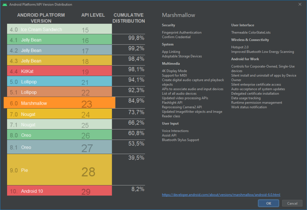
You can find platform version information in Android Studio’s Create New Project wizard.
One could argue that it’s not a good sign that Google is hiding the information behind its bulky Android development suite, but to be fair, the information is only supposed to be useful to developers. So then, what does Android Studio actually show?
As you can see, instead of a pie chart, we’re given “cumulative distribution” percentages. To break that down, Android developers are asked to select the oldest version of Android that they would like their app to run on, and, by default, their app will run smoothly on all versions newer than that one.
These cumulative distribution numbers let developers know what percentage of global Android devices they lose with each newer version of Android. While it may seem a bit confusing, this is actually exactly the data that Android developers are looking for and was the original goal for the Android distribution chart in the first place.
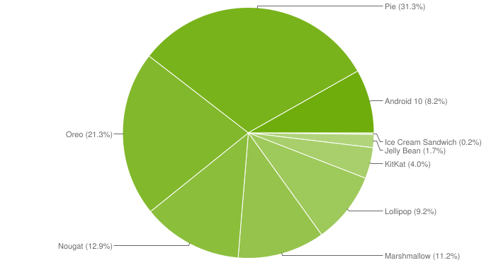
However, Google provides more than enough information there to recreate the Android distribution chart ourselves from this more up-to-date information. Check it out!
From the chart, we see that Android 10 has not yet reached 10% market share, down at 8.2%, by comparison to Android Pie having reached 10.4% by May of last year. We also see Android Pie now controls the largest share of Android devices at 31.3%.
The decreased number of devices on Android 10 seems counter-intuitive as we attributed Android Pie’s success to Project Treble, an initiative to make Android updates far easier to develop for OEMs. One would think that year-over-year the percentage of Android devices on the latest version would increase, not decrease. That said, Android 10 technically still has another month to make up the difference, for a fair comparison.
Dylan Roussel contributed to this article
More on Android:
FTC: We use income earning auto affiliate links. More.
Check out 9to5Google on YouTube for more news:
"Android" - Google News
April 10, 2020 at 10:43PM
https://ift.tt/34rGMKm
Google kills Android distribution numbers on the web, but we’ve got you covered - 9to5Google
"Android" - Google News
https://ift.tt/336ZsND
Shoes Man Tutorial
Pos News Update
Meme Update
Korean Entertainment News
Japan News Update
Bagikan Berita Ini


0 Response to "Google kills Android distribution numbers on the web, but we’ve got you covered - 9to5Google"
Post a Comment