The V27 is a good device overall. The design is beautiful in my eyes, the phone looks light, it's not physically heavy either, powerful enough for the average consumer, and what's more, the camera provides beautiful results and also lots of options for playing with filters and effects. The price also provides value for money.
So what is the downside? Lack of protection against water and dust. It is possible that even without meeting the official standard, the device will be able to deal with them; you can also try to be careful with it, but most of the competitors, even the cheaper ones, provide some kind of protection. If you are convinced that you will be able to protect it or intend to pack it well, you will get an excellent device.
More Smartphone Reviews:
We all already know that we shouldn't judge a book by its cover. This is also true when it comes to smartphones – what is really important, i.e., the processor, memory, and other components, we cannot see, but they affect more than the appearance of the phone.
This is also true because most books, i.e., smartphones, look the same – the build and design are largely similar, even if it's a super ultra-premium phone versus a mid-range device or a basic, cheap model.
Vivo's new smartphone shows that it is possible to do something a little different, even if it only involves a minor design gimmick.
Build and design: An insignificant gimmick upgrades the phone
The Vivo V27 is a mid-level device, that is, not an expensive and prestigious model with impressive specifications, but a mediocre phone that is sufficient for most needs and is sold at a price that is now considered reasonable.
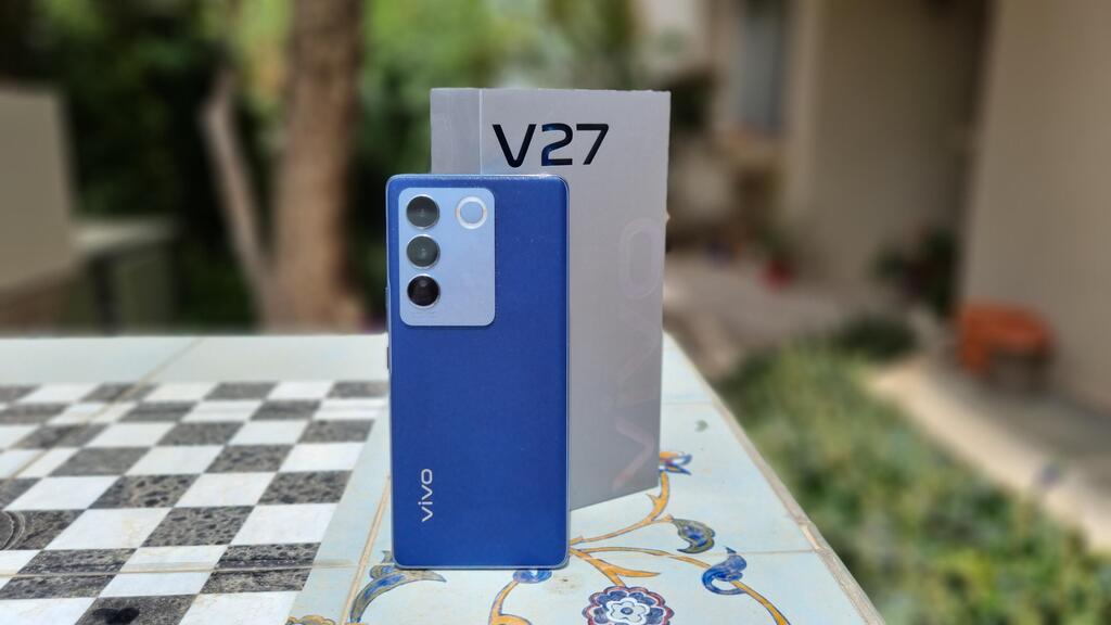
So what is so successful about the design? It is a little different than usual, and for the better. The model I received for testing is light blue in color – it has no effect on performance and capabilities, but it already conveys lightness compared to black or silver devices.
And there is another gimmick: light blue is just the starting point. When you go out with the device in the sun, even an exposure of a few seconds will be enough; the color changes to dark blue. If you put your finger on the back of the device, it will leave a light blue mark, and at a certain angle, you can see that the back even shimmers. I repeat and emphasize – there is no effect on performance or capabilities; it's an insignificant colorful gimmick, but there is something fun about it that just works. Here is a device that looks a little different in the smartphone landscape. If this was the highlight of the phone, it would actually be silly and unnecessary, but the V27 has more to offer.
The Vivo doesn't feel heavy, even though it's large: the 6.78-inch screen, with rounded edges that stretch to the sides of the device – a design that's already been pretty much abandoned, but here it also works because the frame of the device is extremely thin, and it also contributes to the feeling of lightness. The downside is a more vulnerable device because it doesn't have a metal or even plastic frame that wraps the entire screen. The kit does however include a basic (and transparent) silicone protector that helps reduce a little, just a little, the fears of dropping it.
If there are concerns about damage, here is the most prominent weakness of the device – it does not meet any standard of protection against water or dust. Not for immersion in water for 30 minutes, not at a certain angle, not dripping or spraying. Officially, at least, it should be kept away from water. It is also not clear what protection the screen has, that is, what kind of glass it is and how strong it is. In short – you should hold it well.
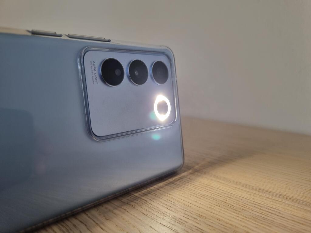
The power button and volume buttons are on the right side, the left side is empty, and the selfie camera occupies minimal space at the top of the screen. On the back of the device, besides the light blue color, there are three lenses, and next to it, another type of gimmick – instead of a normal flash bulb, there is a ring of light. It reminds a bit of a lighting ring of the type used by various content creators, only there the lighting is for selfies, and here the flash is next to the rear camera. That means you gained lighting but lost the possibility of an immediate display of the result.
Hardware: strong with an excellent screen
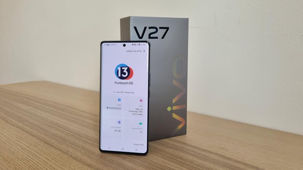
The V27 comes with MediaTek's Dimensity 7200 processor, 256 gigabytes of storage, and 8 gigabytes of memory, with the option to double them at the expense of the storage volume. All this is definitely enough – for games, watching movies, surfing, photography, and more.
The screen is excellent, both when it comes to viewing photos and movies, and it is bright enough for reading or other use in full sun.
One would expect that if there is no protection against water and dust, it would be possible to integrate a headphone jack, but there is none, probably due to the choice of an extremely thin frame. There is also no expansion slot for a memory card, and this is actually not related to the thickness of the device, and there is no eSim support.
There is a speaker, of course, but only one – and not a particularly successful one. It can be rated as almost reasonable, and to enjoy music, a movie, or a series, you should connect headphones or a Bluetooth speaker to it.
At the bottom of the screen is a fingerprint reader that works with an optical method and will function quickly and without problems, and the facial recognition mechanism also works excellently. By the way, before its initial activation, a message appears that the information is saved on the device only; if that reassures you.
The battery of the V27 has a capacity of 4,600 mAh, lasts a day of work, and there is also fast charging. Similar to the other Chinese manufacturers, Vivo's kit also has a charger for fast charging, with a power of 66 watts. The company states that 19 minutes will be enough for a 50% charge, and in a home test, this is indeed the case. It takes almost an hour to fully charge.
Software and interface: Android with a friendly approach
The smartphone's operating system is Android version 13, and on it is Vivo's interface, called Funtouch OS, also in version 13. The name is unique, but the method is familiar – the apps are displayed on the home screen and in the app drawer, from which you can go to a library of various widgets.
If you're switching to Vivo from another Android device and haven't come across Funtouch yet, you can quickly get the hang of it. As with all Android systems, there are options for customization, but it seems as if there are fewer such menus and sub-menus compared to what some of the competitors offer.
There is also support for shortcuts, for taking a screenshot or splitting the screen to display two different apps, and Vivo doesn't load or push too many of its own or partner apps onto the device.
What is still a bit different and less successful in my opinion is the notification curtain – the notifications themselves are perfectly fine, but the shortcut to the settings does not appear with one pull down. Another pull will show access to notifications which is not particularly cumbersome, but different and less convenient.
In the notification section, there are also occasional updates about an application that continues to run in the background or an application that eats up the battery, and it is recommended to close it – messages that also appear on other devices, but on Vivo, their implementation is better. The message is not annoying, and it also offers a solution with a clickable button, without sending you to look in the settings for what needs to be done.
In addition, there is an option to open a guest account, without entering any details; then the applications are available but without your personal details. On the other hand, switching back to your account does not require entering a password, so if you give the device to someone else, they can easily switch back to the main account.
Related articles:
Camera: plenty of gimmicks and also good photos
Beyond the successful exterior design, photography is the highlight of the V27. The lenses themselves are - 50 megapixels for wide photography, 8 megapixels for extra-wide photography, 2 megapixels for macro, and another 50 megapixels for the selfie camera.
The company calls the device a "photo studio," not only because of the lenses but also because of the features that are integrated into the photo application (and don't forget the flash ring).
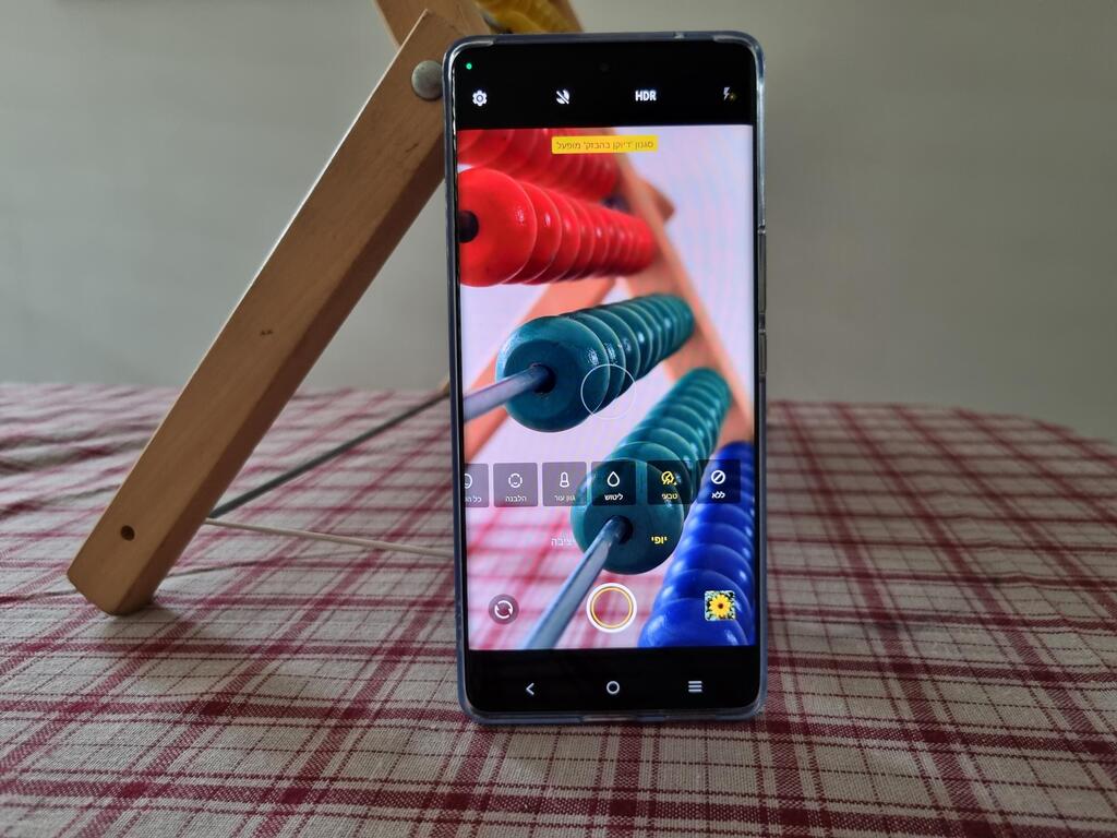
Where to begin? There is a natural color mode that you can turn on or off. In the normal shooting mode, there are different filters for the entire picture, like on Instagram. In portrait mode, you will find a shortcut to another set of effects, including the "polishing" of the face, a menu for effects on the whole face in which there are a variety of options, including the design of the forehead, jaw, cheeks, and the head itself, another menu for facial features – i.e., the design of the mouth, nose, eyes, and much more. Within each such sub-menu, there is a sort of bar through which you can control the application of the effect.
There is also a separate menu for the makeup that is put on the face of the person being photographed and suggestions for different poses for selfies, including a demonstration of them on the screen, another menu with templates ready for photography, and a log according to different categories (food, travel, sports, and more) – and this is a very partial list.
As mentioned, all these options come within the photo application, without the need to install an external application, which in some cases involves an additional fee. How is the result? The effects are a bit exaggerated, and there is a noticeable difference between a normal image and the one in which the various changes were used. It is not clear if this is done on purpose, but it seems to be less successful for photo editing and more intended for gaming. Children and teenagers will enjoy going through all the different options.
On the other hand, I couldn't find an option to cancel one effect I activated and leave the others; the solution is to reset all the effects and return to the starting point – which is a bit annoying.
The flash ring helps achieve a slightly better distribution of the lighting and improve the image, but as mentioned, is not relevant for selfies.
If we leave the effects aside, the zoom is only 2x, and the macro shots are problematic – the focus is fixed, and you have to find the right point for the shot; otherwise, the resulting image will be blurry and smeared. In the other shooting modes, the results are beautiful, even if you use the natural color mode.
In night photography, the camera shows in advance how long you will have to remain motionless for the exposure to be good enough, and after pressing the photo button, a countdown of the seconds until the end of the photo is displayed. Here too the results are successful, and the camera copes without problems with a dark environment.
"Smartphone" - Google News
August 21, 2023 at 01:38PM
https://ift.tt/Id0gGXJ
Vivo V27: A mid-range smartphone with a refreshing design approach - CTech
"Smartphone" - Google News
https://ift.tt/YbWQyit
https://ift.tt/auKQCe1
Bagikan Berita Ini


0 Response to "Vivo V27: A mid-range smartphone with a refreshing design approach - CTech"
Post a Comment