You probably spend a lot of time thinking about the perfect way to organize your home screen. What apps make it to the main homepage, the right weather widget, what shortcuts are necessary for daily use —even your icon pack needs some consideration. What you probably don't consider, at least as often, is how you get to your home screen. These days, many of our readers rely on gesture navigation, flicking their thumb up from the bottom of the screen to return to their personalized space.
Gesture navigation has a long history on Android, dating back to the days of Android 9 Pie. In the shadow of the iPhone X—the first Apple device to drop the once-iconic home button—Google immediately began working on a new navigation method, one that could replace the virtual button lineup that had become synonymous with Android. And while the company would eventually end up with a system that works for millions of users, it took years of trial and error to get there.
The death of the home button
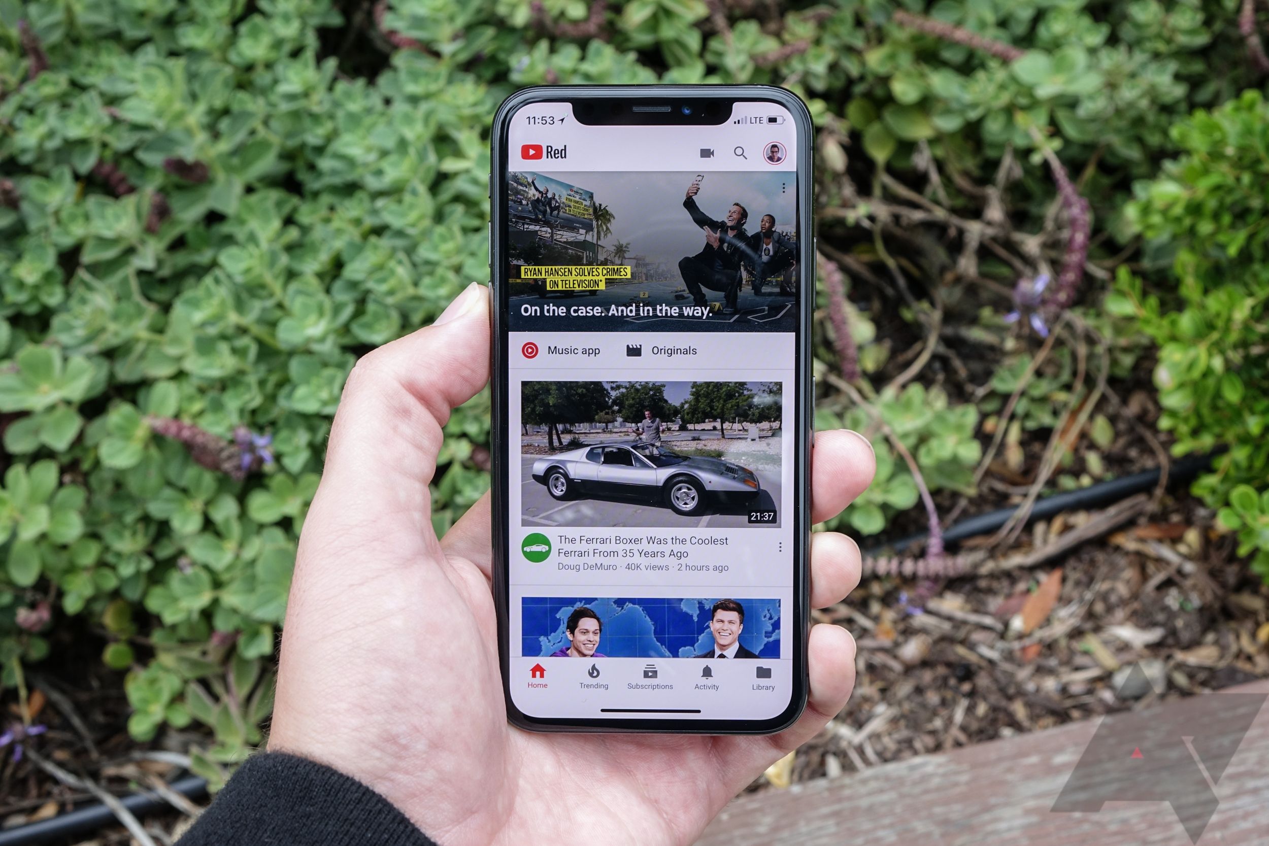
Google's eventual switch to a gesture-based navigation system on Android was all but destined by 2017. A month before the Pixel 2 arrived on store shelves, Apple debuted the iPhone X, a complete reinvention of its flagship smartphone. The home button was gone, replaced with a swipe-based gesture system for returning home and swapping between recently used apps. The change seemed controversial at the time. While it was far from the first gesture-based system on phones—even some Android phones beat Apple to the punch—it was a massive change to how a once-simple mobile operating system worked. Would iOS users adapt to one of the biggest changes to ever arrive on the platform, or would millions be left struggling to use their new phones?
The iPhone X, in all its glory.
Nearly five years later, we know the answer. Only one iPhone SE and entry-level iPad have retained their home buttons.
Switching to a gesture-based navigation system has some obvious benefits—namely, screen real estate. While Android manufacturers had switched away from physical home buttons long before Apple, the line of virtual navigation buttons still consumed nearly a centimeter of the display. Apple's system, meanwhile, didn't just eliminate the bottom bezel from its phones—it allowed icons, web pages, and games to extend across the entire screen.
The iPhone X hit store shelves in November 2017, and while not every review was positive, most critics found the gestures adaptable over time. By April—just five months later—an early leak of Android 9 Pie showed off the gesture system Google had built to compete with Apple. It looked unfinished, removing the recent apps button entirely, replacing the home button with a pill-shaped oval, and leaving the back button untouched. Naturally, it was exactly what shipped in a final build months later that year.
Third-party predecessors
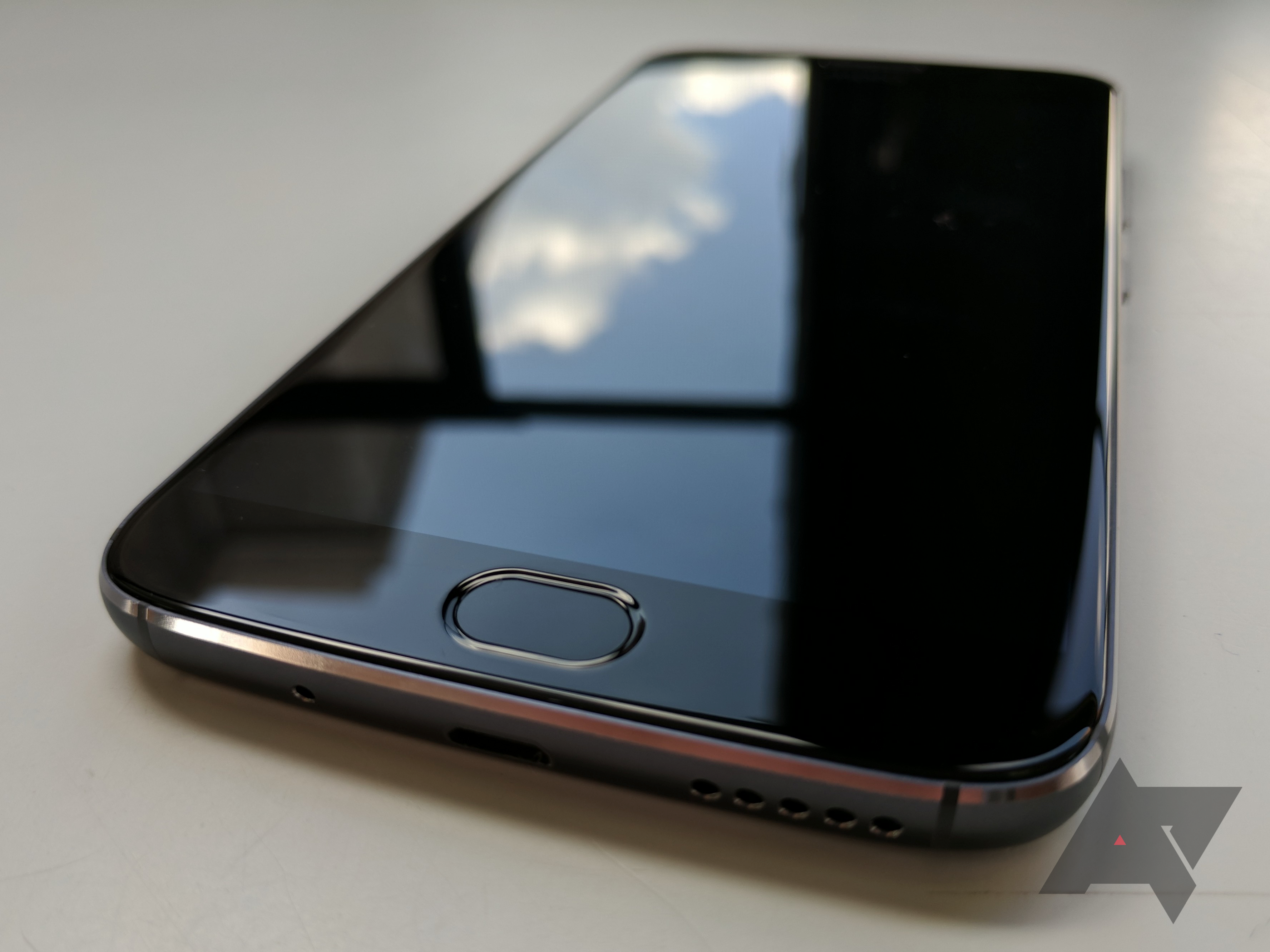
Apple might've made gestures mainstream, but it was far from the first company to adopt them. Phones like the Moto G5S Plus utilized front-facing fingerprint sensors to double as a "one-button navigation system." A single tap sends you home, a swipe to the left acts as the back button, and a swipe right opens the recent apps menu. It's not a one-to-one match with how we think of gesture controls today, but it was a cool idea nonetheless. Unfortunately, the death of bezels has all but killed front-facing fingerprint sensors—all those not under the display, at least—so it's an idea restricted to the history books.
The Moto G5S Plus replaced the navigation bar with the front fingerprint sensor.
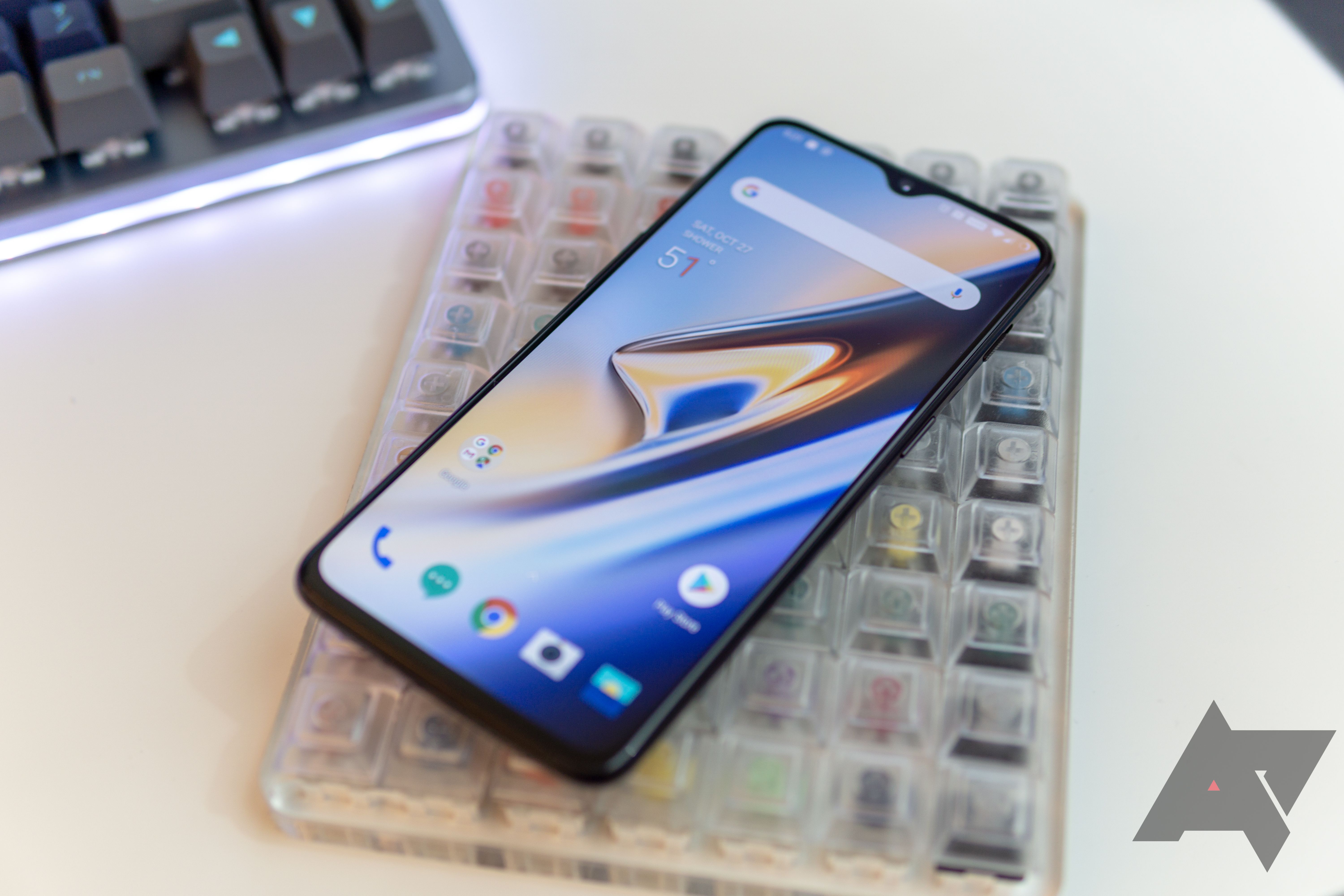
OnePlus made some impressive steps in this field in 2018, likely spurred on by the success of the iPhone X. The OnePlus 6 was the company's first device to launch with gestures (some earlier models received the feature through software updates), eliminating the navigation bar altogether and allowing the UI to stretch down the entire length of the display. In his review, AP's Ryan Whitwam described them as feeling unfinished, though he noted he "almost like[d] using them." It's all fairly standard these days: a swipe up sends you home, a swipe-and-pause opens the multitasking screen, and a swipe from the left or right bottom edges sends you back. Easy, right?
The OnePlus 6 series took gestures to the next level, completely hiding the navigation bar.
Unfortunately, the OnePlus 6's version was pretty buggy. It didn't always pick up on a gesture, occasionally preventing the user from going home or making it difficult to close the keyboard without tapping something on the screen. The OnePlus 6T made some improvements in this area, including adding some new animations. It's clear the company's gesture rendition was popular among fans—AP's Ryne Hager seemed much more won over in his review of the 6T, even if some of the shortcuts remained awkward.
Still, for many, Google's version of Android is the "real" version of Android. It wouldn't take long for the company to try out a new way of navigating around the phone, but that's not to say it was entirely successful.
Google's first attempt
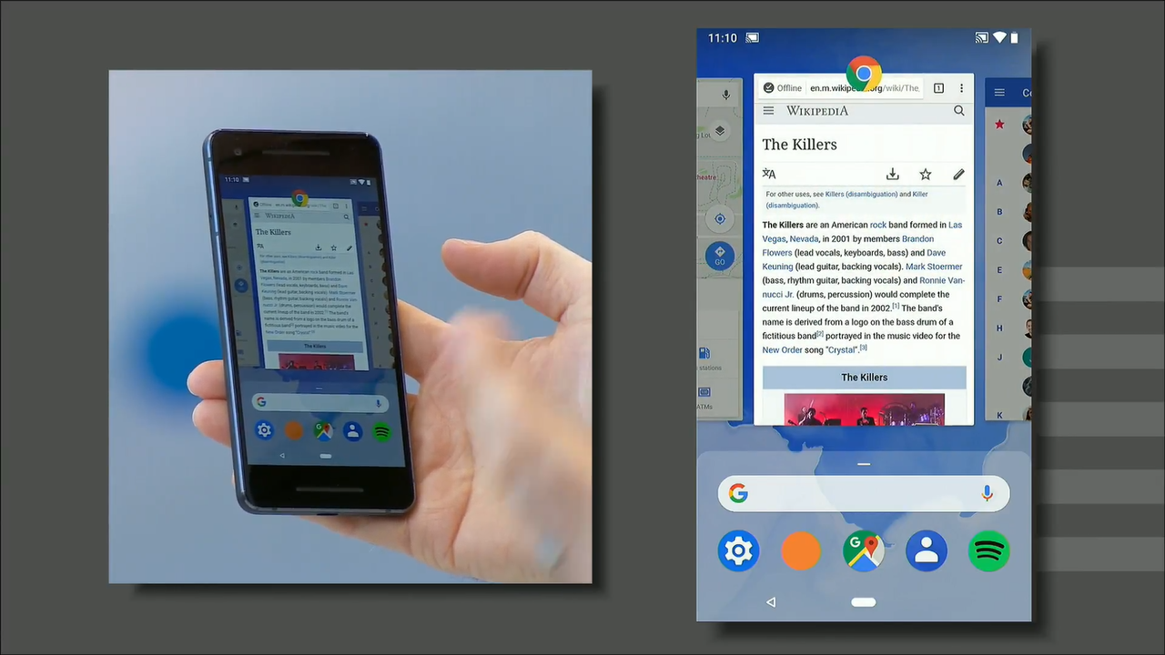
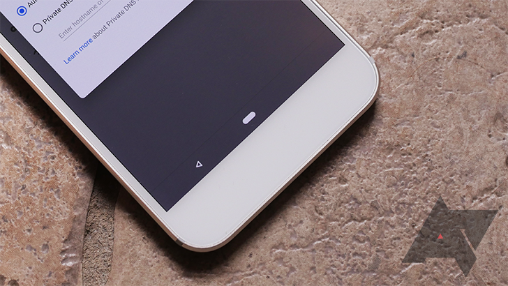
When Android 9 Pie launched in August of 2018, it included the same gesture system that had leaked months earlier, with only a couple of small changes to the overall look. This navigation method still took up a similar amount of space along the bottom of the screen, only removing one button entirely. In the middle of the bar was a new pill-shaped home button. On the home screen, this was the only icon you'd see, effectively cleaning up the bottom toolbar and consolidating three icons into one. With any application open, however, the back button would reappear on the panel's left side, leaving it unbalanced.
Google presenting its new gestures at I/O 2018.
Meanwhile, the pill pulled triple-duty. Tap to go home, swipe up to reveal the multitasking menu (with a second swipe up opening the app drawer), or swipe right to switch back to your most recent app. In theory, this added a whole library of swipes and gestures to Android, making it faster to navigate between apps without relying on three ever-present buttons. In practical use, though, it didn't make a lot of sense. Why was Google trying so hard to split the difference between buttons and swipes? How did this improve over the classic three-button layout most Android users felt comfortable using? Why keep the back button at all?
To no one's surprise, Google's new gestures received a polarizing response. Looking at a roundup of our favorite features at the time, AP alumnus Rita El Khoury wrote that small improvements throughout the beta phase had made the experience much smoother. Meanwhile, David Ruddock wrote a scathing column panning Android's new gestures, describing it as "something out of a bad custom ROM—not a serious smartphone OS." No one was as harsh as Ars Techina's Ron Amadeo, who referred to Google's attempt as "ugly, lopsided, and pointless."
The now-infamous pill.
For most Android 9 Pie users—including Pixel and Pixel 2 owners—these gestures were optional. You could pick between adopting Google's vision for the future of navigation, or stick with the tried-and-true triple-button layout. Pixel 3 owners weren't so lucky. When Google launched its 2018 flagship lineup in October, the company confirmed on Twitter that its new phones were locked into the pill. It wasn't until the third Android 10 beta in May 2019 that the classic three-button layout arrived on third-gen devices.
It was easy to see Google's insistence on its new gestures as a way of moving Android in new directions, all while simultaneously avoiding a straight copy of Apple's iOS system. The iPhone XR brought swipe controls to more users than ever before. Samsung had introduced its own take on gestures, avoiding Apple's take while translating Android's three-button design to something a little more understandable. Google was desperate not to get left behind, but it was clear that Android 9 Pie's implementation left much to be desired.
Back to the drawing board
Even for users who liked Google's pill-shaped gesture controls, it was clear the implementation needed work. Early on in the Android Q rumor mill, word about the back button's imminent demise spread like wildfire. It made sense for Google to consider changing one of its main navigation control—as it stood on Android 9 Pie—because it was clunky, unintuitive, and ugly.
Before a public preview of Android Q even dropped, a demonstration of a back button-powered pill showed up online, demonstrating how the device could start allowing users to swipe back rather than typing a button. Early betas for Android Q even buried a work-in-progress version of this in their settings, but it wasn't until Google I/O that the vision for the future of smartphone navigation came to life.
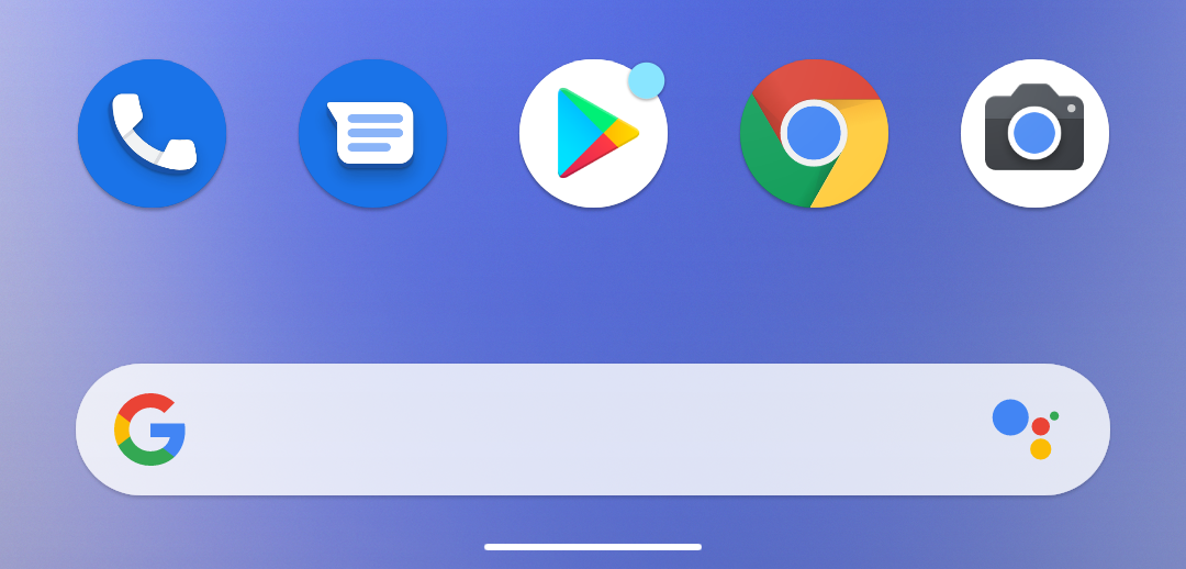
Alongside the release of Android Q Beta 3, the company showed off a brand-new bar replacing the pill-shaped icon at the bottom of the display. It solved many of the problems Android 9 Pie's implementation faced: it was shorter, less intrusive, and didn't rely on legacy buttons to move through apps. It also had some pretty obvious inspiration from iOS, right down to the thin line running along the bottom of the device. Sure, some Android-exclusive controls remained — there's still nothing quite like the back gesture on the iPhone — but the rest of the experience was all too familiar.
It's hard to fault Google for throwing in the towel and moving to something similar to what Apple offered on its devices. By this time, the company was preparing to launch the iPhone 11 series, its third round of devices lacking a home button. The third-gen iPad Pro was just under a year old, also pairing Face ID with gesture controls. Even if reviewers— and consumers, to a lesser extent—weren't sold on swipes and flicks in 2017, two years later, it's clear they'd caught on.
Because of how Google's beta program works, consumers spent months prior to a stable launch testing it out. And just as the pill-shaped button before it, the gesture was controversial among beta tester. It was not only another change in how you navigate your phone—the second in as many years—but also a challenge for some people with disabilities who use Android, as they found triple-button navigation easier to use. It also didn't support third-party launchers, something Google admitted when Beta 5 arrived in July.
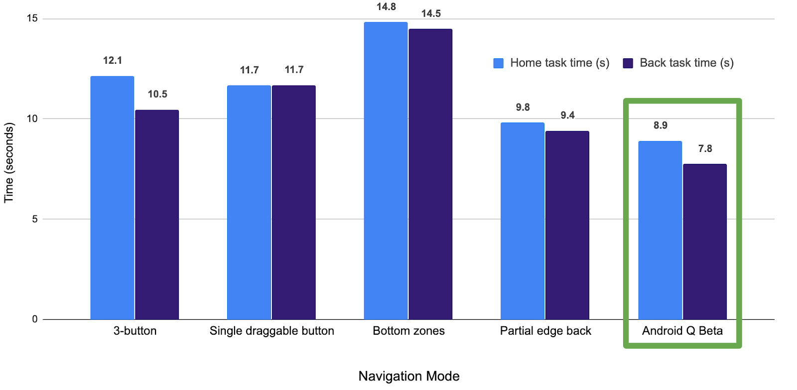
Google backed up its argument, citing internal testing that proved its new gesture system was the fastest way to navigate around Android. Home and back swipes saw a huge increase in speed, at the cost of a slight increase to opening the multitasking screen. Google defended this too, citing stats that proved the app switcher was far less essential to the average user than swiping home or back. And as for those concerns over third-party launchers, well, the company promised to fix it…eventually.
And so, gestures launched in full force with Android Q—now Android 10—in September 2019. Looking back, it was a fairly positive update for our readers. In a poll with nearly 10,000 respondents, more than half of voters who'd received the update felt positive about the changes. Still, digging into the comments section tells a different story. Some loved the changes, others found them annoying. More than a handful of users stuck to the classic three-button navigation mode, especially if they relied on a custom launcher.
Heading back to Ars Technica's Android 10 review—a year after his scathing remarks about Android 9 Pie's attempts at redesigning navigation—Ron Amadeo puts his thoughts about Android gestures right upfront, listing them as the first section of his review, following a quick preamble about the naming scheme change. He makes it clear that although many of these new motions come straight from iOS, they're such a massive improvement compared with what Google tried before, that it doesn't matter. One of the biggest critiques offered by Amadeo targets the visual look of Google's back gesture, something the company wouldn't actually target until Android 13 nearly three years later.
Just a couple of months after Android 10 launch, Google was clearly ready to put its pill-shaped gesture attempt behind it. Although the Pixel 4 included support for the legacy three-button layout, it dropped the Android 9 Pie gestures entirely. This move was far less controversial than when the Pixel 3 launched, partially because of the older buttons still appearing, and partially because these new gestures were now much, much better.
Despite some bumps in the road, everything with navigation post-Android 10 eventually worked out. Third-party launchers work fine on more recent Android releases. You can switch between Android manufacturers and usually get the same gesture experience regardless of brand. It's rare to swipe and get an unexpected result these days—something that could not be said for some earlier third-party attempts. As iOS-esque as the current design might feel, it's hard to argue with its success.
What's next for gestures on Android?
Since the days of Android 10, not much has changed. Pick up a Pixel 6 with Android 12, and you're unlikely to notice many differences between the current OS and what first shipped nearly three years ago. For Android 13, Google mostly continues this pattern, albeit with a new take on the back gesture. Predictive back gestures promise to fix that ugly design flaw Amadeo wrote about three years ago. Through some backend trickery, Android will start showing the home screen when you're about to head home — rather than to a previous page or menu. It's a big change, and it's one that is far more complicated behind the scenes than it looks in action. It should come with two big advantages: a new, cleaner look with improved animation, and a way to deliver information to the user seamlessly through transitions.
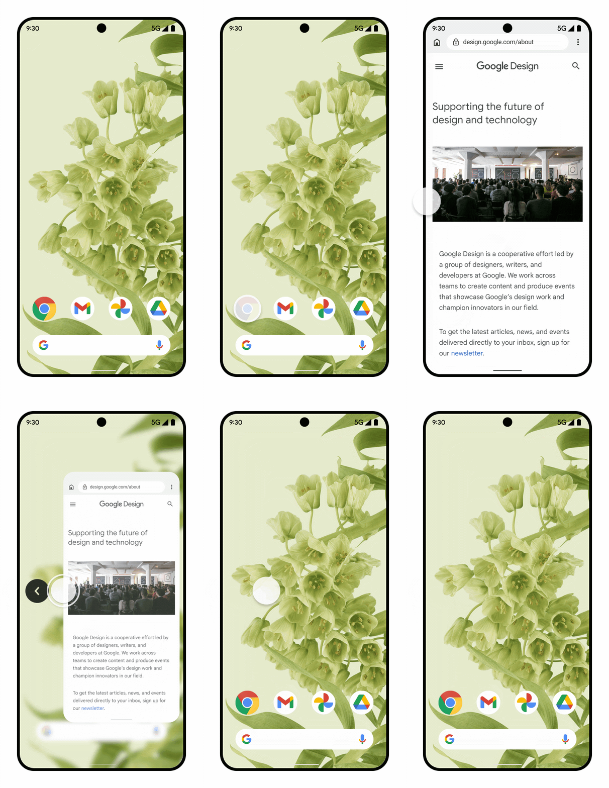
One more thing will change with Android 13: the bottom navigation bar. It's thicker and bolder now, nearly identical to the one seen on iPhones. After all, at the end of the day, if you're going to copy, you might as well go all the way.
It might've taken years of practice, failed attempts, and some inspiration from the competition, but gestures on Android are as good as they've ever been. Until technology like Project Soli evolves to the point where touching our phone's display is no longer required, ensuring that each swipe and tap is as efficient and user-friendly as possible is the only practical strategy. So far, Google's stayed on the right track with gestures. Let's just hope they continue to get better and grow in functionality.
"Android" - Google News
July 01, 2022 at 05:30PM
https://ift.tt/YBpQPeR
A brief history of Android gesture navigation - Android Police
"Android" - Google News
https://ift.tt/UhrYjWm
https://ift.tt/DL1anyG
Bagikan Berita Ini


0 Response to "A brief history of Android gesture navigation - Android Police"
Post a Comment