
Nothing Phone 1
Nothing's debut Android smartphone effortlessly competes with the best budget phones at the first time of asking.
Table of contents
How do you crack the smartphone market? It’s a question many debutant companies — from industry giants to passionate minnows — have tried to answer, yet there are as many (if not more) tales of reputational and financial tragedy as there are success stories. Despite being the ubiquitous gadget in the world, snatching a piece of the smartphone market pie is frequently a Sisyphean task for new brands.
Every now and again, though, a fresh face emerges capable of sending out enough signal to break through the noise. In 2022, that brand is Nothing — the hottest prospect in the Android world since Essential, and with the same level of industry pedigree behind it (and armed with some of the defunct company’s patents, to boot).
Fittingly though, hype means absolutely nothing without a product people love, to give buyers a reason to gravitate away from familiar names. After all, there’s always a risk in backing a newcomer. Does Nothing’s first smartphone, the Nothing Phone 1, crack the code? Find out in Android Authority’s Nothing Phone 1 review.
About this Nothing Phone 1 review: I tested the Nothing Phone 1 (8GB/256GB) over a period of seven days. It was running the Android 12-based Nothing OS 1.0.2 (Spacewar-S1.0-220705-2315EEA) on the May 1, 2022 security patch throughout this testing period. The unit was provided by Nothing for this review.
What you need to know about the Nothing Phone 1
Oliver Cragg / Android Authority
- Nothing Phone 1 (8GB/128GB): £399 / €469 / Rs. 32,999
- Nothing Phone 1 (8GB/256GB): £449 / €499 / Rs. 35,999
- Nothing Phone 1 (12GB/256GB): £499 / €549 / Rs. 38,999
The Nothing Phone 1 is the second product from the London-based startup, following hot in the footsteps of the warmly received Nothing Ear 1 true wireless earbuds. Boosted by the reputation of OnePlus co-founder and hypeman extraordinaire, CEO Carl Pei, the nascent company’s stock has been further raised thanks to investment from Google’s parent company Alphabet, collaborations with leading tech YouTubers, and influence from design luminaries from Dyson and Teenage Engineering.
For all its high-profile backing, the Nothing Phone 1 is a much simpler, more modest affair than you might expect. Since its founding in late 2020, Nothing has been extolling the virtues of simple, open technology, and the Phone 1 continues in this vein, while also continuing the Ear 1’s balance of eye-catching design, a capable feature set, and an affordable asking price.
The result is not an industry-shifting premium phone, but a mid-range device whose striking appearance belies its reserved spec sheet and sub-$500 price tag. Comparisons to OnePlus were inevitable, yet the Phone 1 has more in common with the clean, lean, original OnePlus Nord — Pei’s final project at the Shenzhen brand — than it does its beloved “flagship killers” of old. Now unencumbered by demands from a mysterious conglomerate, the Phone 1 is the Nord vision in its purest form.
Oliver Cragg / Android Authority
The most divergent part of that vision from its spiritual predecessor is immediate — its aesthetic. Every part of the Nothing Phone 1, from the handset’s bold look, to the slimline box it arrives in, right down to the humble SIM ejector tool with a weirdly extravagant transparent pill handle, is designed to stand out from the crowd. The bizarre exception is the bland white USB-C cable. Nothing’s official 45W charger (£45) at least tries by slapping a see-through cover on top of a basic white brick, but you’ll have to buy it separately.
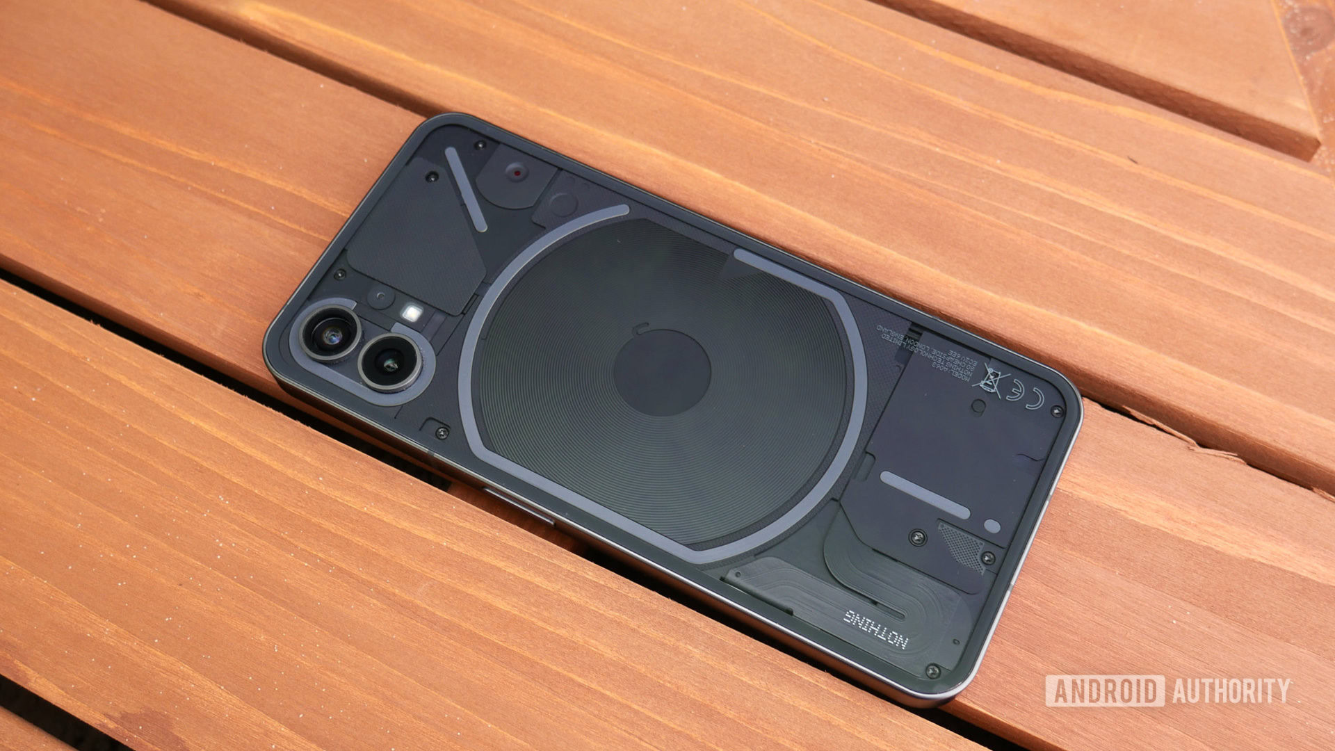
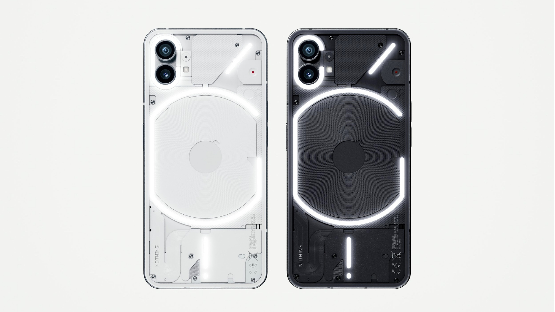
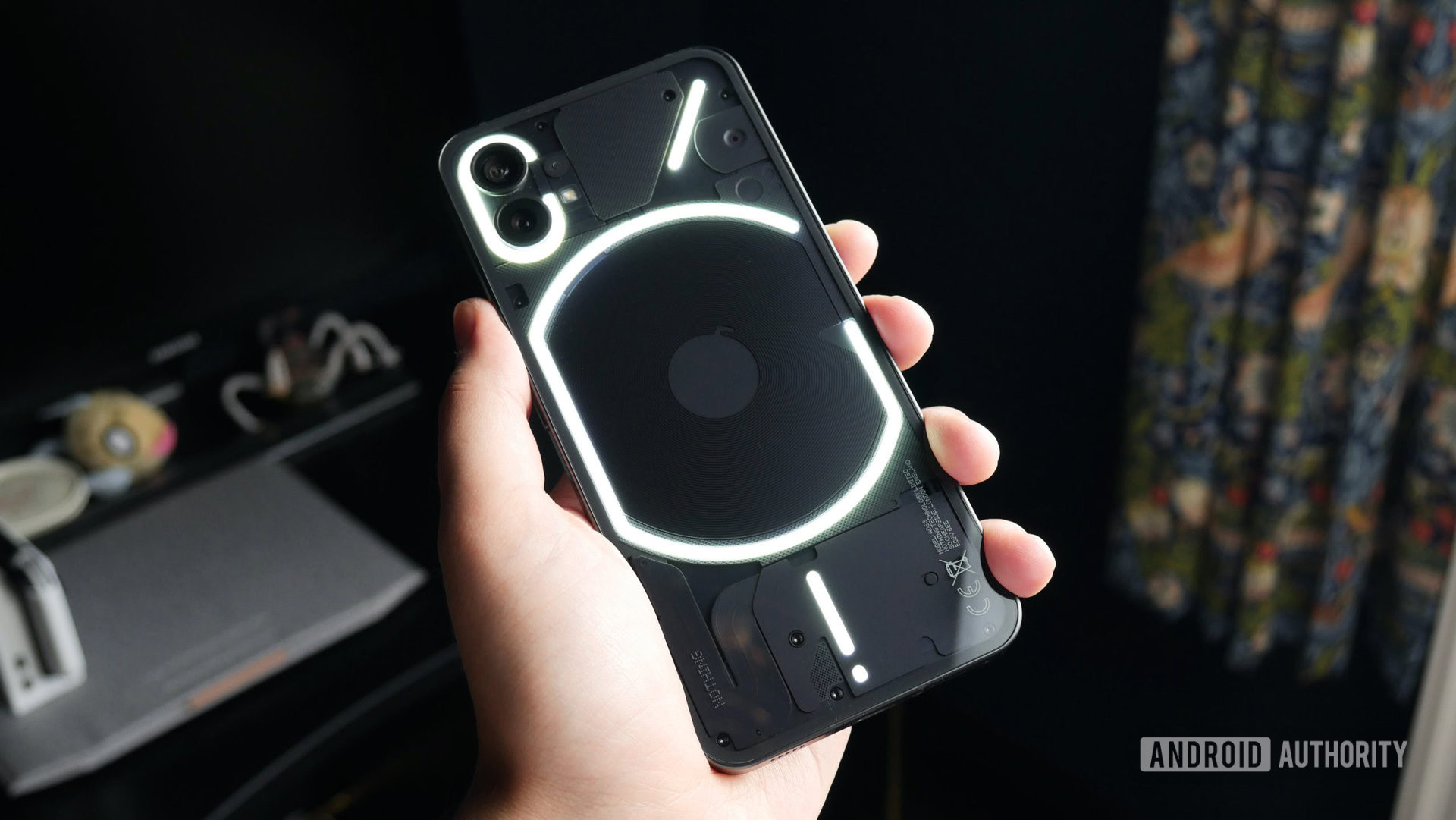
It’s the phone that really matters, though, with its transparent rear glass and visible mix of faux components and meticulously placed panels and screws, its conspicuously iPhone-like form factor, and its centerpiece, the Glyph — a quartet (quintet if you count the bottom dot) of pulsing rear lights powered by hundred of LEDs.
The Nothing Phone 1 feels like a purist vision of what the OnePlus Nord line could have been.
Nothing is certainly looking to grab attention while still keeping the price low, but it seemingly hasn’t skimped on the materials used to craft its debut smartphone, with Gorilla Glass 5 on the front and back, and brushed aluminum along the squared-off frame. The company has also taken great pains to espouse its sustainable approach, with recycled packaging and metals, and 50% of the plastics originating from bio-based and recycled sources. Nothing’s “unfailing determination to shrink tech’s environmental impact” is perhaps undermined somewhat by its controversial dabbles with promotional NFTs — a proclivity that isn’t entirely absent from the final product (more on that later).
For all its visual pizazz, what lies further beneath the rear panel is somewhat more humble as far as specs go. The competition in the mid-tier is fierce, with once-flagship-exclusive features like wireless charging, IP ratings, and faster refresh rate displays all trickling down to the $500 and below mark. Nothing (mostly) keeps up the pace, at least on paper, though eyebrows have been raised about the now-18-month-old Qualcomm Snapdragon 778G Plus processor sitting at the very heart of the phone.
Check out: The best budget phones
Sadly, the Nothing Phone 1 is not launching in North America. Instead, it’s looking to capture the attention of budget buyers in markets like Europe and India — two target areas that have no shortage of mid-range phones with similar price tags, specs sheets, and in many cases, more power under the hood.
The Nothing Phone 1 is available in white or black (tested), and following the conclusion of a OnePlus-esque invite-only pre-order phase, goes on general sale from July 21. Those in the UK can buy the Nothing Phone 1 direct from Nothing, as well as Amazon, Smartech at Selfridges London, O2 (as an exclusive carrier), and in pop-up kiosks in Seven Dials, Covent Garden, London between July 16-20.
How well designed is the Nothing Phone 1?

Oliver Cragg / Android Authority
Much has been made of the Phone 1’s flashing lights, and while the Glyph Interface is a fundamental part of the phone’s identity and aesthetic, it’s only one part of the reason why the Nothing Phone 1 looks and, crucially, feels like a phone worth twice its asking price.
For obvious reasons, let’s start with the back. Transparent gadgets have a long lineage, especially among hobbyists obsessed with seeing what makes their tech tick at all times. As such, this is far from the first see-through phone. The most recent examples have obscured their inner workings with subtly translucent shells or adorned them with blatantly fake components and gaudy branding.
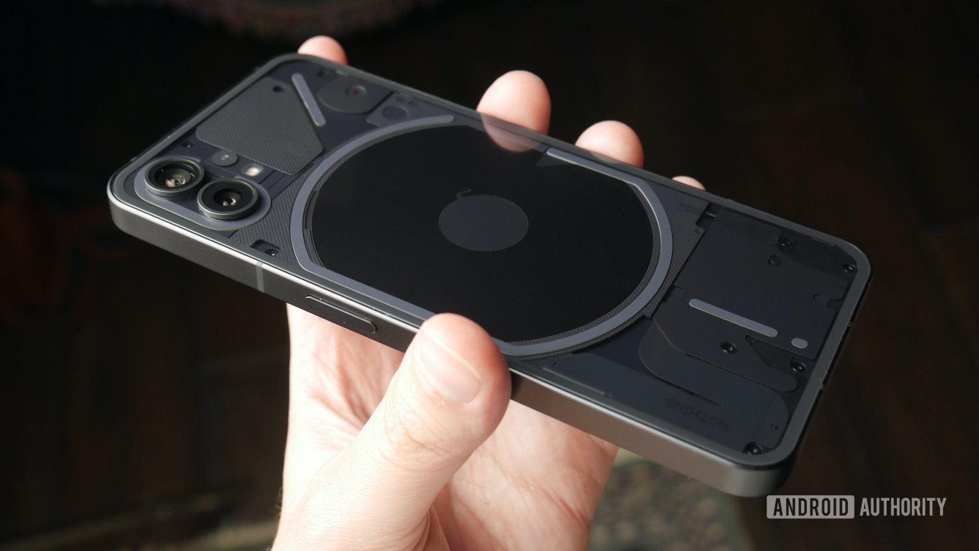
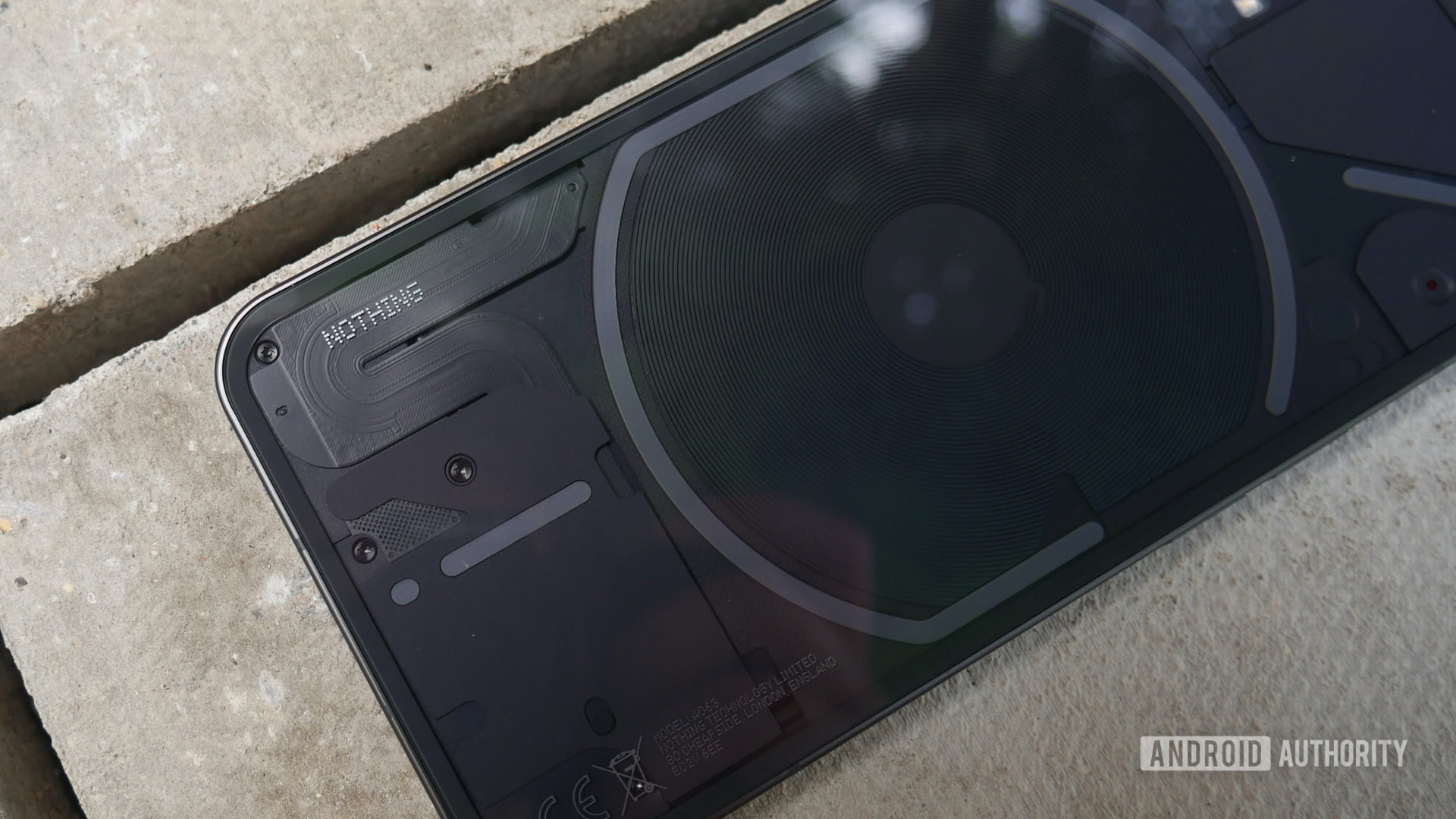
The Phone 1 opts for a more mature middle ground where the cooling pipes and wireless charging coil are visible, but the rest is covered by panels (some textured, some matte, all in a uniform color), and segmented by the Glyph lines, with the only branding nestled in the bottom left corner in Nothing’s signature dot matrix typeface. The whole look is undeniably bold but avoids tipping over into garishness. Nevertheless, it’ll immediately put off some who don’t want to draw inquisitive stares on the subway. As a child who spent hours glued to a transparent original Game Boy and an unashamed fan of anything with even a hint of retrofuturism, it’s no surprise I’m a sucker for what Nothing is putting down.
That’s not to say it’s all entirely an original work. Nothing claims the design was inspired by the modernist maps of Italian designer Massimo Vignelli, but there’s also an unmistakable Cupertino flavor here too. Look past the novel rear under the very-easy-to-smudge glass, and you could uncharitably call the Nothing Phone 1 an iPhone clone. The symmetrical bezels (just shy of 3mm), near identical button and port layout, and those aforementioned flat rails all evoke Apple’s golden goose. At least there’s no notch?
Yet as much as the Nothing Phone 1 looks like an iPhone, you have to ask: what iPhone actually looks like this? You can certainly ding points for originality, but if you’re a fan of the general iPhone form factor, and many people are, then the Phone 1 delivers its best design qualities, adds its own style, and, crucially, retains a similar level of build quality. Remember, Apple already sells an iPhone at a similar price, but the iPhone SE (2022)’s tired design and inelegant ergonomics are lightyears away from what Nothing has achieved.
Gorilla Glass 5 covers the front and back of the Nothing Phone 1. This isn’t the highest level of protection from Corning, but it’s a fair grade for a mid-ranger. There are no clumsy edges, as the glass slots neatly into the brushed aluminum frame. The Phone 1 is no small phone (think iPhone “Max” size), but it strikes a delicate balance between feeling satisfyingly weighty without being heavy. The buttons have a pleasing click, and the haptics are exceptional. The vibration motor is alarmingly precise and can deliver a broad range of feedback for different tasks, whether it’s a quick keyboard tap, during a game, or corresponding uniquely to the Glyph patterns. It’s a cut above the usual budget fare and easily rivals Google, which is a very high bar.
Yes, it looks like an iPhone, but no iPhone looks like this.
One minor blemish on the phone’s design is its IP53 rating. It’s certainly better than… well, nothing (this is the first and only pun, I promise), but halting the official certification at splash resistance means it falls a step behind Samsung, Apple, and Google, all of which have rival mid-rangers that can be temporarily immersed in water without worry.
There’s also the case conundrum to consider. Nothing sells a clear polycarbonate Phone 1 case (£25), but it’s a grease magnet, and the button covers are a bit mushy. It’s hard enough to find a nice variety of phone cases for existing brands (that aren’t Samsung or Apple), but here’s hoping Nothing can convince some big names to come up with better options. After all, you don’t want to cover that transparent back, or the phone’s biggest design gambit…
What does the Nothing Phone 1 Glyph Interface do?
The Glyph Interface is Nothing’s attempt to reimagine the concept of a banal notification indicator. Constructed of over 900 white LEDs, the Glyph’s abstract lines are primarily there to signal incoming notifications and calls. Nothing has loaded the phone with 10 bespoke ringtones and an equal number of notification sounds, each corresponding to different flashing light sequences.
In theory, even when calls and notifications are muted, you can still tell the difference based on the light patterns. This can be extended by setting different Glyphs to specific contacts, and even further with the Flip to Glyph mode — a sort-of evolution of Google Pixel’s Flip to Shhh feature whereby placing the phone face down limits notifications to just the phone’s light show.
It's undeniably gimmicky and a bit underbaked, but the audiovisual feedback of the Glyph Interface is just plain fun to play around with.
Out of the box, the Glyph lights are blindingly bright, but thankfully you can control the brightness with a slider housed in the settings menu that can be quickly accessed through a dedicated notification tray bubble. Here you can also set a bedtime schedule so you’re not woken in the night by strobing LEDs. It should be noted here that Nothing doesn’t recommend using the Glyph Interface if you have epilepsy or other conditions related to light sensitivity. With this in mind, there’s a toggle to turn the mode off entirely.
There are some other functions too. The Google Assistant feedback causes the exclamation mark-like Glyph at the bottom to act as a mic indicator for commands. The same Glyph also fills to match the current charge of the phone when plugged into a charger, though this is far less useful as it disappears after a few seconds. I’m not sure why it isn’t permanent while charging. This is also the case for the large C-shaped Glyph surrounding the wireless charging coil, which momentarily illuminates when you reverse wireless charge an accessory.
Is the Glyph Interface a gimmick? Yes, absolutely. We’ve seen plenty of RGB lights on gaming phones, and fundamentally it’s a fancy, slightly overengineered notification indicator. It also seems like a missed opportunity to not let users select multiple Glyph tones for notifications from different apps. While you can assign different ringtones, and therefore Glyphs, to specific contacts as part of Android’s usual feature set, as it stands, there’s no way to tell whether you got an SMS message or a calendar alert without actually checking your phone the old-fashioned way. This isn’t helped by the fact the LED bars are all diffused white lights — the option to change colors might have negated some of the uniform aesthetic, but it would’ve benefitted the system on a practical level as a way to distinguish different alerts.
With all that said, the Glyph Interface is still really cool, and the audio component plays a big role in that coolness factor. Those aforementioned tones were all inspired by old-school tech, such as retro Nintendo consoles and Casio electronic watches. The wide array of 8-bit bleeps, taps, and squeaks paired with pinpoint vibrations and the visual feedback of the Glyph Interface is just plain fun to play around with, and it could become even more so as Nothing has teased plans for customizable Glyph arrangements and further involvement from the community. However, Nothing confirmed to Android Authority that it doesn’t currently have plans to open Glyph Interface APIs to third-party app developers.
How powerful is the Nothing Phone 1?
Oliver Cragg / Android Authority
We’ve known that Qualcomm’s Snapdragon 778G Plus chipset powers the Phone 1 for a while now. Nothing has been seemingly very eager to confirm the news to avoid any disappointment that we’re not in flagship killer territory. Take a look through any online discussion thread about the Nothing Phone 1 and you’ll see how unsuccessful that strategy turned out to be.
The Snapdragon 778G Plus is a mid-tier system on a chip (SoC) that was first launched at the start of 2021. While it has an identical core architecture to the chip found in a handful of other Snapdragon 778G Plus phones, Nothing says (confirmed to us by Qualcomm) that the 6nm SoC in every Phone 1 was tweaked slightly specifically for the Phone 1 to enable support for 15W Qi wireless charging and 5W reverse wireless charging.
Even in the face of palpable anger from spec-hungry enthusiasts, CEO Carl Pei has remained bullish on the decision to go for the Snapdragon 778G Plus over a flagship chipset like the Snapdragon 8 Gen 1, explaining that it struck the right balance between price, efficiency, heat, and overall power for what the company was trying to achieve.
The Snapdragon 778G Plus is a far cry from Qualcomm's most elite silicon.
Was it the right choice? As far as everyday performance goes, it certainly wasn’t a bad pick. In just under a week of testing, I had no major complaints. The lean software and fluid refresh rate play a factor in how fast a phone feels when zipping around the UI, but it never felt as though the raw compute behind the Phone 1 was lacking. Lag isn’t completely absent (especially if you’re a fast typer), but it’s kept to a minimum. Otherwise, photos process quickly, and even under stress, I didn’t notice any excessive heat buildup.
The only scenario in which you start to tangibly feel the limitations is during gaming. That’s not to say the Phone 1 isn’t a serviceable phone for playing games. Even the most demanding games will run, but expect to see dropped frames in titles like Genshin Impact and Diablo Immortal even on low settings (both are capped at 30fps). Less demanding fare like Brawl Stars and Stardew Valley ran with no such hiccups.
This all tallies with benchmark scores. Compared to similarly priced phones, the Nothing Phone 1 surpasses the Galaxy A53 5G’s Exynos 1280 on all counts and keeps pace with the CPU performance of the Snapdragon 870-powered Poco F4 and OnePlus Nord 2T with the Mediatek Dimensity 1300. The Adreno 642L GPU is the weak link, with the Phone 1 falling well behind both in GPU tests. The Pixel 6 — standing in here for the Pixel 6a for an approximate result — and its Tensor chip and the A15 Bionic-toting iPhone SE (2022) easily lead the pack.
There has been some suggestion Nothing has been gaming benchmarks to artificially increase its numbers. A Nothing spokesperson told Android Authority categorically that it does not boost benchmarks, blaming the apparent misunderstanding on defunct code from a software partner. This code is reportedly in the process of being removed. In our own tests, we found similar results with stock benchmark apps and spoofed versions that avoid boosting through app whitelists.
Raw power is only half the equation for performance, and Nothing’s claims of impressive efficiency don’t completely hold up as far as battery performance is concerned. The Phone 1 managed to last a day with extreme usage (several hours of streaming, an hour of gaming, multiple benchmark runs, and more), mustering over five hours of screen-on time. That increased to just over six with more realistic use, taking the phone to the morning of the second day before needing a recharge. These aren’t world-beating battery numbers, but those looking to eke out a little extra have the option to lock the refresh rate to 60fps for increased endurance.
As for keeping the Phone 1 juiced up, the aforementioned wireless charging is a very nice bonus for a mid-range phone, but reverse charging is the real rarity in this price tier. Being able to wirelessly charge accessories from your phone in a pinch is a feature almost exclusively reserved for flagships, so it’s nice to see it here, especially for those with matching Ear 1 buds.
Meanwhile, the 33W wired charging — compatible with USB Power Delivery 3.0 and Quick Charge 4 tech — isn’t the ridiculous 80W of the Nord 2T or even the Poco F4’s 67W charging, but it’s plenty powerful. We didn’t have the official Nothing brick on hand for testing, but a compatible third-party plug saw the Nothing Phone 1 race to 52% charge from zero in 30 minutes (2% higher than Nothing’s own estimates). A full charge took a little longer at just under 71 minutes, though roughly eight minutes of that time saw the phone stuck on 99%. The Phone 1 does get pretty toasty at top speeds, but not enough to be of any real concern.
See also: The best phone charging accessories
What is Nothing OS like?
Oliver Cragg / Android Authority
Software is something of a flashpoint for Nothing as it looks to make a statement about the overcomplexity and impurity of many modern Android skins. Its solution is centered on a few general tenets: smooth, consistent, no bloatware, friendly with third-party products. If there’s one area where comparisons with the halcyon days of early OnePlus make the most sense, this is it.
The actual result is a take on Android 12 that is clinical in its simplicity but tips over the edge into outright anemia. Bar two exceptions, every pre-loaded app is a Google app, including the Phone app and the file manager (Files). Those exceptions are the Camera app, which we’ll touch on in the camera review section, and a Recorder app. The latter has a pleasingly nostalgic, tape-like aesthetic, but lacks any of the voice transcription smarts of the Google Pixel equivalent. It can focus on voices to drown out environmental noise, though.
Oliver Cragg / Android Authority
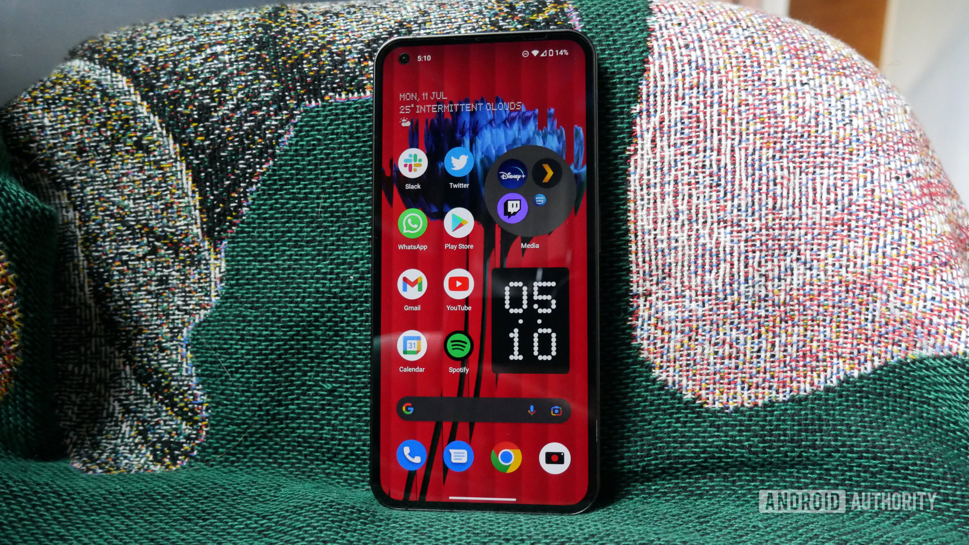
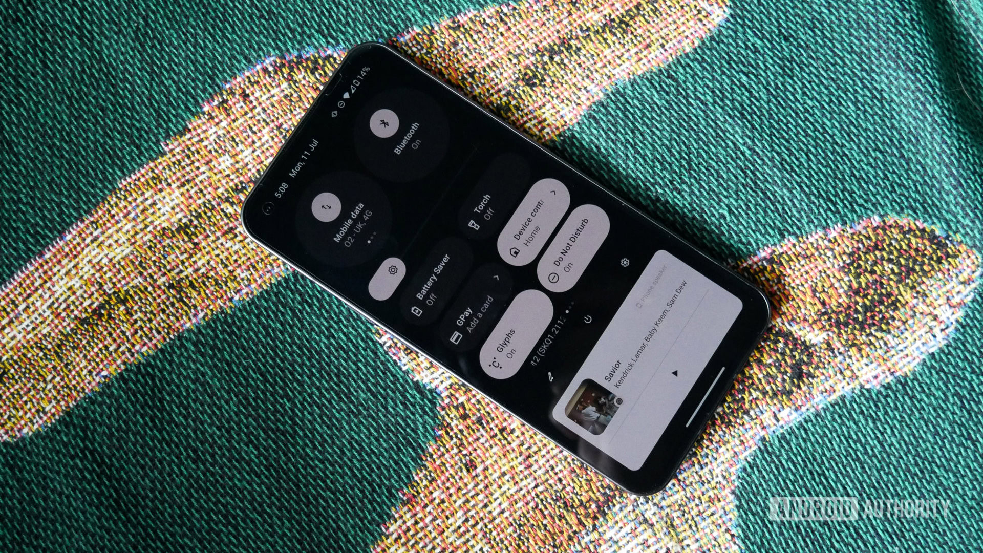
The overall UI is equally spartan in terms of unique features. There are six quick settings in the notification tray instead of the typical four, while swiping down again reveals two oversized circles with controls for networking on the left and connections with other devices on the right. These can be swiped horizontally for even more granular controls. For example, you can swipe across the left circle to switch between mobile data, Wi-Fi, and hotspot toggles (and long press them to go straight to the corresponding Settings menu).
Nothing OS is clinical in its simplicity but tips over the edge into outright anemia.
The right circle plays into Nothing’s dream of an open ecosystem as it says it’ll offer quick controls for third-party integrations. So far, that extends to remotely controlling some features within Tesla vehicles, though the necessary account linking is earmarked as an “experimental feature” in the software build I spent time with. I also couldn’t test this feature as I don’t have a Tesla on hand — I’m not sure I’d get away with expensing one either.
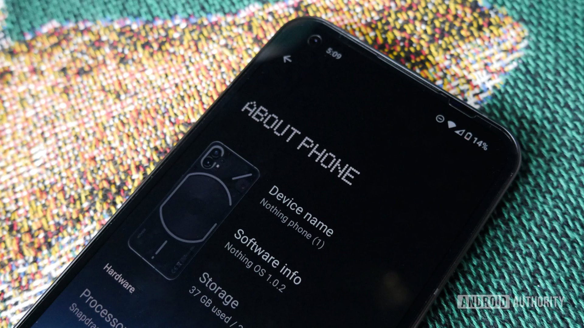
Aside from a basic Game Mode tucked away in the System menu, there’s very little else that separates Nothing OS from stock Android. Sure, you can also make single apps or app folders into oversized circles, and the dot matrix typeface is used for all the main headings in menus, but the former is weirdly implemented (why does the fourth app in a large folder immediately become tiny?) and the latter is used so sparingly that it sits at odds with Google’s standard curvy fonts and shapes. Nothing’s claims of a “single visual language” fall apart under even the lightest scrutiny, and there’s an unshakeable sense that Nothing OS is shipping unfinished. Case in point, there are only two custom Nothing wallpapers, and of the four bespoke widgets, three are clocks, including a numbered 12-hour version that looks like a 24-hour version because it neglects to tell you if it’s currently AM or PM (a problem that’s repeated by the always-on display clock). There’s also no one-handed mode, which is a bizarre oversight for a phone this large.
As for the fourth widget, that’s an NFT Gallery that snuck its way onto the Phone 1, trojan horse-style, with the Nothing OS 1.0.2 update, which was available out of the box on our unit. The Nothing Dot NFTs already prompted a significant backlash, but Nothing’s interest in cryptocurrency and its culture clearly runs deeper than a promotional stunt — more so than one widget for showing an NFT collection and tracking prices might suggest. So far, it’s easy enough to ignore a single widget if you’re not interested or firmly against all this, but only time will tell if there’s more to come.
Nothing OS is as close to stock as it gets, but it feels like a sign of things to come.
The upside of the Phone 1’s almost skeletal skin is the fluidity of the UI, with smooth animations aided by an adaptive refresh rate that switches between 120Hz, 90Hz, and 60Hz depending on the content on display. Nothing OS is coming in a little hot, though. I experienced a few pesky bugs during testing. Among them were the back gesture symbol getting stuck on the home screen, the fingerprint reader outright disappearing until a restart, white screens in some games, and YouTube temporarily refusing to play any sound. Netflix also shows as incompatible on the software build we tested (we’ve asked Nothing to clarify what the issue is).
There’s very much a sense that this is Nothing OS’ imperfect form; a sign of things to come. Its ambition of an open ecosystem is admirable and is given some weight due to the fact that there are no exclusive features for Ear 1 and Phone 1 owners — the Phone 1 plays just as nicely with a pair of AirPods or Galaxy Buds. It’s also bloat-free and smooth as silk. For spurned OnePlus fans mourning the decline of Oxygen OS, that’s perhaps enough for now. Nevertheless, and in stark contrast to the Phone 1’s external appearance, Nothing OS’ first appearance fails to leave a lasting impression.
How good is the Nothing Phone 1 camera?
Oliver Cragg / Android Authority
Imaging is the Achilles’ heel of many cheaper phones, though thanks to some strong contenders, the gap between what a sub-$500 phone and a flagship can do is shrinking every year. Does the Nothing Phone 1 secure its place among the best budget camera phones? Read on for our Nothing Phone 1 camera review, or check out the full-resolution samples for yourself in Google Drive at the link.
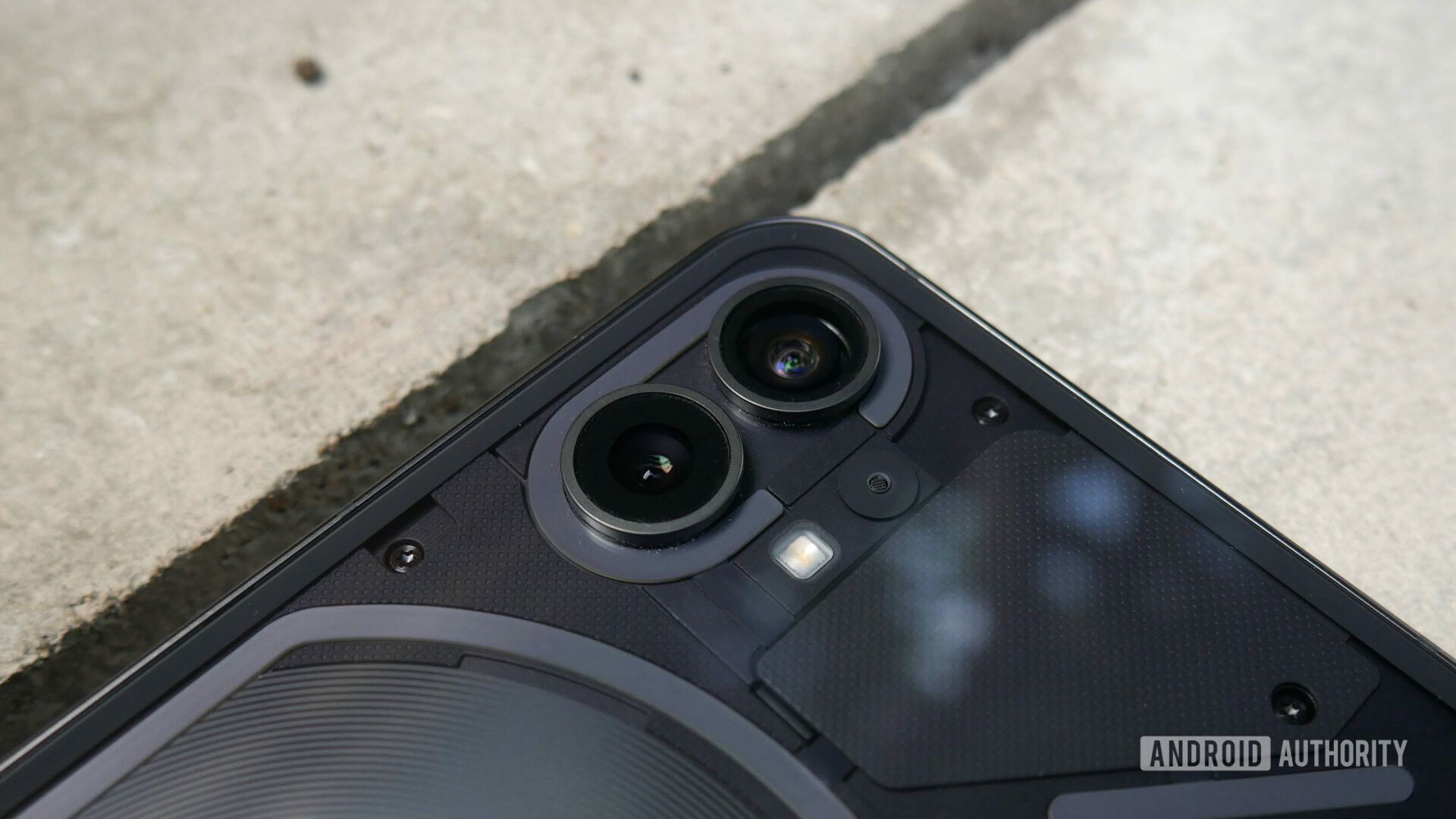
The main 50MP camera furthers the OnePlus connection as it uses the same Sony IMX766 sensor as the Nord 2 and Nord 2T. We had some issues with the former’s primary shooter, but Nothing’s iteration performed much more consistently, albeit with a few minor issues.
Images — binned to 12MP by default — trend towards a contrast-heavy look. The shot of the dome above is a good example of this, as the people and the wood pop-up stall take on a sickly color due to the overemphasis on blue tones. If you want Instagram-ready snaps, the Phone 1 will happily oblige, but while things aren’t ever too oversaturated, the final images aren’t exactly natural either.
Otherwise, shots taken outside in good lighting from the main camera deliver the goods more often than not. The dynamic range is middling, shadows on peripheral objects in the frame can be a little noisy, and there are a few minor instances of purple fringing, but there’s plenty of detail, the dual stabilization (OIS and EIS) assists in reducing the number of blurry images, and while there is some clearly visible sharpening in post-processing, it’s not excessive. The software-based zoom is surprisingly decent too. Shots taken at 2x zoom retain more than enough detail, though anything beyond this starts to fall apart. This is to be expected without dedicated hardware, of course — something you don’t get at this price tier.
Related: Photography terms explained
Indoor and low-light performance is a little less impressive as the HDR struggles with exposure from bright light sources (check out the glare from the outside to the left of the stairs in the third image above), while darker areas become a little noisier than you’d hope. There’s a Scene Detection feature that is enabled by default, which in theory should help here. The app doesn’t tell you when it’s active and it’s not clear how many scene types are available, but Nothing says it has custom settings for Night, Document, Pets, Nature, Food, and more. Personally, I couldn’t see much of a difference with the mode on or off (all samples here are taken with it on).
The Nothing Phone 1's capable main camera is let down by a middling selfie shooter and an outright poor ultrawide lens.
Meanwhile, the Night Mode is a necessity for shots when the sun goes down as the noise in shadows really begins to ramp up. The mode itself does wonders in dim scenarios, though for some reason, it can only be activated by a toggle that appears when the phone detects low-light settings. It didn’t ever fail to appear when needed, but such an important mode should be a constant option.
Sadly, the ultrawide camera is, to be blunt, awful. We don’t see a great number of amazing ultrawide shooters in this price tier, but the Samsung JN1 sensor found here is well below standard. Consistency between the primary and ultrawide cameras is non-existent as the latter completely washes out color. Details turn to mush with people, in particular, looking like objects in an oil painting — look at the poor folks in the dome ultrawide shot below and compare to the previous 1x version to see what I mean. Even in good lighting, there’s plenty of added noise too. Unsurprisingly, it’s near unusable as you get into the late evenings, let alone at night even with the night mode active.

Ultrawide
The only saving grace of the ultrawide camera is that it has autofocus, which enables the excellent macro mode. The camera’s issues are still there even for extreme close-ups, but it’s nevertheless a significant upgrade over the typically throwaway 5MP or even 2MP dedicated macro shooters on many budget phones.
The selfie camera performs adequately in bright, outdoor settings, capturing a decent level of detail and delivering images that are sometimes more color accurate than the phone’s main sensor. However, it really struggles with noise and smudged details indoors, let alone in dim conditions. The portrait mode from the front and rear camera adds some smoothing effects, but the bokeh effect does an okay job, and the edge detection is passable.
In a bold move, Nothing decided to film its bizarre, bombast-free, one-man-in-a-theater Phone 1 launch event on the phone itself. In doing so, it showcased all the phone’s best video capture qualities, but also its one glaring omission. On the positive side, footage captured is detailed and color-rich, aided by excellent stabilization and the impressive Live HDR mode.
However, there’s only so much you can do with capture quality that caps at 4K/30fps. You’re better off sticking with the 1080p/60fps mode as the trade-off of lower resolution is better than lower frame rates, but you also shouldn’t have to choose between the lesser of two evils when Google and Samsung offer budget phones that can do both.
The Phone 1’s Camera app shares a lot of DNA with Google’s Pixels, though Nothing does provide an Expert mode for those that want to tinker with ISO, white balance, and more. There’s also the option to shoot full-res 50MP shots, time-lapse video, the aforementioned macro mode, and slo-mo video at up to 1080p/120fps.
The most unique feature ties back into the Glyph Interface as the flash toggle has an extra option to activate the LED lights for use as a makeshift fill light. This is probably the least useful of all the Glyph gimmicks, as even at maximum brightness Nothing’s sigil-like lights aren’t bright enough to illuminate a subject from a reasonable distance. Oddly, there’s also a notification light on the rear of the phone that’s completely separate from the Glyph Interface. This tiny dot at the top right-hand corner flashes red when you’re recording video. It’s a handy way of letting people know when you’ve finished recording, though I imagine many Phone 1 users will never know it even exists, as it’s hidden away in the additional settings menu in the Camera app.
Anything else?
Oliver Cragg / Android Authority
- Display: The Phone 1’s 6.55-inch OLED display is crisp, colorful, fluid, and gets surprisingly bright, with a claimed peak brightness of 1,200 nits. The choice of a flexible panel was key to those symmetrical bezels, as the display wraps neatly into the base of the phone on all sides. The adaptive brightness is a little too aggressive at times, and it’s hampered a little by the minimal customization options in Nothing OS, but more broadly, this is a high-quality panel.
- Audio: The stereo speakers can get pretty loud and remain clear even at higher volumes, but the audio is wildly imbalanced due to the tinny earpiece speaker. Thankfully, there’s support for a wide range of Bluetooth codecs for wireless audio.
- Biometrics: The in-display fingerprint reader is perfectly functional. As it’s optical it can be a bit hit-and-miss, though I only ever got a single misread before it got it right. There’s face unlock support too, but it’s software-based and therefore nowhere near as secure.
- Connectivity: It may be a mid-range handset, but Nothing certainly didn’t skimp on the Phone 1’s connectivity suite. There are the expected sub-6Ghz 5G bands, but the Phone 1 also supports Wi-Fi 6 and Bluetooth 5.2 for some significant and welcome future-proofing.
- Updates: Nothing has promised that the Phone 1 will be supported for three years of Android version updates and four years of security patches. This should take it to at least Android 15. That’s great, and a solid improvement over similarly priced phones from OnePlus and Poco, though the four years of security updates is bested by rival mid-rangers from Google, Samsung, and Apple. It’s also on a bi-monthly security patch schedule rather than monthly, which again trails behind the latter three alternatives. Nevertheless, it’s a good start and should reassure buyers who are apprehensive about backing a debut brand.
Nothing Phone 1 specs
| Nothing Phone 1 | |
|---|---|
|
Display |
6.55-inch OLED |
|
Processor |
Qualcomm Snapdragon 778G Plus |
|
GPU |
Adreno 642L |
|
RAM |
8 or 12GB |
|
Storage |
128 or 256GB |
|
Power |
4,500mAh battery |
|
Cameras |
REAR:
- 50MP Sony IMX766 wide-angle (ƒ/1.88, 1/1.56-inch sensor, 1μm pixel, 24mm focal, OIS, EIS) - 50MP Samsung JN1 ultrawide (ƒ/2.2, 1/2.76-inch sensor, 114-degree FoV, EIS) FRONT: |
|
Video |
4K at 30fps |
|
Audio |
Dual-stereo speakers |
|
Security |
In-display fingerprint reader |
|
Durability |
IP53-rated |
|
Ports |
Dual-SIM |
|
Network |
Gigabit LTE with 4x4 MIMO |
|
Software |
Android 12 |
|
Dimensions & weight |
159.2 x 75.8 x 8.3mm |
|
Colors |
Black, white |
|
In the box |
Nothing Phone 1 |
Value and competition
Nothing Phone 1
Nothing's first smartphone stands out from the crowd thanks to its unique transparent design and 'Glyph' LED notifications.
It’s impossible to quantify how cool something is, but thankfully the Nothing Phone 1 isn’t just a fashion statement. Starting at £399, there’s plenty of value on offer here in the quality of the materials and pristine design alone. Some corners will always have to be cut to hit such a price point, yet while the processor isn’t cutting edge, even the base model has ample RAM and storage. Meanwhile, unexpected features such as wireless and reverse wireless charging add flagship-tier polish, and the novelty of the Glyph Interface will be worth something to style-conscious buyers.
As for which version to go for, we’d recommend either the base model or the middle SKU. Both come with 8GB of RAM, which is the sweet spot for a mid-range phone. Plus, the 12GB model isn’t coming until later in the summer and doesn’t improve on the middle-tier’s 256GB of fixed storage. The only other question is which color? I’m sure you already have a preference, but it’s worth noting that I wasn’t keen on the black model until I actually got to see it in the flesh.
Before you spend your hard-earned cash though, you should definitely consider the alternatives because, hoo boy, there’s some fierce competition.
The Galaxy A53 5G (£399) is the popular choice in the Android sphere. It’s not just Samsung’s brand power that carries the phone though, it’s a great device in its own right with a gorgeous AMOLED display and impressive battery life. It’s nowhere near as interesting to look at and its homegrown processor isn’t as powerful even as Nothing’s aging chip, but it offers a superior update commitment, an IP67 rating, and a more consistent ultrawide camera alongside its reliable primary snapper.
It’s not available to buy at the time of this writing, but the Google Pixel 6a (£399) matches the Nothing Phone 1’s price tag. Thanks to a Pixel 6-inspired makeover, it’s possibly the most stylish alternative, though the series’ now signature camera bar isn’t quite as eye-catching. The real appeal of the Google’s budget phone is the Pixel-exclusive software features, the company’s near-legendary imaging prowess, and the adoption of the custom Tensor processor. Modified from the Pixel 6 series’ AI-focused chipset, Tensor is expected to provide a huge power boost over the Pixel 5a (which only ever launched in the US and Japan). Of course, if your budget can stretch a little higher, the flagship-grade Google Pixel 6 (£599) itself is an absolute steal and remains one of the best-value Android phones of all time.
Don’t miss: The best phone deals
Nothing clearly cribbed from Apple for the Phone 1’s initial blueprint, but the iPhone that gets closest to the former’s price tag has a reheated design from circa 2017. The iPhone SE (2022) (£419) benefits from Apple’s trickle-down approach to silicon and trounces any comparable phone on performance, however, its cramped, low-res display, paltry 64GB of storage on the base model, and painfully inflexible camera make Apple’s cheapest phone line an increasingly difficult sell.
Other decent options include the Poco F4 (£379), which boasts some performance and charge power gains over the Nothing Phone 1, though the lacking update policy and system ads might be a turn-off for many. The OnePlus Nord 2T (£369) feels a bit like a distant cousin to the Phone 1, and the two even share a main camera, though OnePlus’ phone has a dull, derivative look and has no IP rating whatsoever.
Nothing Phone 1 review: The verdict
Oliver Cragg / Android Authority
Does the Nothing Phone 1 live up to the excessive hype? No, and Nothing has no one but itself to blame for that. This isn’t a revolutionary smartphone. The Glyph Interface isn’t going to recode your brain into only acknowledging incoming calls when accompanied by cryptic, blinking symbols. Nothing OS is not a utopian iteration of Android where all devices are made equal under Google. No matter how efficient or amended with additional perks, a mid-of-the-road chipset can’t resolve an inherent performance delta against Google Tensor or an A15 Bionic. One pretty good camera out of three does not make for a photography powerhouse.
Yet for all of the brand’s tiring bluster and occasional drifts into pretentiousness, it’s hard not to admire what it’s achieved with the Phone 1. As soon as we got a glimpse at the company’s first smartphone it was immediately subjected to accusations of being all style and no substance. That’s categorically not the case. Yes, it’s stylish in a way that blends retro chic and contemporary cool. But at its fundamentals, this is an exceptionally well-made handset that effortlessly competes with the best budget phones — a category that is dominated by some of the industry’s biggest names — at the first time of asking. That shouldn’t count for… nothing (okay, two, I lied).
It's not without its flaws or gimmicks, but the Nothing Phone 1 effortlessly competes with the best budget phones — not bad for a big debut.
When buying any product from a new brand, there’s always a crucial part of the transaction missing: trust. Can you trust a fresh face over pre-established ones? On the basis of the Phone 1, I don’t think you have to worry.
If Nothing is smart, it’ll evolve the Phone 1’s slightly underbaked software during its lifespan and build upon the hardware’s best qualities for its future devices. Hopefully, it’ll be emboldened enough to move out of the shadow of the obvious Cupertino influence and forge an even stronger identity of its own. In fact, I’d be willing to bet we’ll be boarding the hype train again for the Phone 2 very soon. Whether that’s another affordable offering or a bona fide flagship, I, for one, will be happily buying another ticket either way.
Top Nothing Phone 1 questions and answers
The Nothing Phone 1 can support two SIM cards at once via a double-sided SIM tray.
The Nothing Phone 1 supports 15W Qi wireless charging and 5W reverse wireless charging.
It’s hard to test exactly how much effect the Glyph system has on the Nothing Phone 1’s battery, but comparing days with it on or off results in nominal variance. Nothing says that its own tests showed only a 0.5% battery drain with the lights on for a full 10 minutes.
"Android" - Google News
July 15, 2022 at 04:03PM
https://ift.tt/KOT7gFD
Nothing Phone 1 review: A bright debut - Android Authority
"Android" - Google News
https://ift.tt/7bsKzOG
https://ift.tt/jh3bugM
Bagikan Berita Ini


0 Response to "Nothing Phone 1 review: A bright debut - Android Authority"
Post a Comment