Can Google do to car infotainment what it did to smartphones?
Every car manufacturer nowadays needs to include an infotainment system with its car, and that means developing an operating system, making a UI that isn't terrible, building an SDK and app ecosystem, and doing a million other things car manufacturers have not typically needed to do. In the face of all that, Google is pulling out the Android smartphone playbook and tempting car manufacturers with a car-specific version of Android, called the "Android Automotive OS."
"Let us build your operating system!" Google essentially tells the car manufacturers. "We've got great hardware and touch support, third-party apps, and a well-known developer SDK! We'll provide Google Maps, Google Assistant voice commands, and the Play Store! We even update the codebase with monthly security updates! Best of all, for you, it's free! Just sign this contract ensuring you'll include all of our apps and services."
We've been covering the Google push into infotainment since the concept was first demoed at Google I/O 2016, but now, actual commercial cars featuring Google's operating system are starting to ship. The first Android Automotive car (and the core of today's review) is the Polestar 2, an all-electric vehicle from Volvo's new subsidiary, Polestar. Volvo also is shipping Android Automotive in the XC40 Recharge, and a ton of other companies have signed up for Google's infotainment system: Ford, GM, Stellantis (Dodge, RAM, Jeep, Fiat, Chrysler, Peugeot, Opel, etc), and Renault-Nissan-Mitsubishi. No matter your badge of preference, you're going to see a lot more of Android Automotive in the future.
Before we shift this review into gear, we have to give our usual Google-is-terrible-at-branding disclaimer: Android Automotive is not Android Auto, Google's projected car interface that serves as the company's competitor to Apple's Car Play. Android Auto runs on your smartphone and uses the car infotainment system as an external monitor. Your car's stock infotainment system still exists as... something else, it just moves out of the way for your projected smartphone interface.
On the other hand, Android Automotive OS (AAOS) is totally different. It is the car infotainment system. We're running Android Automotive on the "bare metal" of the car. It controls not just maps and media, but the air conditioning, lights, ride settings, seat location, camera views, and most other car settings. You don't need a smartphone, since Android Automotive OS is installed on the car computer storage. An onboard version of the Play Store even lets you download apps directly to your car. The car is like the world's biggest Android device.
Table of Contents
- The rising tide of car infotainment?
- The basics of AAOS
- The Polestar 2 hardware—an iPad clone with Intel Inside
- The setup process—What’s a phone?
- The Polestar 2 home screen basics
- The Play Store and the very, very early beginnings of a car app ecosystem
- The killer apps—Google Maps and the Google Assistant
- Under the hood with Android Automotive
- Garage mode and power management
- RROs, the future of Android OEM customization?
- Flash wear management
- Android, but not enough Android
- A solid platform, but it needs work
- The good
- The bad
- The ugly
The rising tide of car infotainment?
Car infotainment software is still a hot mess of fragmented development that is almost entirely up to the car manufacturer to figure out. By and large, each company goes to market with a custom operating system. And if we look at how the smartphone and PC markets have played out, that does not seem like a viable long-term solution. Dell, Lenovo, and HP don't make PC operating systems, and Samsung, BBK, and Xiaomi don't make (successful) smartphone OSes. Other than Apple, all these hardware companies focus on hardware, and the OS is licensed from a software house. The phone and PC markets both started where the car infotainment market is now, with hardware vendors all building a myriad of different software solutions, but the demand for better application and hardware support has caused both industries to coalesce around one or two OSes each.
Until the Android Automotive launch, there really haven't been any platform-building operating system vendors offering solutions for the car infotainment market. The biggest player offering a capable core OS is Blackberry's QNX, but Blackberry is pitching QNX as "middleware" instead of as an app platform. Blackberry's app strategy seems to firmly be "let someone else deal with that," with web apps and CarPlay/Android Auto as its app solution. Microsoft used to offer a car OS, but its big partner, Ford, bailed on the company for Google. Even then, Microsoft wasn't pitching a full app ecosystem.
Google's move into the car infotainment space today feels a lot like its move into the smartphone space in 2008. There are a million different car manufacturers all shipping different operating systems with no central app distribution system. Even if two companies are using similar operating systems, app developers still have to support, update, and maintain individual apps for each manufacturer platform. Pandora is a great example of an app really dedicated to car support—it has over 20 car brands listed on its support page. That number is a bit fluffed up thanks to companies like GM sharing a platform across four car brands, but it's still a ridiculously high number of apps to support.
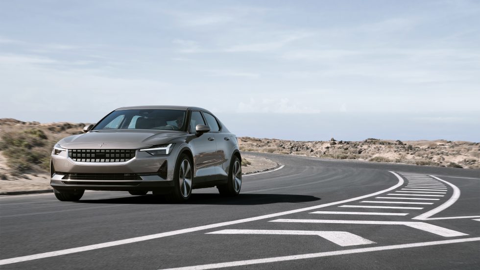
Other than QNX, car manufacturers have been scraping together their own solutions. Lots of companies roll with a Linux distribution, either of their own design—like Tesla (an infotainment stand-out) and BMW—or as part of the Linux Foundation's "Automotive Grade Linux" project, which is favored by Toyota. For the purpose of this review, it's particularly interesting that there are a lot of Android forks out there powering infotainment without Google's involvement. Honda infotainment systems are all based on Android, anywhere from version 4.0.4 to 6.0, while Hyundai and Kia are up to Android 4.2. GM's new infotainment software is based on Android 6.0, and the company messed it up so badly there is a class-action lawsuit over the many issues the system has. Executed well or not, these are all grossly out-of-date versions of Android.
On smartphones, Android gets a bad rap for the slow (and oftentimes nonexistent) rollout of updates from manufacturers, with companies like Samsung taking 3-6 months to roll out the latest OS updates to its lineup. That's bad in comparison to iOS (and Pixel phones, I guess) with their day-one updates, but that would be an incredible improvement for the car infotainment space. Android Automotive on the Polestar 2 is based on Android 10, an OS that is only a year-and-a-half old (instead of the 6- to 9-year-old version of Android that Honda, Hyundai, and GM are employing). As of April 2021, the car got its last security update in December 2020. Again, that's bad for a phone but way better than rolling around with eight years of bugs and security vulnerabilities in your Android 4.2-powered Kia.
With Android Automotive, I don't think the point right now is to do a blow-by-blow feature comparison to other infotainment systems out there. Franky, Android Automotive would lose. It's actually a pretty beta-feeling operating system lacking many features. You'd definitely get a better experience from something like a Tesla, and I think even Android Auto running on a phone might be preferable.
Instead, what you get right now is a stable platform that feels like it is built for the future, as opposed to the technological dead-ends that make up most modern car infotainment systems. This is a solid version 1.0 OS that is competently developed and maintained, with a centralized app store, a well-known SDK, and one or two killer apps. Assuming Google does not do the Google thing and inexplicably kill Android Automotive (in this case, they are probably contractually obligated to not do this), there will be a version 2 and 3 of this software, along with a string of monthly security updates. That package would be much, much more than you can say for most car operating systems.
A single car manufacturer's infotainment system being good only helps that car manufacturer, but, just like the Android-for-phones model, Android Automotive can be a rising tide that can lift all boats. For all these car companies that seem to not care all that much about infotainment, here is a licensable operating system that is dramatically better than the ancient codebases these companies are shoveling out the door. It's easier to get started, it comes with an app selection, and it's hard to go wrong with the headline-feature bullet point of "We've got Google Maps!"
The basics of AAOS
Android Automotive has been in development forever. Google employee LinkedIn profiles tell us the project started in 2014. Internally at Google, Automotive has grown through "7 Android dessert releases," probably meaning it has been around since at least Android 5.0 Lollipop. Given that the first rumors pointed to an Android 6.0 Marshmallow (2015) release, that checks out. Google has been sneaking automotive-centric features into mainline Android releases for years.
Today, Android Automotive's latest version that you can actually run, even on the emulator, is based on Android 10. Google posted release notes for "Android Automotive 11" with some great-sounding features like searchable settings and multizone audio, but it's not available anywhere as far as we can tell. (When does the Google Pixel Car come out?) The Polestar 2 first shipped with Android 9, the first commercial release of Android Automotive, but that lasted about a month and was upgraded to version 10 in January 2021. Apparently, like Android TV or Wear OS, Google can do under-the-hood OS upgrades without changing the above-board interface that much. Speaking of those other Android form factor spin-offs, it was a surprise to see that Android Automotive is open source—you can dig it out of the usual AOSP repo. I say it's a surprise because while Android for phones is famously open source, Android TV, Android Things (RIP), and Wear OS are not.
Google does monthly security updates for Android Automotive, complete with the usual security bulletin releases just like a phone. These updates include all the fixes from the regular Android security bulletins. But since they only list additional, Automotive specific problems, they have, so far, all been blank. The Polestar 2 has averaged one OTA update a month since its release, though unfortunately, those updates haven't included Android security updates. As of April 2021, the latest update for the Polestar 2 was only a January 2021 security patch.
Automotive is the only Android form factor besides the main codebase to get security bulletins, and along with the source code availability, Google makes it seem head-and-shoulders more important and Android-like than Android TV or Wear OS. Automotive is clearly Google's second favorite flavor of Android.
There are actually a ton of Android analogs that have been re-created for Automotive. While the Open Handset Alliance is a group of smartphone OEMs dedicated to Android, Automotive has the Open Automotive Alliance, which is a Google-led group of manufacturers bringing Android to cars. On phones, Android is free and open-source, but Google would really like it if you licensed the proprietary "Google Mobile Services" app collection, which brings things like the Play Store, Google Maps, and Google Play Services. On Android Automotive, Google has the manufacturers sign up for the proprietary "Google Automotive Services" with car versions of Maps and the Play Store.
Android Automotive is skinnable, just like a smartphone. Car manufacturers can make it look like whatever they want, just with the Android code base, APIs, and app ecosystem underneath. Basing our initial review of Android Automotive on the Polestar 2 is a little awkward since our only commercial look at the OS is this version that's been skinned by Polestar—it's a lot like trying to figure out new Android features by looking at a Samsung Galaxy phone. It's not necessarily clear which features and limitations are the fault (or credit) of Google or Polestar. We can help with this a bit by also firing up the Android Automotive emulator in Android Studio, which will give us an unskinned version of the OS, but it's unclear how finished that is, since it doesn't actually ship on anything. The other downsides to the emulator is that it's trapped inside a computer screen with limited access to the outside world, and it's designed for a much smaller display than the Polestar. We're doing our best here, though.
The hands-down most disappointing thing about Android Automotive for me is that developer mode is completely disabled on production cars. You can't sideload apps, or tether a laptop to the car and run ADB, or pull apps off the car or take screenshots. This is disappointing first because I can't have any fun—I wanted to benchmark a car and sideload a bunch of stupid, impractical apps—but it also seems like it would make development harder than it needs to be. There is just no way to test an Automotive app on an actual car.
Safety is a constant concern with these car computers. AAOS gets to see the car speed, gear, and parking brake status, and it can adjust the UI accordingly for apps that are not "safety optimized." There is a whole service that manages UI safety restrictions based on the current driving state. Some features can be totally disabled while moving, like Bluetooth setup, the Play Store, or the car manual, and apps can adjust or turn off individual features while moving, like the QWERTY keyboard, list length, text box length, dial pads, text messages, videos, and more. In Android 11, there's also a safety restriction mode for passengers, which presumably would open up more features when a second person is in the car.
Like every other infotainment system, car manufacturers are responsible for determining what is and isn't safe in each driving mode, and these decisions are often made with local regulatory bodies, like the National Highway Transportation Safety Authority (NHTSA) in the US. In the future, a car with more advanced autonomous features might open up the feature set more while rolling down the road.
The Polestar 2 hardware—an iPad clone with Intel Inside
| SPECS AT A GLANCE: Polestar 2 | |
|---|---|
| SCREEN | 11.15-inch 1536×1152 LCD |
| OS | Android Automotive 10 |
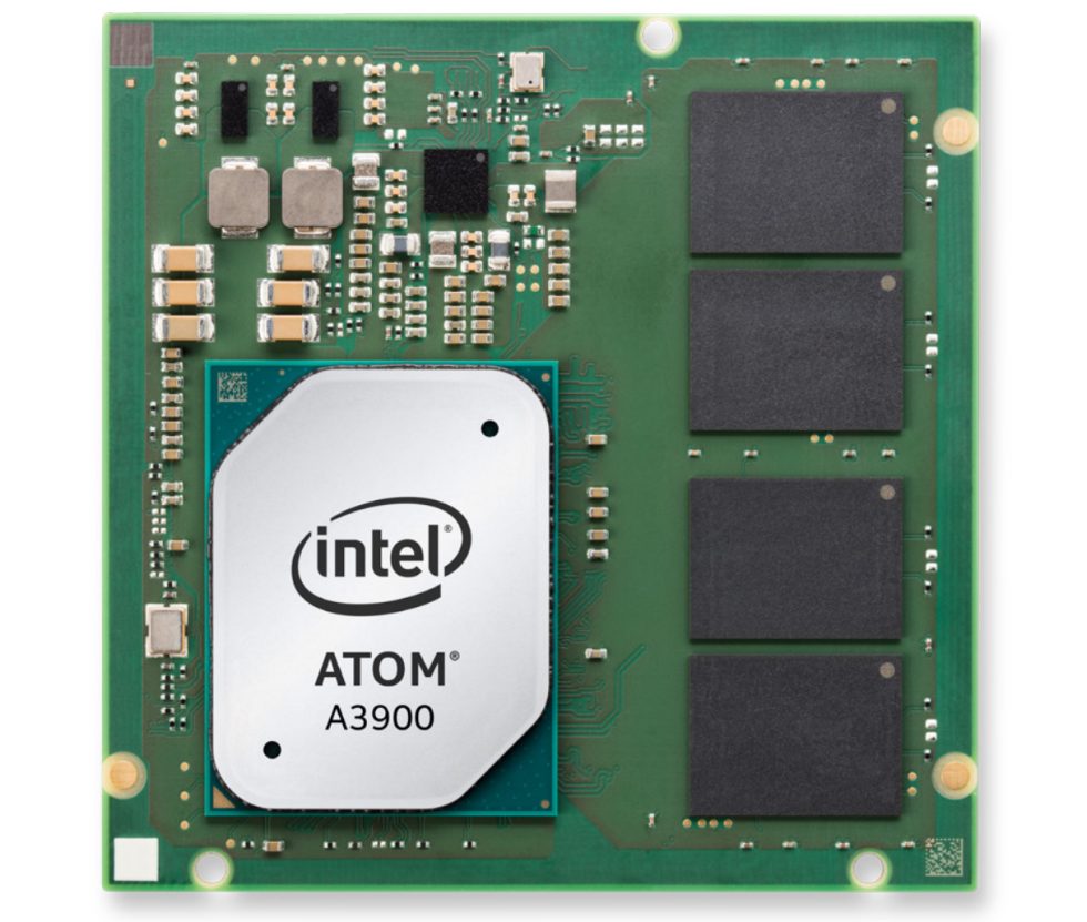
| CPU | Intel Atom A3900 SoC (Apollo Lake) |
| GPU | Intel HD Graphics 500 |
| STORAGE | 128GB |
| PORTS | USB-C x 4 |
| SIZE | 4607×1985×1479 mm |
| WEIGHT | 2,600 kg |
| BATTERY | 78 kWh |
| STARTING PRICE | $59,900 |
| OTHER PERKS | It's a car |
Speaking of the car, let's briefly talk about our big Android device. The hardware in these cars is always interesting. On a phone, every single hardware choice revolves around power usage, where OEMs push to make tiny ~4000 mAh batteries last as long as possible. As an all-electric car with a 78 kWh battery, the Polestar 2 has basically infinite power as far as a computer is concerned (let's see... at the standard 3.8 smartphone volts, 78 kWh would be 20 million mAh!). You could fill the car with gaming desktop PC parts if you wanted, and it would probably be fine.
In the past, we've also talked about how the three-to-five-year development time of a car negatively affects the infotainment computer. It seems like these computer components are chosen at the beginning of the development period, and while nobody cares if your engine technology is three to five years old, it can be a major problem for a computer. The Polestar 2 infotainment hardware still sticks to this philosophy, and this "2021" vehicle ships with cheap PC parts from 2016, like the Intel Atom A3900 powering the system. This is based on the Apollo Lake architecture, which was announced the same year as Kaby Lake. This is a 14nm (of course) architecture built for cheap PCs, IoT, and, for the "A" line, automotive uses. It doesn't seem like car manufacturers have gotten any better at picking modern hardware, but at this point 6-year-old PC parts are fast enough to run Android well.
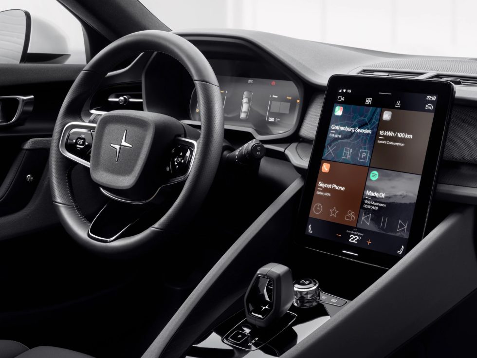
I like to imagine that one day, a Volvo designer was sitting in their car, taking notes on an iPad, brainstorming what the future of in-dash infotainment should look like. Suddenly, a eureka moment hit the Volvo designer, they held up their iPad up against the dash, triumphantly yelled "That's it!" and the Polestar 2 interior was born.
The 11.15-inch,1536×1152 center infotainment screen looks exactly like someone glued an iPad to the dashboard, right down to the big, graspable bezels and a fully rendered back case that lets the screen float above the normal dashboard lines. Once, someone asked me if there was a button that would eject the faux-tablet from the dashboard. There is not, but I completely understand why you would arrive at that assumption.
A smartphone touchscreen has an oleophobic coating to cut down on the fingerprints, but it really doesn't seem like the Polestar 2 touchscreen has any coating on it at all. It's such a fingerprint magnet, the car comes with a cleaning cloth. There are no alternative control surfaces for the Android Automotive interface, so you'll be touching the screen a lot.
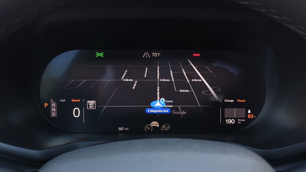
In addition to the center screen, there's also the 12-inch "driver's screen" behind the steering wheel, which replaces all the usual dials and such. Because this display runs mission-critical government-regulated items like the speedometer, it can't be powered by Android and instead runs a real-time OS that will never lag. Android can still send it a Google Maps image, but other than that and the usual car stat readouts, it doesn't do much.
For connectivity, the Polestar 2 comes with three years of AT&T LTE service included, and there's on-board Wi-Fi that you can patch into your home network.
The setup process—What’s a phone?
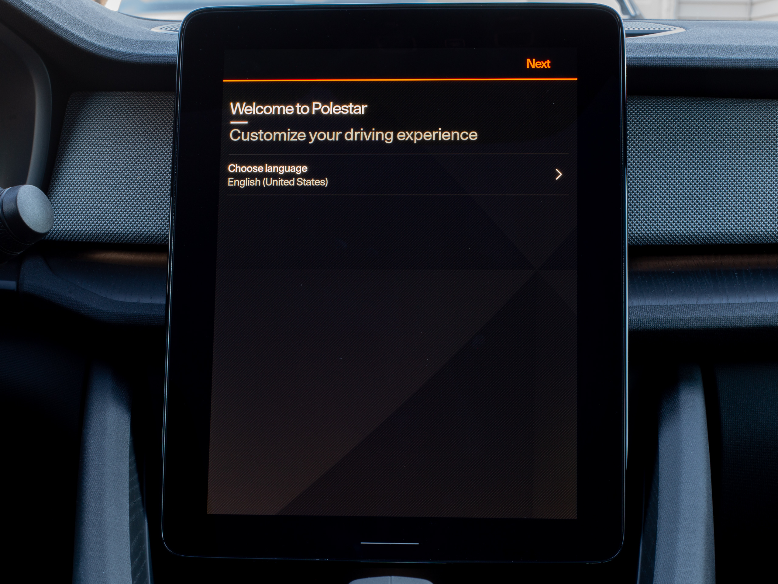 Let's get setup. Here's the first screen.Ron Amadeo
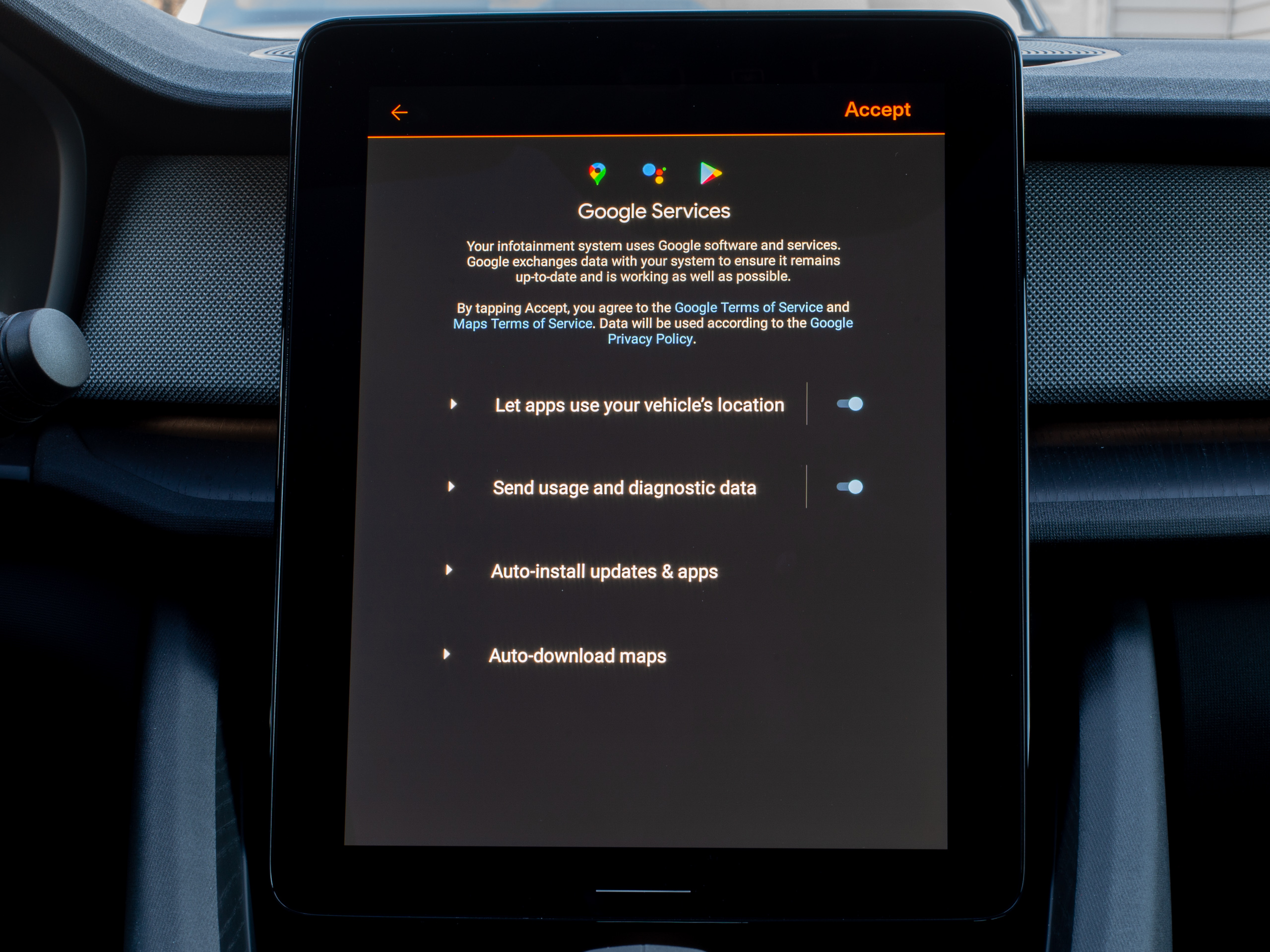 The Google Services screen pops up before you even sign in.Ron Amadeo
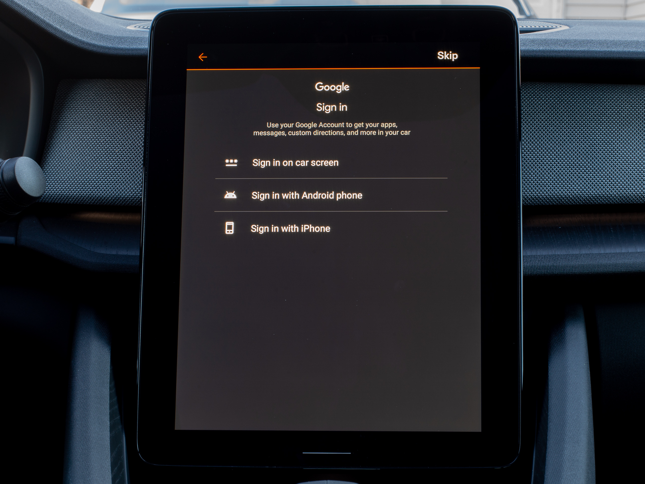 You can sign in with your phone, but AAOS won't really pull down any data from it.Ron Amadeo
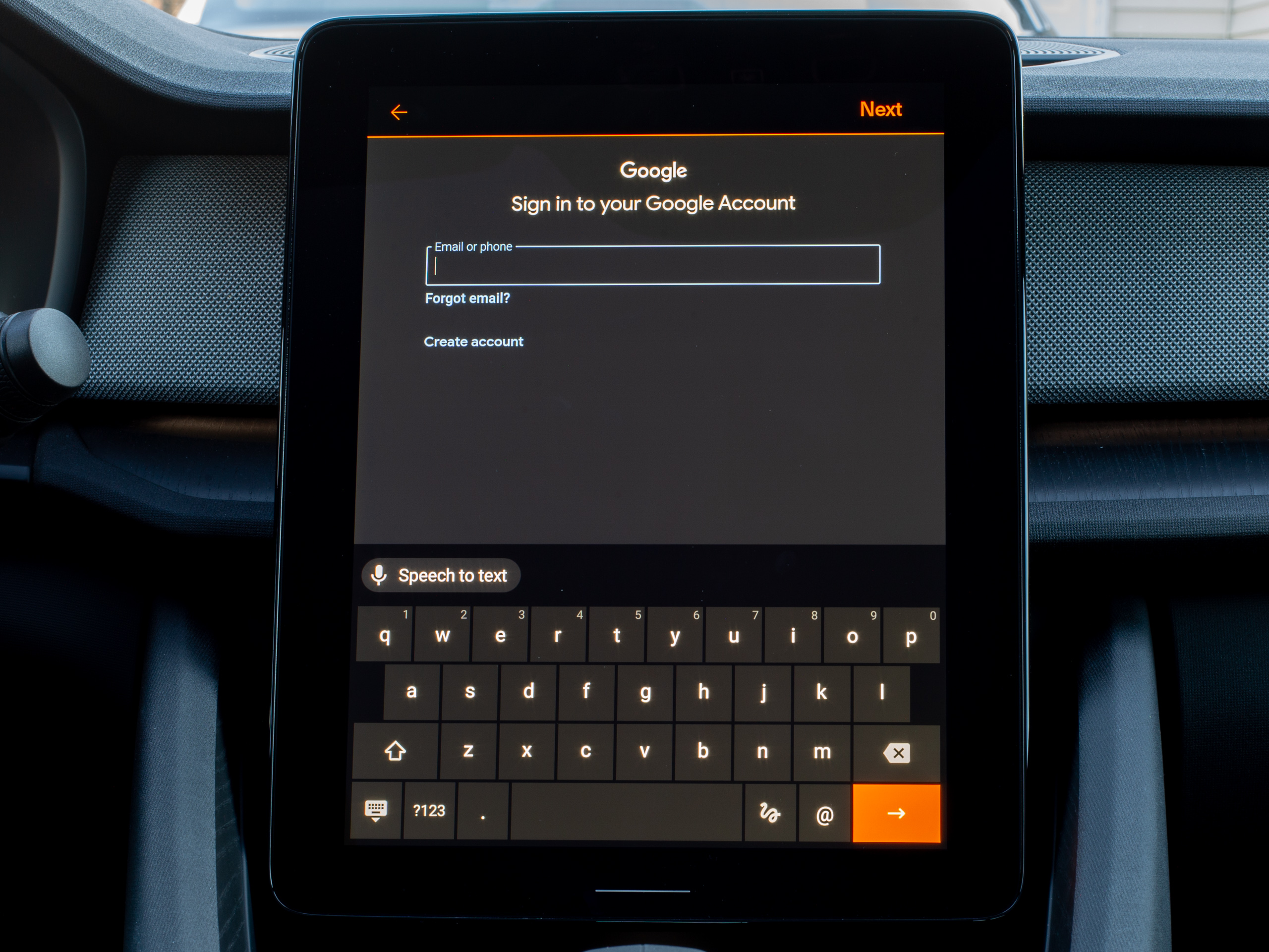 On-screen sign-in brings up this lovely QWERTY keyboard.Ron Amadeo
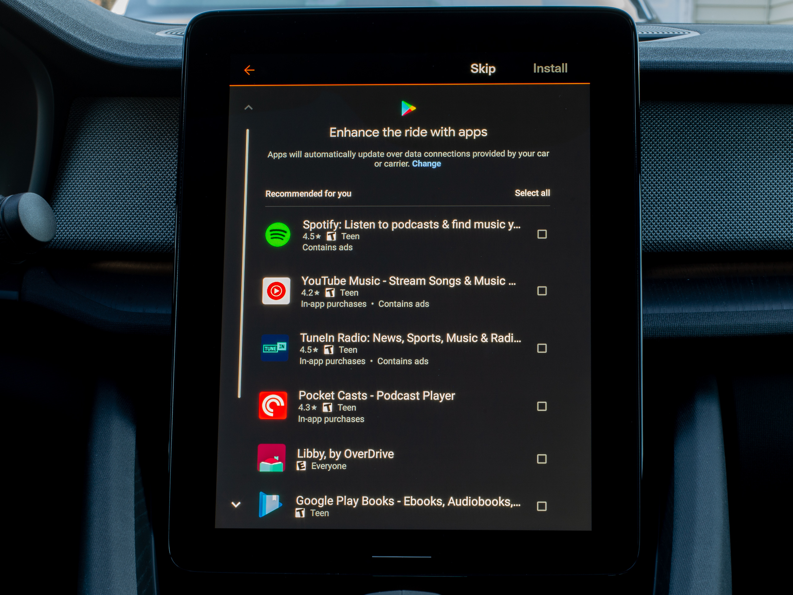 Popular apps are then promoted, but it doesn't know which apps you normally have on your phone.Ron Amadeo
Setup for Android Automotive is just like an Android phone. The above gallery is the order the screens pop-up in, so the pop-up saying "Your infotainment system uses Google software, accept the ToS, or else" pops up before you ever sign into a Google account. Google is going to get usage data, diagnostics, and be involved in the update process. You can either press "I accept" or start walking to your destination.
After the mandatory acceptance of Google's terms of service, you can actually skip signing into a Google account. Without an account, you'll still be able to use the default apps, the radio, Bluetooth connections, and Google Maps. You won't be able to get apps from the Play Store, though.
To sign in you can either type a special URL into a phone—just like setup on a TV—or, since we've got a big touchscreen, just pop up a big QWERTY keyboard and punch in your details directly. Since this is a system based on Android, it supports multiple users, so a car can support multiple people with different Google accounts, different apps, and different data, all encrypted and separated from each other. Switching users will even change things like the seat and mirror position, and users can be bound to certain keyfobs, so the car will know who you are.
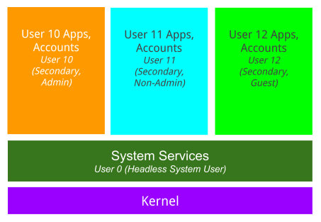
Fun fact: you aren't ever the primary user on an Android Automotive system. The first user, which you can't create or edit, is always the "headless system user," and any actual user accounts are "secondary" and run on top of the system user. The system is a "headless" user meaning it doesn't show any UI, and people never interact with it, but it hosts all system services and always runs in the background. This is in contrast to regular phone Android, where 1 user = 1 human. One regular automotive user does get to count as "admin" though, and that person can make other users. There's also a provision for "Guest" users with ephemeral data.
Android 11 (again, not on the Polestar or on anything, at all) is planning for concurrent multiuser support, which sounds neat. Imagine the driver being logged in with all their contacts and Map data, and a passenger or the kids in the back could also be logged in with access to all their media.
It's kind of shocking how little Android Automotive cares about your phone. It is a full-fledged Android device, and it's really not interested in your pocket computer... but I guess you can attach it as a generic Bluetooth device if you want. Once signed in, the car will pull down your contacts and Google Maps bookmarks from your Google account, but disappointingly, that's about it. Google knows what apps you use on your phone, but unlike phone-based Android Auto, Android Automotive OS won't try to connect those dots and bring over any familiar apps. You'll have to dig through the Play store to find them.
The one other phone feature Polestar patched-in after our time with the car was an app for your phone, allowing you to use your phone as a car key, and (finally) letting you remotely see the charging status. Since Android is a phone OS and Google is one of the world's biggest app developers, it kind of feels like a comprehensive, capable phone app framework is something Android Automotive should help with, but Google didn't have anything to do with the Polestar 2 app.
Once you do find your familiar apps, AAOS will do a good job of logging you in, thanks to Google Autofill, which is seamlessly integrated. For instance, after I manually found the apps, the car was able to suck down my Pocketcasts and Spotify account credentials in just a few taps, which was very nice.
The Polestar 2 home screen basics
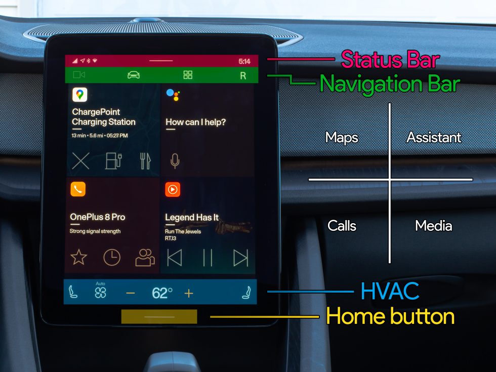
Once you're set up, you'll be presented with the home screen and basic navigation. The components here will be familiar if you've used an Android phone before, but the layout is a bit different. There's a status bar with a pull-down notification panel at the top of the screen, just like a phone. After that, it's a surprise to see system navigation right below the status bar, featuring four items: the car cameras, car settings, the app drawer, and user switching. Just like Android's "back, home, and recent apps" navigation bar, this bar stays on-screen the entire time, even when you're inside an app.
The HVAC controls live at the bottom of the home screen. They generally stay at the bottom of the screen for most apps, but if they hide (like when scrolling through the settings) you can generally swipe up from the bottom of the screen to access them. Below that, there's the home button, as a capacitive hardware button that lives in the display bezel.
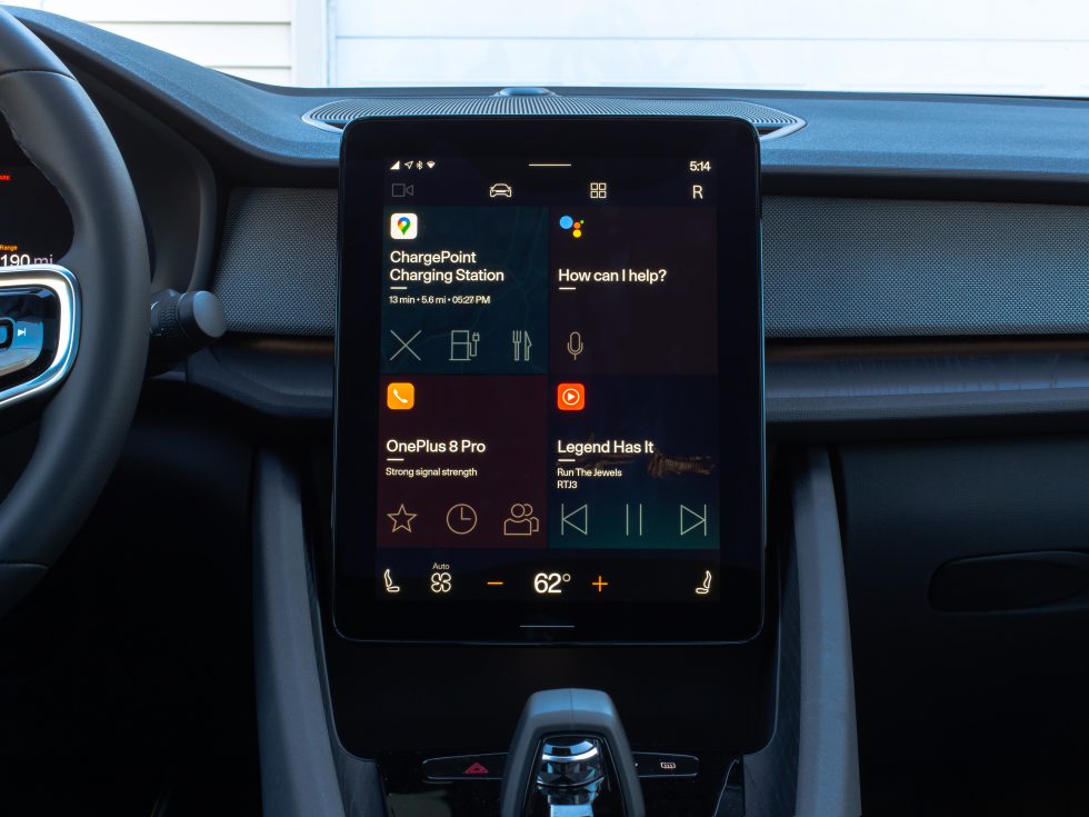
The main home screen area is a 2x2 grid, and by default, it shows controls for Maps, the Google Assistant, calls and contacts from a connected phone, and media. Each one of these squares is called a "tile" by the OS, and it sounds like maybe developers will someday be able to plug into this, but not yet. A lot of the tiles are nearly useless. The Maps square only shows text about your destination, a way to stop navigating, and permanent shortcuts to search for a charging station or food. It never shows useful information, like say, the next turn, and it never actually shows a map. It feels like a gigantic app icon more than anything else.
The Google Assistant square is also pretty useless: it houses a single microphone button to start voice recognition and nothing else. On pretty much every Android device and form factor, the Google Assistant is a pop-up, and it seems like that would be a more appropriate interface here, too. Personally, I would never want to tap the on-screen microphone button given that 1) there's already a hardware button on the steering wheel, and 2) the "OK Google" hotword works just like it does on a phone. Just shout "OK Google" along with your command, at any time, and the car will do it.
The bottom left "Phone" section is again just a collection of status and navigational buttons. It spends about half of its space listing the name of your phone and a written out message about your signal strength (couldn't it just be normal signal bars?). Below that are three buttons linking to starred contacts, call history, and the full contacts list. Like the maps square, these are all buttons that open lists. It would be nice to have more direct call buttons, like say, a customizable list of frequent contacts that you could call with a single tap.
The only square in this home screen setup we're giving high marks to is the media section, which actually displays useful information and gives you meaningful action buttons. First, you see your chosen media app icon, then media info like the song name, artist, and album (or other text if you're listening to a podcast). Below that are three media controls, for songs you get the usual previous, play/pause, and next, and the background is your album art. This is a great tile because it actually does something.
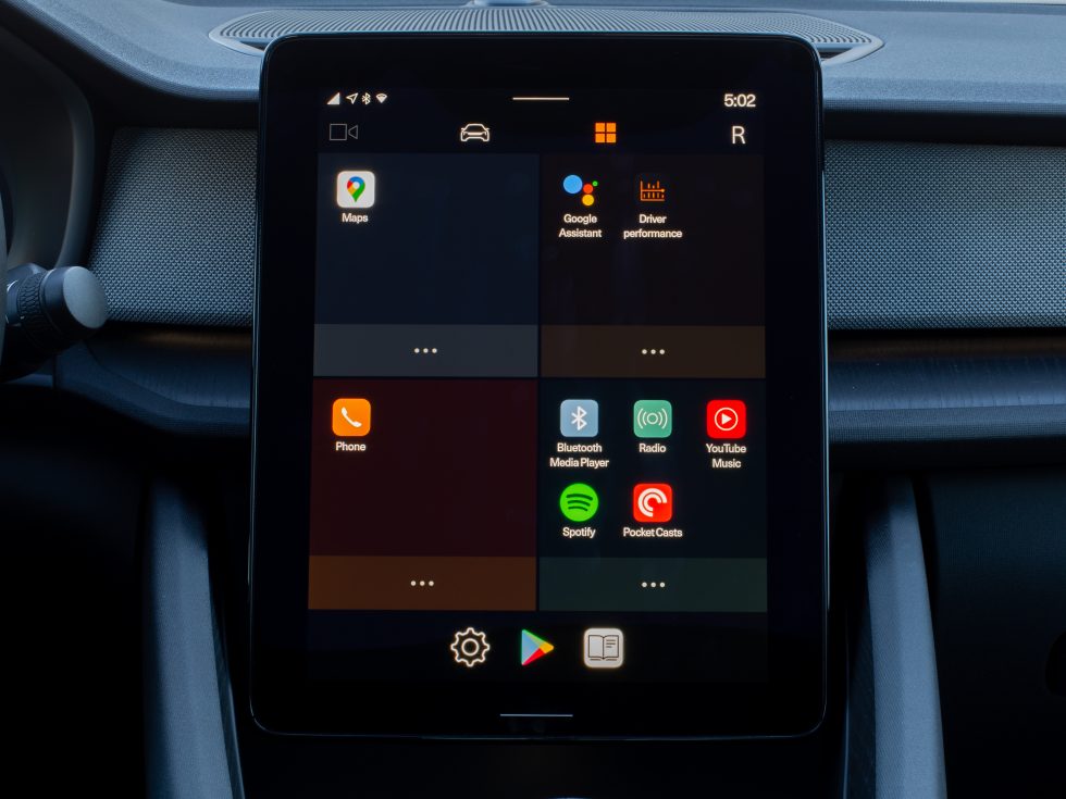
That covers all four tiles, but remember this screen is customizable. So if you tap on the third button on the top navigation bar (the one with four squares in a 2x2 grid) you'll get a behind-the-scenes look at the home screen, and instead of a 2x2 grid of tiles, you'll get a 2x2 grid of app icon folders. The way this works is really strange. This is a list of every app on your device, so it's Android Automotive's equivalent to the app drawer, but it's in four sections. You can move app icons between each section of the grid, and by default, the first app in each section will get to be the tile on the home screen. If there are multiple apps in any of the four sections, you'll be able to swipe down on that tile, revealing that list of apps, and then you can tap an app to launch the full-screen interface. When you go back to the home screen, that last icon you tapped on will now be the tile. By default there are only multiple icons in the media tile, so you can swipe down on the media tile to access more media apps.
The screen is customizable, but there are only these four tile types, so any "customization" of the home screen means turning off some of the existing tiles and replacing them with copies of the media tile for different apps. You can have a home screen made up entirely of YouTube Music, Spotify, Pocketcasts, and the Bluetooth player if you want, and your car will be a media playing machine.
The problem with this whole tile system is that this is also the primary way to launch apps, so if an app is good but the tile is terrible (like say, Google Maps), having quick access to it means dedicating a quarter of the home screen to it. It would be nice if, like on a normal Android home screen, we could have one or two tiles (or widgets) for apps that have good tiles, and then our favorite app icons.
With the exception of the media section, every single home screen button is just navigational, leading to further display interaction. It would be nice if the buttons actually performed an action, like navigating to a favorite place in Google Maps or calling a specific contact. What's really frustrating is that these shortcut types already existed in regular phone Android, but for whatever reason, they have been cut from Android Automotive. You're driving around with this interface, and it should strive to be very configurable to let you do your common tasks with a single tap, so you are less distracted and a safer driver. But instead of doing something useful, almost every button on the home screen just currently opens a list of stuff.
It's good that you can customize the home screen, but there's not much I want to do when three of the system's four tile types are bad. As a result, the home screen feels pretty useless as anything other than an app launcher. And as an app launcher, it only shows you four apps at once. Yuck.
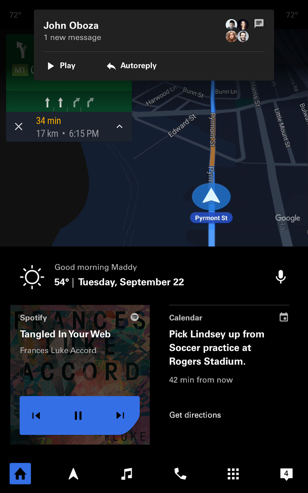 This is Google's screenshot of "stock" Android Automotive, which doesn't exist anywhere, but looks a lot more capable than the Polestar layout.Google
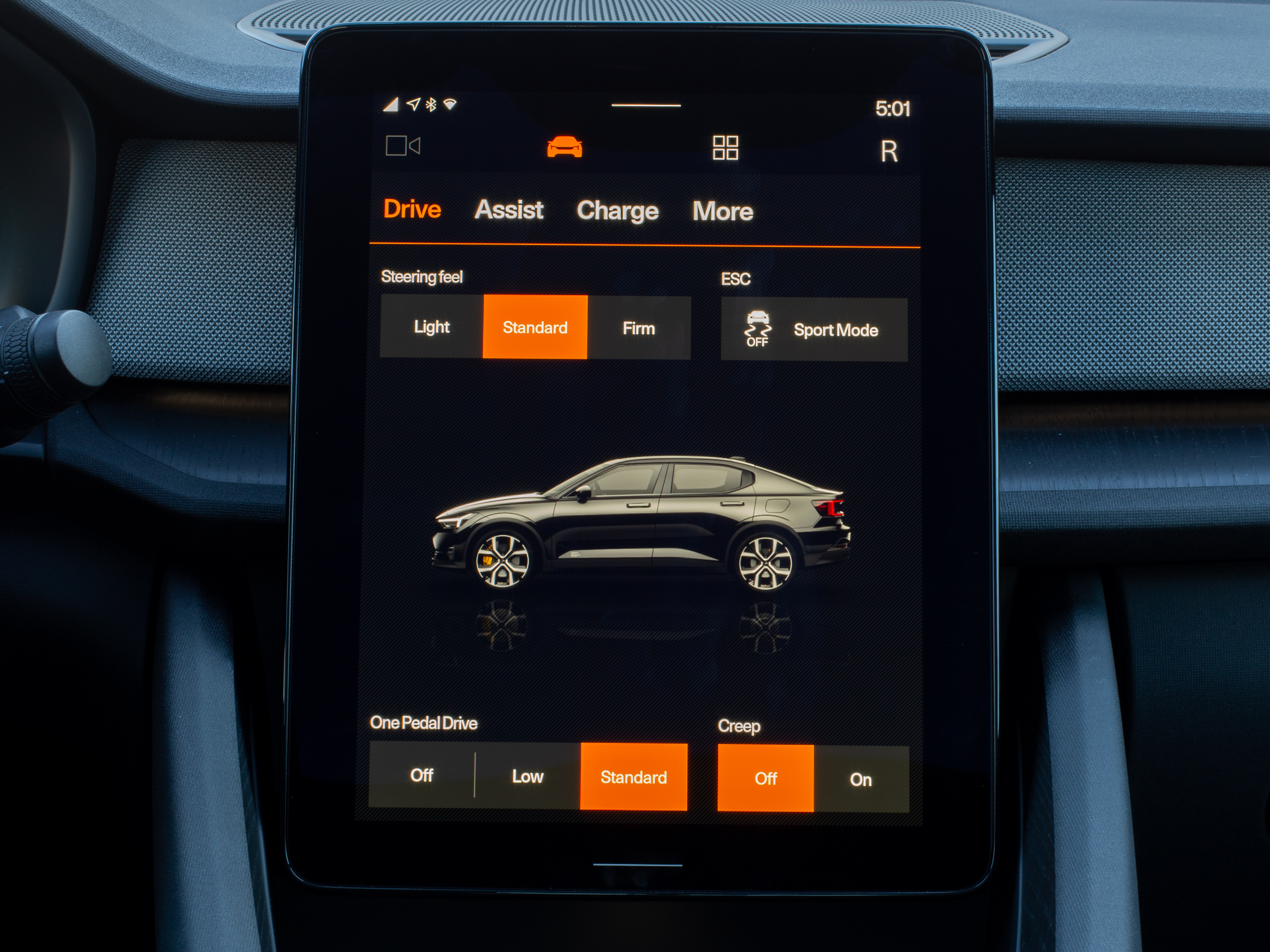 We'll go over the buttons on the Polestar 2 nav bar. Here are the driving settings.Ron Amadeo
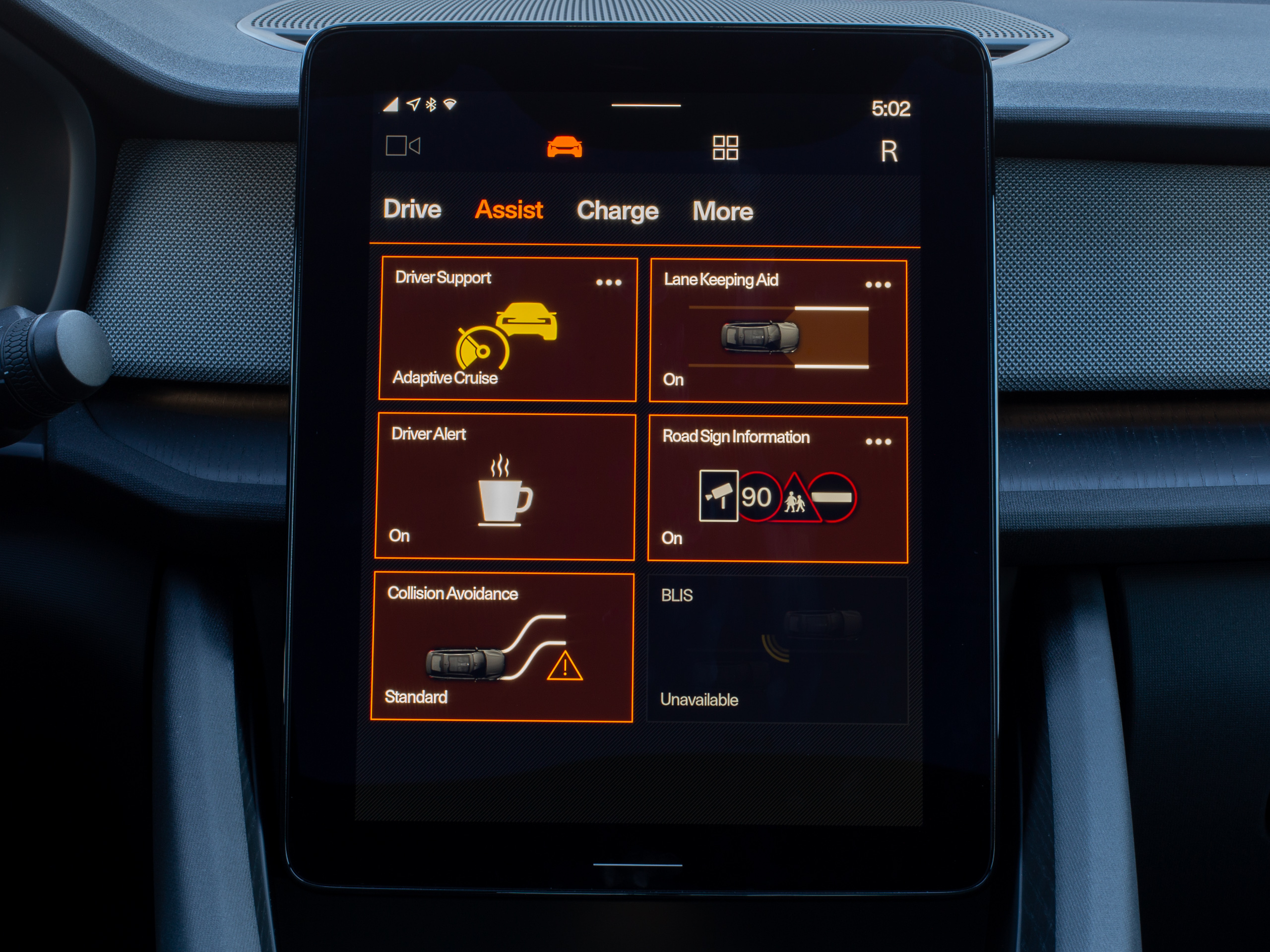 Driver Assist settings.Ron Amadeo
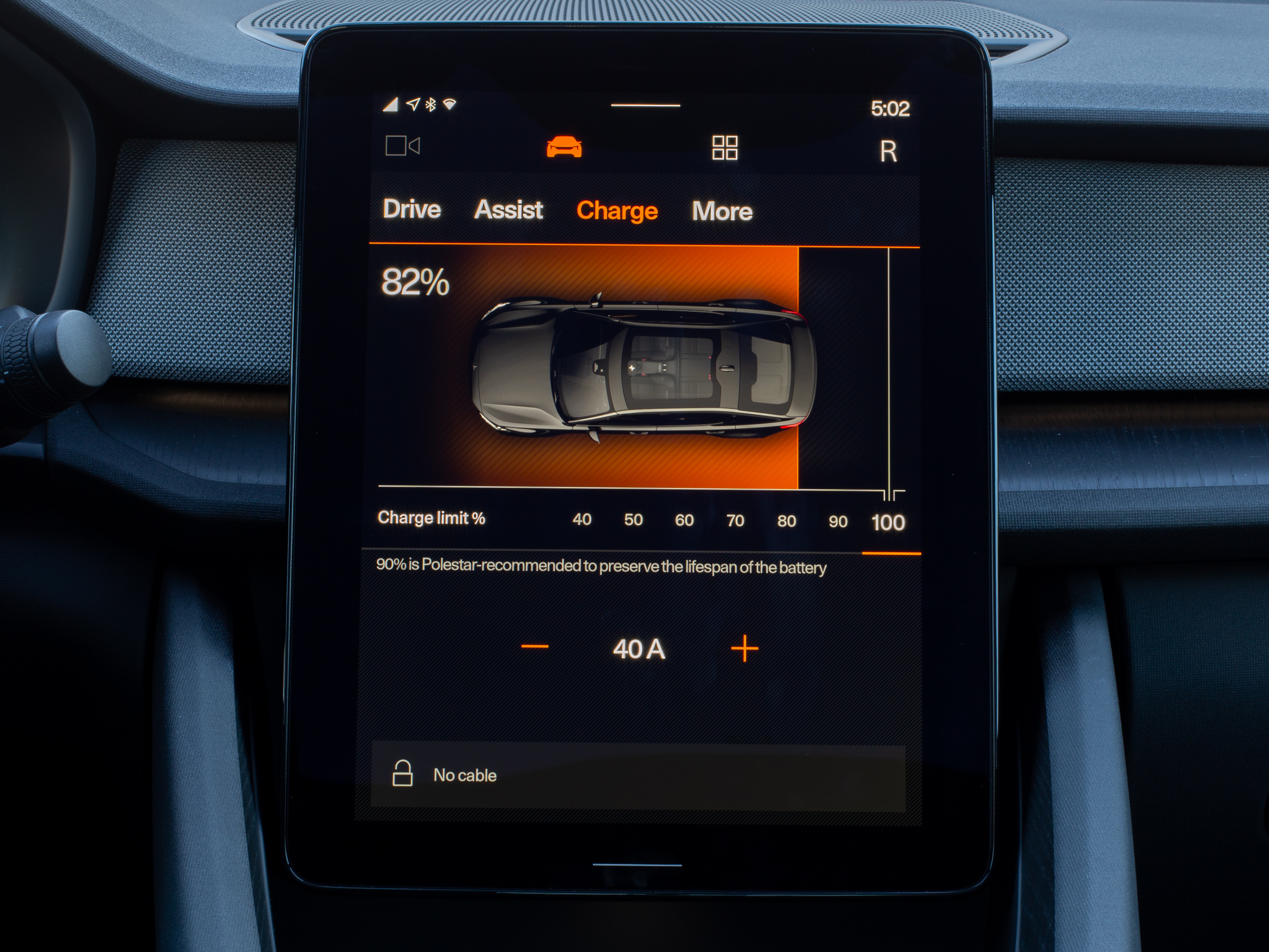 Charging status.Ron Amadeo
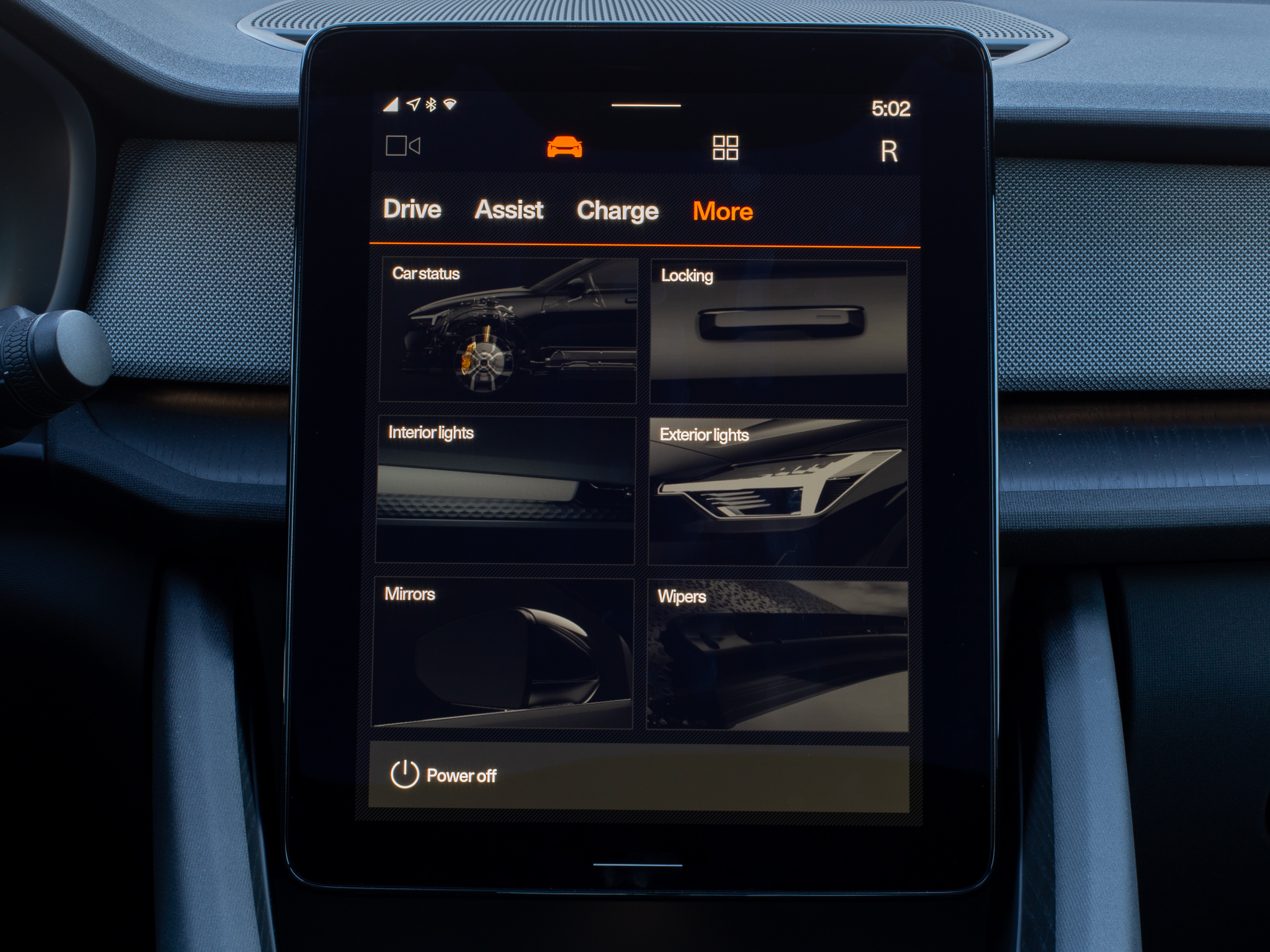 A bunch of other random settings. It seems like you'd only change these once.Ron Amadeo
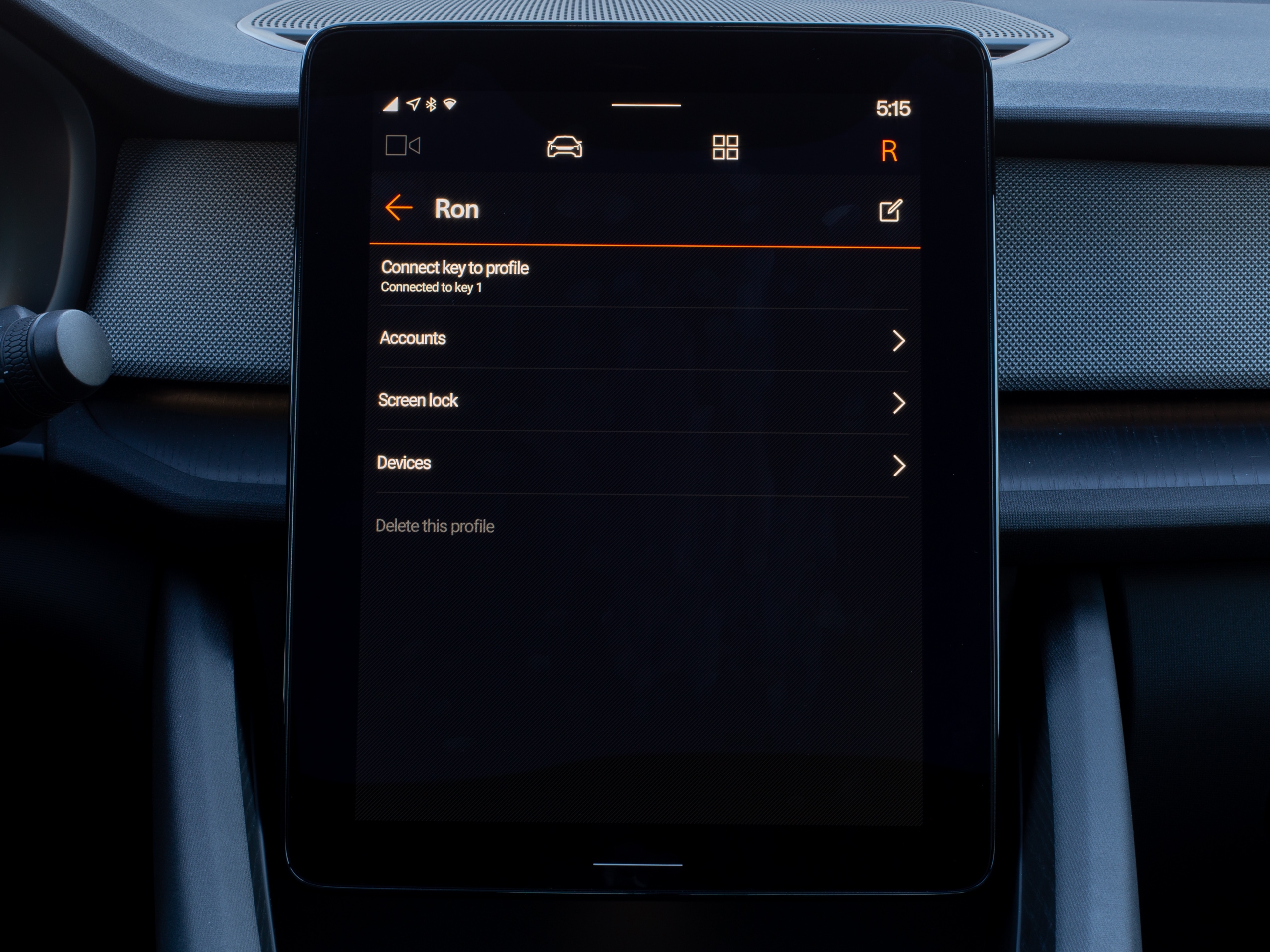 The left "R" button on the navigation bar is just the user settings.Ron Amadeo
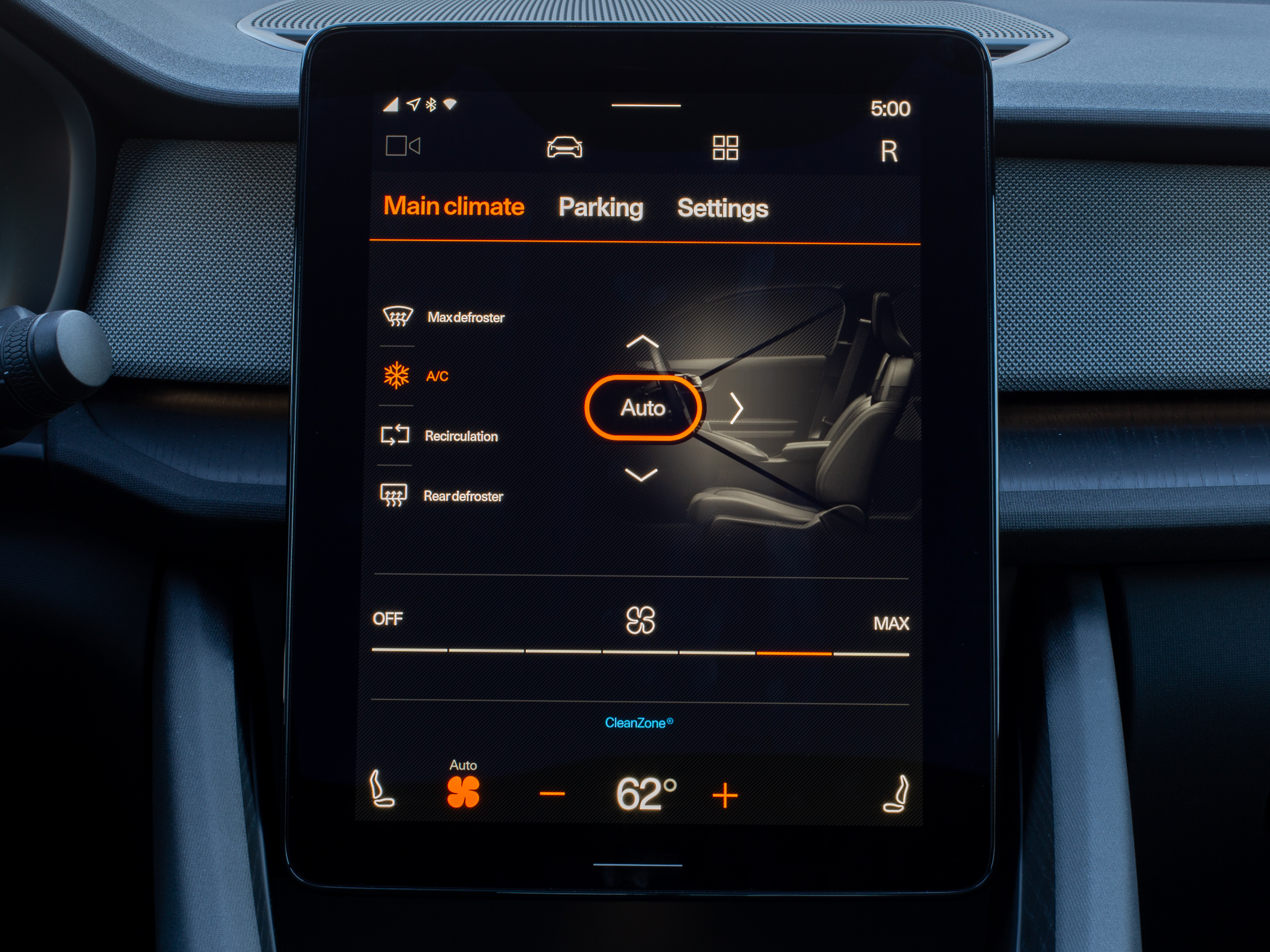 The HVAC screen.Ron Amadeo
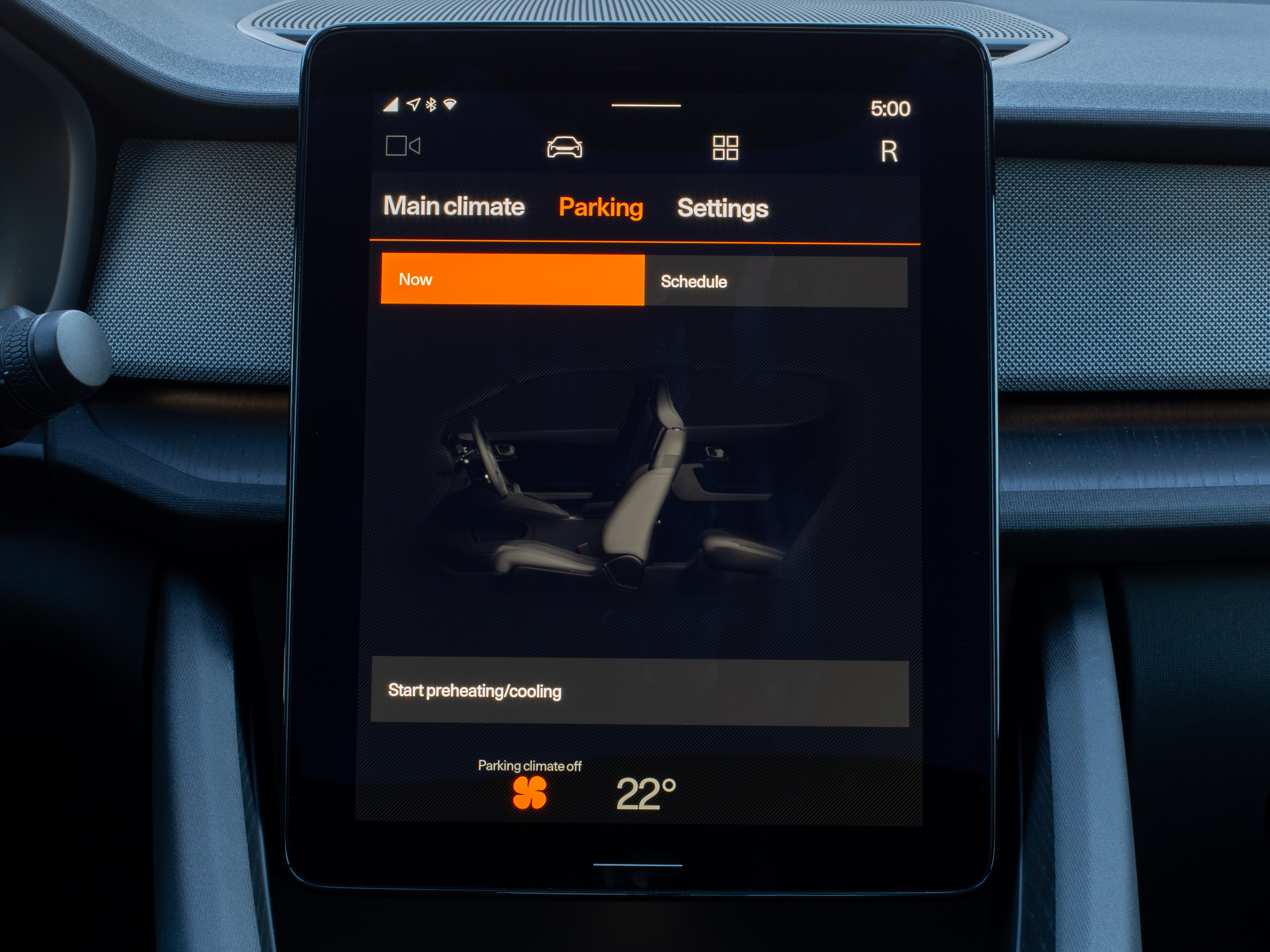 You can schedule HVAC settings so you can jump into a temperate car.Ron Amadeo
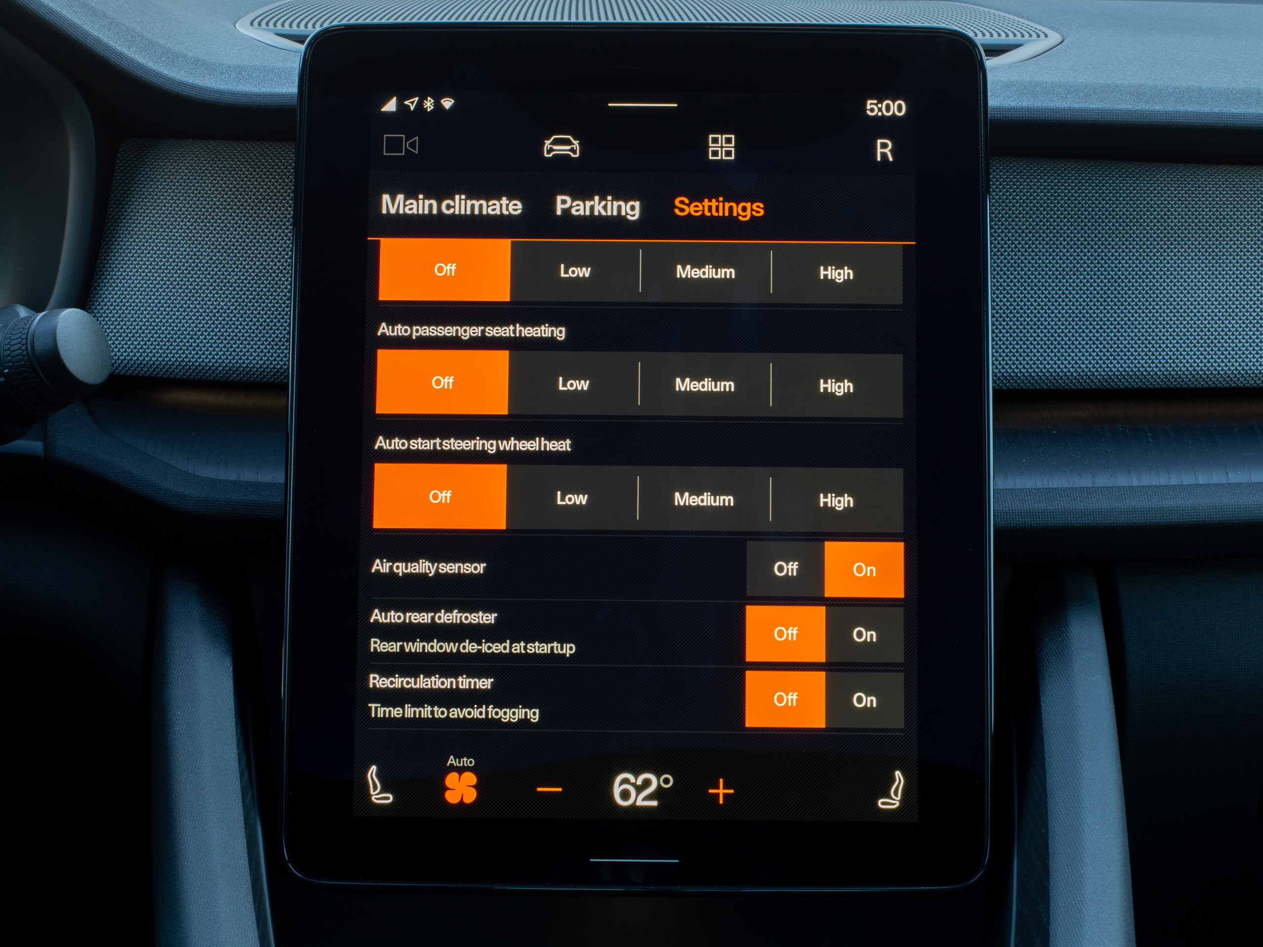 A bunch more HVAC settings.Ron Amadeo
The good news for other car buyers is that it looks like we can blame a lot of the home screen's low-functionality design on Polestar. This is a skinned OS, after all, and in the case of the home screen, it has almost nothing to do with the default Android Automotive OS layout. Google's picture of "Stock" Android Automotive, above, (which I have to stress, doesn't yet exist anywhere, even on the emulator) seems like it has a much more useful layout. First, it splits the screen in half, with the most important app, Google Maps, running in the top of the screen. Next, it shows the weather and date—both of which would be nice additions to the Polestar 2—followed by what looks like two tiles, one for Spotify and one for Calendar. Oh! A Calendar tile! It would be great if that existed. It looks like it links directly to directions for an event.
We also get to see Google's take on the navigation bar, which makes a lot more sense than Polestar's. This style of navigation bar, which is filled with shortcuts to functions, asks the question, "What are the main functions of a car computer?" The answer from Google's navigation bar is "Maps, music, phone calls, apps, and notifications," which sounds to me like a fantastic A+ answer. The Polestar 2 navigation bar answers this same question with "Camera views, cars settings, apps, and user switching." Uh, Polestar is wrong, and that makes navigating the UI a hassle.
The stock Android Automotive picture really draws a sharp contrast against Polestar's design decisions. Three of the four buttons in the Polestar 2's navigation bar are useless. There is no justification to elevate these items to the most important, top-level bar in the UI, and it really feels like Polestar just used the navigation bar as a dumping ground for all their stuff, while the less important Google stuff could live somewhere else in the UI.
Let's go down the list: The camera tab is completely unnecessary since it is disabled most of the time (while in park and while moving above parking lot speed) and opens automatically whenever it is enabled and useful (reversing and low-speed parking for 360 object avoidance). You could completely remove it from the UI and that would probably be fine for 99 percent of scenarios. Next up is the car button, which is just the car settings, and after picking things like the interior lighting color and steering wheel feel, you'll probably never touch it again. The one daily-useful item in here is the battery charge status, which is super important, but that really feels like it should be a home screen tile, not something buried in the car settings. We already covered Apps—a fine top-level section that deserves to be here. The last button is the user account button (labeled "R" because I'm "Ron." Hi.) and again this is a setting that you will never touch after the first week. It lets you do things like add a new user, delete an old user, and set up a screen lock. The most likely reason to use this is for user switching, but that doesn't make it a top-level navigation item. In phone Android, for instance, user switching lives about two screens deep in the pull-down notification panel. You can also do user switching automatically with multiple keys, making this tab even less useful.
With the Polestar navigation bar being the way that it is, there is no way to jump directly from Maps to media, which are my two most-used features. Every app switch requires bouncing back to the home screen first, adding more taps and more distractions to your journey. The Google version, which has dedicated buttons for the top-three screens of "Maps," "Media" and "Calls" looks so, so much better.
The Play Store and the very, very early beginnings of a car app ecosystem
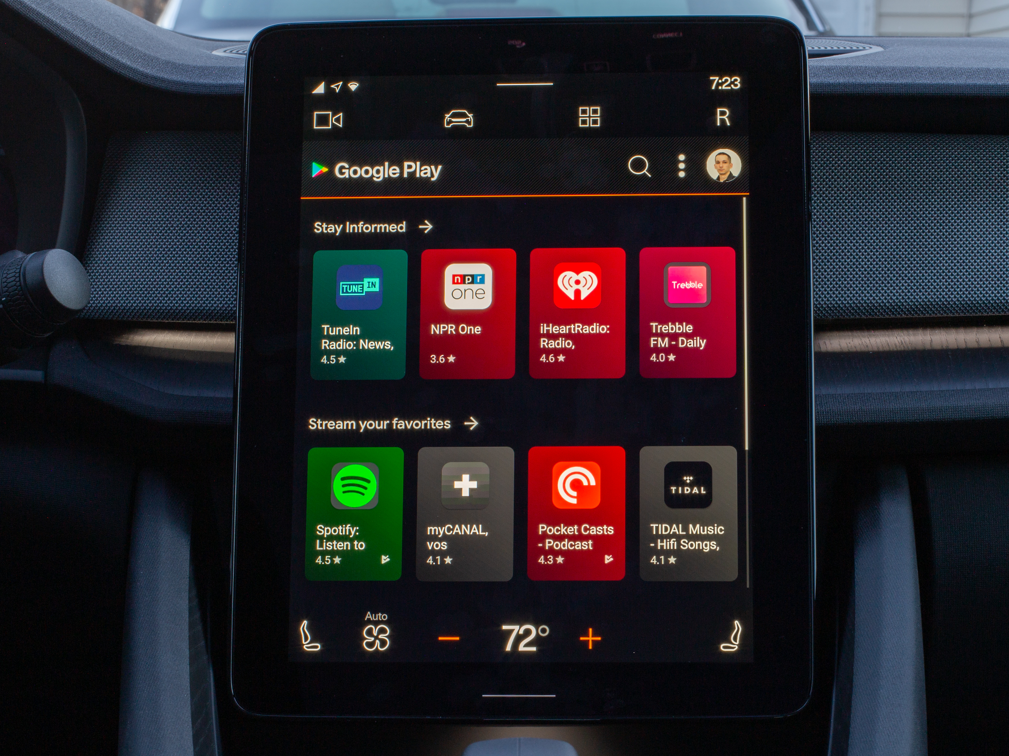 The Play Store.Ron Amadeo
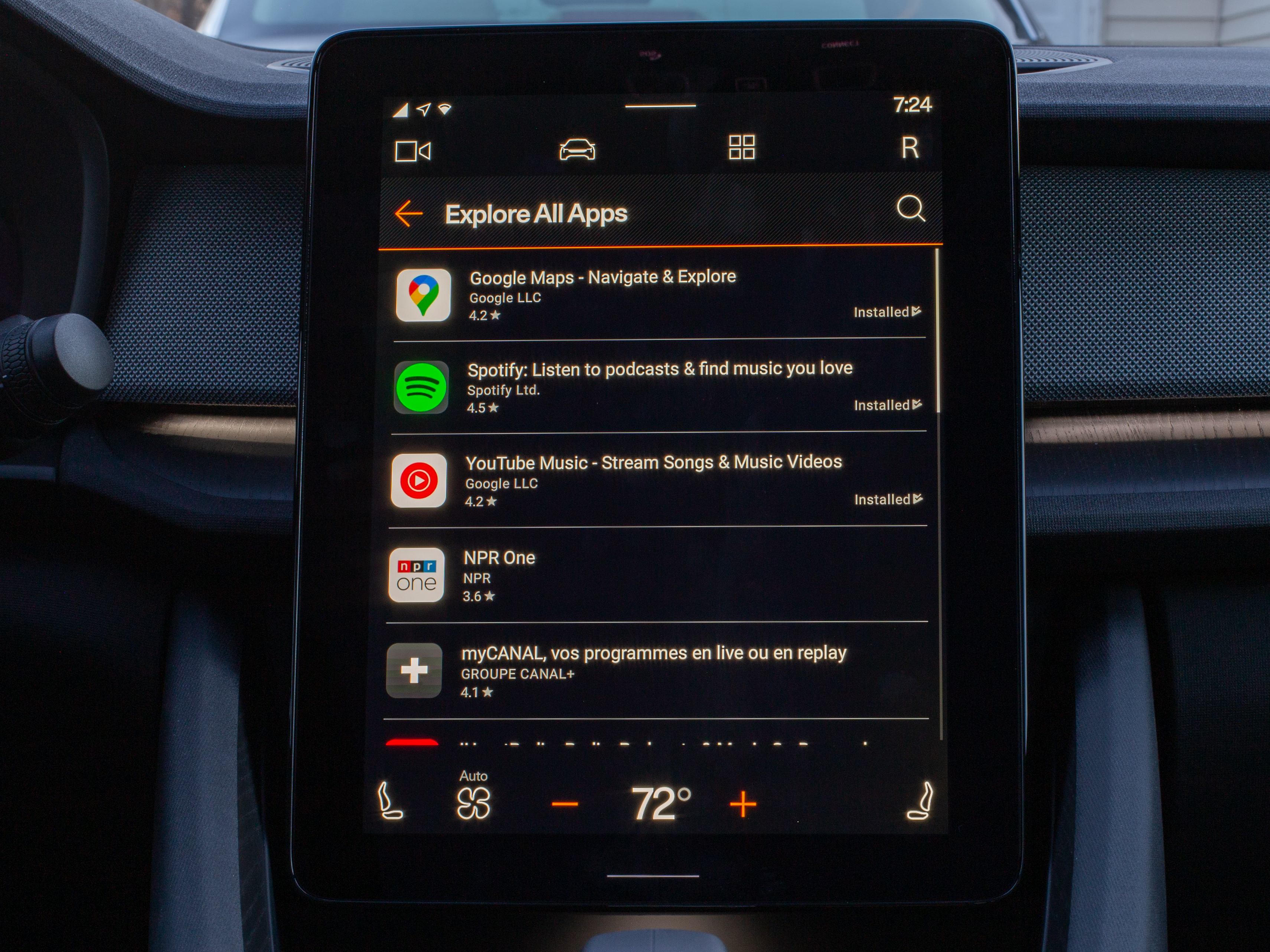 When you only have 30-ish apps, you can have an "Explore All Apps" screen.Ron Amadeo
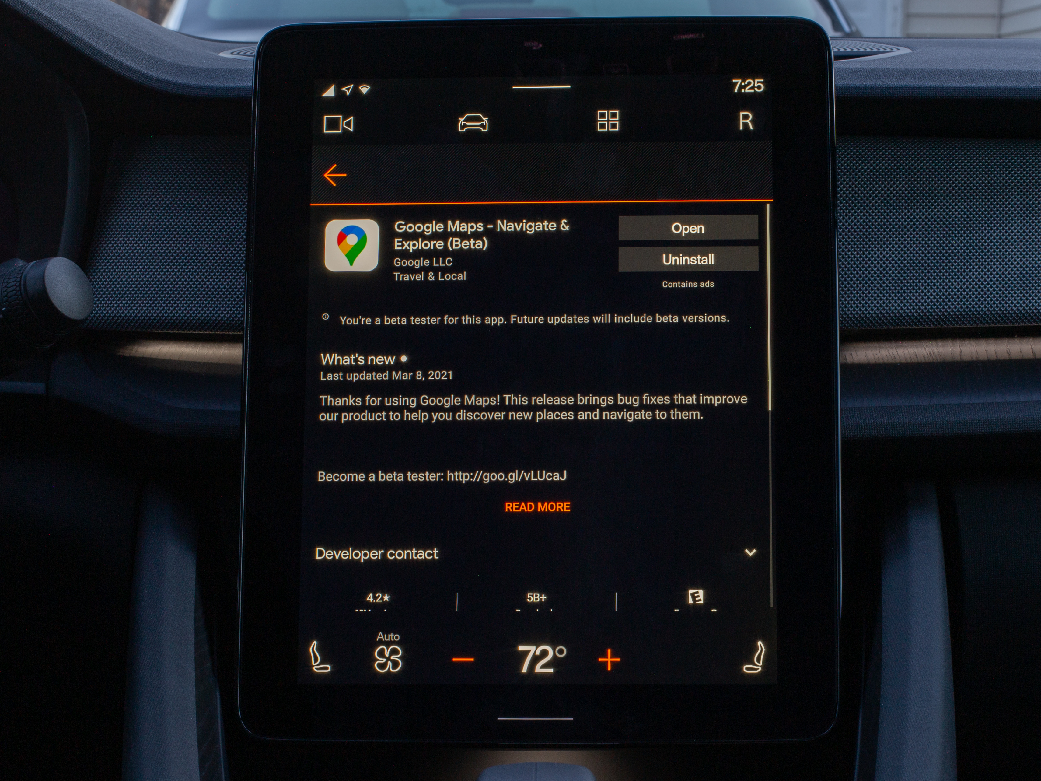 The individual app pages look just like a phone.Ron Amadeo
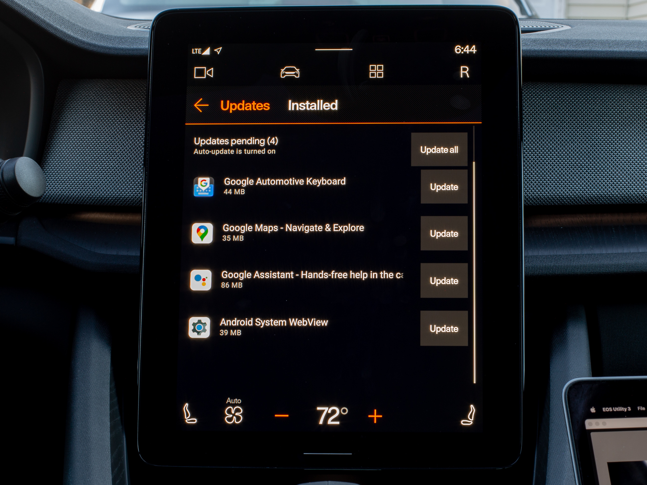 You've got app updates!Ron Amadeo
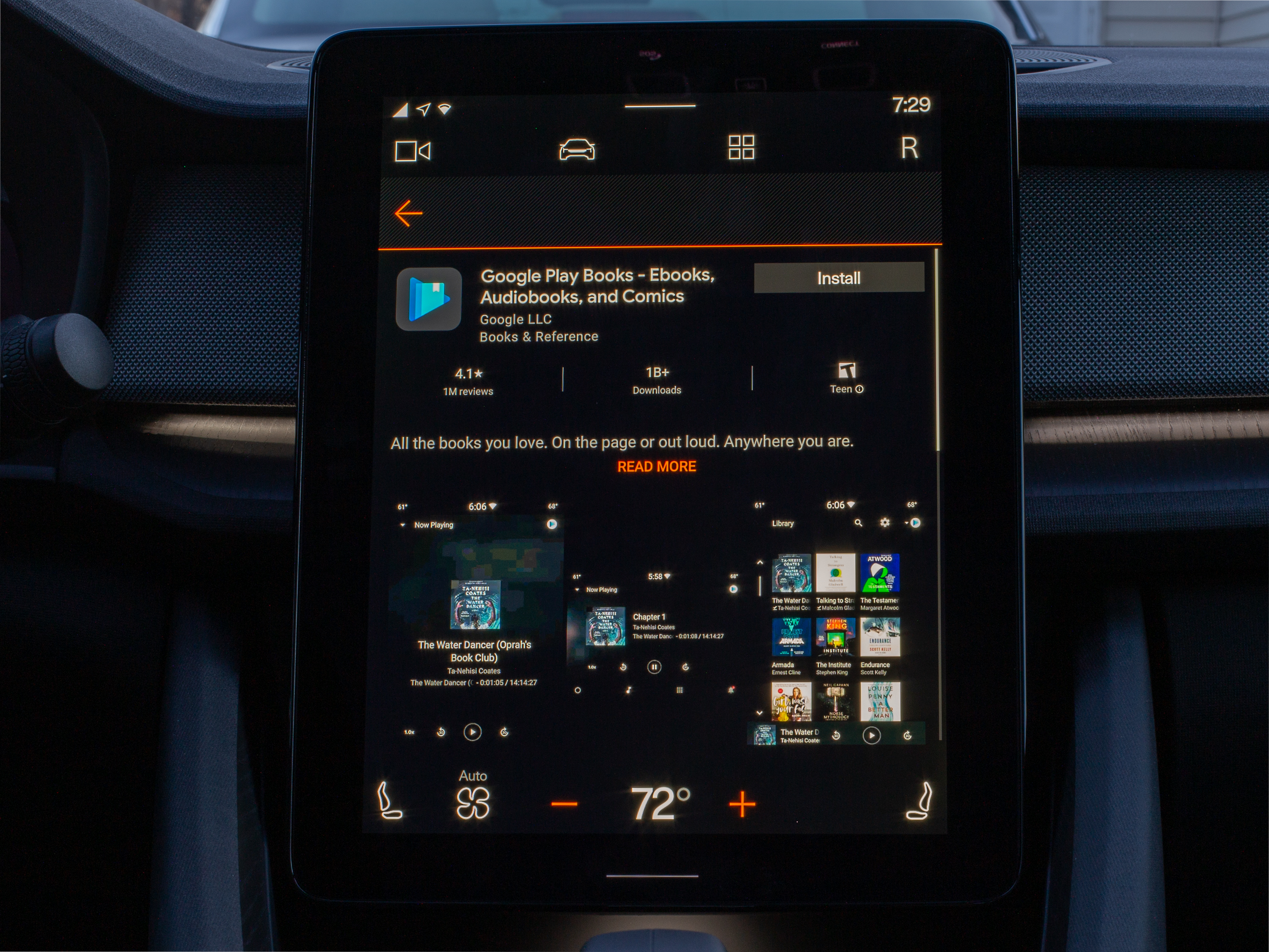 Google Play Books (for audiobooks) lists 1 billion downloads because it is just the phone listing, which is a bummer if you wanted reviews and comments about the car interface.Ron Amadeo
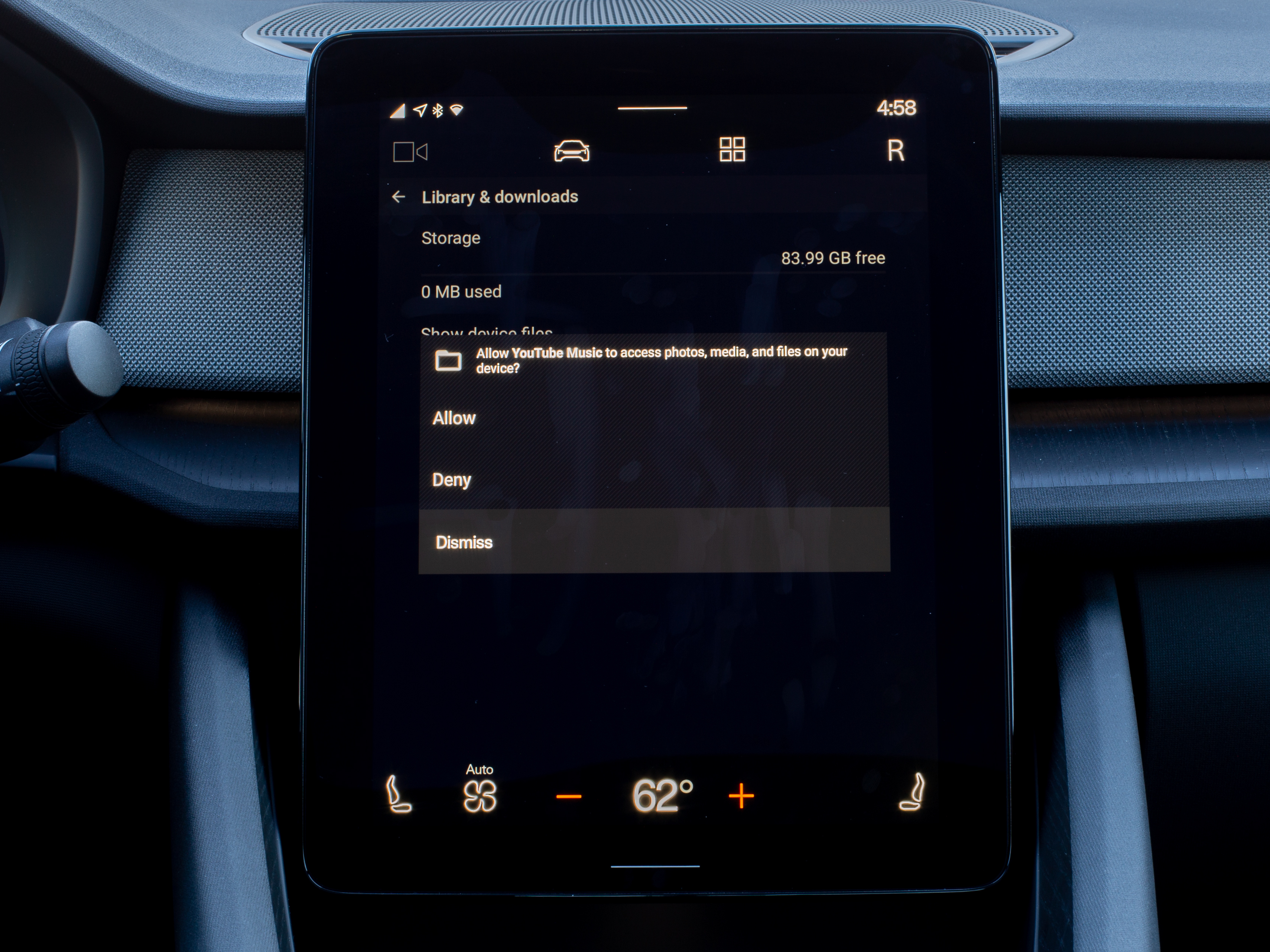 An app permissions pop-up. Did I mention the display was a fingerprint magnet?Ron Amadeo
One of the biggest introductions of Android Automotive OS is the Play Store for cars. The actual Google Play app (which is disabled when you are moving) seems exactly like the phone version, but without any app categories because there are so few apps right now. You can browse a big list of apps; check out descriptions, reviews, and screenshots; and install and uninstall whatever you want. The features and layout of an app listing are exactly the same as a phone. It all works great and you really couldn't ask for anything more from an app store client.
Since this is still Android, there are advanced capabilities you won't find on most other car OSes, like a fully working permissions system. Apps will need to request access to your location, contacts, storage, and a bunch of other sensitive areas in order to function, and you'll be able to control all of it.
As for the apps you'll find on the app store, don't expect a lot. The Android Automotive app ecosystem has a lot of work to do. I counted 31 apps in the Automotive Play Store. That's the total, including four apps that are part of the operating system: Google Maps, Play Services, the Keyboard, and the Google Assistant. The apps I've actually heard of are Spotify, YouTube Music, Tidal, Pocket Casts, iHeartRadio, TuneIn Radio, NPR One, and Google Play Books (for Audiobooks).
If you haven't guessed from the list yet, the only supported apps on Android Automotive are media apps. Android Automotive OS uses the same app platform as Android Auto, the projected phone interface. While the projected phone interface supports apps for media, messaging, and maps, Automotive only supports third-party media apps for now. Messaging apps are a big part of Android Auto, and not being able to get any messages (at all) on Android Automotive is really disappointing and a big hole in functionality. Phone Android Auto supports alternative map apps like Waze, but there is no option for Android Automotive OS. For the record, there are about 250 apps for the phone version of Android Auto, so the OS has a lot of work to do.
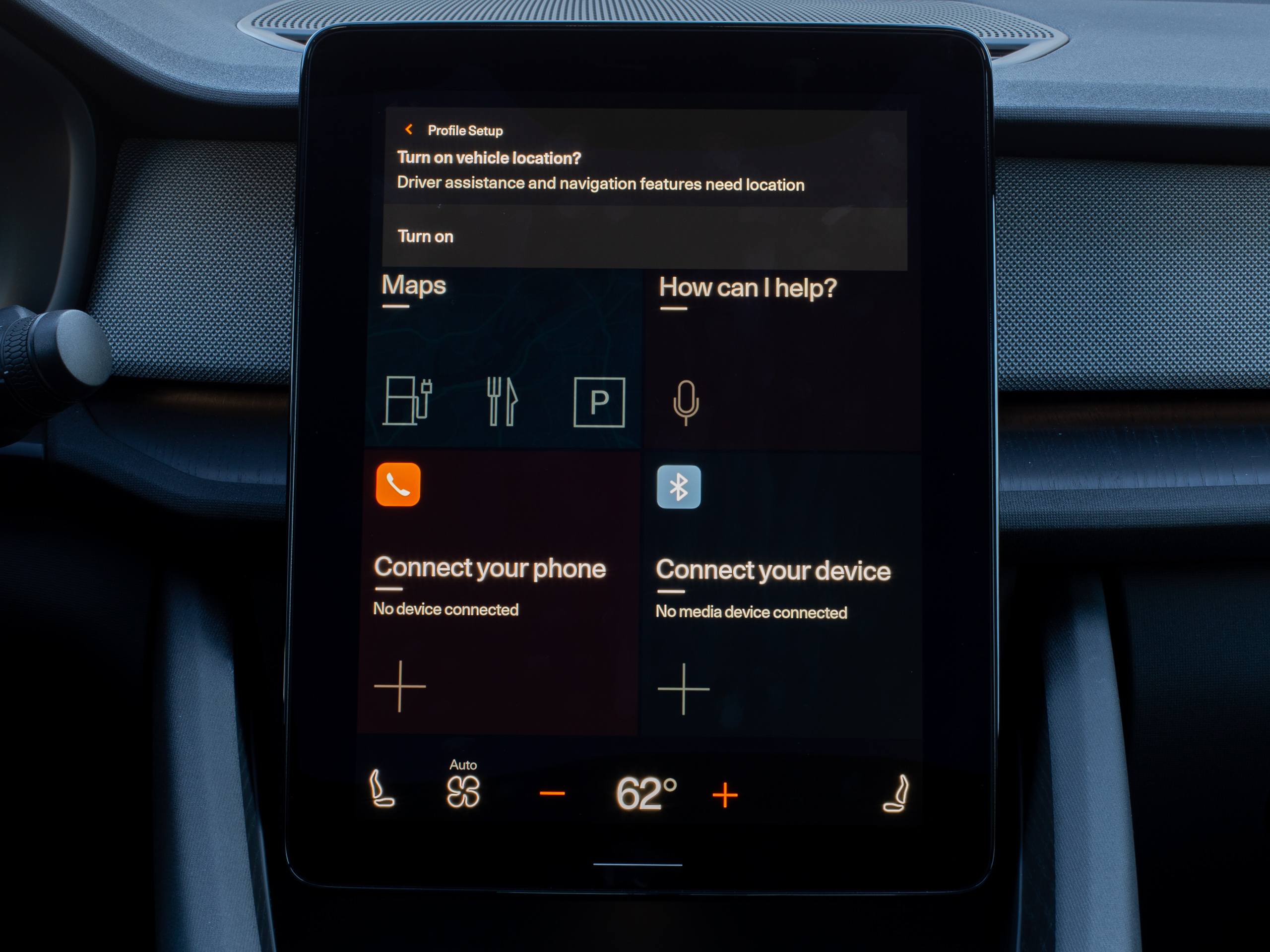 Hey look! A notification. These are an extremely rare occurrence since messaging apps aren't supported.Ron Amadeo
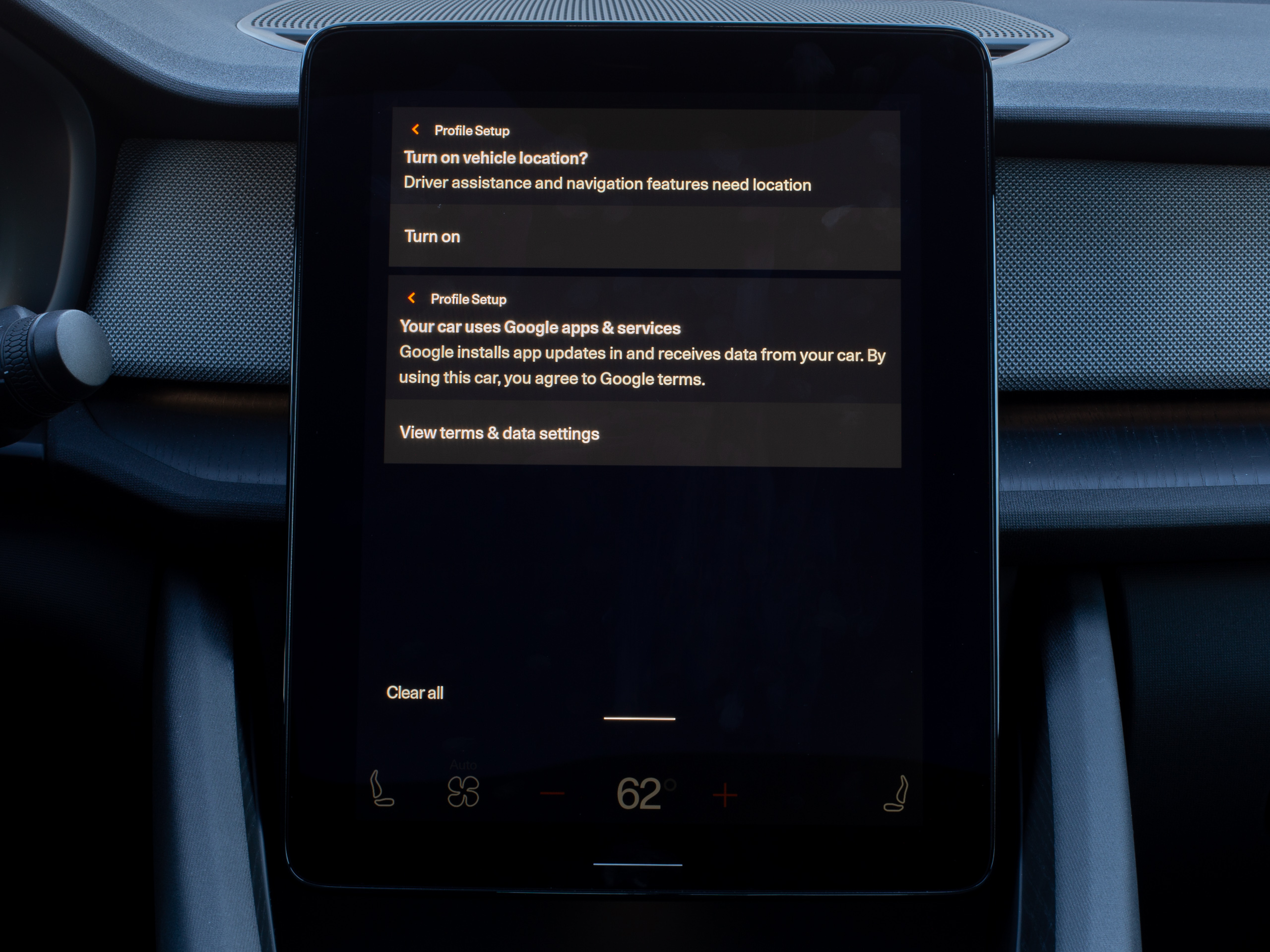 This is the most active the notification panel will ever be.Ron Amadeo
Interface design for cars primarily revolves around safety, and developers need to comply with a huge amount of regulations from governments around the world. Because of all the safety concerns, developers don't get to make an app interface from scratch. Instead, Google's car app platform has developers customize a canned, pre-approved app layout. For a media app, developers get to plug in an audio stream, pick an app icon and color scheme, and customize which buttons go in the designated button slots (for example, next and previous for music, or 30-second skip for podcasts). The layout is the layout, though, and once you've seen one media app, you've pretty much seen them all, since they all use the same scaffolding. This has been the Android Auto phone policy forever, and it's fine. The whole point of picking Spotify versus Tidal versus YouTube Music is for the music, and as long as that works in a car, we really don't need any avant-garde app layouts. The big difference between phone Android Auto to AAOS is that developers don't have the phone app UI to fall back to, so they might need to add things like a vehicle-safe sign-in UI.
Phone Bluetooth audio and the AM/FM/XM radio also run through one of these pre-canned media apps. If you want something not in the officially supported AAOS Play Store, you can still run it on your phone and beam it to the car stereo. The Bluetooth app gives you the usual Play/Pause/Next commands, and though it looks like it wants to pull down album art over Bluetooth, it does not work. This is apparently a feature of Android Automotive 11, which isn't out yet.
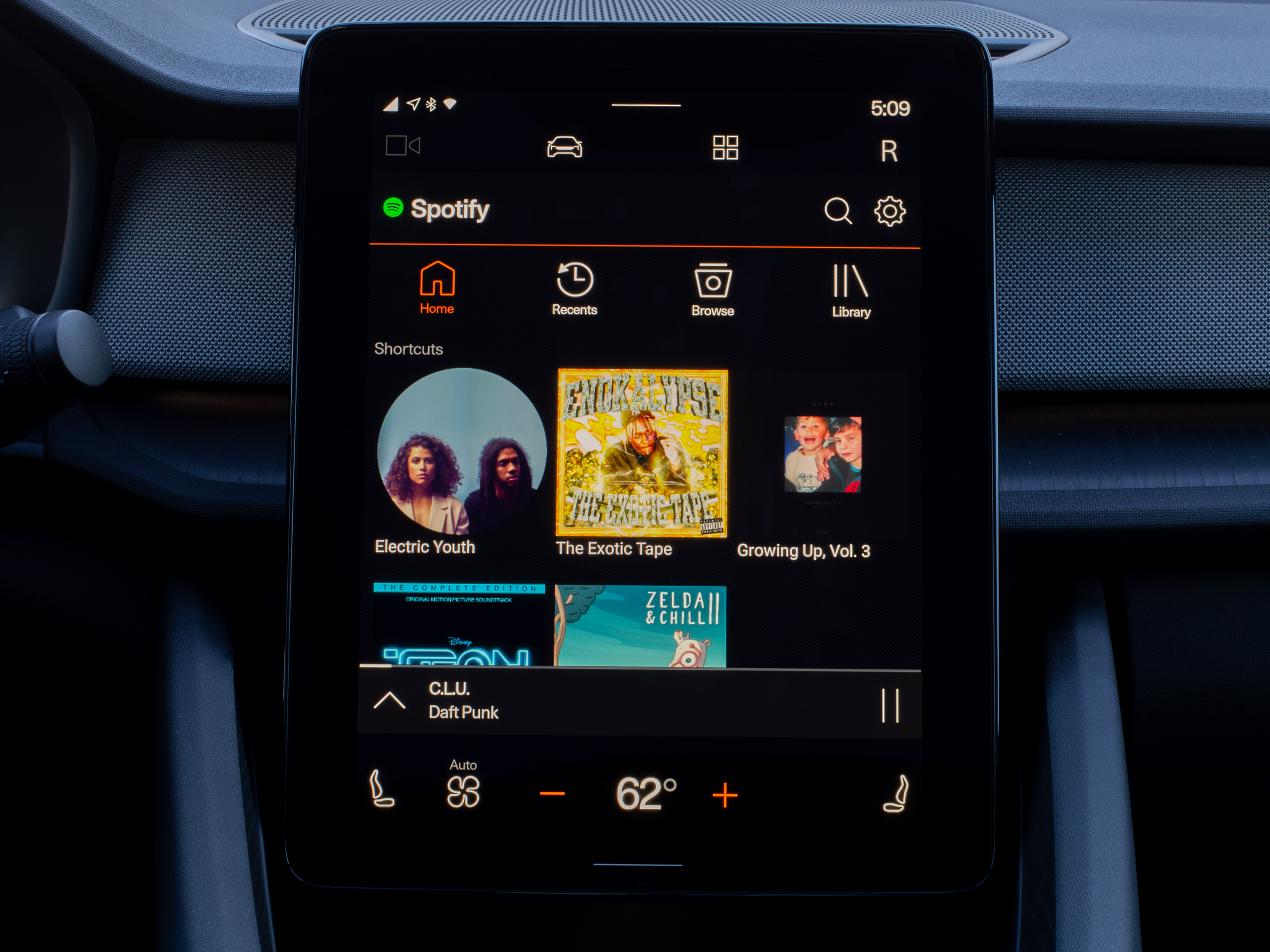 A media app, in this case Spotify. Once you've seen one media app, you've really seen them all, since they all share a codebase.Ron Amadeo
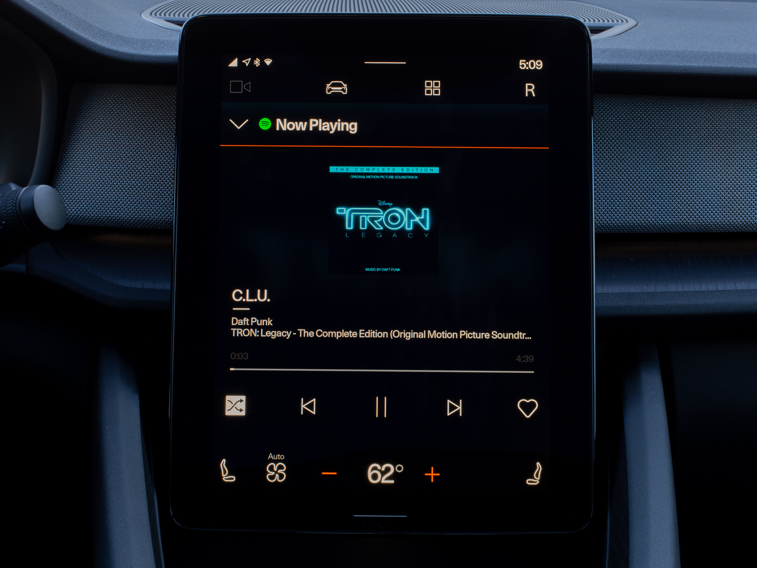 The Now Playing screen for Spotify.Ron Amadeo
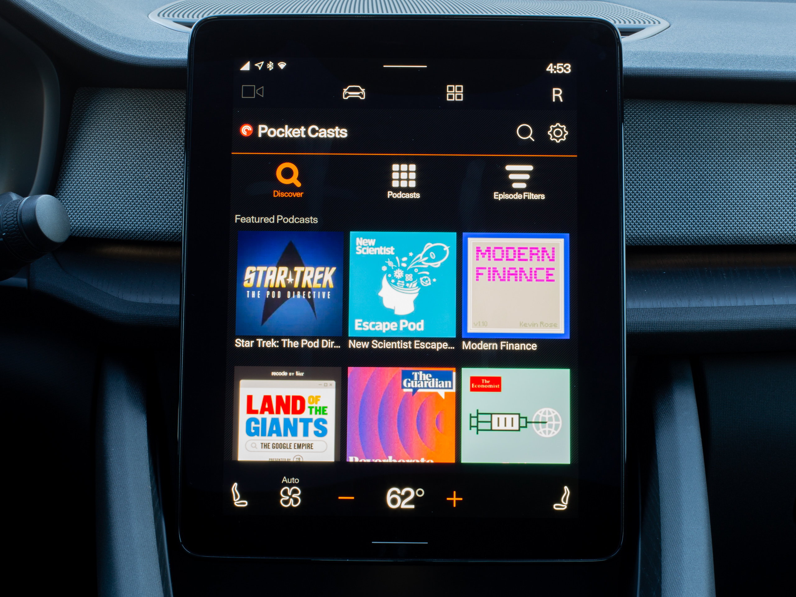 PocketCasts. Again, it's a lot like all the other media apps.Ron Amadeo
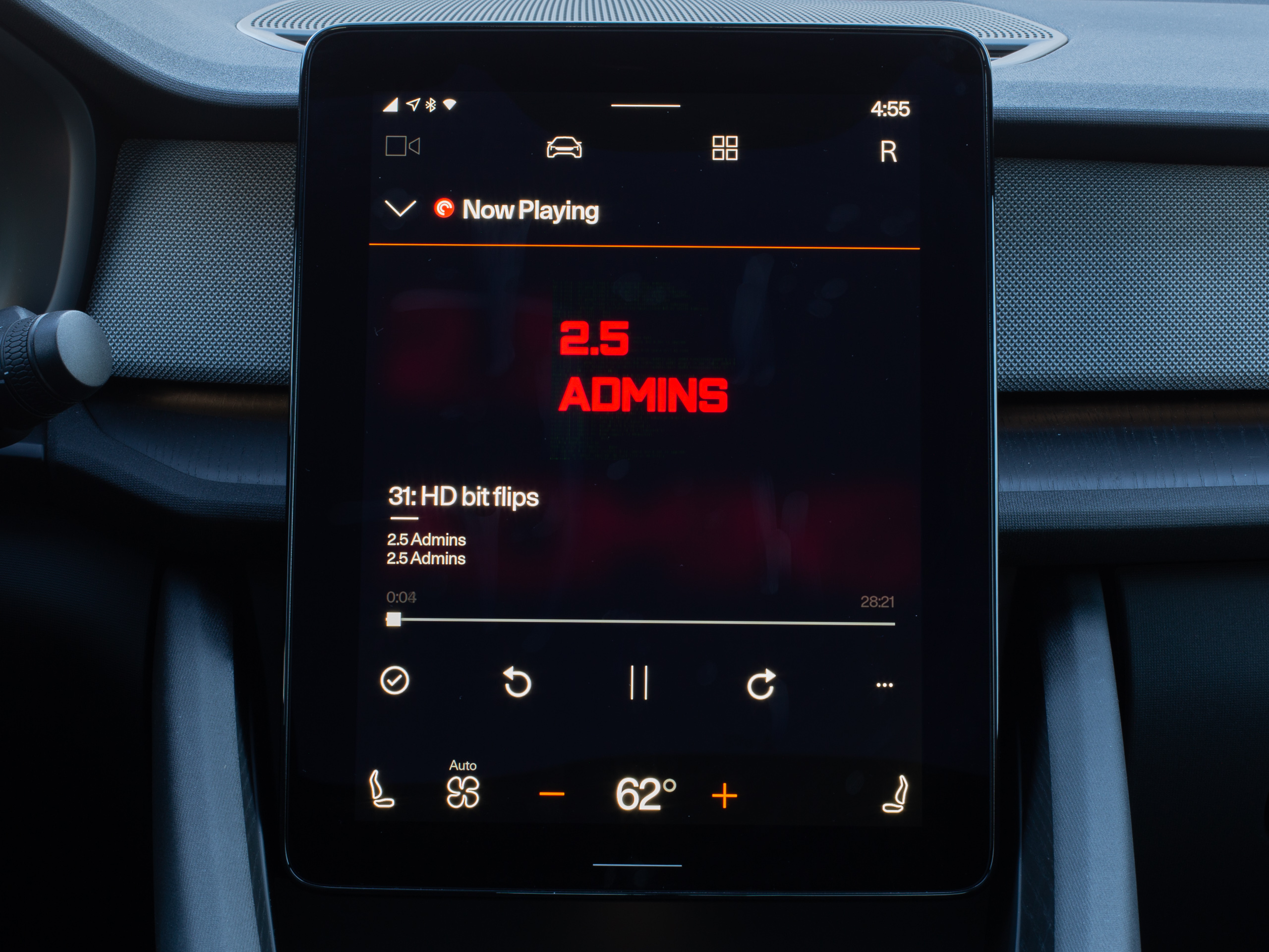 Listen to 2.5 Admins, Jim Salter's podcast.Ron Amadeo
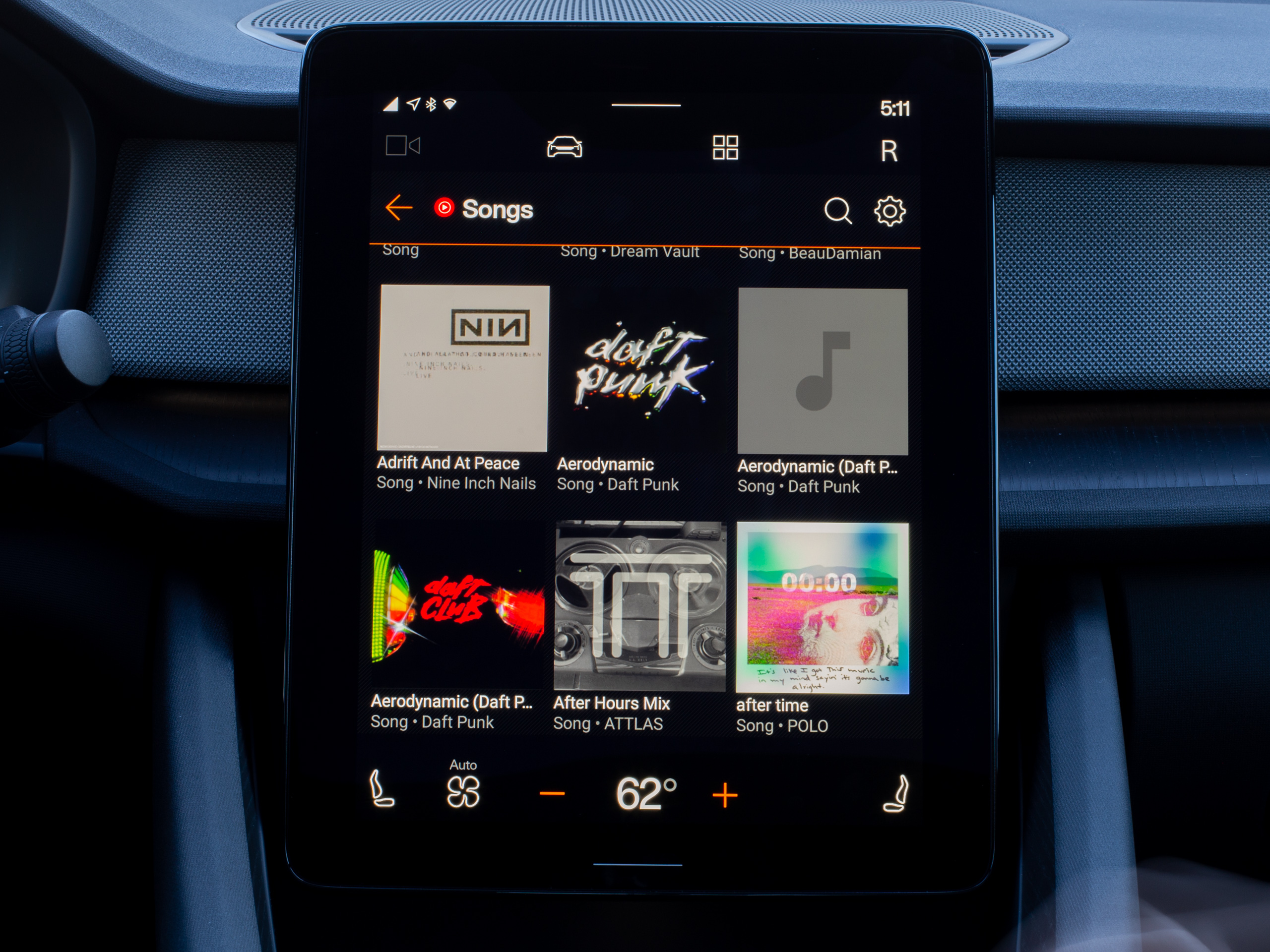 YouTube Music!Ron Amadeo
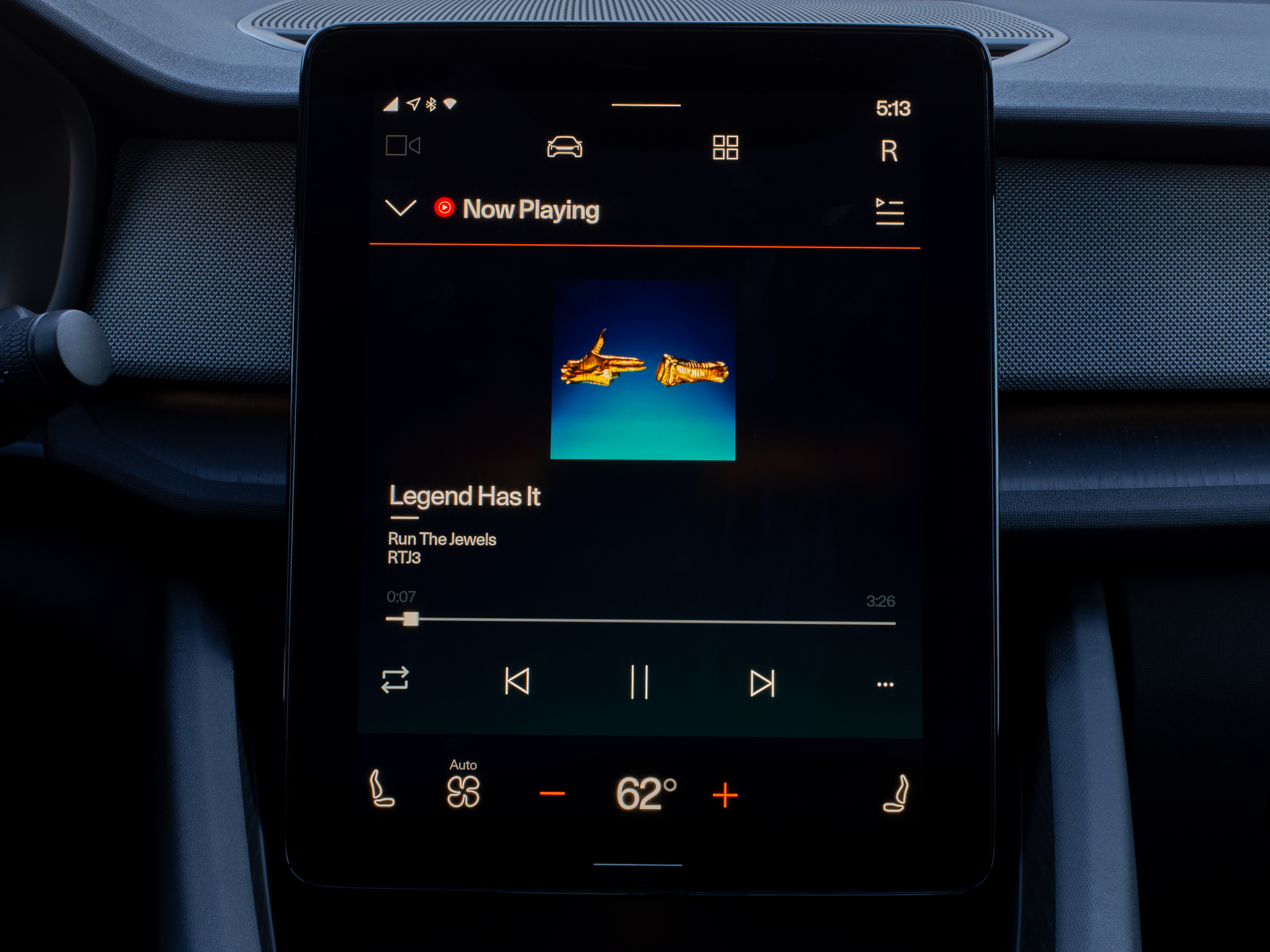 The YouTube Music now playing screen.Ron Amadeo
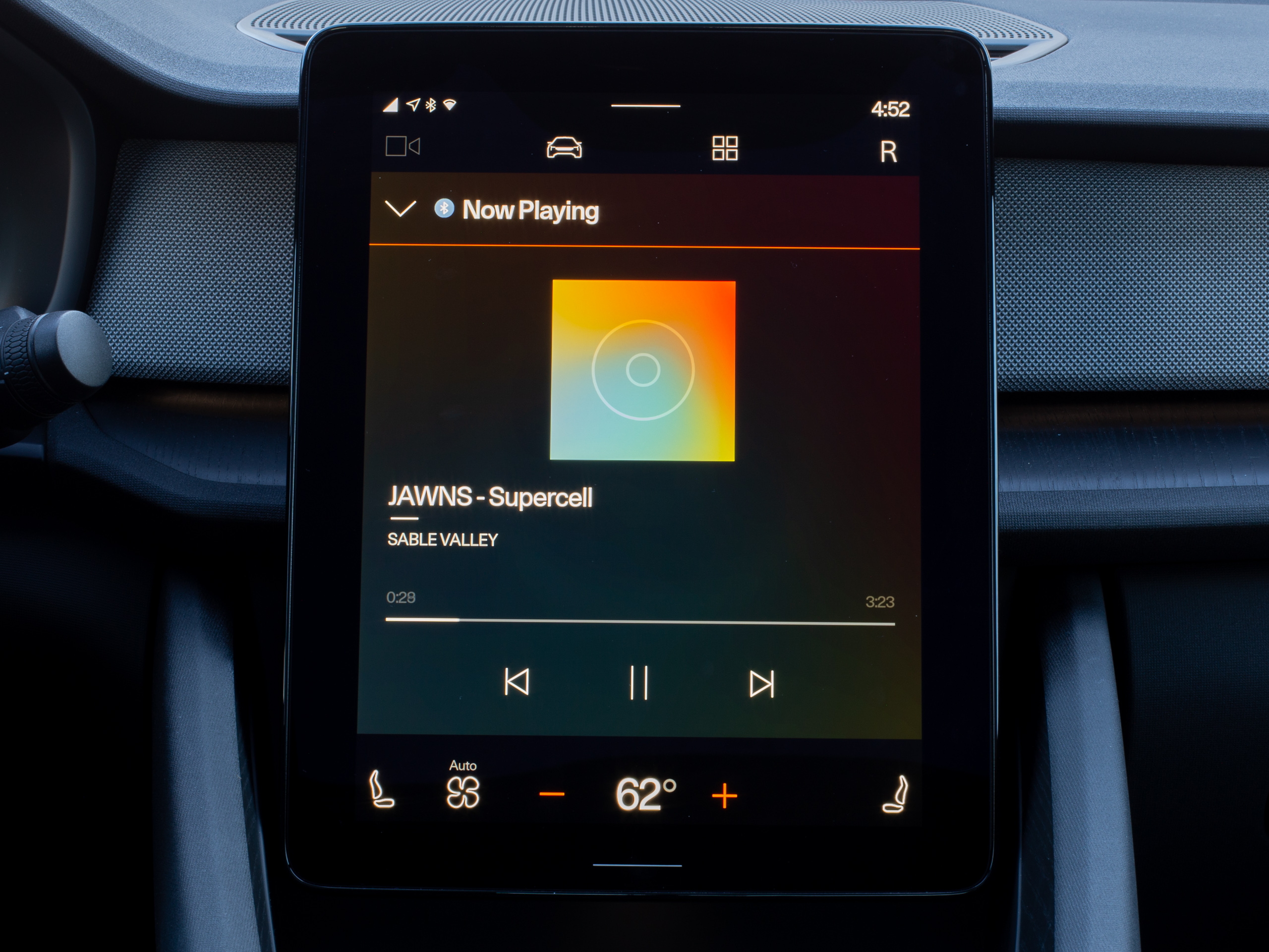 Phone Bluetooth is also a media app.Ron Amadeo
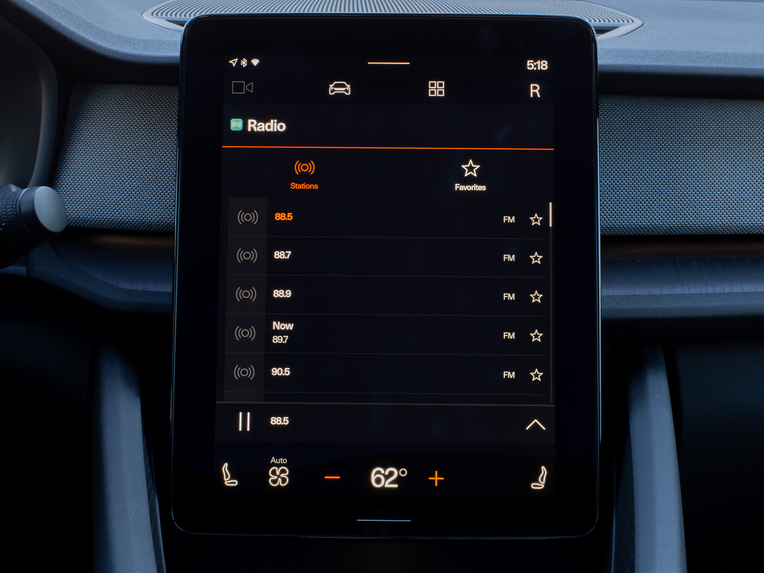 The radio.Ron Amadeo
Google is clearly working on getting the wider Phone Android Auto app selection working in cars. All the parts are here, they just don't work yet. For instance, there is a whole section in the docs about AAOS notifications and how, like on phone Android Auto, they'll be spoken to you and you'll be able to reply by voice. Any on-screen text will even be truncated, and like media apps, it seems like notifications need to fit into a certain layout in order to comply with various safety regulations. Again though, with no messaging apps, today any passenger or driver will basically never get a notification on AAOS.
The app ecosystem, even if it did get the full Android Auto app selection, leaves plenty to be desired. Right now, Google seems only focused on apps that are usable by the driver while the car is moving. That's a good first step, but car infotainment systems can handle more than that. Some systems, like Tesla's, are usable as more of a general-purpose computer while the car is stationary. Tesla even offers an "Arcade Mode" that lets you play games with the steering wheel, touchscreen, or a plugged-in controller. Just think of how many Android games you could play on this if Google allowed it. Also on the Android Automotive roadmap are rear displays for passenger entertainment, and you would want an app free-for-all for those devices.
Polestar took a baby-step toward stationary apps shortly after our time with the car, with the announcement of a "Video Player" app. This app has "channels" for videostreams Polestar was able to license, like BBC ideas and Aljazeera English. This feels like it will never have a great channel selection because Polestar is just a car company and not a major player in web video. If you really wanted a serious video solution, Google would open up Android Automotive to the Android video app ecosystem, so you could have apps like YouTube, Netflix, and Disney Plus. Polestar's video app is a start, but it's using locked-down functionality that only Polestar has access to as the owner of the OS.
When I say the Android Auto project phone apps and the Android Automotive apps are the same platform, I mean they are the same platform. The Play Store listings on AAOS are just the phone listings, but with car-centric screenshots swapped in. Until you wrap your mind around this, it's pretty confusing seeing things like 5 billion installs and millions of reviews for something like Google Maps when there is a grand total of one Android Automotive OS car in existence. This also means people don't really get to rate and review the individual car interfaces and limitations of these apps, since they will be drowned out by hordes of phone users. You also don't get relevant release notes for app updates.
The projected Android Auto apps live inside the phone APK, and since they are the same as AAOS apps, the AAOS app store actually downloads the full phone APK. Since app developers are just plugging in to an interface that already exists on AAOS, ~95 percent of that phone app code won't be used. On one hand this seems like a big waste of storage space, but on the other hand, it's also easier on developers.
The killer apps—Google Maps and the Google Assistant
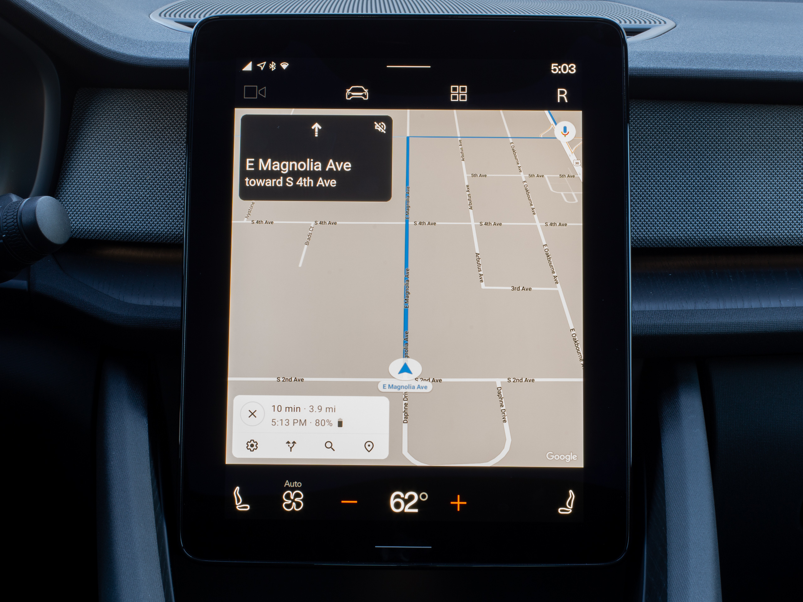 Google Maps! Some of your favorite features are here.Ron Amadeo
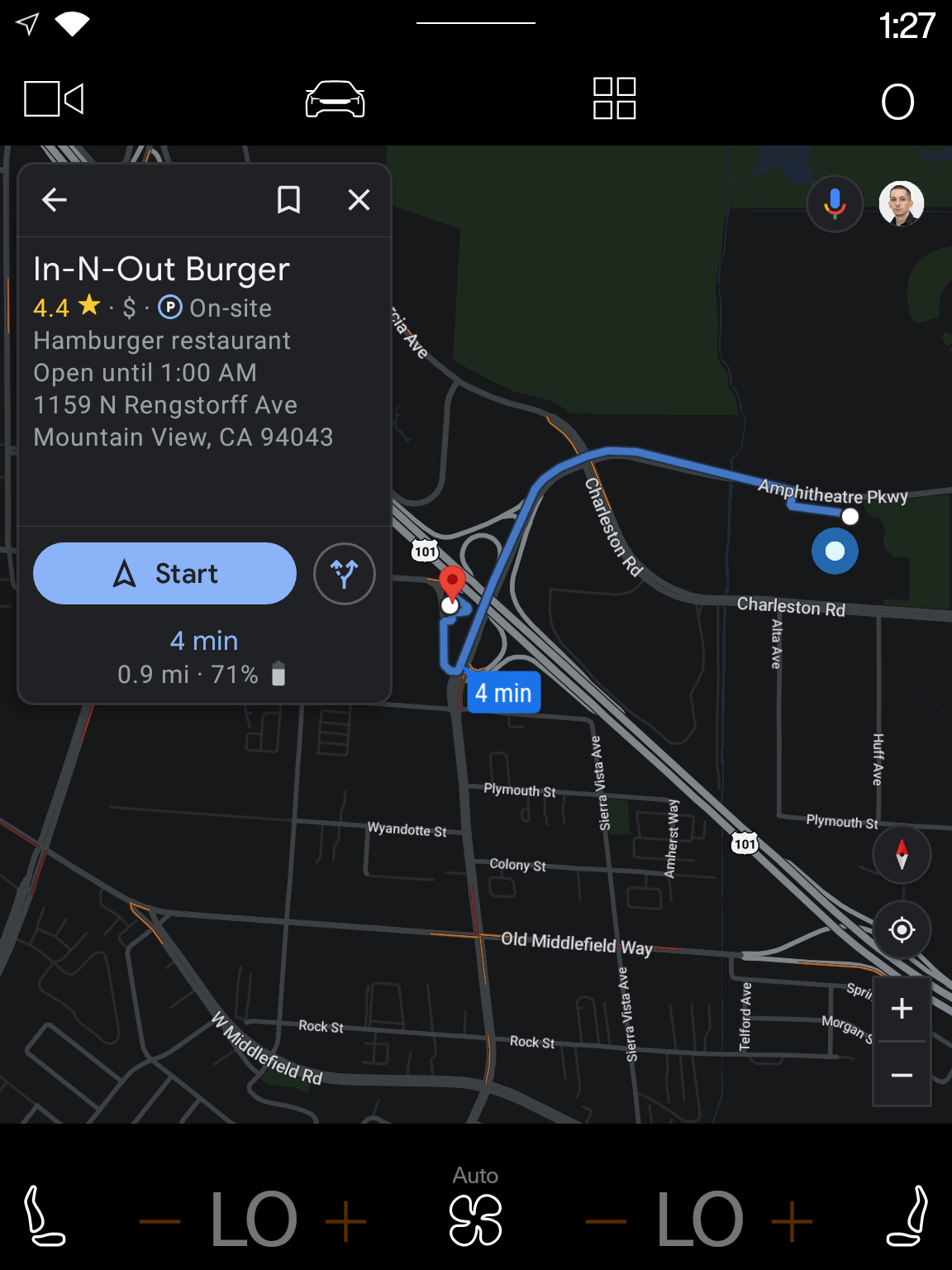 Night mode.
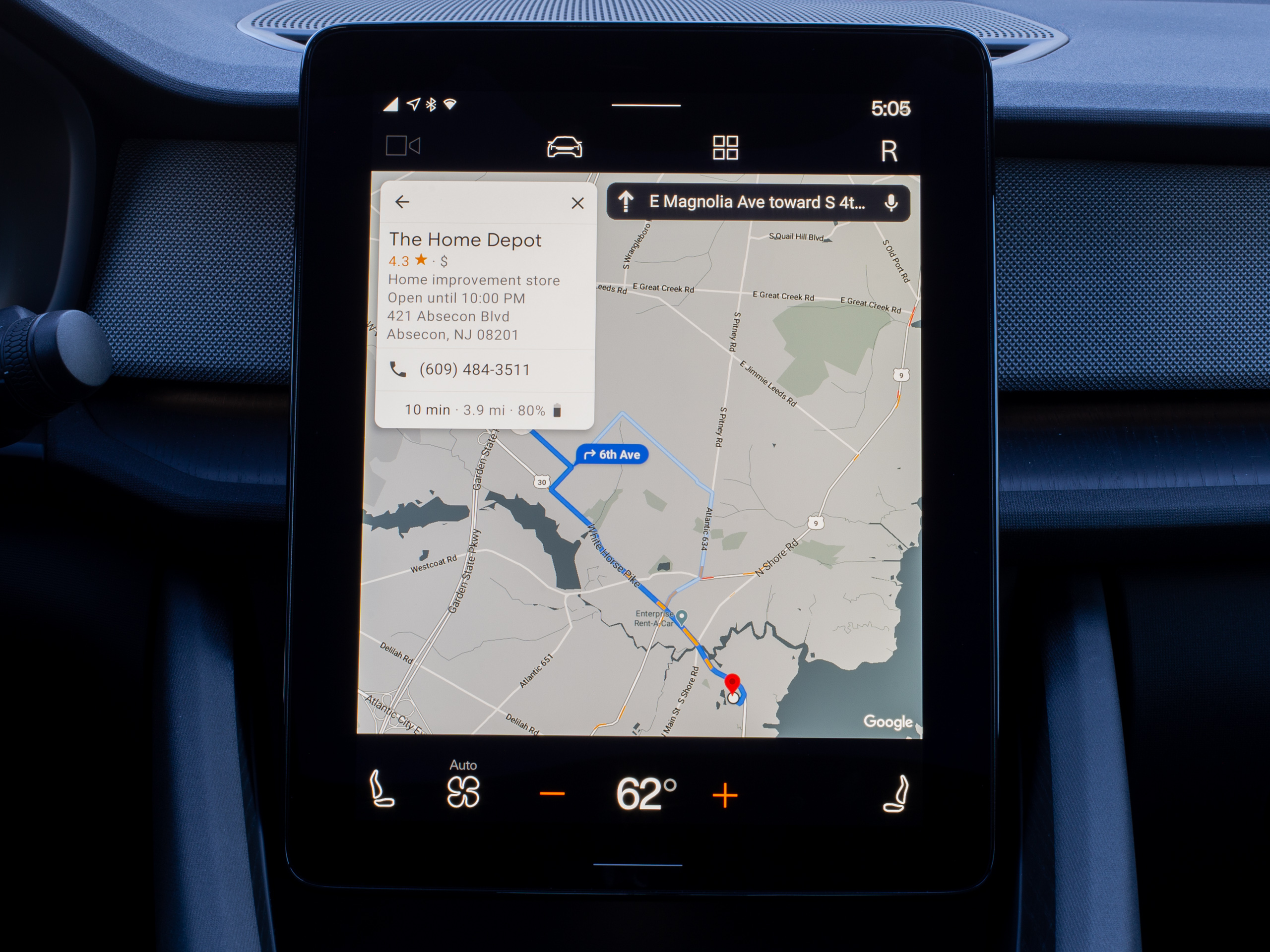 All the point-of-interest data is here: addresses, phone numbers, closing times, reviews, and more.Ron Amadeo
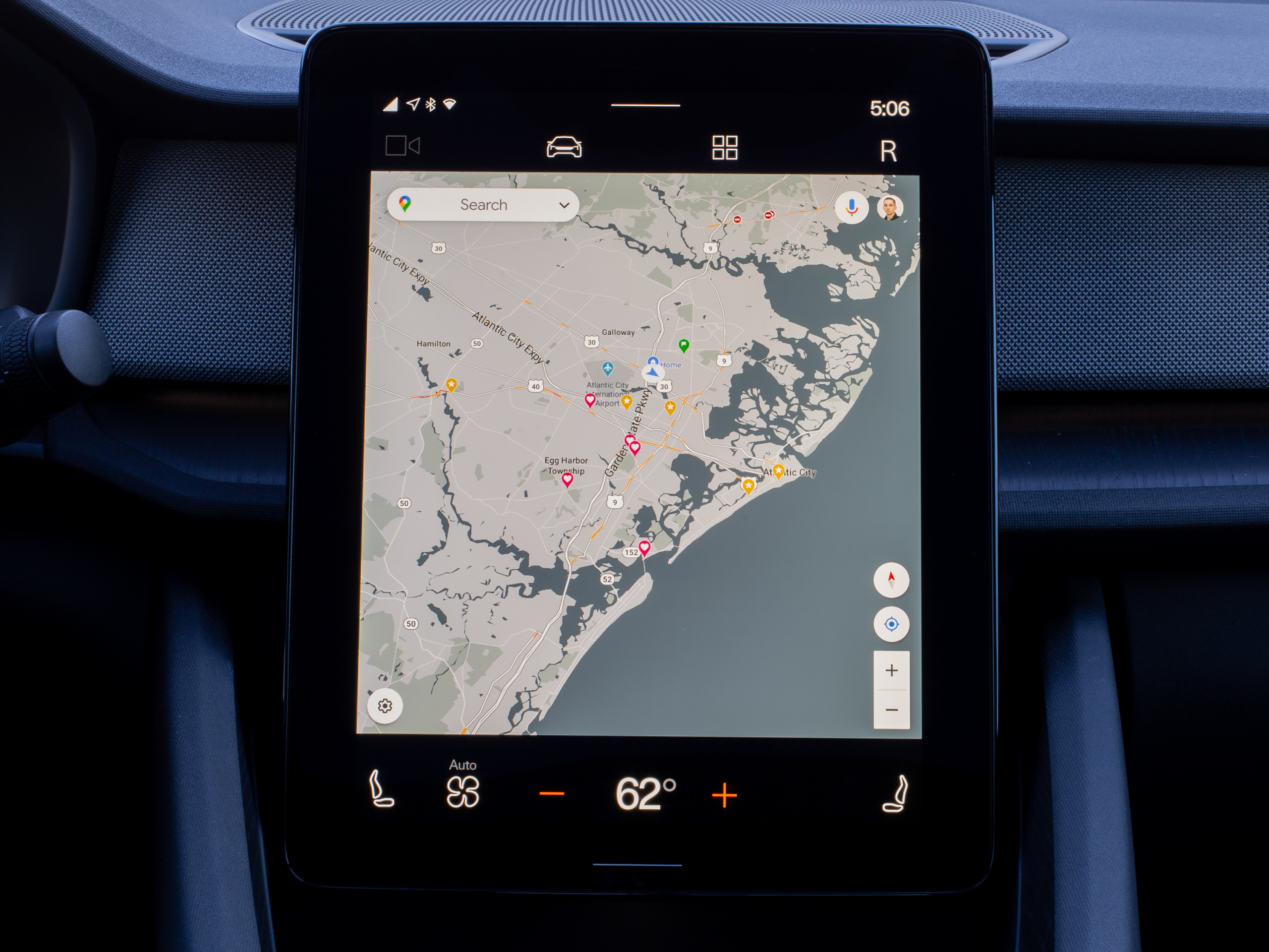 All your saved places from normal Google Maps will be brought over.Ron Amadeo
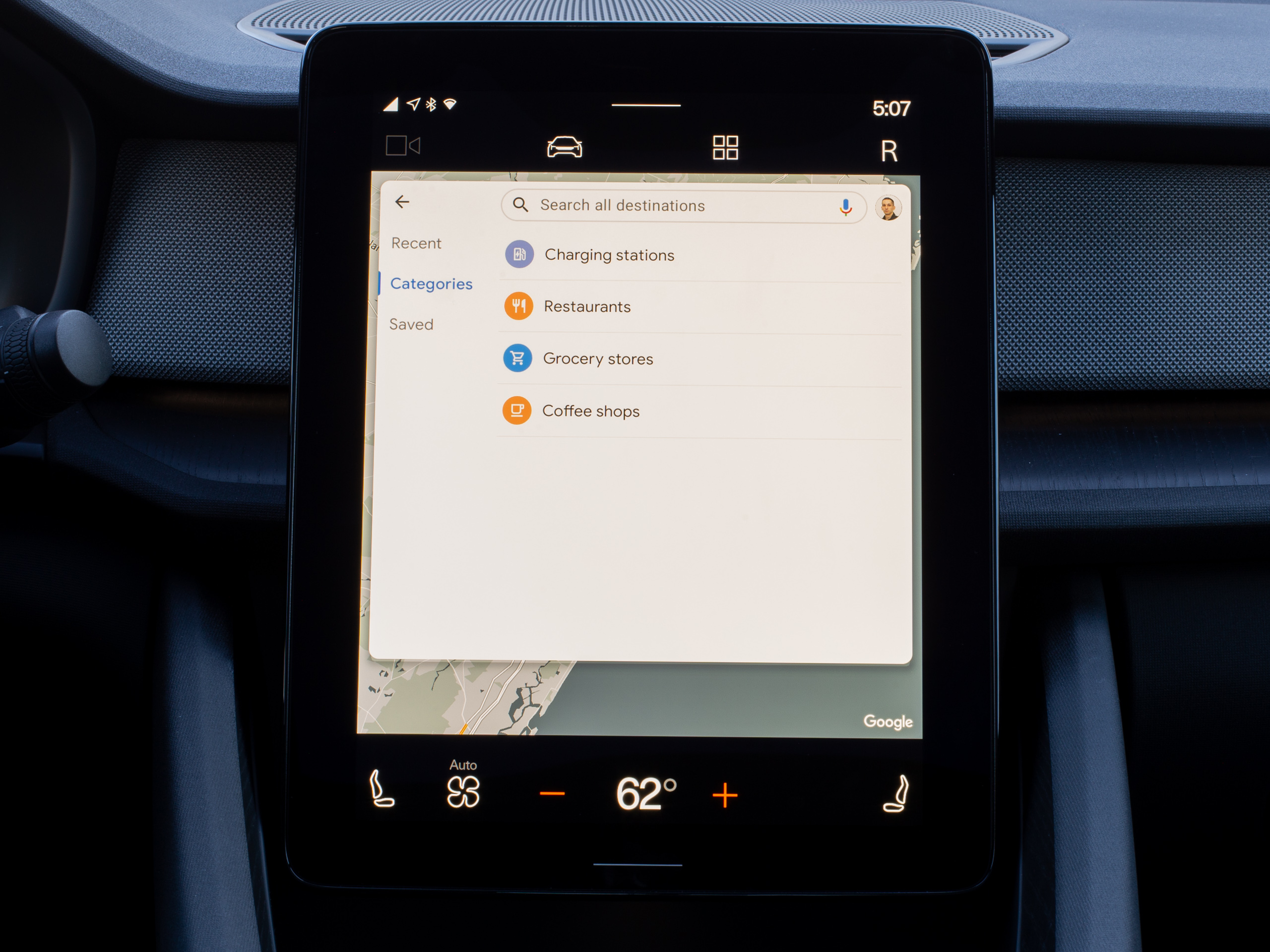 The search box shows recent searches, categories, and saved places.Ron Amadeo
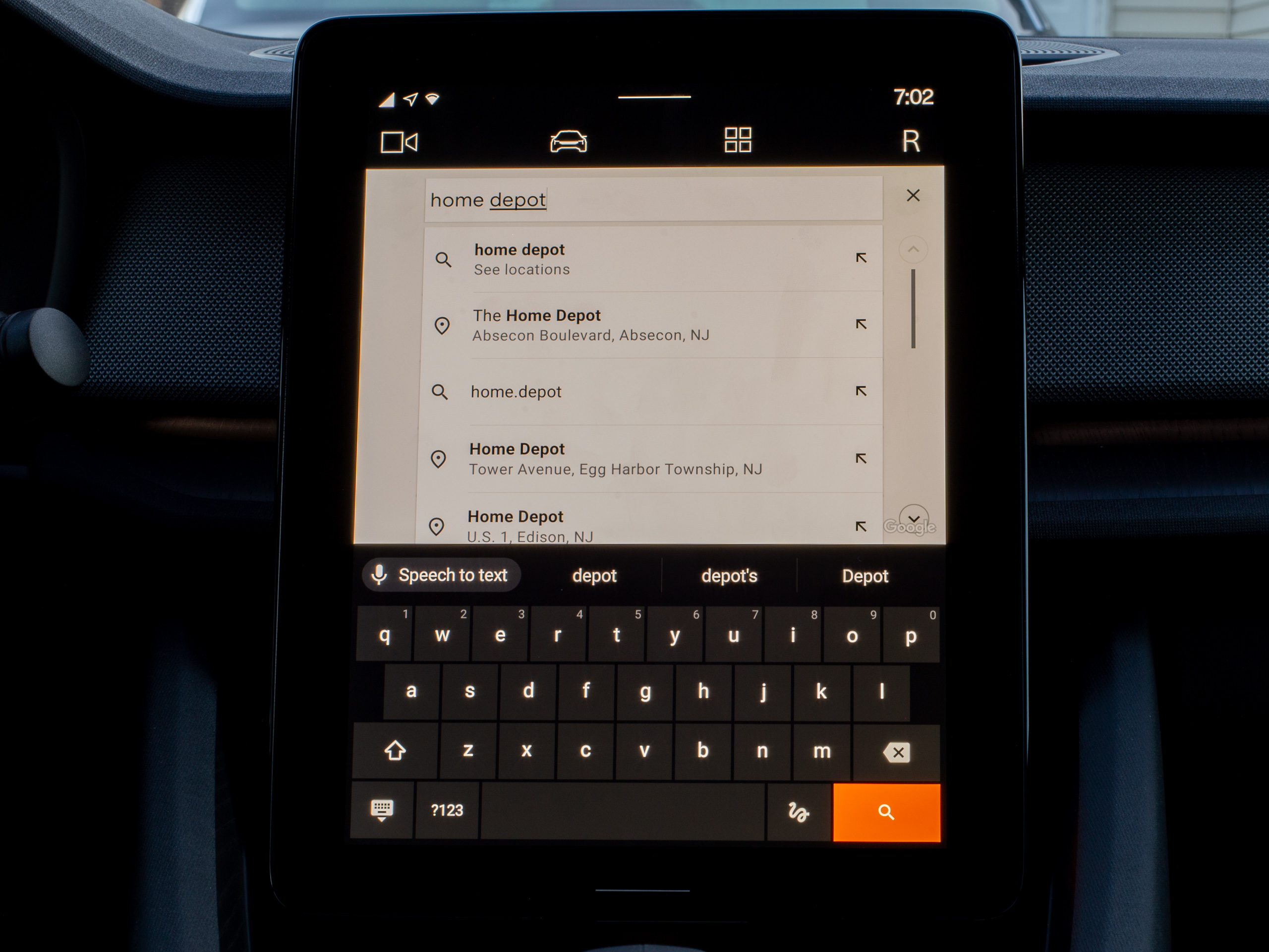 The QWERTY keyboard is also an option while parked.Ron Amadeo
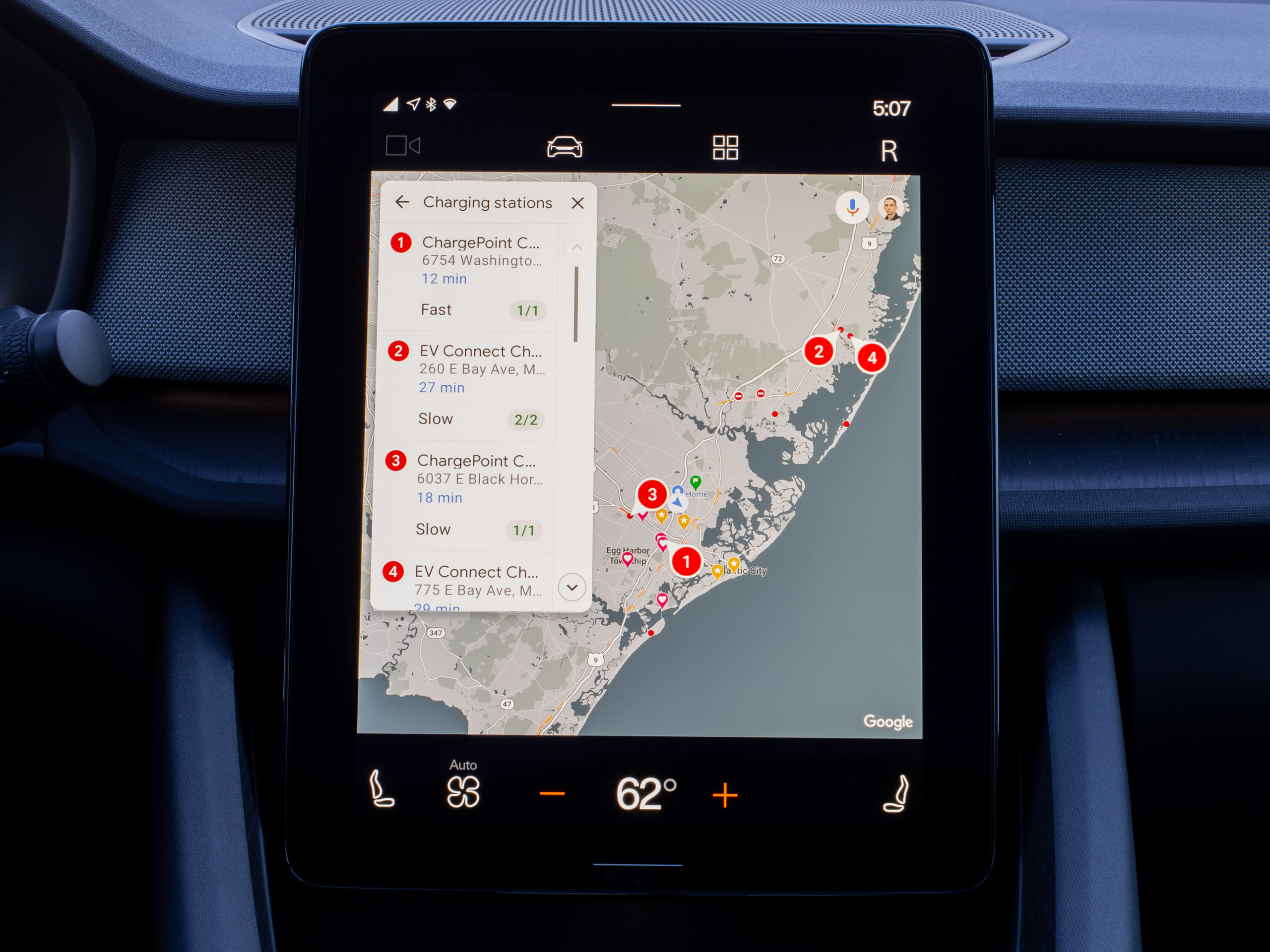 Charging stations all show which charger they use.Ron Amadeo
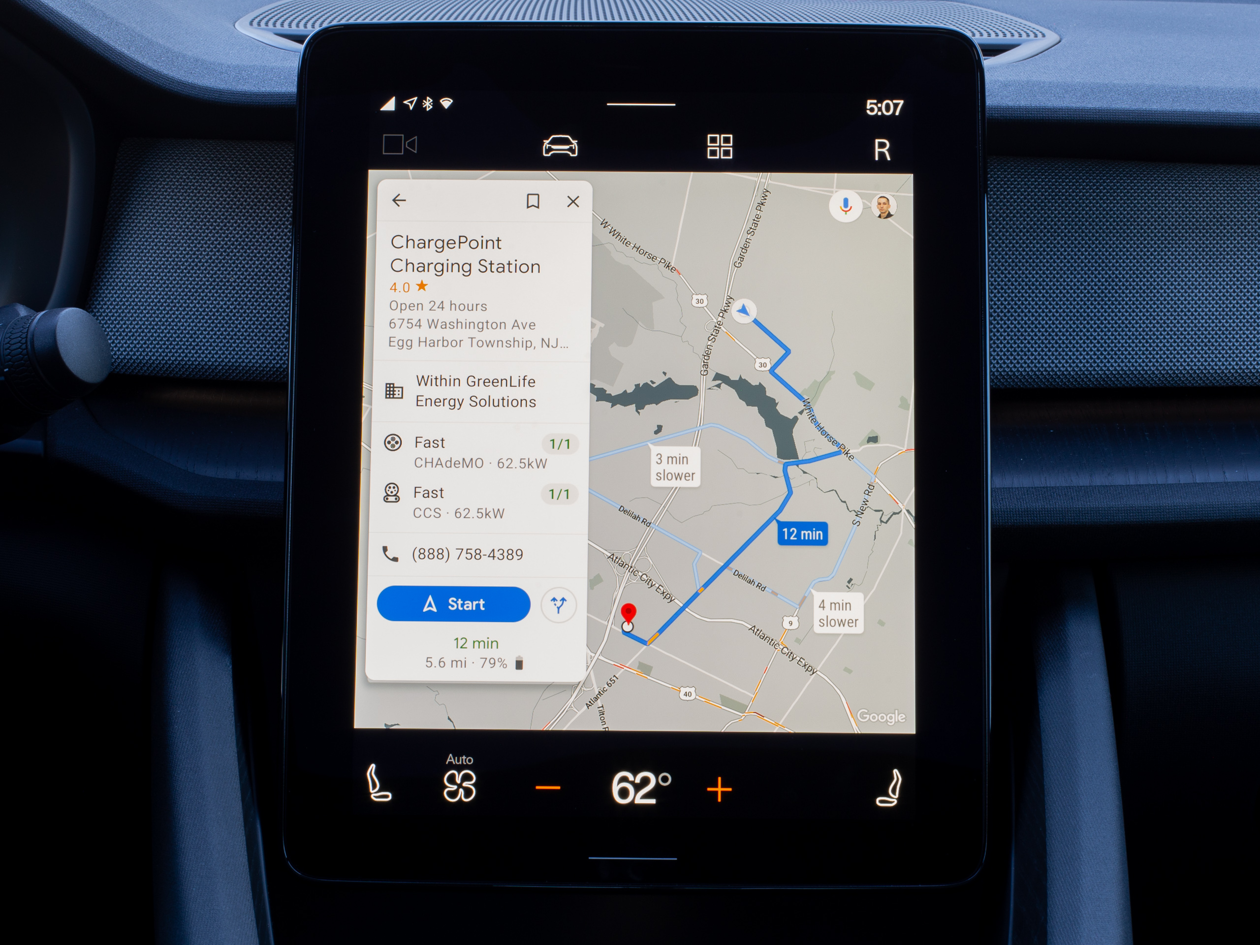 Let's go to this place!Ron Amadeo
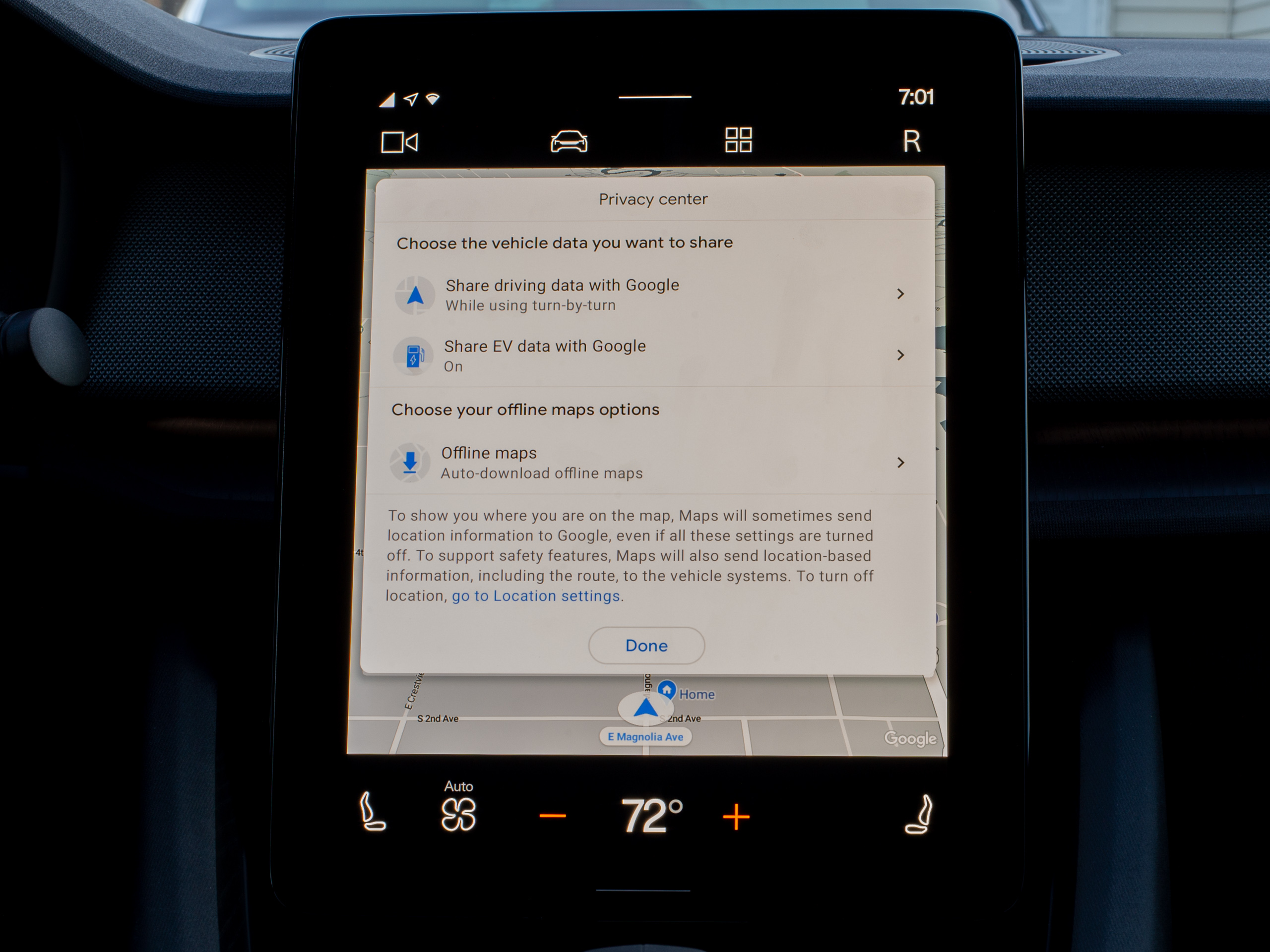 Do you want to share Google Maps data with Google?Ron Amadeo
The best features of Android Automotive OS are easily Google Maps and the Google Assistant, two features
most competing infotainment systems are trying to copy but almost never even get close. There are no imitators here—you're getting the real deal, albeit customized (sometimes bizarrely) for car use.
Google Maps has the road data, points of interest, phone numbers, and traffic data you'd get on your phone. Every search result and direction on the all-electric Polestar 2 includes a battery-usage estimate, too, which is nice, including a warning when Google Maps thinks you won't be able to make it. A link on the home screen searches for charging stations and includes "fast" (CHAdeMO and CSS) and "slow" ratings (J1772) for chargers. Tapping on a phone link will also jump right to your paired phone, so the whole setup is very well-integrated. If you're logged into the car, it will also pull down your Google Maps history, bookmarks, and labels.
You're not getting the full Google Maps feature set, though. There's no "layers" button, so satellite, terrain, and traffic views are all missing. You can't browse street-view imagery, which makes finding those hard-to-spot places before you start driving a challenge. There's also no way to read reviews, see place images, popular times, the menu, or any of that other extra stuff from Google Maps, which is a bummer considering you're sitting in front of a big tablet.
The biggest problem I have with Google Maps is the completely gutted search feature. One of the biggest strengths of Google Maps is the huge amount of point-of-interest addresses, phone numbers, and imagery, and despite the huge 11-inch display, Google Maps for Android Automotive OS just doesn't give you workable tools to dig through the Google Maps dataset. You are limited to nine search results, total, even while parked, and this completely breaks how Google Maps search works.
Google Maps on the web and on phones lets you type in your search, and it will show you results in your immediate area. If you can scroll the map, the search results will update, showing you your query in whatever area you're looking at. It's super handy and exists on nearly every Google Maps interface because it is a useful way to look for stuff. The nine-result limitation on AAOS means this doesn't work—you get the nine results in your immediate area, and scrolling the map view does nothing. You have to type in a new search in order to get more results.
Limiting the length of lists is a common safety technique in car interface design, but this limitation is in place even when you're parked. Android Automotive OS is designed to suspend the safety requirements while you're not moving, and despite being able to use completely "unsafe" things like the QWERTY keyboard while parked, Google Maps never gives you more than nine search results. Nine results are nowhere near enough for Google Maps, especially when the interface shortcuts encourage you to search for very vague terms like "restaurants." On a phone, the expectation from the "restaurants" search is that you'll scroll through pages and pages of results in the quest to answer "What are we going to eat tonight?" Despite the AAOS interface still pushing you toward searches like that, they are not viable on the car platform. You have to very carefully scope all your searches with specific keywords and location restrictions, all to work around the suffocating nine-result limit.
At one point with the Polestar 2, we were looking for that one pizza place that no one could remember, and the AAOS search interface was so limiting that I ended up just pulling out my phone. With no search result limit, I quickly found what we were looking for, and that is embarrassing for AAOS Google Maps. By all means, be as safe as you want when the car is rolling, but in park, AAOS powered by an 11-inch screen and desktop-class computer should be a powerful computing tool. It shouldn't be worse than my phone.
List-length concerns are also a problem with media apps. You won't be able to browse big song collections, even in park. In YouTube Music, I was only able to hit the "B" section of my alphabetical song list before the system stopped me.
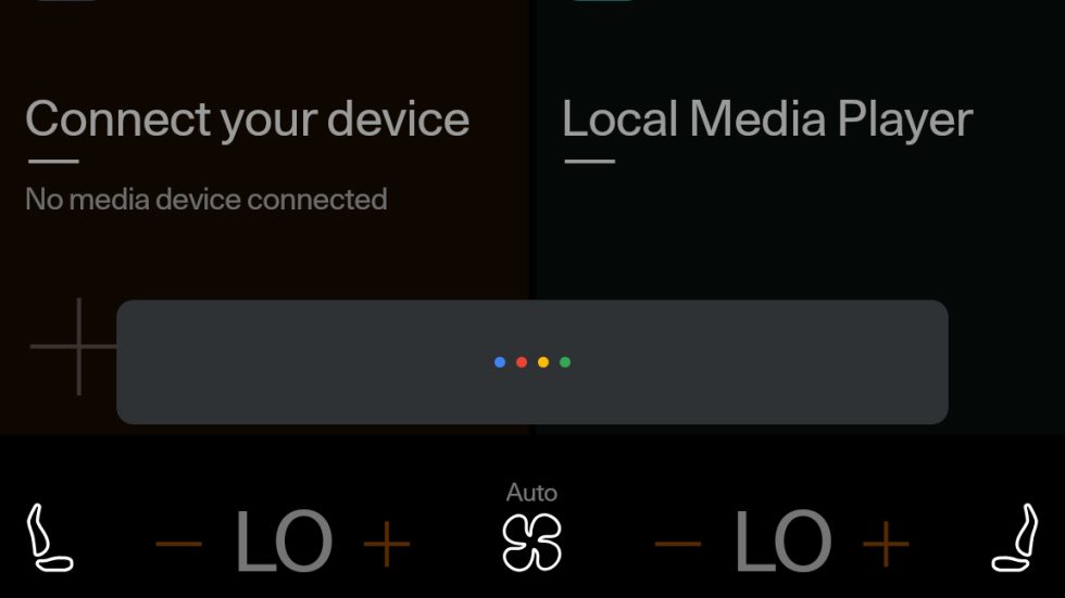
The Google Assistant is amazing. The "OK Google/Hey Google" hotword works just like it does on a phone or Nest Audio/Google Home speaker, and shouting commands at the car was just as easy as shouting at home. Just like on a speaker, the Assistant works fine while music is playing, too. Dedicated "Start listening" buttons are located on the steering wheel and the touch screen.
Again, a lot of imitators are out there, but having the real deal in a car is something else. The Google Assistant can do all the same stuff it does on a phone or speaker but in a car. This means it can answer all sorts of general knowledge questions (it's great to ask, "Hey Google, what's the 0-60 time of a Polestar 2?" and then floor it), along with the weather, sports scores, the times businesses open and close, math, and a million other things. It's also great for commands to the AAOS system, like "Navigate to [business name]" or "Call [contact/business name]."
The Google Assistant also has a ton of control over the car features. Especially for my purposes, when I'm in a new car for just a few days and don't know where any of the buttons are, shouting "Hey Google, turn on the defrost" is handy. The Assistant could be a little better at context, though. I once asked it to "turn on the lights" because it was dark in the car and I wanted the dome lights on, and after Google responded in the affirmative, nothing obvious happened. I came home to find my house lights were on.
Under the hood with Android Automotive
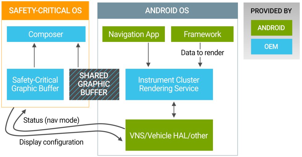
Google's motto for Android Automotive (actually said by one of the engineers in the Android Automotive Bootcamp) is, "We don't do safety-critical things inside Android." AAOS is here purely for "infotainment" and nothing else—the air con, maps, music, and other fun stuff. You could shut the system off completely and the car should still work fine. To that end, cars with a dashboard "cluster" display like the Polestar 2 use Android for the central display but not the display behind the steering wheel. Having your speedometer crash or lag would be bad, so that usually runs a much simpler real-time OS.
As Google's graphic above details, running a separate operating system doesn't mean the dashboard can't show data from Android. AAOS and the dashboard OS share a graphic buffer, so while the "safety-critical graphic buffer" would handle things like the speedometer, the "shared graphic buffer" can house things like a live feed of Google Maps or media info. The composer can mash the two images together, and you get a safety OS speedometer and a Google Maps overlay from two different sources.
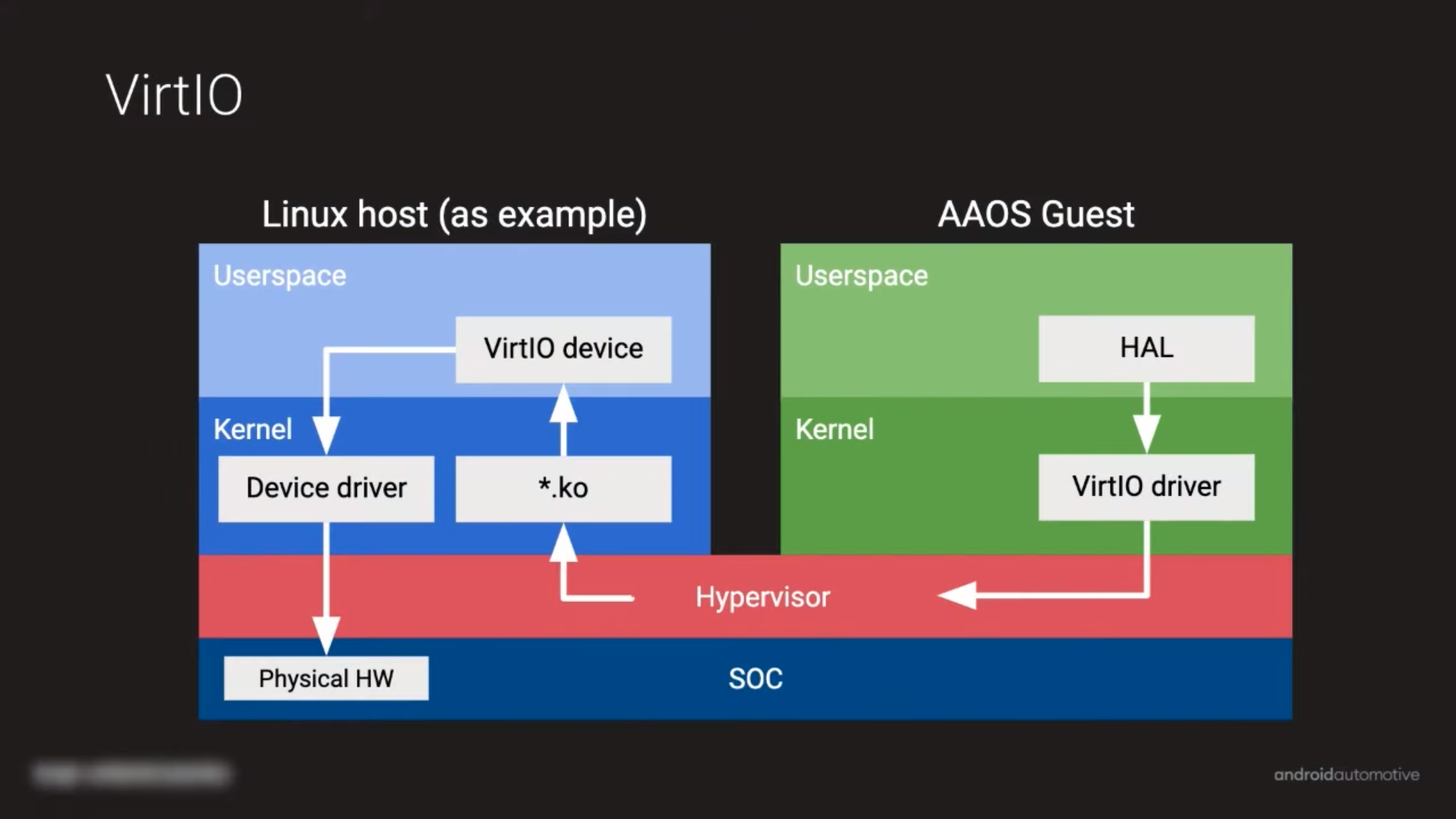 The two OSes are virtualized and run on the single Atom computer.
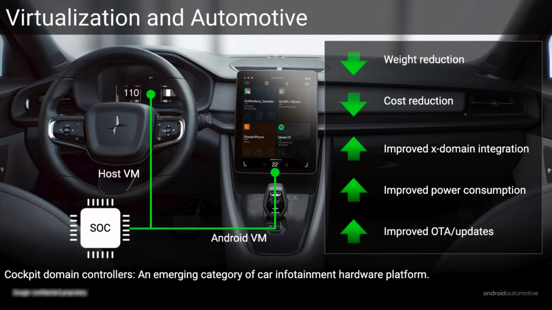 This graphic calls the dashboard OS the "host."
You might assume two different operating systems means two different computers, but it does not! Both OSes run as virtual machines on the single SoC. Google's AAOS setup uses VirtIO, a virtualization driver standard that lets guest OSes know they are running in a VM, allowing them to communicate with the host OS for things like that Google Maps overlay. Google's diagram, which uses the Polestar 2 as an example, calls the safety-focused cockpit OS the "Host VM," while Android Automotive is the guest OS.
Garage mode and power management
An Android phone takes upwards of 30 seconds to boot. That would be agony for a car computer, so I wanted to pay special attention to the Polestar 2 boot time. The problem is, Android does not boot when you turn the Polestar 2 on, because it never really turns off. When you shut off the car, Android does suspend-to-RAM. Just like the sleep mode on a good laptop computer, the computer never fully loses power. Instead, it drips just enough power to the RAM to keep it powered up and holding data. When you open up the car door, Android instantly—and I mean instantly—turns on. It's almost as fast as the dome light. This is an option that probably wouldn't work for a gas car, but it's a great option for an electric vehicle with a giant battery.
Even if your version of Android Automotive does have to shut off, Google has some tricks to start up faster. First, the important things you'd want to use as soon as you get in the car, like the rearview camera and audio, are prioritized in the boot process. The rearview camera is actually handled by the kernel, and Google says it can be ready "before Android boots." Android Automotive will also resume application states for things like music and maps after a power cycle. And again, all sorts of other power tricks are at work, like specifically connecting the "power on" message to opening the door handle, so that Android starts booting as quickly as possible. And in an electric car, the only time you will see the Android boot process is if you factory-reset the car. Android just never completely turns off.
Android phones have this concept of "idleness" with the JobScheduler API, Android's background-process traffic cop. Basically, a great way to save phone battery is to just not do unnecessary work while running on the battery. Instead, wait until the phone is plugged in, and it has unlimited power. So typically, when the phone is plugged in and charging overnight, Android decides now is a great time to do background work, and it downloads app and OS updates, lets apps upload telemetry and other data, and even fires up the Android runtime system to compile and optimize frequently used app code. In a car, power is not a concern when you're running on gasoline or on a battery that takes up the entire floor, but performance is a concern. In the same way, idle work happens in the new "Garage Mode."
If you only followed the obvious power-cycling of the car, there would be no idle time at all, since the only time the car is on is when you're driving it. Android Automotive would only be able to do unimportant background tasks while you're trying to use the car, and that would slow everything down and disrupt the user. In the case of an app update, Android Automotive would shut off and restart apps while you're using them. In the case of an OS update, it would shut down the whole system while you're trying to use it. So Garage Mode allows the car to just wake up on its own from sleep mode, execute any idle tasks it needs to do, and then go back to sleep. I actually caught the car doing this once on my network logs: it jumped on the network at 2 am, downloaded something like 30 megabytes of stuff, and went back to sleep.
Android's phone-charging-idleness scheme maps very well to an electric car, but the docs don't mention anything about what happens when you're powered by gas. Would the computer run off the starter battery? Is that a good idea?
RROs, the future of Android OEM customization?
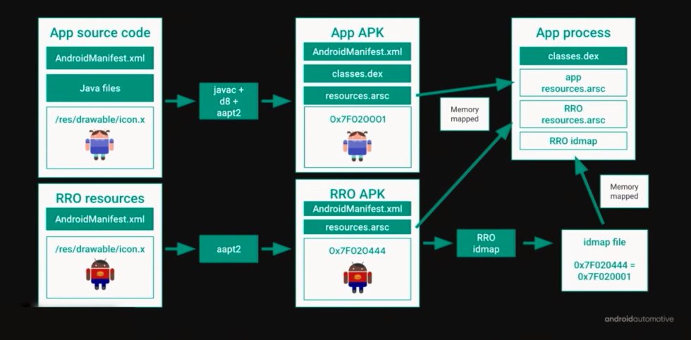
The skinning process OEMs go through seems to be much different from regular Android—more specifically, it feels like a next-generation skinning process that Google would probably like to move over to phone Android, if it could ever get away with that. Over in smartphone land, OEMs skin the OS by forking the source code and adding their own customizations. This gives OEMs full control over everything, but it also enables Android's infamous fragmentation issues and makes updates harder. In Automotive land, Google is trying to put the source code genie back in the bottle, and the company is pushing car manufacturers to use Runtime Resource Overlays (RROs) instead. The RRO system has been in Android for a while, and most OEMs hijack it to enable a theme store on top of their Android skin. On Android Automotive, RRO has become the primary preferred method of device customization.
Just like it says on the tin, Runtime Resource Overlays lets apps swap out their existing Android app "resources"—their icons, images, layouts, colors, fonts, and text strings—at runtime, which can result in an app that looks totally different. The way this works is that there's the regular stock Android APK (APKs are Android's app file format) and an extra RRO APK containing customized colors and icons and everything else that gets applied to the stock APK at runtime.
Google designed the entire car interface with the expectation that it would be heavily customized through the RRO system, and it's even reworking core parts of Android to be more accepting of this kind of styling. Google has a system that allows multiple brands to use the same build of AAOS with multiple sets of RRO packages, so a company like GM can flip a few switches and turn a Chevy infotainment system into a Cadillac one with different branding and styling but the same underlying code. (This is basically the way GM car development works!)
Time will tell how popular this approach becomes, but with our sample size of "one," Volvo appears to have leaned heavily into RRO skinning for the Polestar 2. I counted at least 30 RRO files shipping in the car. Obviously, if car manufacturers can do all the customization they want without touching the underlying Android code, it would be a huge win for updatability. No one will have to fork Android into their own customized codebase.
Flash wear management
Car computers need to last much longer than the one- to five-year life cycle of a phone. The problem with this is that the flash memory these cars all run off has a finite life cycle, and every write takes that memory closer to death. Tesla is actually already running into problems with flash-memory life cycles, and the company had to recall cars with flash memory that died an early death due to excessive logging.
Google has a whole page up on "Flash Wear Management in Android Automotive" detailing how the company wants to keep AAOS running for as long as possible. Flash memory comes out of the box with "wear leveling," a data-writing algorithm that tries to use the flash memory evenly across every block (since always writing to the first open block, sequentially, would result in the early blocks of memory wearing out quicker). Google's first plan is to just game the system and ship with really big amounts of storage so the wear-leveling algorithm has more to work with.The Polestar 2 follows this advice and ships with a whopping 128GB of storage, with something like 92GB free at ship time. That's probably way too much storage for an OS that can't play arbitrary videos, can't download random stuff from the Internet, and can't scroll through big lists of content due to safety concerns (more on that annoyance later). What 128GB does let you do is ride that wear-leveling algorithm for a longer period of time. Tesla's dead flash chips were 8GB.
With Automotive in mind, Android 8.0 Oreo added support for Linux's "storaged," a daemon that collects storage metrics. (As a Linux daemon, this would be pronounced "storage dee," not like a made-up word that means the past-tense of "storage.") Storaged lets OEMs, Google, and developers track which apps are writing to flash. Then, by making sure each write is absolutely necessary, you can prolong the life of the car storage.
The other option Google suggests is—get this—removable storage. You don't actually have to weld a flash chip to the motherboard, where it can never be replaced. If you just make the storage a separate component, when it wears out, you can just throw it in the garbage! Google's suggestion for this is to include a removable SD card, which, using Android's excellent "adoptable" storage feature, can be formatted, encrypted, and merged into the primary pool of internal storage. Google's docs say that SD cards must be in a "safe" location and that "users are not expected to remove the SD card frequently."
It's kind of sad Google is only suggesting an SD card, though, as that still seems strangely focused on Android's mobile, phone-based roots. The Playstation 5 is normalizing consumer-installed NVME drives even in appliance-style devices like a game console, and I think that would be a more appropriate option for cars given that space isn't at a premium. (After all, all the other Polestar 2 parts are PC parts.) Like with all car integrations of technology, I'm sure they'll get there in five years.
Android, but not enough Android
Many times while using Android Automotive OS, I appreciated the familiar Android features that were there—but I often wished there was more Android. Being based on Android 10 means Android Automotive gets all of this great Android stuff for free, but a whole lot of it is disabled or missing for various unclear reasons.
First off, the big shocker for me—and a complete deal breaker for Android Automotive—was the complete lack of a split-screen mode. The Polestar 2 has an 11-inch touchscreen, and it can't show maps and music at the same time. That is inexcusable. Android Auto, the projected car interface that runs on your smartphone, has split-screen support, and that's on much smaller displays than the Polestar's giant 11-inch tablet. Why is this option missing from the full OS? The complete lack of multitasking made AAOS feel shockingly limited and made it kind of a pain to use. It felt like a complete waste of Android and of the luxurious touchscreen. At times I longed for my usual split-screen smartphone setup, just so I could see and control everything at once.
I'm not sure if this is a Polestar limitation or not. Again, we're dealing with an actual car sample size of one for now. The Android Automotive emulator, in unskinned Google mode, seems to use a split-screen mode as the "home" screen. I can get the full version of Google Maps on one side of the screen and a music player on the other side. It sort of seems like the Polestar 2 home screen is a watered-down version of this idea, with four quadrants for Maps, Assistant, Phone, and media apps, but the quadrants aren't especially functional. The Maps section on the home screen never shows a map. It lets you cancel the current navigation and jump to food or charger listings—that's it. The Phone quadrant is just some icons linking to contacts and the call log.
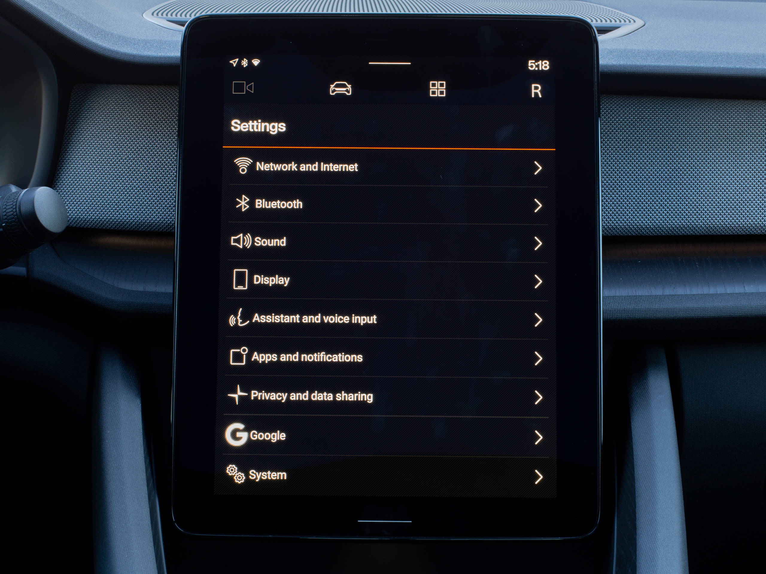 The main settings page. It's a lot like phone Android but stripped down.Ron Amadeo
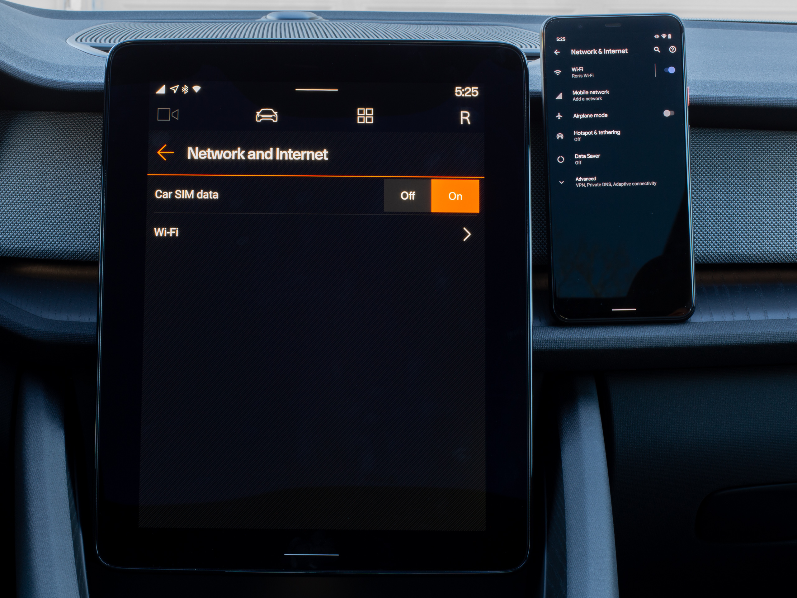 The network page is missing all the data usage and metered connection settings, along with the hotspot capability.Ron Amadeo
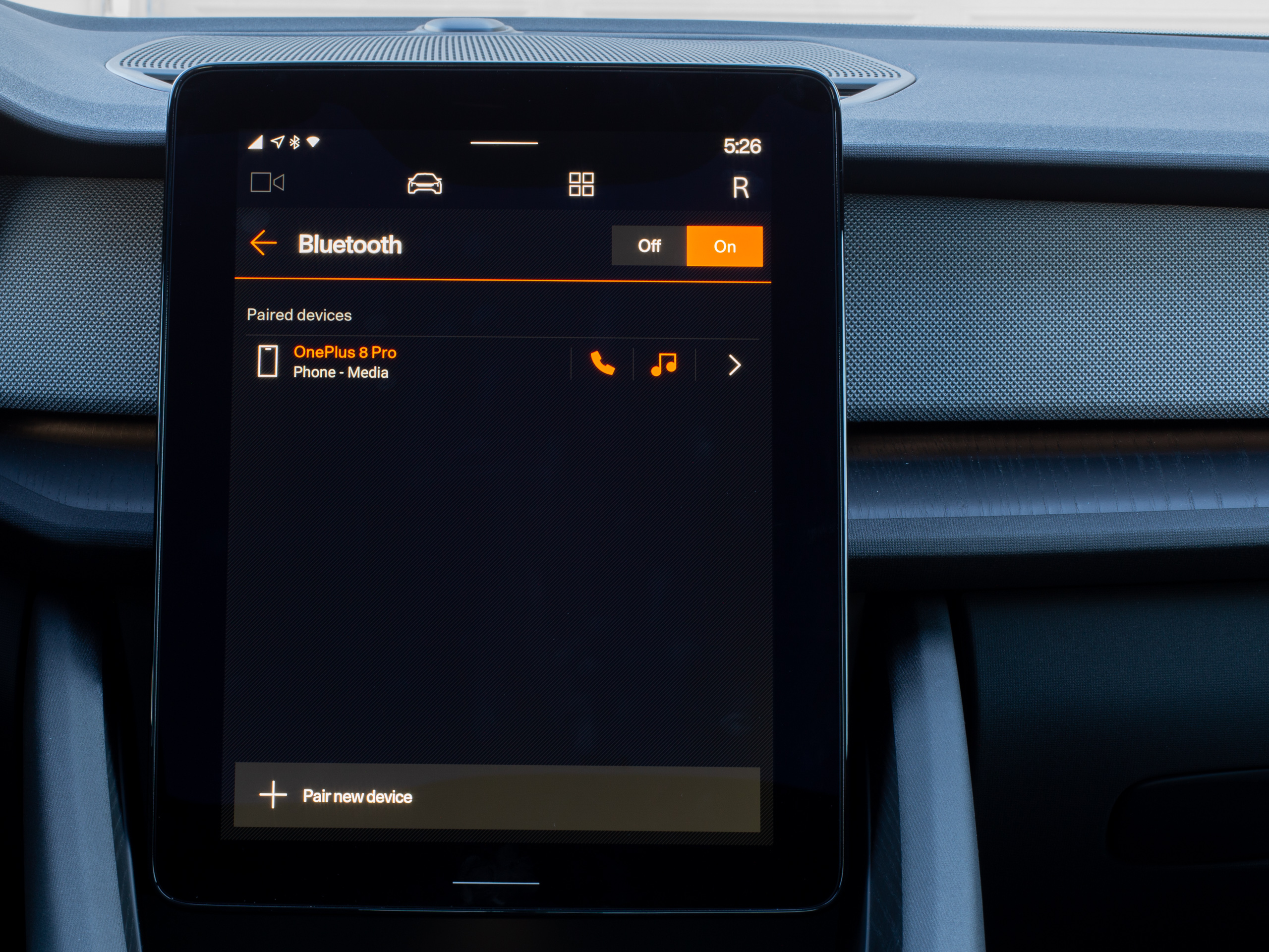 Bluetooth is also very basic.Ron Amadeo
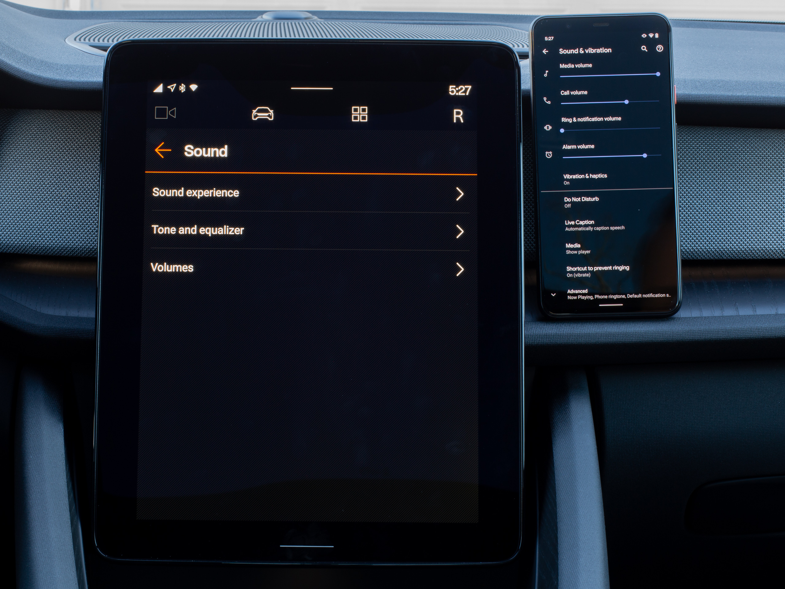 Sound! You can't pick ringtones.Ron Amadeo
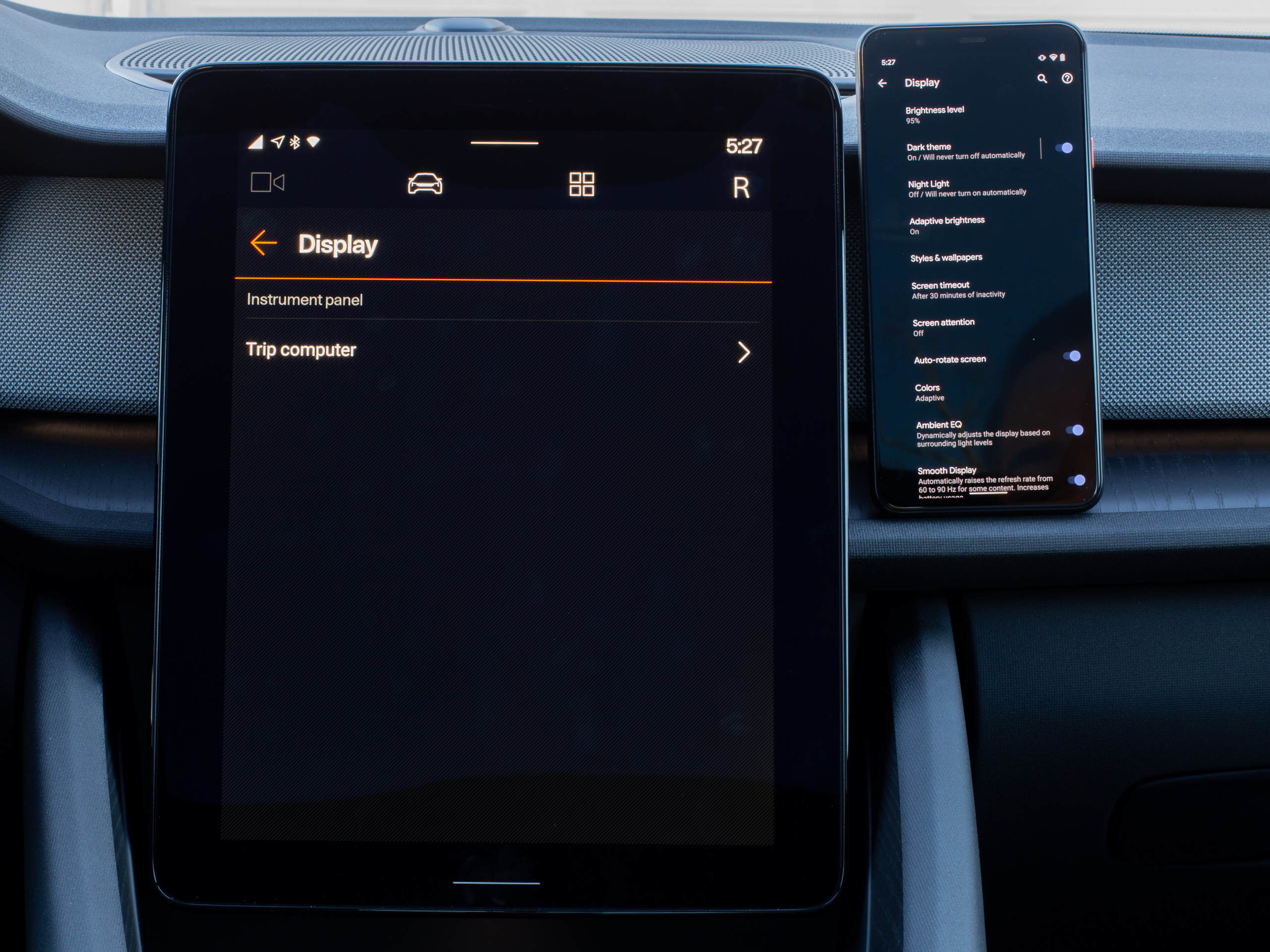 Display also has next to nothing. It would be nice to change brightness or toggle night mode for apps.Ron Amadeo
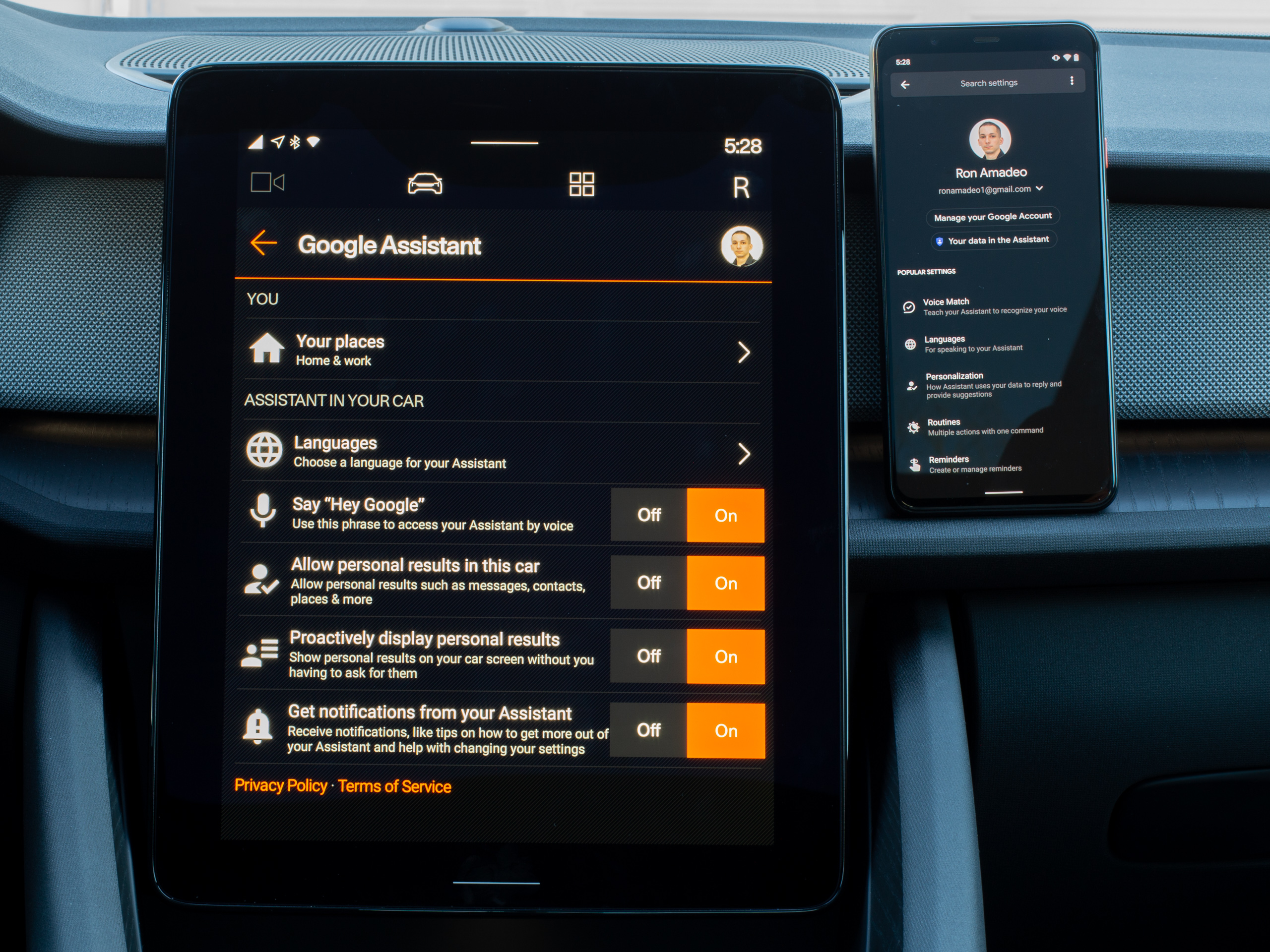 The Google Assistant is the same as a phone.Ron Amadeo
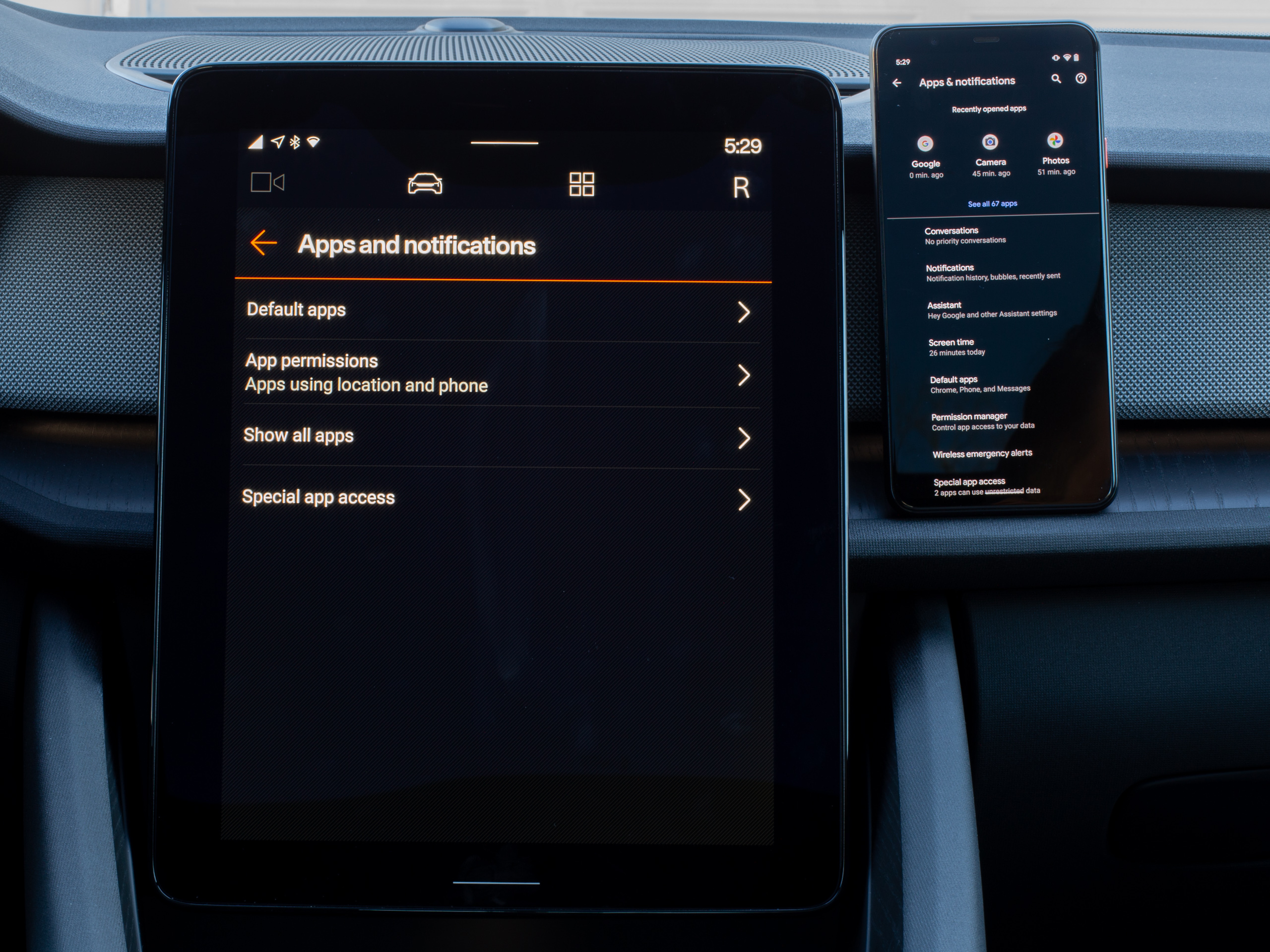 Apps and notifications are also pretty similar.Ron Amadeo
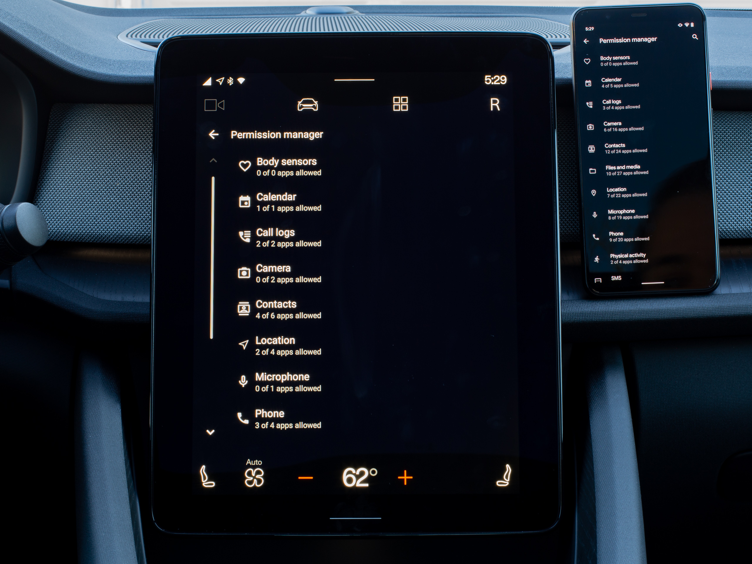 Permissions.Ron Amadeo
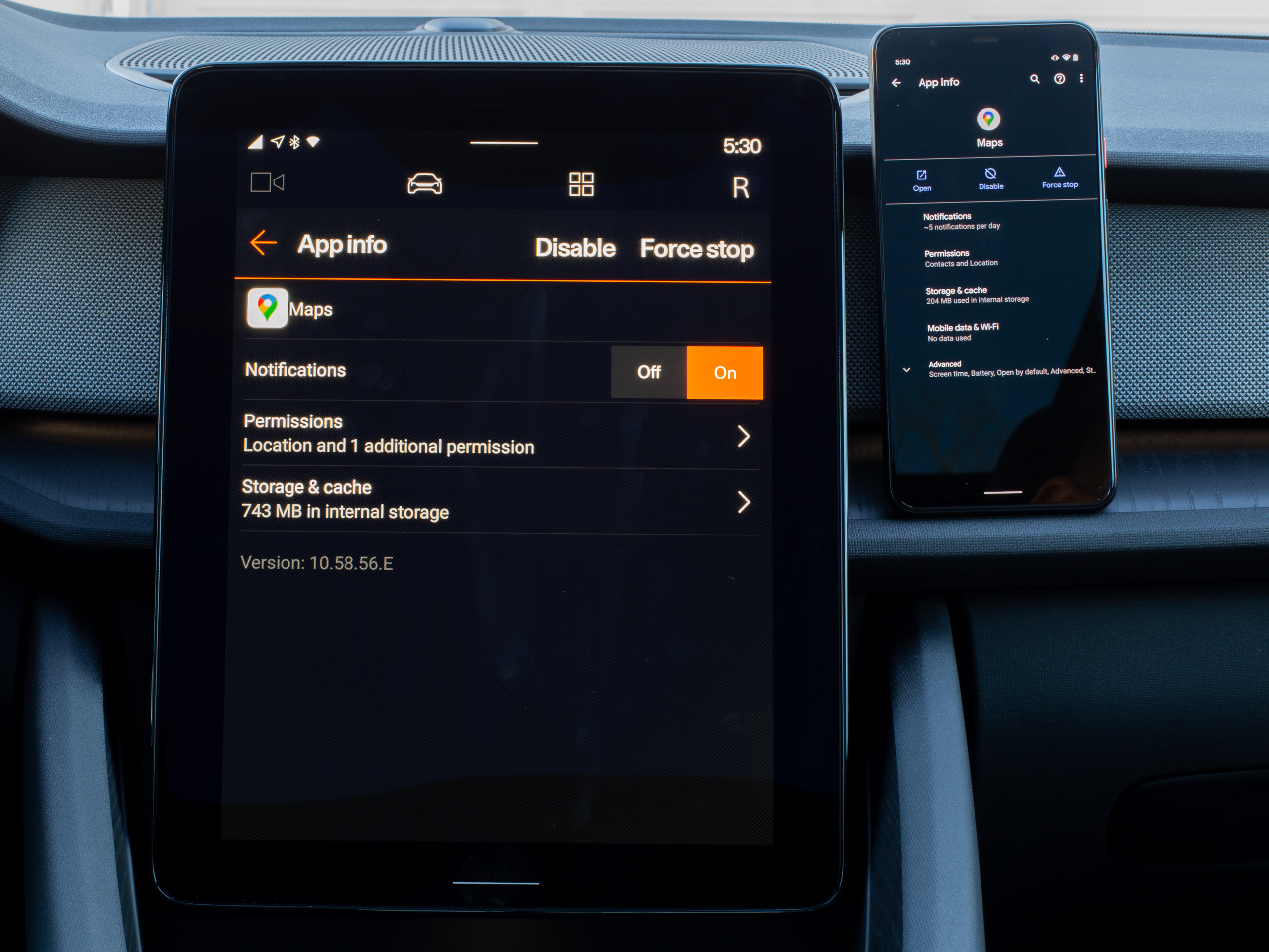 Data usage tracking has been removed, but this is pretty much the same.Ron Amadeo
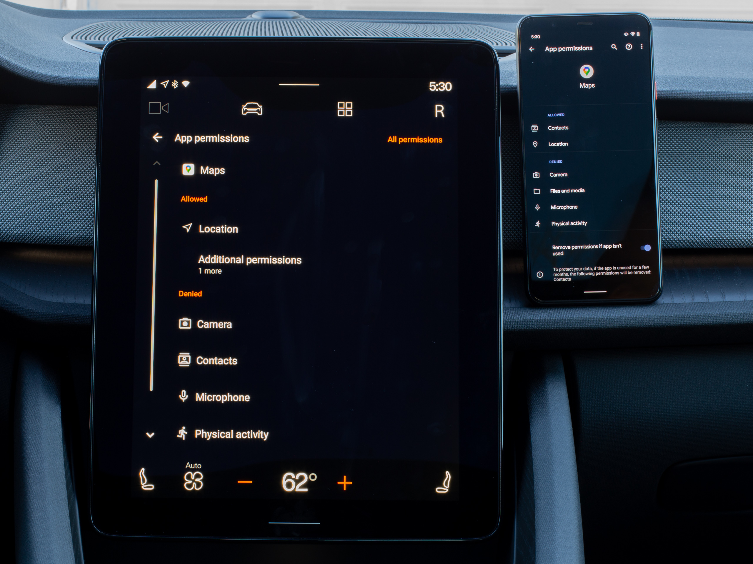 Google Maps permissions.Ron Amadeo
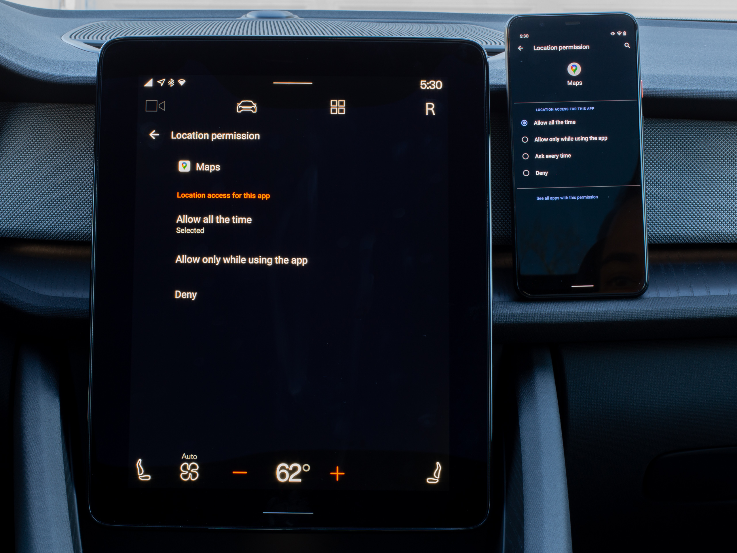 The usual permissions screen.Ron Amadeo
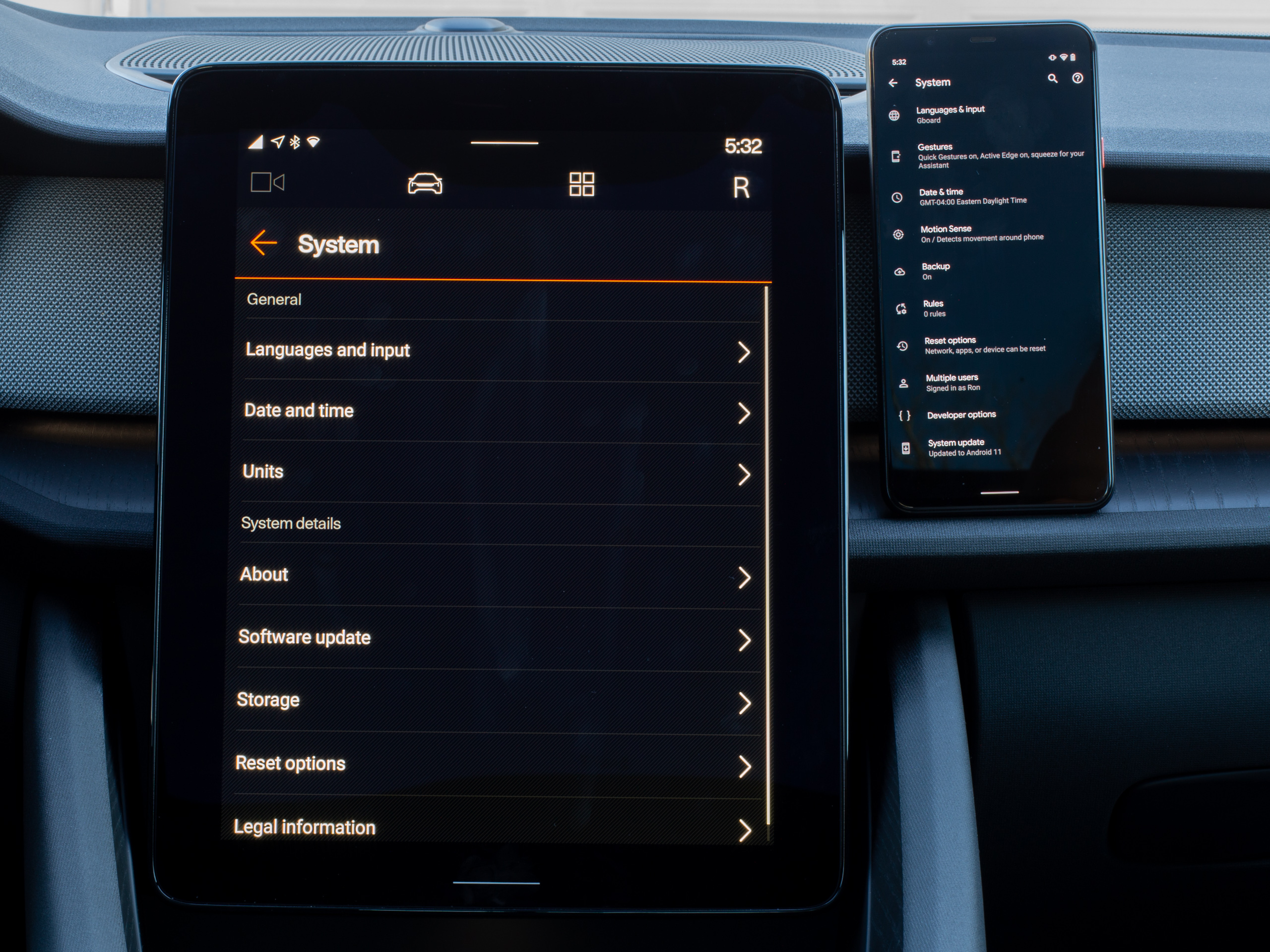 The system screen.Ron Amadeo
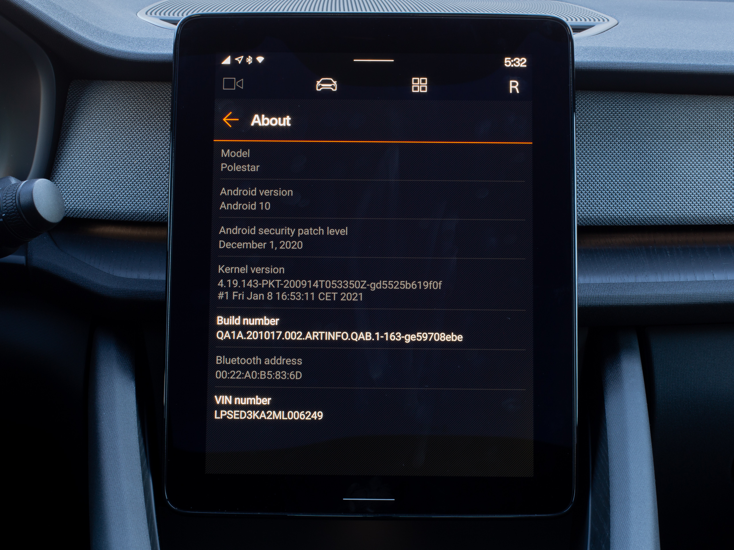 The about screen, showing Android 10 and the December 2020 security patch.Ron Amadeo
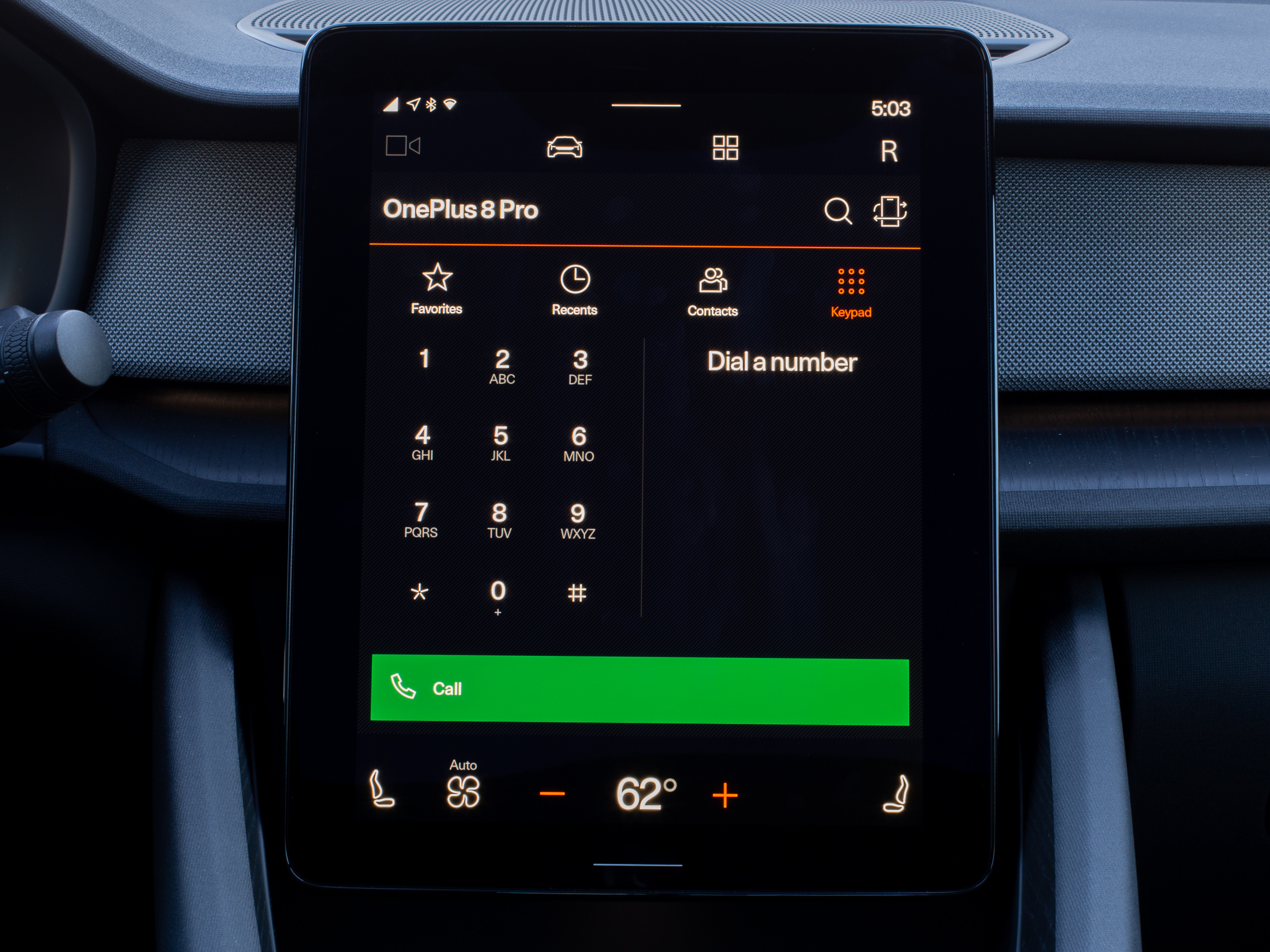 The phone app.Ron Amadeo
Another thing that bothered me was the lack of system-level navigation. A regular Android phone has "Home," "Back," and "Recent apps," but Android Automotive only has "Home," accessible on the Polestar 2 via a capacitive button below the display. I didn't necessarily ever need Recent apps, but the lack of a Back button was a continual frustration while using Android Automotive OS. Individual apps can provide an app-based back button in the top-right corner (Android confusingly calls this the "up" button), but this stops at the top level of the app. Some parts of the interface don't provide this button at all.
After using gesture navigation for years, muscle memory had me constantly swiping in from the side of the tablet to trigger back, only to be disappointed that no such gesture or function existed. Look at how huge the side of that tablet is! There is so much room to swipe in from the side. Android Automotive would be a lot easier to use if it just implemented the normal back gesture.
Another quirk of AAOS is the way it treats a data connection, which is completely un-Android-like. Android is a phone OS. It was raised on limited-user carrier data plans, so it's usually very considerate of how it uses data. The OS has this concept of a "metered" Internet connection in the settings: flip the flag (it's automatically on for cellular) and Android will skip automatic OS and app update downloads. The OS can even warn you before starting a big download. AAOS, despite running on a SIM card, will turn on and immediately start pounding your data connection. After the initial setup, it was a shock to see it start downloading hundreds of megabytes of Play Store updates without asking.
For some reason, all the metered data considerations have been ripped out of the Android Automotive OS. This includes the settings, which are just a shadow of their phone counterpart. The settings no longer track data usage or show any graphs. The network settings have an "on/off" button for cellular data, the ability to enter a Wi-Fi network... and that's it. This is not an immediate disaster on the Polestar 2, which comes with unlimited AT&T data for three years. But AAOS is supposed to be a platform for multiple cars, so it sure seems like it should be able to understand and be considerate of limited data connections. Alas, right now, AAOS cannot.
Speaking of gutted settings, uh, there's no hotspot capability? There is no way to share the car's data connection with other devices over Wi-Fi. This is another example of something that was built into Android and then removed during the transition to cars. Other cars have hotspot capability, so it's an odd missing feature. A properly designed car hotspot is great, since the car can have a bigger, more powerful antenna than your phone, plus better reception.
A solid platform, but it needs work
I think the platform is what's important in this first launch of Android Automotive OS, and in that regard, Google nailed it. You get an up-to-date open source OS for car manufacturers with monthly security updates available if you want them. That's way more than most of the roll-your-own OS solutions have going for them. Having the Google Play Store just work on a car OS is a big deal. While the app ecosystem needs plenty of work from Google, the framework for it—the store and the SDK—is all here, with every feature you could want, thanks to over 13 years of development.
With AAOS, Google is employing what looks like an exact copy of its phone strategy, and it's something that hasn't existed before in the car space. While there are companies like Blackberry pushing the QNX OS for car infotainment, no one is making an app ecosystem the way Google is. Sign up with Android Automotive OS, and you'll instantly get access to Google Maps, the Google Assistant, and third-party apps like Spotify.
Google's ambitions to turn Android into an OS-for-everything hasn't always worked out. Android's entry into the smartwatch market, VR headsets, and tablets ended up being flops, while smartphones and TVs are doing well. I think the platforms that have succeeded are the ones where Google's apps make the most difference. Apps like YouTube, Google Maps, Gmail, the Google Assistant, and Chrome are great for phones, and YouTube gave the company a boost on TV sets.
Exclusive Google Maps and the Google Assistant are a big deal on cars, and unlike many of those Google-led expeditions into various form factors, companies are already choosing Android for car infotainment systems with or without Google's involvement. Google's official program brings dramatically more up-to-date software and a regular update plan, several built-in considerations for a long-term car computer, a nascent car app ecosystem, and those killer, exclusive Google apps. If you're a company that is already using a fork of Android (like Honda, Hyundai, GM, and Kia), it's hard to argue against Google's all-around better version.
While Google's platform seems like a good one, the actual apps and features of Android Automotive OS leave a lot to be desired. It needs to get messaging apps working, and it would be nice if, like Tesla, Google would enable more apps for stationary or rear-screen usage. The lack of split-screen is a real killer, since you aren't able to access the two most-used car features (maps and navigation) at the same time. There are indications that this is a Polestar problem and not an Android Automotive problem, but it's a huge problem while using the car. At times, I just wanted to mount my phone to the dashboard. Google also really needs to come up with a workable solution for Google Maps search, since, with only nine results, this is also something that required a phone to do efficiently.
Maybe the lack of split-screen falls under the tried-and-true category of "OEM Android skins are bad." On the Polestar, that's a category with plenty of entries. Polestar's choices for the system-wide navigation bar removed shortcuts to useful things like media, maps, and apps, and it replaced them with shortcuts to rarely used settings screens like the user panel and car driving settings. The result is that navigating between common features of the OS takes way more taps than it should. For a safety-focused car interface that should try to limit distractions, that's a critical design failure. The home screen also doesn't seem particularly useful, as it highlights a bunch of "tiles" that aren't very functional outside of the media tile. This tile thing is probably Google's fault, since it seems to be a half-baked feature that someday might be developer customizable (but right now isn't).
Like most Google launches, Android Automotive feels like a "minimum viable product" today. It does all the basic stuff you need a car OS to do and not a single thing more. Also, like most Google launches, what really matters is how many resources Google wants to throw at AAOS now that it has hit version 1.0. If this is the start of a significant investment into turning Android Automotive into a more fully featured and mature platform, Google could have a real winner on its hands. If not, the Killed by Google site is always looking for more entries.
The good
- Google gets the core OS right, with a modern version of Android and monthly security updates.
- The Google Assistant is just perfect, with excellent voice recognition and access to most of the car's features.
- Google Maps gets you where you want to go, with up-to-date map data and battery usage estimates.
The bad
- There's no split-screen support on this 11-inch tablet? Seriously?
- Google Maps search results are nearly useless, thanks to only seeing the first nine results even when in park.
- No messaging apps yet, even though they work great on the phone-based Android Auto.
- Google Play merges phone and car app listings, so you don't see reviews and ratings for the car interface.
- A system-wide back button would make this work more like an Android phone, especially if it was gesture navigation-based.
The ugly
- Polestar gutted the navigation bar, and now it takes way too many taps to move between common features.
"Android" - Google News
May 10, 2021 at 06:15PM
https://ift.tt/3uzlyqt
Android Automotive OS review: Under the hood with Google’s car OS - Ars Technica
"Android" - Google News
https://ift.tt/336ZsND
https://ift.tt/2KSW0PQ
Bagikan Berita Ini


0 Response to "Android Automotive OS review: Under the hood with Google’s car OS - Ars Technica"
Post a Comment