I’ve been using the Nothing Phone (2) for the past few weeks, and I’m wildly impressed.
You may have heard of Nothing, the startup that launched in 2021 with big ambitions about the future of technology and design. The company, founded by Carl Pei (who also co-founded OnePlus), focuses on unique design and well-rounded feature sets for each of its products, while letting the technology fade into the background. That began with wireless earbuds (the recent Nothing Ear (2) are quite good) and later carried over to phones, starting with the Phone (1).
That device launched internationally and was never intended for the United States. It was a mid-ranger that received decent reception from reviewers, but it couldn’t garner much hype in the West simply because you couldn’t buy it.
Now we have the Phone (2), which is officially available in the US through Nothing’s website. The company is taking things up a few notches. Its design has been refined, the specs are much more powerful, the cameras have been revamped and — best of all — it starts at $599.
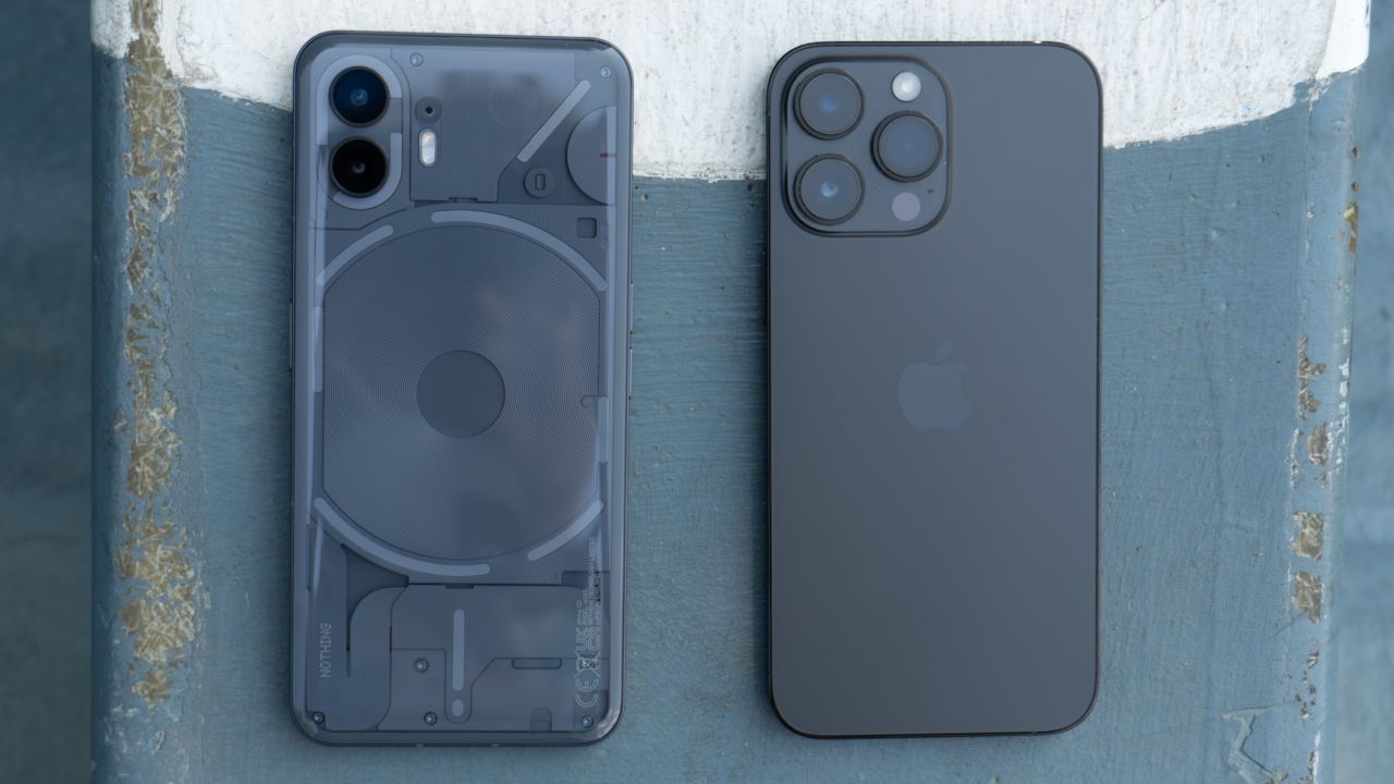
I’ve been testing it for the past few weeks, comparing it to my Pixel 7 Pro and iPhone 14 Pro Max. I wanted to see if it could hold up against the big dogs, despite it being from a company with zero experience selling a phone in the US And beyond some important issues that come with every new company, they hit it out of the park.
So, what is it like to use? Let’s find out.
If you’re looking for an affordable Android phone that stands out from the pack — while also offering excellent performance and cameras for the price — the Nothing Phone (2) belongs on your radar.
What we like about it
Exceptional design that’ll make you say “Glyph”-yeah
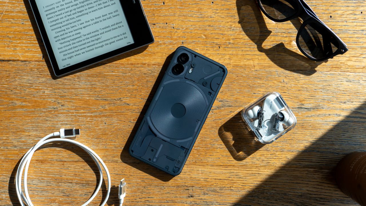
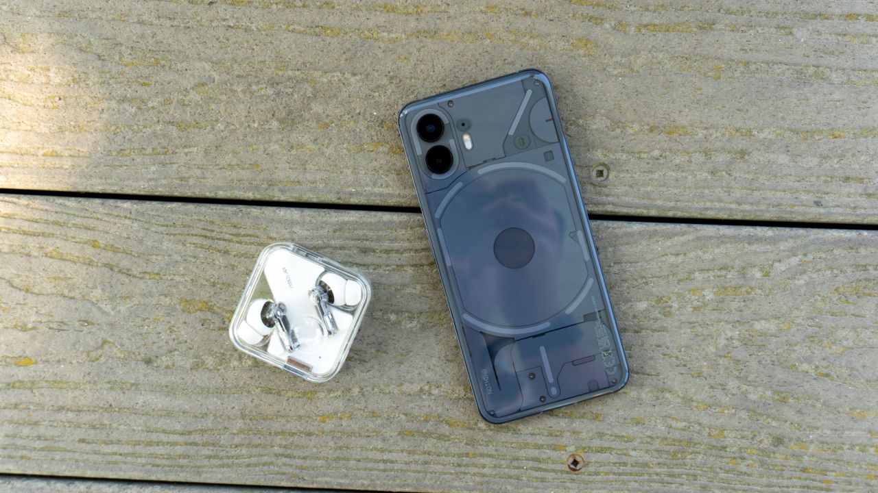
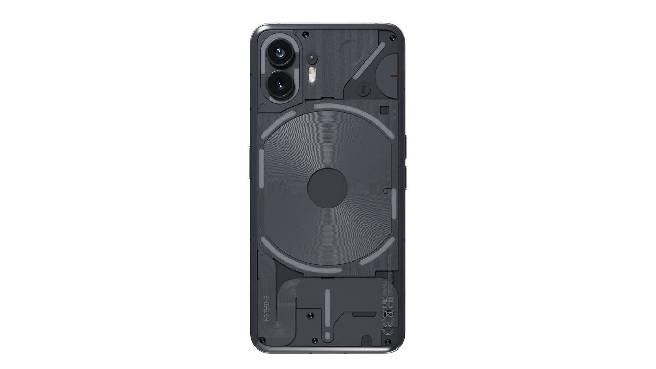
The Phone (2) looks a lot like the Phone (1) with its flat sides and transparent glass backplate. However, it’s still a wildly unique smartphone compared to the rest of the market. No other phone looks like the Phone (2), especially in the US where the only interesting phone designs are ones that fold in half. Nothing has given the standard brick smartphone a much-needed face lift, and I’m here for it.
Admittedly, the Phone (2) looks like an iPhone 14 Plus when the screen is off. The flat sides further aid in the illusion, but I don’t think this is a big deal. I’m a huge proponent of flat sides on smartphones, thanks to their more premium feel, so I’m glad Nothing kept them around for its second generation.
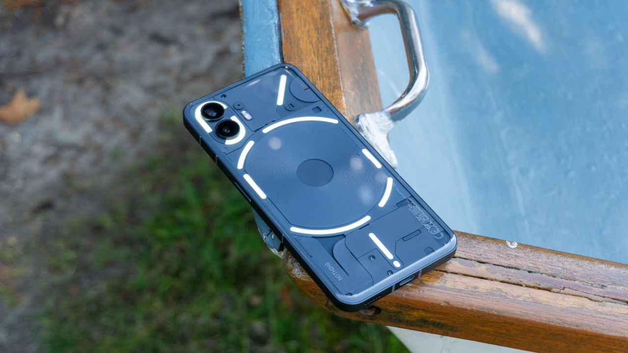
Nothing uses pillowed glass on the back with gentle curves, which makes it a very comfortable device to pick up and use for hours on end. That’s also thanks to its weight. At 201 grams, it’s lighter than the Pixel 7 Pro (212 grams) and iPhone 14 Pro Max (240 grams) but a tad heavier than the Galaxy S23 Plus (196 grams). It hits a sweet spot I can only describe as “premium-ly light,” where it’s not too light to feel cheap and not too heavy to be unpleasant.
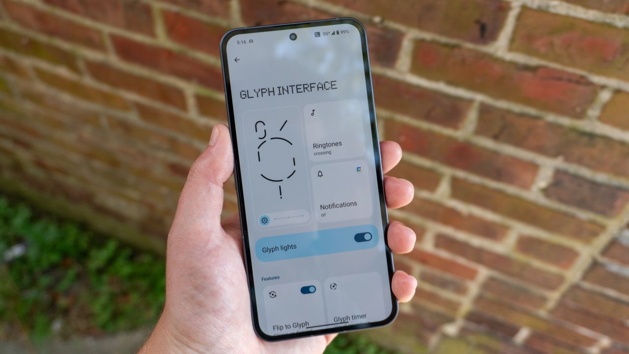
Of course, the boldest design choice Nothing has made with the Phone (2) is the Glyph Interface, which is a fancy name for all the LEDs on the back.
So, what does the Glyph Interface do? A lot, actually. Flip the phone on its face and it’ll silence sounds and vibrations, alerting you of new notifications with unique light patterns. You can use custom light patterns for specific contacts when they message or call you, and you can force the top right corner Glyph to remain lit up when an important notification arrives.
The Glyph Interface also works as a flashlight, a fill light for photos and even as a light show for your music through a neat hack. A lot of this was available on Phone (1), and with Phone (2), Nothing wanted to improve things by increasing the number of LEDs and LED segments.
This allows for more precision and accurate representations of certain features, like volume. Now, when you increase or decrease the volume of the device, the Glyph will light up and let you know how high or low it is. This same functionality also works for timers (perfect for avid enthusiasts of the pomodoro method) and even third-party apps like Uber for tracking your ride’s distance from your location.
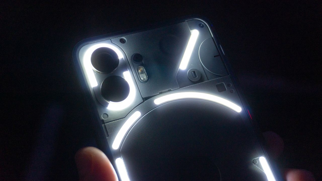
There’s a lot of versatility in the Glyph Interface, with a little something for everyone. It all works really well, although I didn’t get a chance to test the Uber integration. My favorite features include the persistent LED for important notifications, the light show and Glyph Composer for fun light shows at night and the neat charging indicator at the bottom for checking how full my battery is.
Is any of this necessary? No, I don’t think so. But it does encourage you to use your phone a little less to stay on top of things. A quick glance at whatever is making the phone light up will tell you whether to pick it up while everything else can be ignored. I didn’t find it distracting or difficult to get on board with, either; something about it felt very natural, which is all you can ask for from a feature like this.
It’s not life-changing, but it’s a very cool addition to this already unique smartphone. Just make sure you pick up a screen protector for it since you’ll be laying your phone face down far more often than not.
A beautiful display that’s beautifully flat
Flip the Phone (2) around and you’ll be greeted with its 6.7-inch display. It features a 2412 x 1080 resolution that keeps everything nice and sharp, an OLED panel for inky black levels and vibrant colors, and a peak brightness of 1,600 nits, which makes it easy to see even in direct sunlight.
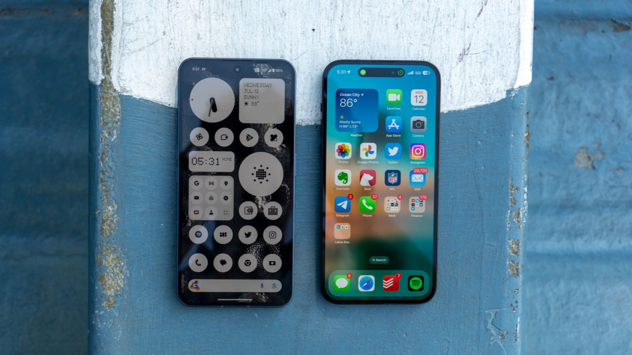
Nothing also includes a 120Hz refresh rate, which makes the screen feel smooth and responsive. It’s the same refresh rate as many other flagship smartphones, down to the LTPO technology that allows the refresh rate to drop down to 1Hz when you aren’t interacting with the screen.
It’s a beautiful display to look at, and it’s perfect for everything from watching movies to scrolling on social media. But here’s the most beautiful part of it all: it’s totally flat. Nothing didn’t curve the sides to make the device feel thinner, which means there aren’t any weird drop-offs or light reflections to be seen. It’s just a simple, flat screen, and I absolutely love it. It’s a breath of fresh air in a market full of Android phones that try to catch your eye with curves and slopes around their displays.
The cameras are surprisingly great
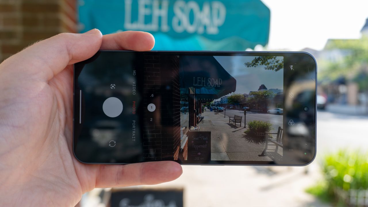
I’ve been taking a lot of pictures with the Phone (2), testing to see if they can stack up against the big dogs and give you great photos and videos for your collection. Surprisingly enough, they absolutely can.
The Phone (2)’s camera system is a meaningful upgrade over the Phone (1). It still uses a 50MP, f/1.9 main camera and 50MP, f/2.2 ultrawide camera for the back, but pairs them with a new 18-bit Image Signal Processor (ISP) that can capture 4,000 times more camera data. That’s fancy talk for better exposure, color, detail — you name it. Nothing also includes Advanced HDR, which combines eight RAW frames captured with varying exposure levels and blends the best elements of each photo into the final image. It’s similar to how a lot of other camera phones work and is another big upgrade over the Phone (1), which could only blend three frames.
So, how do the photos look? See for yourself.
Nothing Phone 2 camera
With its improved HDR, processing techniques and Motion Capture 2.0 for better shots of moving subjects, the Phone (2) can capture stellar photos. I was specifically impressed with its ability to balance saturation and contrast; it reminded me a lot of the Pixel 7, which is one of the biggest compliments I can give. That also means it’s not oversaturated, so those worried it would follow in Samsung’s footsteps can rest easy.
Compared to my iPhone 14 Pro Max, the Phone (2) was able to keep up in a variety of settings, from broad daylight at Rockefeller Plaza in New York to nighttime with cocktails at a rooftop bar. I’ll admit that the Phone (2) does struggle a bit to keep highlights in check (it’s a lot more willing to let them blow out than other phones I’ve tested), but it’s a minor nitpick in an otherwise excellent capturing experience.
Speaking of taking photos at nighttime, the Phone (2) was able to do that just fine. These images won’t take the crown from the Pixel’s astrophotography mode anytime soon, but each photo I got was detailed enough to encourage shooting some more. I can’t say that about every phone I use, let alone those from totally new companies.
Nothing Phone 2 vs iPhone 14 Pro Max
Video quality is pretty decent. It’s a $600 Android phone, so my expectations weren’t very high to begin with, but I was happy with the clips I captured. Colors were well saturated and vibrant, while exposure and contrast were well-balanced. I did notice a few dropped frames if I moved around a lot, but it only happened a couple of times. And for the record, the videos I shot couldn’t beat what my iPhone is capable of, but it’s very good for a flagship, let alone one that costs well below $1,000.
As a side note, the Phone (2) supports shooting at up to 4K resolution and a smooth 60 frames per second, and you can freely switch between the main camera and ultrawide while recording. I also found selfies taken with the 32MP shooter on the front to be perfectly good enough for Instagram and Snapchat.
Nothing’s Camera app is as easy to use as any you’ve tried in the past; it’s fast, responsive and shutter speed is top-notch. There’s a pro shooting mode for those who want to lock in precise camera settings before capturing, and you can even use the Glyph on the back as a fill light for your subject, which looks a lot more natural than the LED flash.
Overall, the Phone (2)’s cameras are very solid and reliable. While they won’t top the Galaxies, Pixels and iPhones of the world, they’re in the same ballpark in terms of quality and shooting modes. I’m really impressed with what Nothing has pulled off here.
The Phone (2) has incredible performance
Nothing wants the Phone (2) to be a flagship, and in order to do that, it has to pack in the right specs to get those great performance levels you look for in a high-end phone. I’m happy to report that’s just what Nothing has done here.
The device ships with last year’s Snapdragon 8 Plus Gen 1 processor that, admittedly, isn’t the latest chip you can get. However, just like the Moto Razr+, the processor can still deliver a serious punch when it comes to performance. I have yet to slow this phone down; I’ve thrown numerous games at it, multitasked a bunch and sporadically captured photos at the same time, all while the device kept chugging along with no issue. It feels just like using any other high-end phone that came out this year, so if speed is a point of interest to you, the Phone (2) will suit you well.
Here’s how the Phone (2) stacks up against other phones on Geekbench 6, a popular benchmarking app that can give you a ballpark idea of how powerful a phone is.
|
Nothing Phone (2)
|
iPhone 14
|
Google Pixel 7
|
|
|---|---|---|---|
| Processor |
Snapdragon 8+ Gen 1 |
Apple A15 Bionic |
Google Tensor G2 |
| Geekbench 5 (single-core performance) |
1,674 |
2,181 |
1,426 |
| Geekbench 5 (multi-core performance) |
4,382 |
5,052 |
3,726 |
I’d also like to credit the Phone (2)’s great performance to the 12GB of RAM included in my review unit. It gives the device extra headroom to juggle all the stuff in the background, which, in turn, leads to better performance in whatever app you’re currently using. Nothing also ships a model with 8GB of RAM if you’d like to save some money, but I recommend getting one with 12GB if you plan on having the phone for an extended period of time.
All-day battery life with genuinely fast charging
The 4,700mAh battery inside can easily last all day on a full charge. The Snapdragon 8 Plus Gen 1’s efficiency, coupled with Nothing’s system-level optimizations, have resulted in reliable endurance that has gotten me through plenty of 16-hour days with 30% to 40% left in the tank.
Plenty of people have asked me whether the Glyph interface drains the battery, and the answer is no. Even when I’m using it as a flashlight throughout the day, you’re only looking at a difference of around 2% to 3% percent, which is basically nothing.
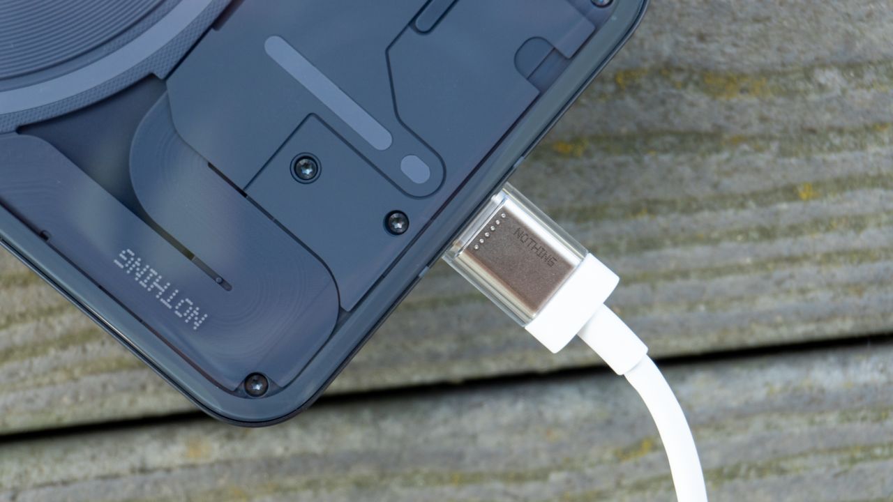
When it’s time to juice back up, the Phone (2) supports 45W fast charging over USB-C. That’s proper fast charging, mind you. Companies like Google and Apple think 20W-30W charging is fast, but by today’s standards, that’s absolutely nothing, especially when phones like the OnePlus 11 exist with 80W charging. Phones need to start at 45W to be considered fast in this day and age, so it’s nice to see Nothing include that spec here.
While there’s no wall charger in the box, the Phone (2) does ship with a USB-C cable that includes transparent end caps. It’s a minor detail, but it adds to the whole transparent aesthetic of the Nothing brand, and I dig it.
The device also ships with 15W wireless charging, as well as 5W reverse wireless charging (perfect for juicing up your Ear (2) earbuds on the go).
Nothing OS 2.0 is fast and responsive — and can help with smartphone addiction
Nothing’s skin on top of Android isn’t as intricate or overwhelming as something like Samsung’s One UI or OnePlus’ OxygenOS. Instead, it alludes to the experience of the Google Pixel and Motorola-branded handsets with minor tweaks and additional features to the core Android experience, which instantly makes this one of my favorite skins on Android to date.
Of course, you wouldn’t know it from the home screen. Nothing OS 2.0, the latest version of the company’s skin atop Android 13, aims to make your home screen more useful and less distracting by using a monochromatic design language. It’s completely optional, but if you turn it on, all your app icons will switch to simpler black and gray designs.
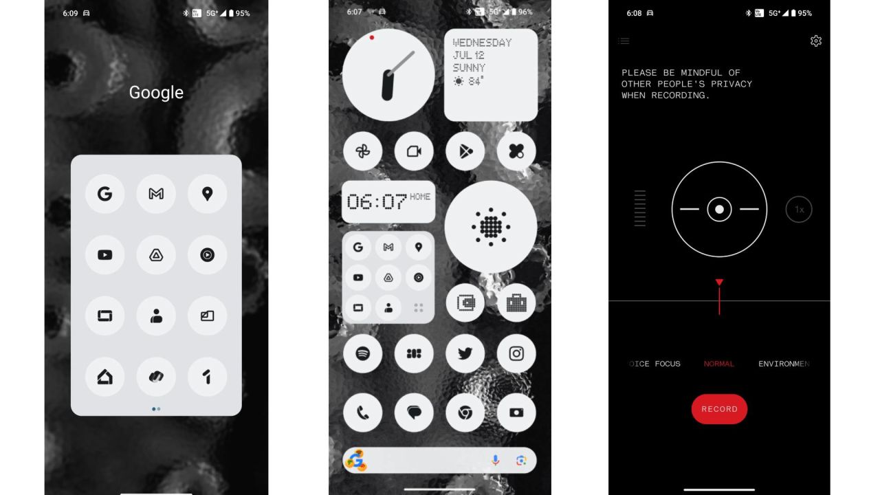
Nothing sees this as an opportunity to take power away from certain apps that play on smartphone addiction by drawing you in with colorful icons (*cough* Instagram and TikTok *cough*). So instead of opening your phone to do something important and finding yourself scrolling through social media for an hour, Nothing hopes you’ll look for the app you need and not feel tempted to dive into something else when you go back to the home screen.
The best part? These icons apply to every app on your phone, so there aren’t any inconsistencies. In addition, you can toggle off the names of each app if you’d like, so that you don’t even have to look at certain words like “Twitter,” “Instagram,” “Threads” or “Facebook.”
I must admit, this is an incredibly useful feature. More often than not, I fall victim to the vibrancy of the Instagram logo on my home screen, which prompts me to “check it real quick” (read: for at least 25 minutes that I don’t have) the second I’ve finished whatever work I was doing. With Nothing’s monochromatic icons, that temptation is almost nonexistent, to the point where I’m on my phone for at least a half hour less every day.
Nothing also revamped a lot of its widgets with its dot matrix fonts and stylings, both of which have also crept into more areas of the Phone (2)’s software. You can add widgets directly to the lock screen for glanceable information, too.
I’d also like to point out the Experimental features section of the settings app. Why? Because it has some very cool stuff inside! There’s native support for AirPods (yes, those AirPods), system-level integration with the Tesla app, enhanced touch response for games, and third-party app support for the Glyph Interface. All these features will be a bit buggy — they’re experimental for a reason — but it’s cool to see Nothing shipping such unorthodox features.
Finally, let’s talk software support. Nothing is promising up to three years of major OS upgrades and four years of security patches. That’s a year or two behind other flagship Android phones, but it’s still long enough where you can keep using the Phone (2) well after you’ve purchased it.
What we don’t like about it
Camera zoom is very limited
Zoom is a bit limited on the Phone (2). Nothing provides a 2x button that crops into the frame and uses the center megapixels for a full-quality photo, but once you go past that, you’ll notice details and clarity aren’t as sharp. It caps off at just 10x, which, admittedly, will be enough for some people. Personally, I would’ve liked to see a proper telephoto camera to round out the experience. I guess we’ll just have to wait for Phone (3).
Water and dust protection could be better
Nothing wants the Phone (2) to compete on every level with other flagships, but there’s one area that it doesn’t quite hold up: water resistance.
The Phone (2) has an IP54 certification, which is slightly better than the IP53 rating on the Phone (1); however, most other phones have an IP68 certification, which gives them far better resistance against submersion. You’ll be okay against light splashes or rain showers with the Phone (2), but I’d be extremely careful about carrying it around the pool.
The speakers are disappointing
There’s no two ways about it: the stereo speakers on the Nothing Phone (2) are pretty bad. I won’t go as far as to call them terrible, but they lack definition and can get very tinny at high volumes. Granted, they do have a touch of bass, which a lot of other smartphones lack, but you’ll be much better off with a Bluetooth speaker or headphones if you want to enjoy your music.
There’s no official Verizon certification
This is an area where you can tell Nothing had to start cutting costs.
The Phone (2) is certified to work on both AT&T and T-Mobile, but it’s not technically certified for Verizon. It’ll work on the Big Red carrier, mind you, but neither Nothing nor Verizon will tell you it’s officially supported.
It costs a lot of money to get a smartphone certified by carriers, and there’s a good chance Nothing didn’t want to hand over the millions of dollars required for the red checkmark. Keep this in mind if you plan to pick up the Phone (2) and use it with your Verizon plan.
Buying the Phone (2) is a risk for a lot of people
The Phone (2) is a solid, reliable phone to use, but it’s still a bit of a risk.
Nothing doesn’t have a large presence in the US, and your only avenue of customer support is going through their website directly if you experience a problem with your device. You can’t take it to the Geek Squad at Best Buy, you can’t run to your carrier to ask questions. You’re at Nothing’s mercy, and it’s largely unclear if that’s a good thing.
You also can’t use the Phone (2) before you buy it. Most people like to check out the latest iPhone or Galaxy at a carrier store before plunking down their credit cards to purchase it, but that experience can’t carry over to the Phone (2). Outside of a few pop-up kiosks around the world — and Nothing’s retail store in London — there’s really nowhere to test drive the device before you pull the trigger.
It’s also worth mentioning that Nothing doesn’t have any financing options for the device, there are very few accessories being made for it outside of a clear case and screen protector and there are no trade-in offers.
These are all problems that arise when you’re dealing with a new company. If you buy a phone from a more established brand with retail presence, you can sleep soundly knowing you can pay for it how you want, check it out before you buy it and go to practically any online retailer for a case. The Phone (2) is extremely limited in all these areas, which may scare a lot of people away from buying it.
Bottom line
So, should you buy the Nothing Phone (2)?
I’ve never tested a phone quite like it, to be honest. For its first attempt at a smartphone that’s available in the US, Nothing has done an excellent job. Everything here feels polished, refined and cohesive, almost to the point where you’d think Nothing has been in the smartphone game for a decade. It’s quickly become of my favorite phones of the entire year.
That being said, it may be a tough sell for certain people. You’ll have to be all-in on supporting a much younger brand, one that doesn’t have the same customer support channels or carrier availability as the big dogs. Accessories, financing options and third-party retail support are also greatly limited.
It’s also worth mentioning that competition is extremely stiff right now. The Pixel 7 is often discounted as low as $400 these days. The same goes for the Galaxy S23, and there are even other phones like the Pixel 7a that offer flagship experiences for less than what the Phone (2) costs.
The focus of the Phone (2) is unique design, minimal software, excellent overall performance and a chance to stand out in the growingly similar smartphone market. At $599, the barrier for entry isn’t too steep, and I think it’s worth considering — as long as you’re cool with the growing pains that come with a new company.
"Smartphone" - Google News
July 14, 2023 at 05:34AM
https://ift.tt/skqeLuM
The $599 Nothing Phone (2) is one of the coolest phones of 2023 - CNN Underscored
"Smartphone" - Google News
https://ift.tt/nbV6MJI
https://ift.tt/EvJSDTG
Bagikan Berita Ini


0 Response to "The $599 Nothing Phone (2) is one of the coolest phones of 2023 - CNN Underscored"
Post a Comment