Editor's Note: After a Google Pixel 7 prototype appeared on eBay this week, we took a deep dive into our archive of older Android hardware prototypes. Our Google Sooner post, first published in 2020, brought back fond memories of the early days of Android, so we're republishing it today.
The very first Android phone, it has been long established, was the HTC G1/Dream. Or at least that's the conventional wisdom. While the G1 was the first Android smartphone ever sold, it wasn't the first built-for-Android smartphone. That honor goes to a prototype Google developed in house called the Sooner. The Sooner looks more like an old Blackberry—a far cry from even the original G1's touch and keyboard combo, and it doesn't even have a touchscreen. The version of the Android operating system it runs is also pretty radically different from what we eventually came to know as Android, and represents Google's earliest vision for a platform that would later come to dominate the mobile industry, helping put the final nails in the coffins of Blackberry OS, Windows Phone, and WebOS. We managed to get our hands on a Sooner, and I gave it a try. After a few days using the Sooner as my personal phone (immediately following the Galaxy S20 Ultra), it's incredible seeing how far Android has come.
Let me tell you, it was an experience, but one that was colored (if not outright twisted) by the times we live in: I can't really spend a lot of time romping around outside and doing Normal Phone Stuff given that the world, including my small part of it, is stuck in an effective quarantine. But I did use it enough to see just how drastically Android has changed.
Before we dive in, I'd like to thank Ron Amadeo of Ars Technica for spending pretty much a whole day digging into the phone with me, and Charlie Callow (@wollac) for screenshots.
Sooner, much later
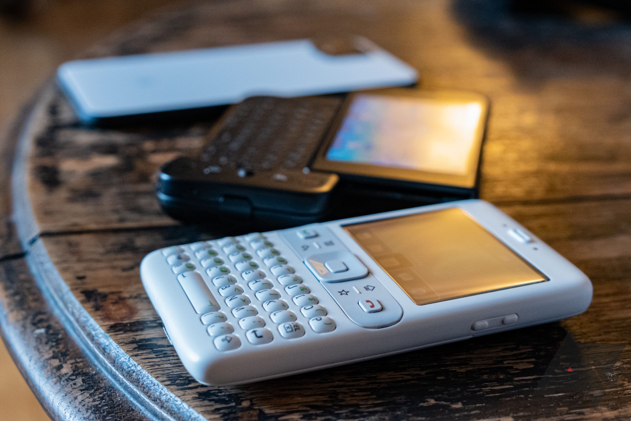
Before I dive into the software, a short hands-on of its hardware is in order, and Sooner's hasn't aged too gracefully. It was a product of the times, when Blackberry phones dominated the high-end productivity landscape. As its name suggests, it was literally the "sooner" of multiple potential hardware plans, and a design that was ultimately (and wisely) tossed out in favor of the HTC G1/Dream.
That low-res landscape display has no touch capabilities, and the only way to navigate around is via the D-pad and hardware keys below the screen. That also means you have only one way to input text. I don't suffer from any misplaced nostalgia when it comes to thumb keyboards on a phone, so a physical text-based input method was a point of frustration, not pleasure, for me. At least it was rather vividly backlit, and sort of pretty in a nerdy way.
Although it was a bit thick by modern standards, it was also quite small, with a rounded shape and matte texture that felt nice in both pocket and palm.
General specs for the phone do not impress:
SPECS
| Chipset | 200MHz Single-core Texas Instruments OMAP850 |
| Display | 2.43" 320x240 LCD |
| RAM | 64MB |
| Storage | 64MB (microSD expandable) |
| Battery | 960mAh |
| Camera | 1.3MP (rear only) |
| Ports | Mini USB |
| Connectivity | Bluetooth, 2G (GPRS/EDGE) |
| Misc | Notification light, rear-firing speaker |
Checking out the FCC ID we didn't expect the phone to have, Ron Amadeo and I were able to determine that the hardware was probably based on a Windows Mobile device, the HTC Excalibur. HTC's former CEO Peter Chou admitted as much in a previous interview. Android's roots, in a way, are connected to Windows Mobile.
That's all underwhelming to the modern eye, but Sooner still has one very noteworthy omission: There's no Wi-Fi (or, at least, they never got it working — the HTC Excalibur had Wi-Fi). The only way to get data is via a 2G connection, and those are few and far between these days. Thankfully, I am a T-Mobile subscriber in an area with the company's 2G service, which is one of the last ways you can use the phone today. And that's part of why I ended up using the phone as my primary device for around half a week — I didn't really have a choice.
Not the world's best camera.
Pre-dating version numbers
If you're familiar with the old emulator images (which everyone should play around with — they're fun!), Sooner offers a similar experience. The actual hardware runs it a bit more poorly, but it's a huge departure from even Android 1.0. (It's actually a bit different from the emulator image as well, more on that later.) Like a good little Android blogger, I just so happen to have an HTC G1 hanging around flashed back to Android 1.0, and it makes for an interesting comparison.
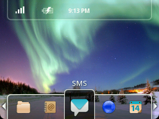
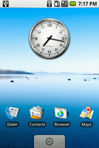
I couldn't get screenshots to work via ADB, but @wollac did. Above: Home screens/launchers compared between Sooner and Android 1.0. Below: Status bar expanded clock.
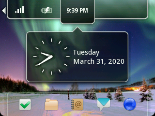
Also note the rounded screen corners at the bottom — before it was cool. Sooner screenshots via @wollac.
Right off the bat, the home screen/launcher is drastically different. It's basically static, outside using the D-pad to scroll among the default app selection (that you can't change) at the bottom, and the scrolling status bar at the top, the only thing you can tweak is the wallpaper. Rather than tapping around a home screen that you can customize and rearrange, you're just stuck with what it has. With no touch screen to drag up on, the app drawer is accessible via an icon labeled "All Applications."
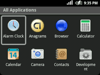
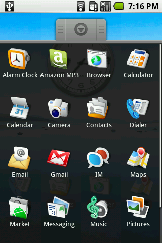
Above: App lists/drawer on Sooner (left) and Android 1.0 (right). Below: Calculator on Sooner (left) and Android 1.0 (right). Sooner screenshots via @wollac.
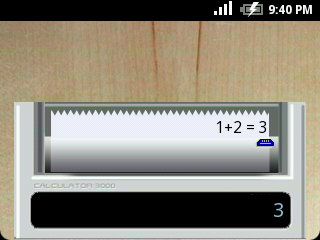
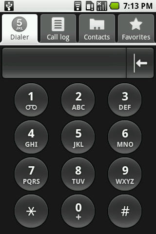
Calculator on Sooner (left) and Android 1.0 (right). Sooner screenshots via @wollac.
This is where things got a little interesting. Turns out, this phone has some apps that we've never seen before, and it's also missing some things we expected to see.
A gallery of some other apps included on the phone. All screenshots via @wollac.
Instead of the usual Google apps like Gmail that other Sooners have shipped with, ours was loaded with a ton of niche, seemingly AOSP apps that haven't cropped up before. For example, it has a Quake app — as in, the arena first-person shooter game. It stutters and has some really weird audio, but it works. A "Tweet" app was also included, and it's explicitly not Twitter, with someone's home-taken photo of a bird as the app icon. The Maps app and Google Talk/GTalk app are also missing.
That is the actual audio. It didn't run great.
Using it more anecdotally as my actual phone, funny little things didn't work. Like the "end call" button wouldn't actually end calls when you were in one — pressing it seemed to do nothing, you had to manually scroll and select "end call" with the D-pad. Putting the phone to sleep/turning off the screen also took an extra step. Instead of just pressing the power button, you had to navigate its resulting power menu to select the option to turn the display off (with options like a simple two-button accidental "keyguard" or a full-on password to turn it back on).
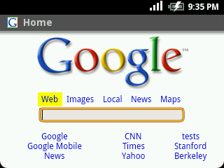
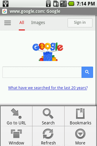
Above: Browser on Sooner (left) and Android 1.0 (right). Below: Settings screens on Sooner (left and center) and Android 1.0 (right). Sooner screenshots via @wollac.
There was also an option to sign into a Google account, and I was willing to sacrifice the security of a testing account, but it wasn't functional. Many of the things hidden in the various settings menus (there were at least two different ones) were placeholders or non-functional.
Battery life was decent, but that's probably because I'm stuck at home. Using my phone less let it stretch out longer, usually to a full day. Call quality was pretty terrible, though. Ultimately, after a few days of uptime, the phone was almost unusable. Many apps would hang for seconds after they were launched, and I'd usually have to force close or wait a while for things to (temporarily) resolve — perhaps one of early Android's well-known memory leaks.
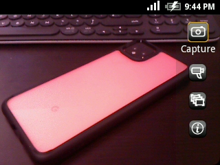
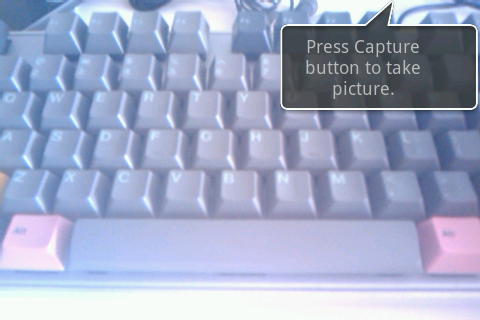
Sooner (left) had a more developed camera UI than the Android 1.0 G1 builds (right). Sooner screenshots via @wollac.
Of course, this is pre-release software that never saw the light of day, tons of things are bound to be broken and in flux. Still, I was surprised to see both how well put together things were generally, and how curious the omissions were. Both seemed to say something about Google's priorities as it built its mobile operating system. The fact that it could do things like play Quake before you could quickly sleep the display or even easily change the system time tells me this was an engineering proof of concept first, and Google wasn't getting ahead of itself. UI decisions like those could be made later once all the different, much more basic APIs and features were in place, and apps like Quake and "Tweet" could demonstrate software completeness and performance. These Sooner models may have been handed out to court developers and interested phone manufacturers as a demonstration and build hype for the upcoming platform. The more mundane issues of usability and design rest far higher on the equivalent of Maslow's software hierarchy when it came to Google's and developer's needs
Android archaeology (or, 'It belongs in a museum')
I should note, that although Ron Amadeo and I first thought the version of Android my unit arrived with was the oldest that the public had ever seen, I have since dug up an analysis from 2012 of an even older build, and that's worth a read as well. Still, even this later in-between version is illuminating, though I had hoped to do more for our readers.
Google's original video discussing Android SDK, features, and platform availability. Our first glimpse of Sooner.
I have spent more than one afternoon now trying to get the prototype to play nice so I could pull a complete software image for public consumption, ideally hoping to have something that could be loaded into the existing Android 0.5 emulator, but my efforts have been in vain. I even reached out to Google for help. Between the problem of USB drivers, functional ADB versions, new operating system limitations, and potential issues with my unit itself, I couldn't find a way to pull the apps (or even take screenshots). However, I wasn't alone in buying one, and brighter minds than mine have succeeded. And if the apps or a complete system image are released, we'll let you know.
Looking back, Android changed pretty drastically even before its 1.0 release, and it's interesting to see how it was shaped, and the guiding principles behind it. Even just experiencing it on Sooner, without a touchscreen, on hardware-that-could-have-been, shows the journey it took. There's more than just time in the nearly twelve year gap between now and when this prototype came to be. Android has taken quite a trip before it landed on the phone in your pocket.
And, as always, using old devices like these makes me appreciate modern software and hardware that much more. We take so many of the fundamentals for granted these days, but I know I'm just glad to be back on Wi-Fi. You can't imagine how slow 2G is.
Thanks: Ron Amadeo and Charlie Callow, who both spent ages helping me.
"Android" - Google News
May 31, 2022 at 10:29PM
https://ift.tt/xJoYVXa
Sooner: Hands-on with Google's weird Android prototype - Android Police
"Android" - Google News
https://ift.tt/nIYfGLD
https://ift.tt/dnxeMHi
Bagikan Berita Ini


0 Response to "Sooner: Hands-on with Google's weird Android prototype - Android Police"
Post a Comment