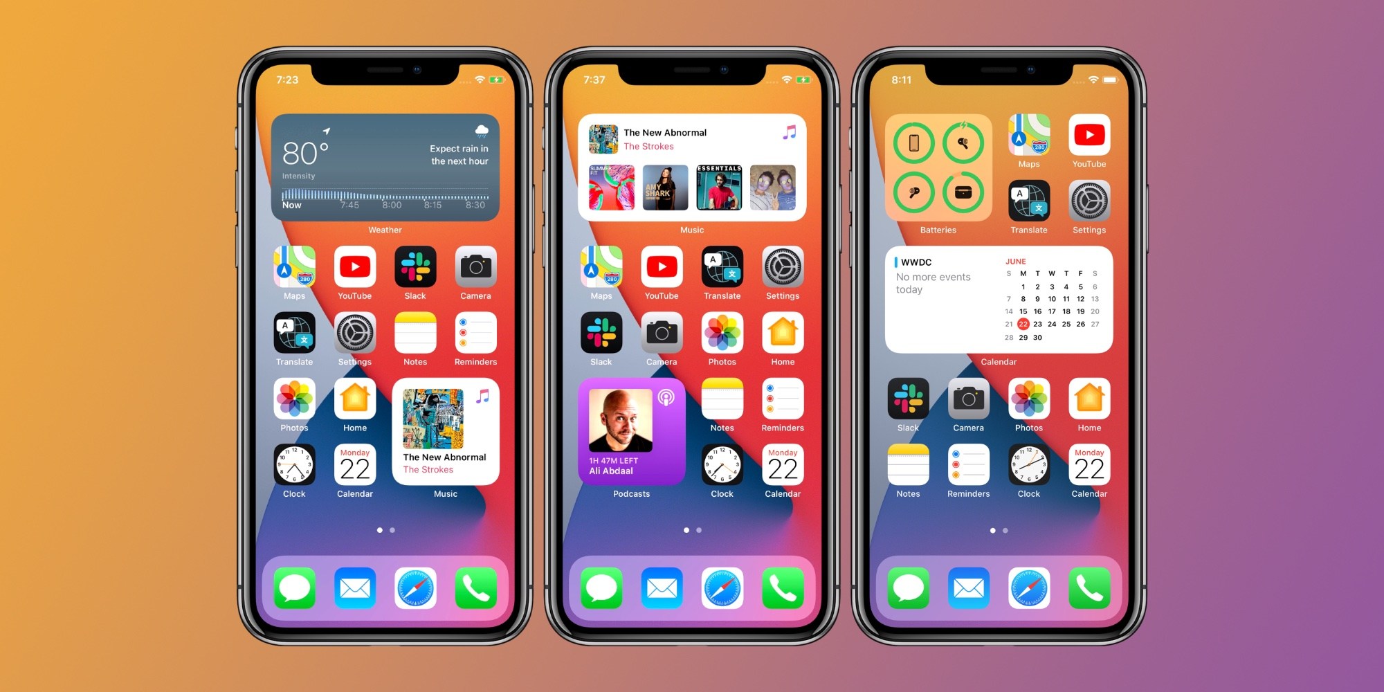
Every year at WWDC, Apple copies Google. But also, every year at Google I/O (or, this year, nothing really), Google copies Apple. Whatever. It’s a cliche at this point; the two major mobile platforms are so mature that it’s rarely a matter of which features one will have and the other will not, but rather which will get them first. But today, Apple showed off what might be the most stereotypically Android release of iOS yet…
While Apple really likes those information dense closing slides showing all the countless innovations that are going to fundamentally change the way you use your iPhone, installing it on your device is often a different experience. Most of those features — no matter how useful — are actually buried deep below the surface. Most of them you won’t even notice until a week or two later. Many of them you’ll never notice at all.
It’s clear that the most noticeable and notable features added in iOS 14 surround the new home screen, widgets, and app library. That stuff — the stuff that the average person will think about when the latest version of iOS hits their phones this fall — is just so Android. And pretty much everyone on the internet noticed. There’s a Twitter Moment about it, and for good reason.
Android users watching Apple "introduce" features which they already have since years. #WWDC20 pic.twitter.com/X8diybR4l4
— Sagar (@sagarcasm) June 22, 2020
While every iOS release has its “you’re stealing that from Android” moments (as does most Android releases with the reverse case in recent years), this year the reactions were more pointed. They are, technically, right. Home screen widgets are an idea that goes back over ten years on Android. It’s not an exaggeration to say that Android phones of all kinds have supported widgets on the home screen since the beginning. It’s the definition of that-Android-feature-that-Apple-just-wouldn’t-let-happen.
And it just so happens the other major change to the home screen is another Android mainstay. The “App Library”, as Apple calls it, is essentially the longstanding Android app drawer. Pretty much anyone who has used an Android phone knows that you can access your apps one of two ways: by finding their icon on one of your custom-made home screens, or by scrolling through the app drawer. Apple finally realized with iOS 14 that having multiple pages of unorganized apps feels cluttered, so they’re letting you hide them and quickly find that one app you almost never use with a quick scroll or tap in what is essentially an app drawer.
Other stuff Apple introduced with iOS 14 were also Android firsts, but they fall more in the aforementioned category of things that Google just happened to get to first by a year — maybe two. Picture in picture support, for example. A dedicated translation app with live translation features (Google Translate anyone?), incoming phone calls that don’t effectively disable your device. Apple tends to be more conservative in general, avoiding launching features just for the sake of having features. And that’s fine.
Lots of that give-and-take happens every year, often because some of these innovations are more inevitable than they are original. But this year, when iOS 14 starts hitting phones, you can definitely expect a lot more “I’ve been doing that for years!” from Android users than usual. Apple finally broke down and embraced some of the decisions that Google made — and stuck with — for over a decade. For one, this is validation for Google — sticking with these decisions for so long — but it also shows that Apple can indeed drag their feet on good ideas out of pride.
I mean, look, there’s no reason iOS 8 couldn’t have done this. And we have the receipts.
FTC: We use income earning auto affiliate links. More.
Check out 9to5Google on YouTube for more news:
"Smartphone" - Google News
June 23, 2020 at 09:35AM
https://ift.tt/2CpjlYe
With iOS 14, Apple embraces smartphone UX decisions Google made a decade ago - 9to5Google
"Smartphone" - Google News
https://ift.tt/2QXWyGT
https://ift.tt/2KSW0PQ
Bagikan Berita Ini


0 Response to "With iOS 14, Apple embraces smartphone UX decisions Google made a decade ago - 9to5Google"
Post a Comment