Despite Google being on the twelfth generation of its ubiquitous mobile OS, recently it’s felt like Android has left tablets behind. Hell, even Google gave up making its own tablets years ago, while some other device makers began favoring Chrome OS over Android on larger gaadgets. But with Android 12L, Google is trying to address some of the OS’s shortcomings while also paving the way for emerging types of gadgets like foldables.
Why Android 12L?
In contrast to Google’s typical once-a-year release cadence, Android 12L is a timely callback to older versions of Android that got one (or more) mid-cycle updates. One big advantage of Android 12L is that because Google doesn’t have to worry about including larger overarching changes as it does with its big yearly update, the company can be more targeted about what kind of features should (or should not) be included.
Who is it for?
Sam Rutherford/Engadget
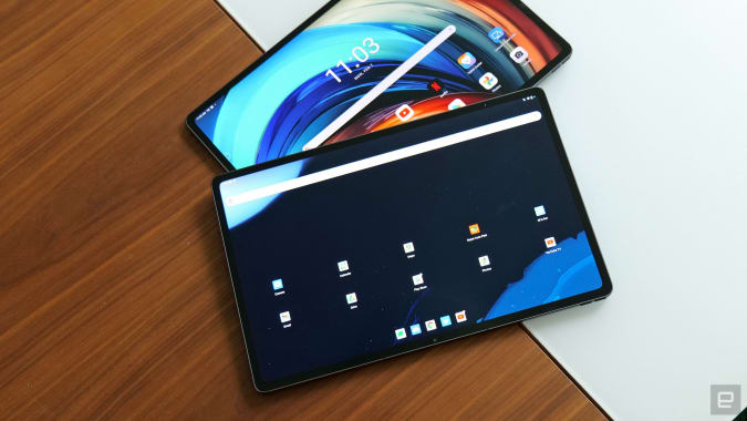
Google says Android 12L is a special update primarily meant to support larger-screen devices, though all the new features will still make their way into Android as a whole. Currently, Android 12L can be installed on a range of Pixel phones (the Pixel 3 and up, but not the Pixel 6 or 6 Pro yet), Google’s Android Emulator, and critically, Lenovo’s P12 Pro tablet–which is the only tablet and third-party device that’s been officially approved to run Android 12L so far. (It’s also the main device I’ve been using to test 12L.)
When will Android 12L be ready for release?
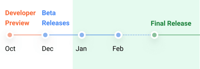
Right now, Google is mid-way through its testing and development cycle. Android 12L has already gotten two beta releases to date (depending on the device), with a third beta planned for sometime later this month prior to an eventual release sometime by the end of Q1 2022 (which ends in March).
The big changes in Android 12L
A new taskbar and improved multitasking
Sam Rutherford/Engadget
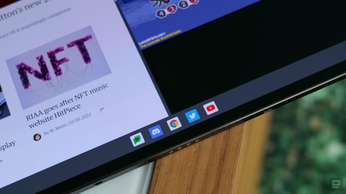
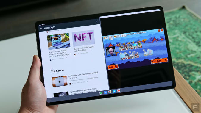
The most important addition in Android 12L is the new taskbar. Similar to taskbars on desktop OSes, Android 12L’s taskbar sits at the bottom of the screen and holds a selection of apps for easy access (though I should note that on smaller devices like phones, the taskbar may not be there by default).
Unlike many Android launchers, the taskbar is pinned in place, so it’ll always be there unless you’re playing a fullscreen video or game. That said, you can make it disappear when you want by pressing and holding. But where things get really interesting is that you can also open up apps directly into split-screen mode simply by dragging the app icon up from the taskbar into the middle of your screen. From there, you can easily adjust the size of the app’s window however you want.
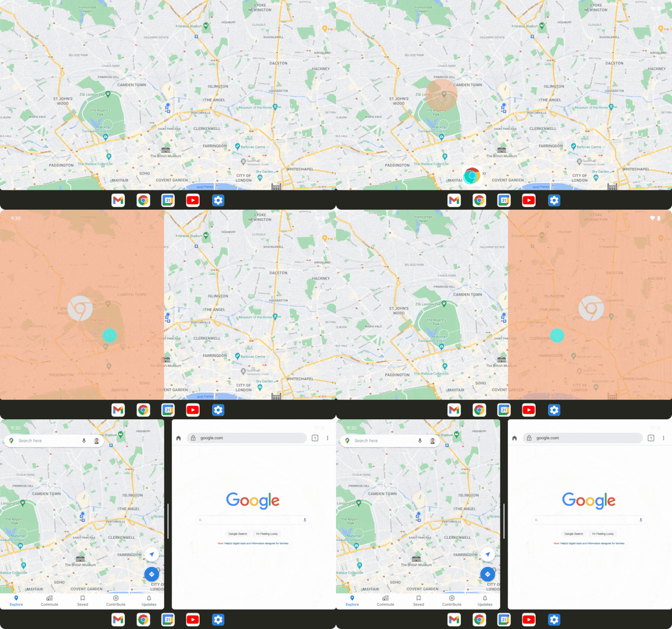
This far into Android’s development cycle, the addition of a taskbar and the ability to drag and drop apps into split-screen mode is as close to a “game-changer” as we’re going to get. It makes the process of multitasking so much faster and easier—particularly for larger devices like tablets and smartphones which often feel like they have more screen real estate than they can actually utilize.
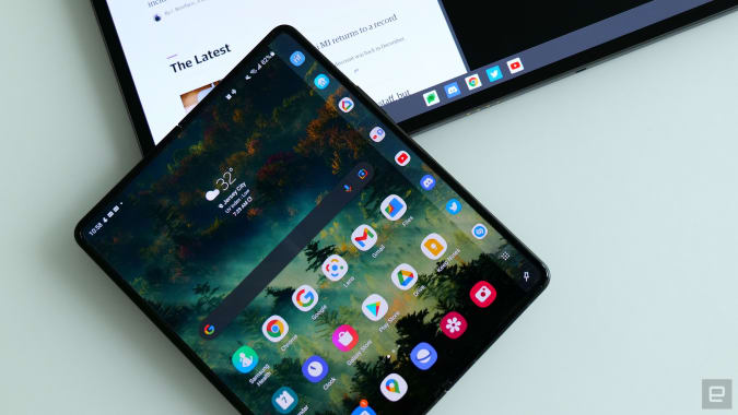
That said, there are some important limitations because unlike Samsung’s One UI, there isn’t an easy way to open up three apps in split-screen at the same time or create permanent app pairs. But even more than that, the taskbar maxes out at five apps, which feels a bit limited. I mean just look at all the extra room on the left and right where more apps could go. I’m really hoping that for the final build, Google increases the number of apps that can live down there, especially when existing foldables like the Samsung’s Galaxy Z Fold3 have a similar taskbar that supports up to eight icons (plus a launcher) with ease.
Sam Rutherford/Engadget
For people who like to watch videos, Google recently added a new split-screen icon to the second Android 12L beta’s picture-in-picture mode, so you can more easily go from the mini player to multitasking with just a couple taps.
UI improvements
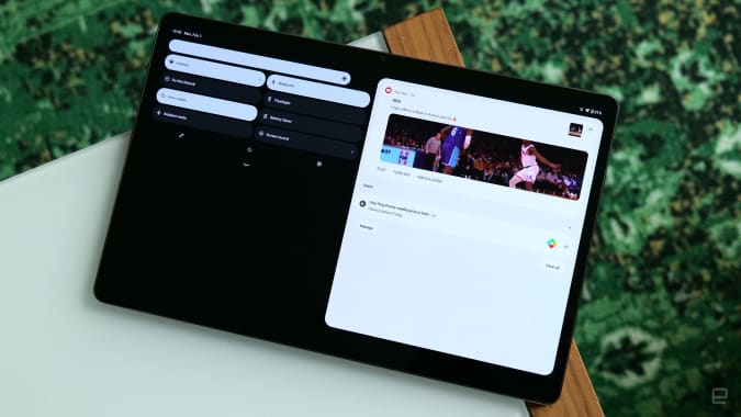
The other big area of improvement in Android 12L are changes to the OS’s UI for larger screens. So instead of the single-column notification tray we’re used to seeing on phones, Android 12L features a two-column layout that puts notifications on the right alongside your usual quick settings icons on the left. It’s a straightforward change, but it really does make the extra display area on bigger devices feel more worthwhile. And it’s a similar situation for the Settings menu, though once again I should point out that Samsung’s OneUI has had this for some time on larger foldables. Sadly on the P12 Pro, I noticed that the two-column notification layout only works in landscape mode, which hopefully Google can address in a future update.
Sam Rutherford/Engadget
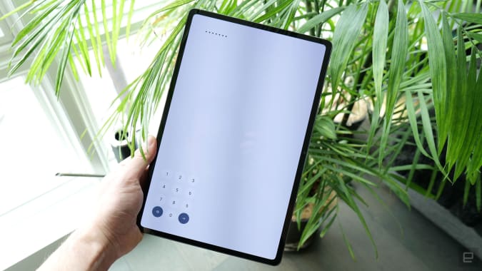
Another clever quality-of-life update is the ability for Android 12L to move the PIN or pattern-entry menu on a device’s lock screen to left or right, based on where you most recently touched the screen. It makes getting into your device just a bit faster and easier. Though once again, Google still needs to tweak things a bit. On the P12 Pro, the field showing your pin appears at the top of the screen, which looks a bit awkward (and also quite hilarious) in portrait mode. Google also updated the Recent Apps screen with a new layout that retains the existing card-based system while better utilizing the space on the sides of your display.
Finally, while it’s not available on the P12 Pro just yet, Google also added a new “double line” clock option to the lock screen. So instead of getting a giant clock smack dab in the middle of your display, you can choose a more compact timepiece that’s tucked up in the top left corner.
Even more under-the-hood big screen optimizations
Elsewhere, Android 12L has even more subtle enhancements designed to make apps look better on bigger screens, even if those apps haven’t been updated in a while. For apps that haven’t been already optimized by their developers, Google upgraded Android 12L’s compatibility mode to make apps automatically look and respond better across various screen resolutions and orientations. And for apps that don’t take up the entire screen, Google added new letterboxing options including new overlays and background settings. There’s even a new tool to apply rounded corners to app windows, though as you can see by the squared-off apps from our Android 12L test device, it’s up to device makers to implement them as they see fit.
Sam Rutherford/Engadget
In the future, Google will also add ratings to Play Store to help point out which apps have been optimized for large screen devices and support things like adaptive layouts and scaling options, which is especially important for foldables that can switch between various screen resolutions and aspect ratios on the fly.
Then there are more niche changes like updated M3 buttons (the ones that look like little pills) that should help call attention to important permissions, some new animations (like the one for power in quick settings) and more intuitive labels for important multitasking functions (like renaming “pin to top” to “split top”).
What Android 12L means for future devices
Google has been very clear thus far saying Android 12L is intended to support “the next wave of Android 12 tablets, Chromebooks and foldables.” So while you may see some improvements on phones, Android 12L is really setting the table for the next batch of big-screen mobile devices. However, if we’re reading between the lines, perhaps the bigger takeaway is that Android 12L could herald the arrival of the long-rumored Pixel Fold or possibly the return of a first-party Google tablet. Google hasn’t done a mid-cycle Android update since Android 8.1 in late 2017, which suggests Google might have some upcoming hardware designed to really showcase all the new features in Android 12L.
Sam Rutherford/Engadget
But has it worked? Compared to vanilla Android 12, the new taskbar in Android 12L makes an immediate impact on how you use and multitask on a tablet or other big screen device. With so many people working and learning from home, the days when a tablet could be a simple video watching or social media machine are over, and with Android 12L is Google acknowledging that shift.
However, it isn’t a clear win, because when compared to Chrome OS which already has a dedicated taskbar and the ability to run Android apps, Chrome OS-based devices often feel like they’re better suited to handle everyday productivity or education needs, particularly on gadgets with built-in or optional keyboards. But for mobile-first hybrid devices like foldables, Android 12L makes a lot of sense, even if many of these new features are already available in other variations of Android like One UI.
All products recommended by Engadget are selected by our editorial team, independent of our parent company. Some of our stories include affiliate links. If you buy something through one of these links, we may earn an affiliate commission.
"Android" - Google News
February 08, 2022 at 01:00AM
https://ift.tt/hMIyzP6
Android 12L hands-on: Some big multitasking upgrades, but is that enough? - Engadget
"Android" - Google News
https://ift.tt/k3CWTwy
https://ift.tt/xmXSlcM
Bagikan Berita Ini


0 Response to "Android 12L hands-on: Some big multitasking upgrades, but is that enough? - Engadget"
Post a Comment