Rita El Khoury / Android Authority
According to details obtained by Android Authority from a trusted source, Google was working on a smarter, visual, and more contextual lock screen and always-on display for Android. This project, which was conceptualized during the development of Android 11, was abandoned in favor of the short-lived power menu interface that married Google Pay and smart home controls.
Google’s original vision was more intricate and interesting, though. We think it’s worth a thorough look, if only for the ‘what could’ve been’ factor.
Pixel ‘At A Glance’ on steroids

Rita El Khoury / Android Authority
The screenshots and information we obtained showcase an advanced ‘At A Glance’ (codename: Smartspace) that goes beyond its homescreen widget and integrates into the Android lock screen and always-on display too. This expansion into more areas of your smartphone would push the envelope on what we’ve come to know as the Pixels’ simple weather, calendar, and flights widget.
Details are a bit sparse on the exact mechanics, but the UI mock-ups imply that you’d first get a suggestion chip with the title of the current context. It seems that you’d have to tap that chip to show the full At A Glance interface. That makes sense because you wouldn’t want all of the cards and actions to remain on the screen all the time, consuming battery and causing display burn-in.
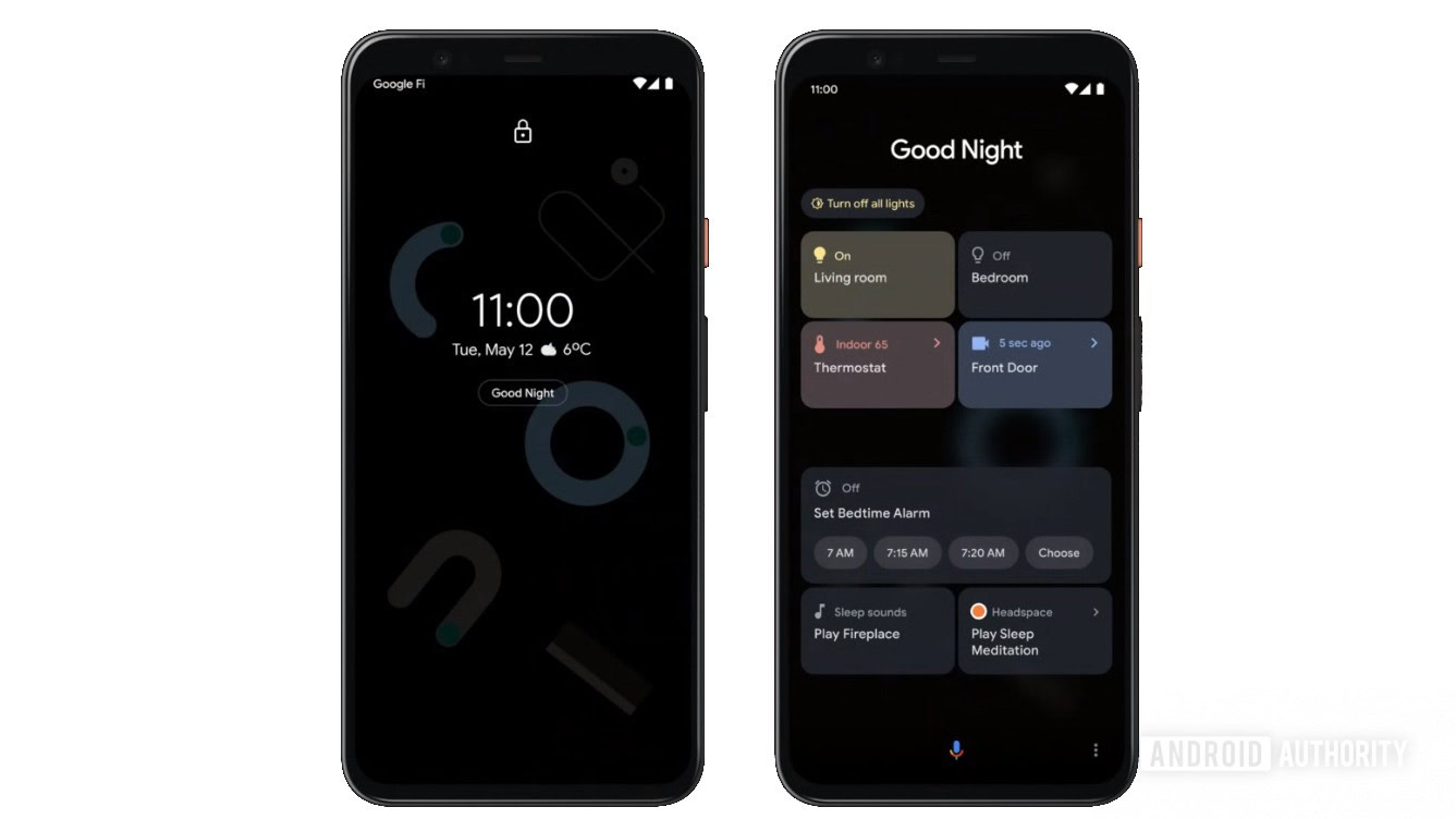
The mock-ups show a smarter At A Glance widget that goes beyond the homescreen and integrates into the Android lock screen and always-on display.
In the screenshot above, you can see that in the evening context, you get a “Good Night” chip that reveals relevant smart home controls (lights, thermostat, security camera), a card for setting up your morning alarm, plus sleep sounds from Google and meditation sounds from Headspace.
The idea is that you’d have almost everything you need right at your fingertips and you wouldn’t have to dip in and out of apps to perform the usual actions you do before going to sleep. The concept goes much further than this, though.
Smarter contextual suggestions
The Headspace example hints that Google had bigger plans than just sleep routines. In fact, in the three other mock-ups above, you can see the extent of the integrations and suggestions it envisioned.
After connecting headphones, At A Glance would surface suggestions to some podcasts, Spotify playlists, YouTube videos, Netflix movies or series, plus a few people to call on the phone, WhatsApp, or Facebook Messenger. Details are sparse on how Google might have picked these, but the idea is that they would be as relevant as possible. (Personal note: I’m not sure I would trust Google to guess these correctly, given how Android’s Share sheet always suggests the delivery driver I once received a message from in 2019 or the third-degree cousin I talked to in 2018 instead of my family or close friends. But I digress.)
Google's intention was to share this feature with other OEMs so they could integrate it in their own skins too.
Similarly, if you find yourself at a bus or train station, you wouldn’t have to manually launch Google Maps or other transit apps. Instead, At A Glance would show you upcoming buses/trains and what seem to be directions to a frequent or recently-searched destination. It could also display relevant tickets if they were stored on your device.
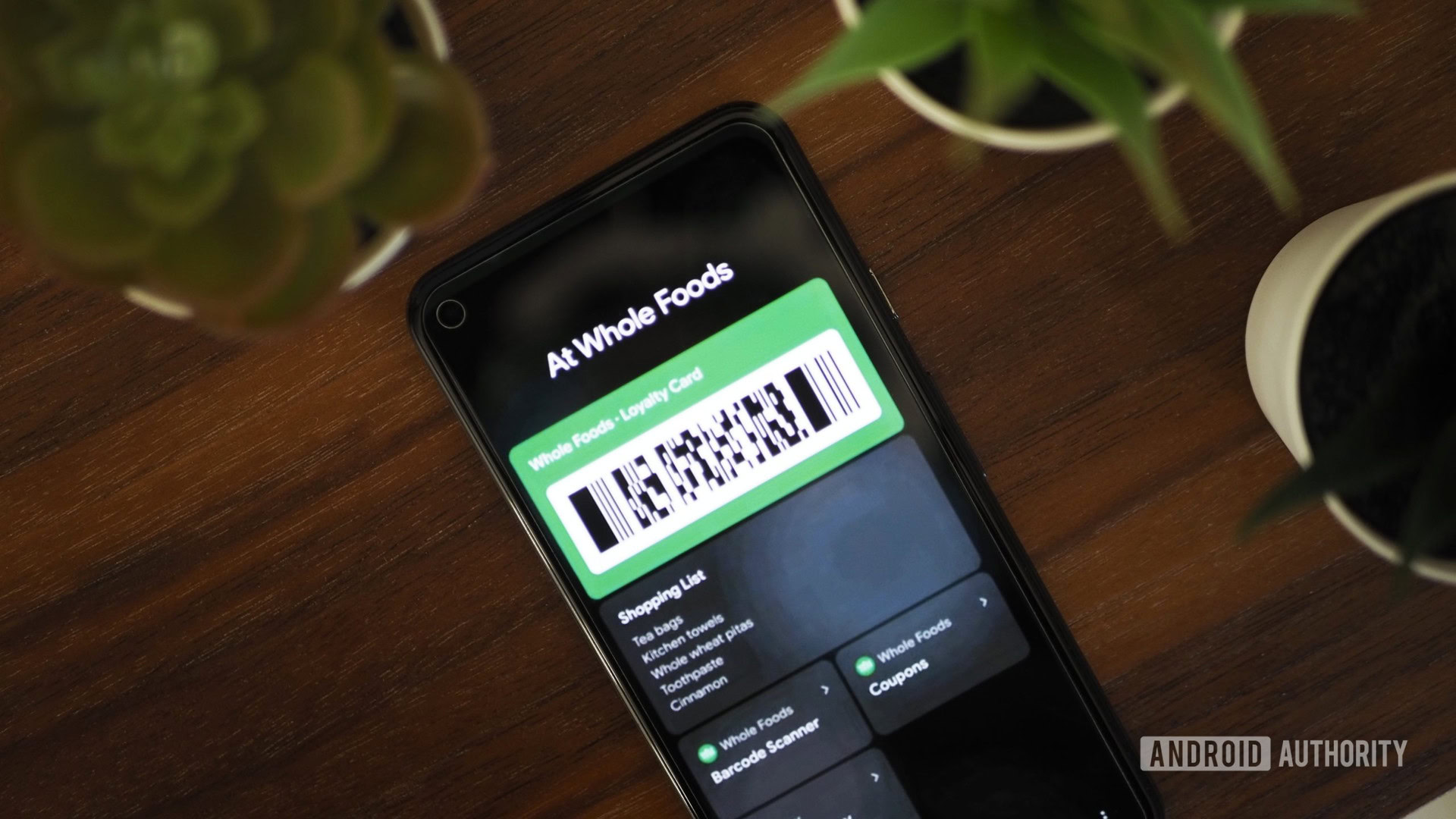
And when you get to a store, it would surface your loyalty cards, shopping list, any relevant coupons or deals, a suggestion to pay with Google Pay, plus any contextual actions that might be relevant to your in-store experience.
Although this may seem like a Pixel exclusive, Google’s intention was to share this feature with other OEMs so they could integrate it in their own Android skins too.
What happened? What did we get instead?

Robert Triggs / Android Authority
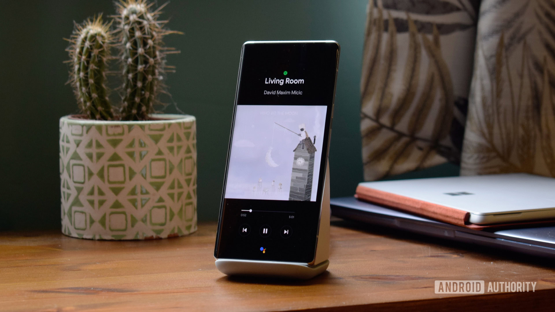
This special Pixel Stand UI shows hints of Google's concept, namely that Assistant button at the bottom.
We know that Google was working on code for this feature around the Android 11 development cycle, but it never moved past the prototyping stage. The reasons are unknown to our source, but we can take a few guesses.
A big part of Google’s vision relies on third-party integrations into At A Glance, thus involving entities and services it has no control over, with potential restrictions depending on location or availability. However, the company’s track record in getting any third party to play nice with its newfangled smart features (think Assistant app actions or app slices in the launcher) has been less than stellar. I’d go as far as saying that it has trouble integrating its own homebrew services together — how long did it take for YouTube Music to make its way to the Google Home, for example? So you can imagine that a project as ambitious as this lock screen vision requires more solid partnerships than that. It would have been a herculean endeavor for Google.
The other hurdle I can think of is one of security and privacy. Surfacing relevant information on the homescreen after the phone is unlocked is one thing, but showing it on the always-on display or lock screen is another can of worms. A stranger could gain access to your smart home devices, see photos of your family, or call your coworkers. Even if every sensitive action requires authentication, the mere fact that this data would be visible is a potential security and privacy risk. Yes, Google could require some form of authentication prior to showing all the suggestion cards, but that would partially defeat the purpose of the at-your-fingertips concept. Why not unlock and go to a widget on the homescreen then?

Robert Triggs / Android Authority
Another Pixel Stand UI shows mixed media and smart home controls, slightly similar to the concept mock-ups.
Whether these speculations are the real reasons behind the project’s demise or not, the end result is that this vision never came to life. Instead, we got bits and pieces of it across multiple interfaces.
- The Android 11 power button menu with its Google Pay and smart home integrations was a severely simplified version of the concept. But it was so restricted that Google abandoned it come Android 12.
- The Google Pixel Stand (2nd gen) has an interface vaguely reminiscent of the mock-ups (see the two images above), but it limits itself to media and smart home controls, in addition to charging speeds.
- The updated At A Glance widget on Pixels is getting some minor integrations with Nest doorbells, fitness services, and Google Clock bedtime, but there’s no hint at potential audio, in-store, or Maps integrations.
- Google Assistant’s Snapshot can surface calendar, stocks, bills, and Google Maps suggestions, but it’s pretty hidden and it lacks many third-party integrations.
All of these small changes, combined, are much less ambitious than the original concept. Not to mention how dispersed they are across Android.
The spiritual successor to Google Now that never was

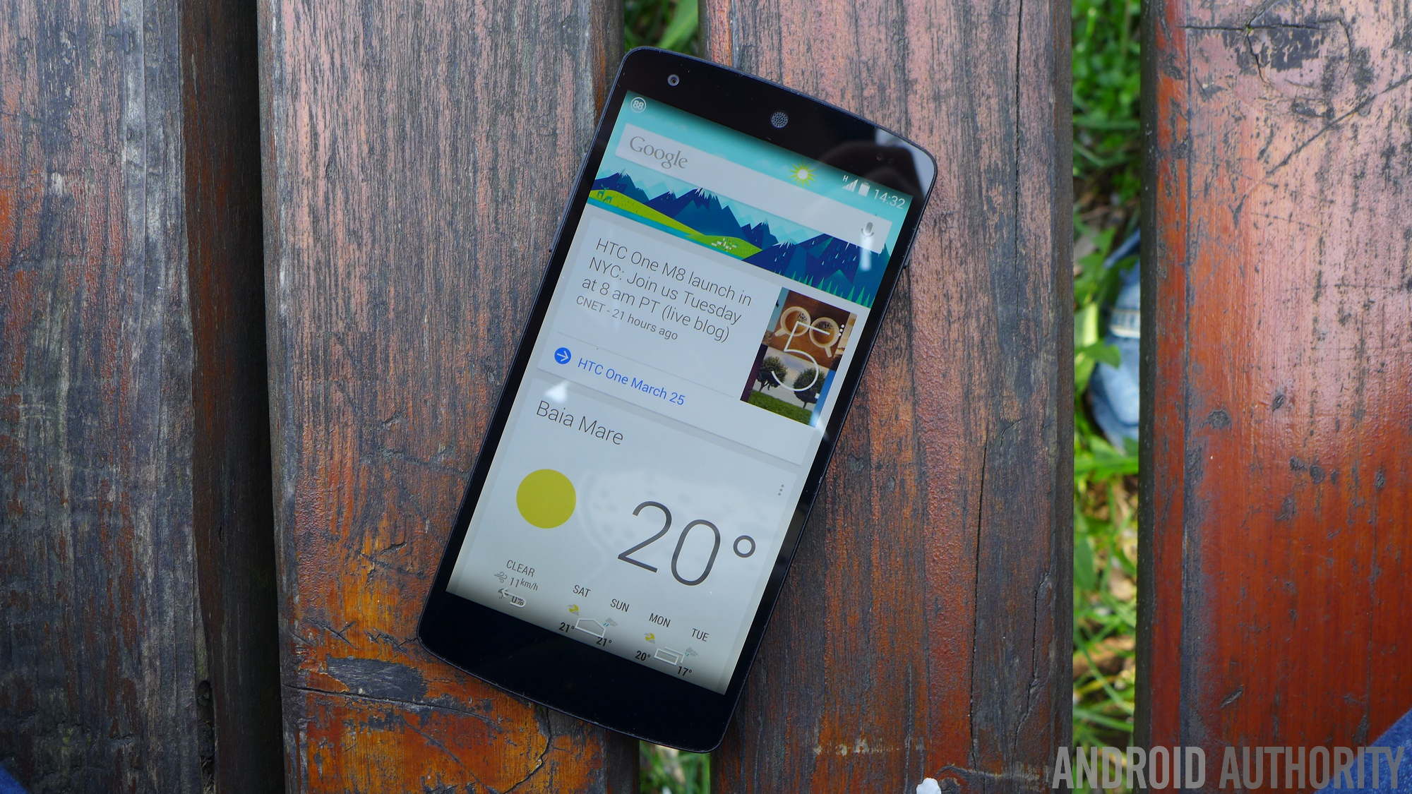
Looking at the project’s mock-ups, the first thing that comes to mind is Google Now. The contextual cards that were surfaced during different times of the day along with the flights, shipments, reservations, entertainment, and other integrations, seemed ahead of their time when they appeared in the early ’10s. If Google hadn’t abandoned Google Now in favor of the Discover feed — and later tried to shoehorn some Google Now features into the Assistant Snapshot and At A Glance widget — this ‘might’ have been the logical progression of Now.
Our entire smartphone experience in 2022 is still app-centric instead of context-centric like Google had originally envisioned.
In a way, we feel a bit cheated by what we got instead of what could have been. Google had this grand ambition of (finally) using what it knows about where we are, what we’re doing, and what we’re likely to do next, in order to surface relevant information and actions. No more dipping in and out of several apps when you’re at the store or the train station. No more wasting time digging into multiple menus in every app to perform simple, repetitive actions. Instead, our entire smartphone experience in 2022 is still app-centric instead of context-centric, and I think it’s a big shame that we’re still here ten years after Google Now’s first introduction.
"Android" - Google News
February 03, 2022 at 10:07PM
https://ift.tt/SDhAl0v3C
Exclusive: This is the intelligent Android lock screen Google never gave us - Android Authority
"Android" - Google News
https://ift.tt/s3nHoOXCc
https://ift.tt/AjKE538mG
Bagikan Berita Ini


0 Response to "Exclusive: This is the intelligent Android lock screen Google never gave us - Android Authority"
Post a Comment