Google's Android 12 software is nowhere near ready for prime time, but Goog almighty: We've sure seen plenty of hints about some of the tantalizing touches it could include. And if you're anything like me, that makes it tough not to feel at least a teensy bit hungry for a taste.
The current Android 12 developer preview, unfortunately, won't do much to satisfy that craving. It's basically just a barebones framework of the software, made mostly for developers, and most of the mouthwatering morsels are carefully tucked away, disabled, and not yet visible or available for regular-mammal phone-owner use.
But wait! Before you go off sulking and seeking out a consolation snack, take heed: A few of the treats that seem to be under development for Android 12 can actually be brought into any Android device, with any Android version — and with very little effort — right now. All you need is the right third-party app to emulate the same basic concept, and you can enjoy at least a small sampling of some of the flavors Android 12 might soon include.
So grab the nearest bib, get some grape soda standing by and ready to wash all this virtual deliciousness down, and let's dig in.
Android 12 feature No. 1: Enhanced privacy indicators
The easiest Android 12 element to give yourself — and arguably one of the more consequential additions likely on its way to the software — is the Apple-inspired system of visible indicators that pop up anytime an app is accessing your device's microphone or camera. It's hopefully something you'll never need or be especially surprised to see, but it's a smart bit of added privacy protection and certainly something that can't hurt to have in place.
The official feature is currently in an "experimental phase," according to the code-studying sleuths over at XDA Developers, who first reported on its presence as part of an Android 12 leak last month and went on to find it out of sight and disabled in the first developer preview — but with about 60 seconds of setup, you can give yourself something almost identical without delay.
Just install an app called Access Dots onto your phone. Open it up and tap the toggle on its main screen to turn it on. You'll be prompted to authorize the app to run as an Android Accessibility Service, which may sound scary but is genuinely required in order for it to be able to see what's using your microphone and camera at any given moment and then report on that properly. The app doesn't have any other system permissions, notably — including the ability to access the internet — and so it couldn't do anything shady even if it wanted to (which I think it's safe to say it doesn't).
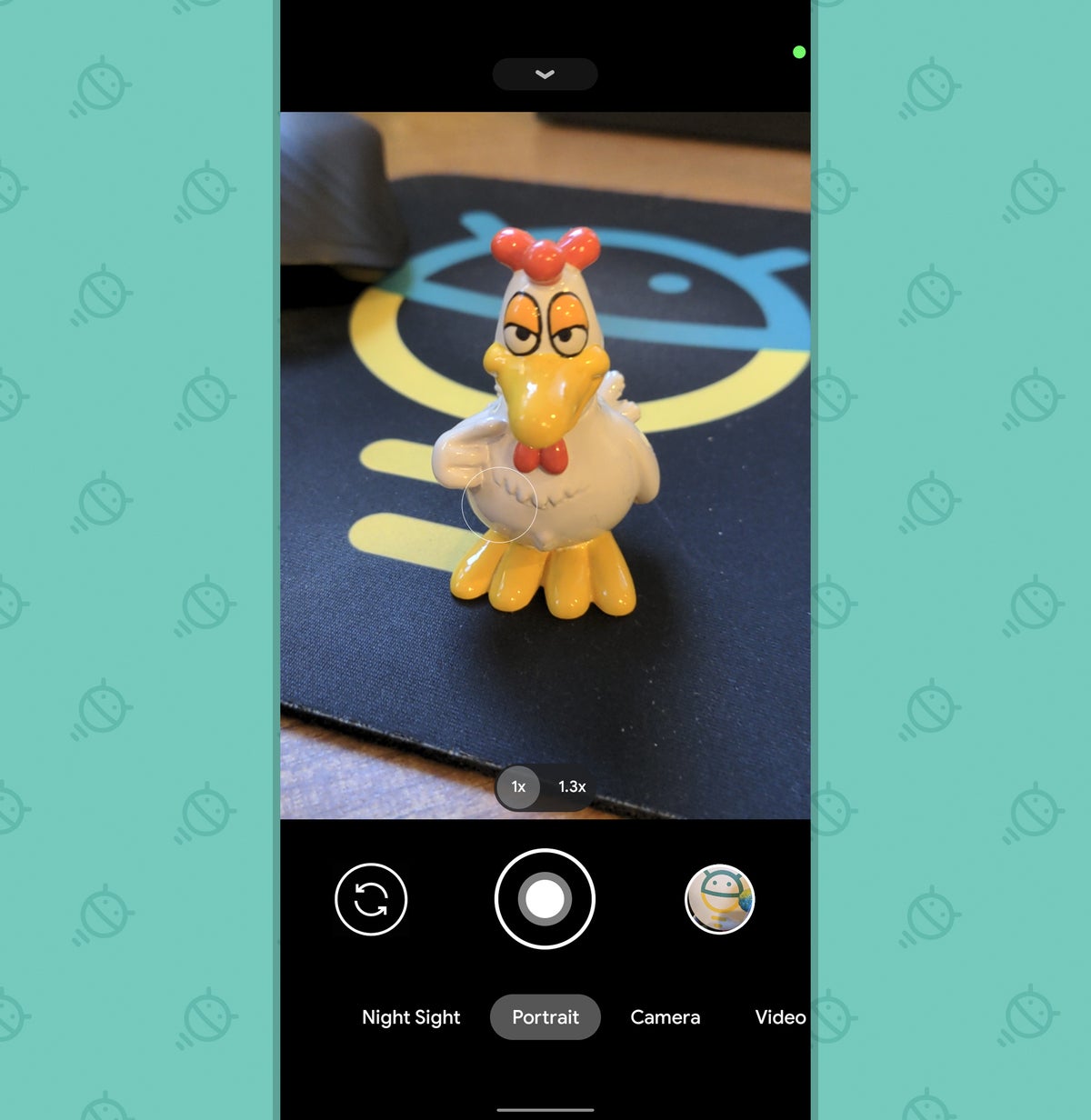
Once you've got that toggle, erm, toggled, that's pretty much it: Anytime an app is accessing your microphone, you'll see an orange dot in the upper-right corner of your screen. Anytime something's using your camera, you'll see a green dot in that same area. Just open up your Camera app if you want to test it out and see it in action:
 JR
JRSee the dot, up there in the upper-right corner of the screen — way up above the beautiful bright beak of my executive assistant, Mr. Clucklesby? That's it!
Before you set it and forget it, Access Dots has a few other noteworthy options worth exploring. First and most simply, you can change the colors used for both of its indicators — maybe to a lovely chartreuse, you fancy, fancy frog — and you can also even change their size and position, if you're feeling especially saucy. You can make the dots bigger, too, if you want 'em to be especially eye-catching and impossible to miss.
Perhaps more significant, you can enable an optional third indicator that goes beyond what Android 12 is even believed to include — one that adds a dot onto your screen anytime an app is accessing your location. That one requires an extra location permission, for obvious reasons, which seems to be why it's disabled by default. A nice little extra to have, though, wouldn't ya say?
Access Dots is free to use, with some mildly annoying ads peppered throughout those configuration screens (which you'll probably never look at again after this initial setup). You can disable those ads and enable some of the more advanced customization options with a one-time $2.50 donation to the app's developer, if you're so inspired.
Android 12 feature No. 2: One-tap app pairs
We've been hearing rumors about a revamp of Android's now-rather-buried and underused screen-splitting feature for a while, and this earliest Android 12 preview does indeed show signs of such an effort being developed. Presently known as App Pairs, the system would let you — wait for it — pair any two apps together (see what they did there?!) and then have 'em open up on your screen at the same time with a single tap.
It doesn't seem like a super-dramatic departure from the standard split-screen command that's been in Android since 2016's Android 7.0 (mmm....Nougat) release, but it could be a more convenient way to put the same basic idea into practice. And that, in turn, could make the feature much more user-friendly and likely to be used. Hey, we'll take it.
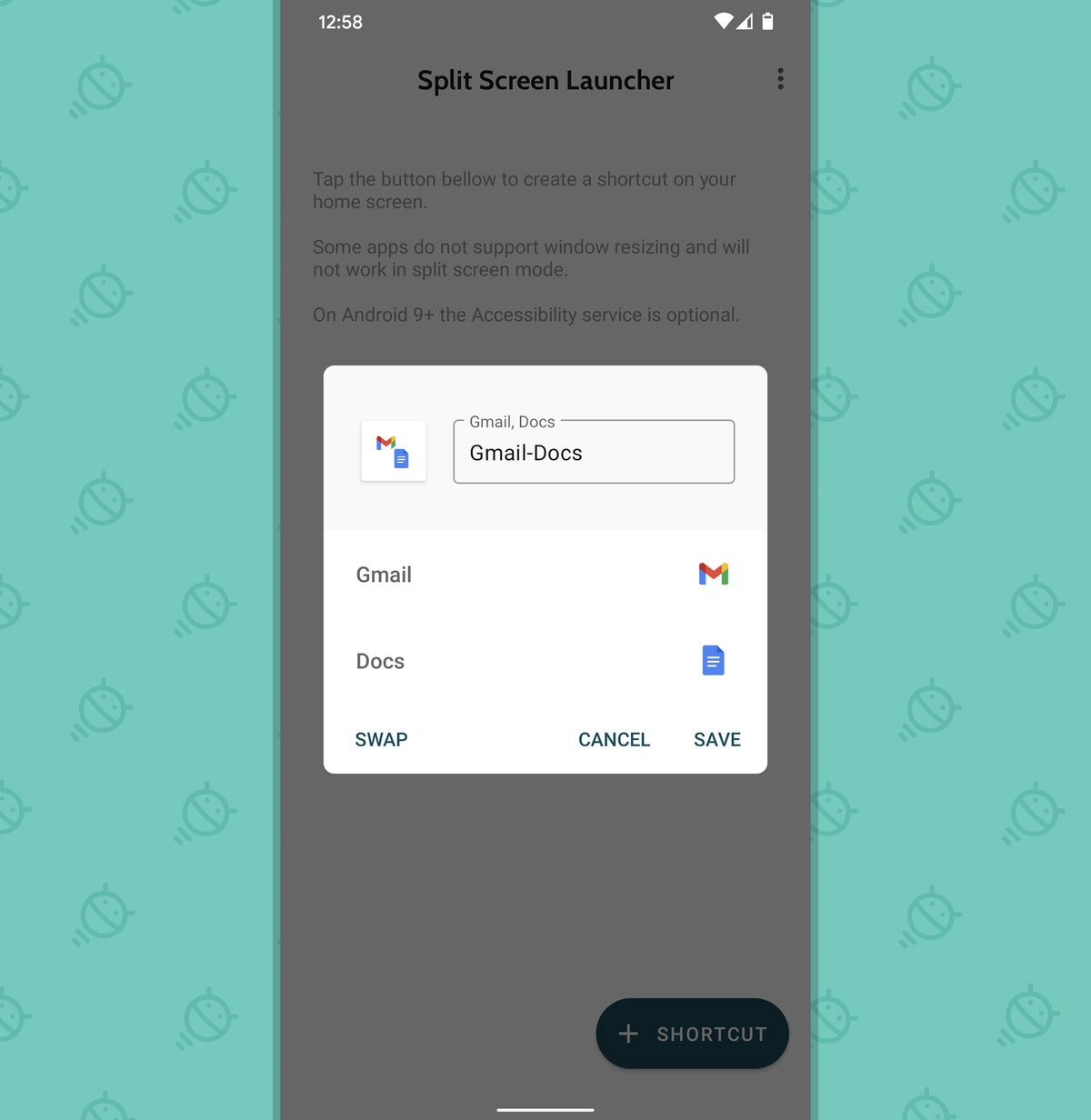
If you want to experiment with the same concept now, grab a simple, free app called Split Screen Launcher. Open it up, and you'll be greeted with a screen that empowers you to create any custom app pair you want:
 JR
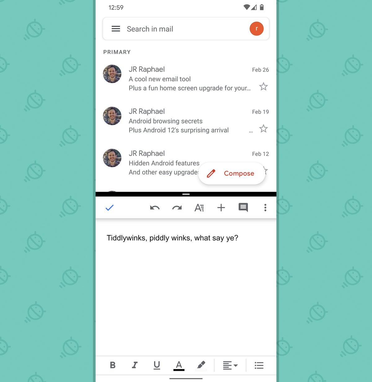
JRJust put whatever apps you want into the form, give your snazzy new creation a name, and follow the steps to create it. A second later, you'll have your shiny new shortcut ready and waiting on your home screen — and anytime you tap it, well, take a look:
 JR
JRPre-tay handy, I'd say. Pre-tay, pre-tay handy.
Oh, and Split Screen Launcher doesn't require any special permissions at all, so there's nothing to worry your pretty little person-head about when it comes to the realm of privacy.
Android 12 feature No. 3: A universal notification gesture
One of the bigger themes of Android 12 seems to be better optimization for single-handed phone use — and one part of that is the small-seeming but significant ability to activate your phone's notification panel without having to resort to any phone-shifting hand yoga. No matter what app or part of the operating system you're using, you can just swipe that stunning fingie of yours down anywhere on your screen, and poof: Your notifications will unfurl.
That sort of gesture is already possible from the home screen with certain devices and launcher setups now, but Android 12 would apparently take it a step further and make it available from anywhere in the Android environment — be it in your email app, within one of your 70 kajillion messaging apps, or even in your browser whilst you're looking at photos of weirdly attractive potatoes. (Hey, I'm not here to judge.)
Well, guess what? You can enable a similar sort of system this very second — and, in fact, even give yourself plenty of other useful universal gestures for accomplishing practically anything imaginable while you're at it.
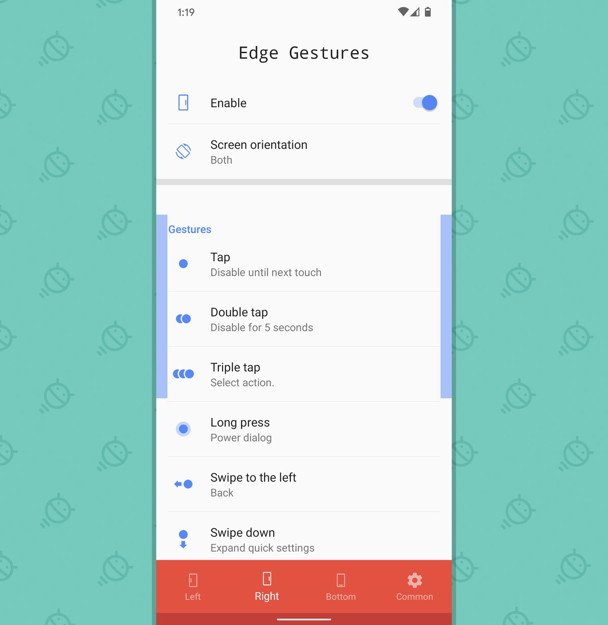
The secret revolves around a fantastic app called Edge Gestures, which costs two entire dollars and is worth every penny of that price. Once installed and granted the permissions it requires, Edge Gestures will give you a configuration screen where you can set up whatever gestures your demented little potato-lovin' brain desires.
 JR
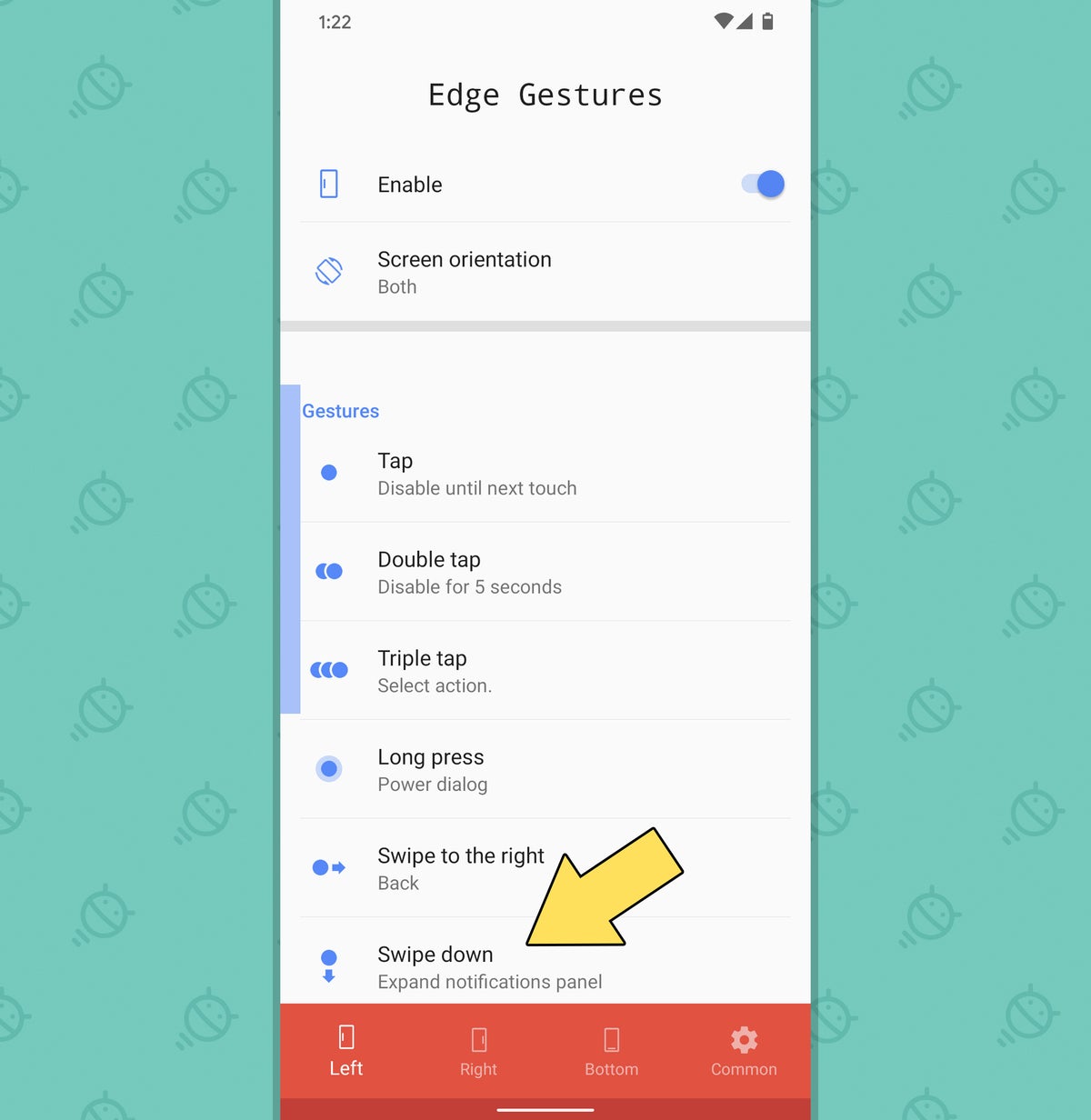
JRIt's a lot to take in at first glance, but it really isn't all that complicated. The tabs at the bottom of the app let you move between gestures for the left side of the screen, gestures for the right of your display, and gestures for the bottom edge along with some general settings for how the app behaves. I'd start by deciding whether you're more likely to swipe downward on the left or the right side of the screen — which probably comes down to a question of which hand you usually use to hold your phone, more than anything — and then flip the toggle to disable whichever side you aren't gonna be using so you can avoid having any commands you don't need sitting around and waiting to be activated on accident.
Then, for whichever side you are planning on using, just look through all the different options. The one closest to the Android 12 implementation we've been hearing about is "Swipe down" — the sixth option under the "Gestures" header — and my goodness, wouldya look at that? It's already set to open your notification panel by default! You don't even have to do a thing. Go, go, gadget pointer-machine:
 JR
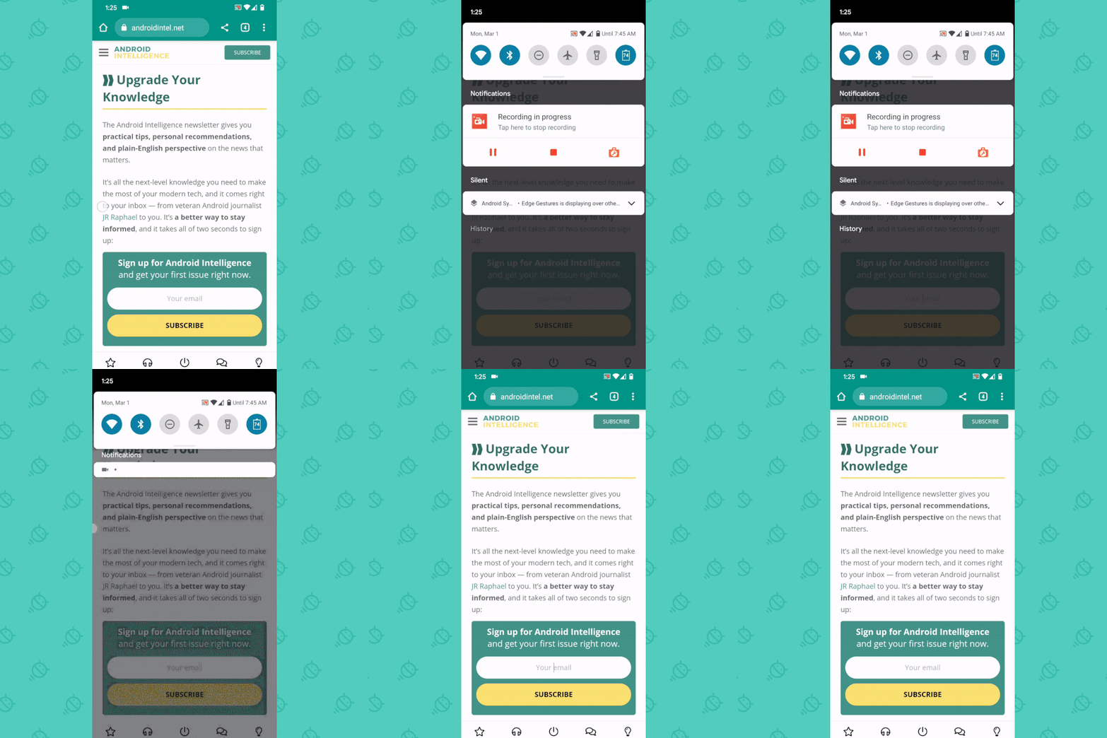
JRSo go ahead and give it a whirl: Swipe your phalange of choice down the appropriate side of your screen, and you should see that notification panel pop up in a flash — no matter what app you're lookin' at or what manner of hijinks you're up to. And, crucially, you can do it in a place that's easy to reach and convenient, without having to reach all the way up to the tippity-top of your skippity-screen.
 JR
JRWhee!
If that's all you want to do, take a minute to go through all the other options in that area of the Edge Gestures settings and disable 'em (by tapping their lines and then selecting "Clear" in the menu that comes up). That'll keep you from accidentally activating anything else that you didn't mean to use.
But before you switch everything off, switch that noggin of yours into its thinkin' mode and mull over what else might be useful. You might come up with some other swiping move you could customize and leave in place while you're at it — maybe, say, a more easily accessible gesture for opening your Overview (a.k.a. Recent Apps) interface or a convenient command for quickly flipping back to your most recently used app. You've got possibilities a-plenty right in front of your peepers, and there's no need to stop with what Google itself is cookin' up in Android 12.
And one more thing: While you're here, you might also want to peek in Edge Gestures' Common tab — at the far right of its bottom menu bar — for some interesting options that'll let you change exactly where and how its "hot zone" for swiping works. This is one seriously powerful tool, and there's not much about it that you can't take into your own hands and control.
In terms of privacy, by the way, Edge Gestures uses that same Accessibility Service thing that we talked about earlier, along with the ability to display over other apps — both of which are completely legitimate and required for its operation. Like the other apps in this collection, it requires no system permissions beyond that and couldn't access the internet or do anything dubious with your data even if it ever wanted to.
And there ya have it, my phone-totin' comrade: your very own early sample of a few things Google's thinking about with Android 12. It's kind of like an appetizer, in a sense, only with an entree that could still turn out any number of ways once it's done. And I don't know about you, but this tiny little taste sure is making me hungry for more.
Want even more Googley knowledge? Sign up for my weekly newsletter to get next-level tips and insight delivered directly to your inbox.

"Android" - Google News
March 02, 2021 at 10:42PM
https://ift.tt/3sDMB2r
3 Android 12 features you can bring to any phone today - Computerworld
"Android" - Google News
https://ift.tt/336ZsND
https://ift.tt/2KSW0PQ
Bagikan Berita Ini


0 Response to "3 Android 12 features you can bring to any phone today - Computerworld"
Post a Comment