While it may have just snuck in under the wire for its intended April release, Android 13 Beta 1 was worth the wait for Android users anxious for the latest or greatest. Android 12 was a significant overhaul — with significant bugs that persisted through the beta and deep into the stable release — but Android 13’s Developer Previews and now Beta 1 are a blessed return to the mostly minor changes norm.
We don’t have any significant new features yet, as Beta 1’s highlighted features aren’t really user-facing yet. While some may find Beta 1 boring for this, its unassuming updates excite me greatly. Material You’s initial version last year brought us a new style, but the styles themselves were limited and Google was still tamping down oddities and rough spots.
With Android 13, Material You starts to truly get fun.
Material You gets its groove on
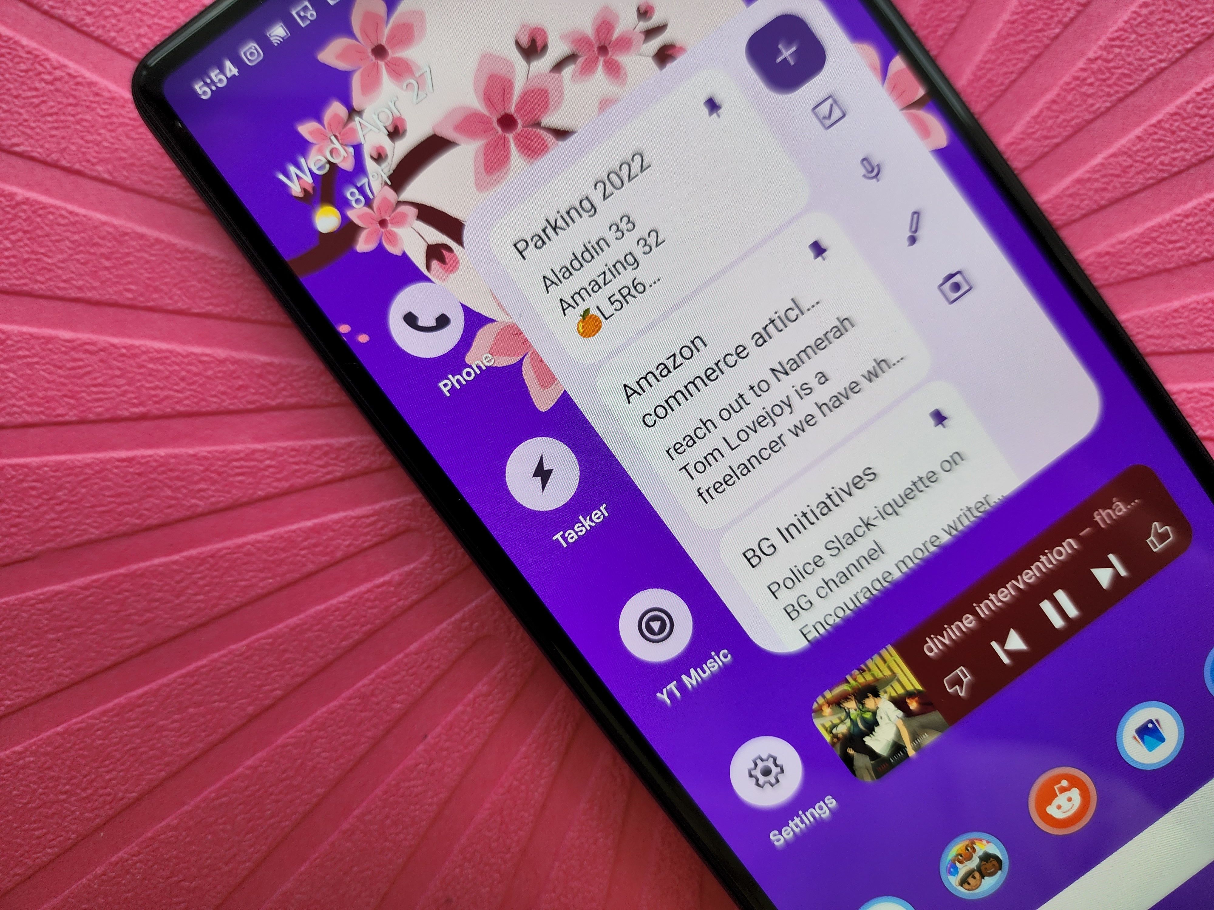
There are three Material You upgrades present in Beta 1: themed app icons, an expanded themes palette, and a wonderfully upgraded Now Playing window in Notifications and Quick Settings. Let’s start with the themed icons because you won’t see many of them for a while; the API was present but undocumented in the Developer Preview. Now that the API is documented, developers need to implement the API for their app icon, and very few have done it so far. Expect that to change as the beta continues through the summer; if you want to see a working one right now, check Sync for Reddit or Tasker.
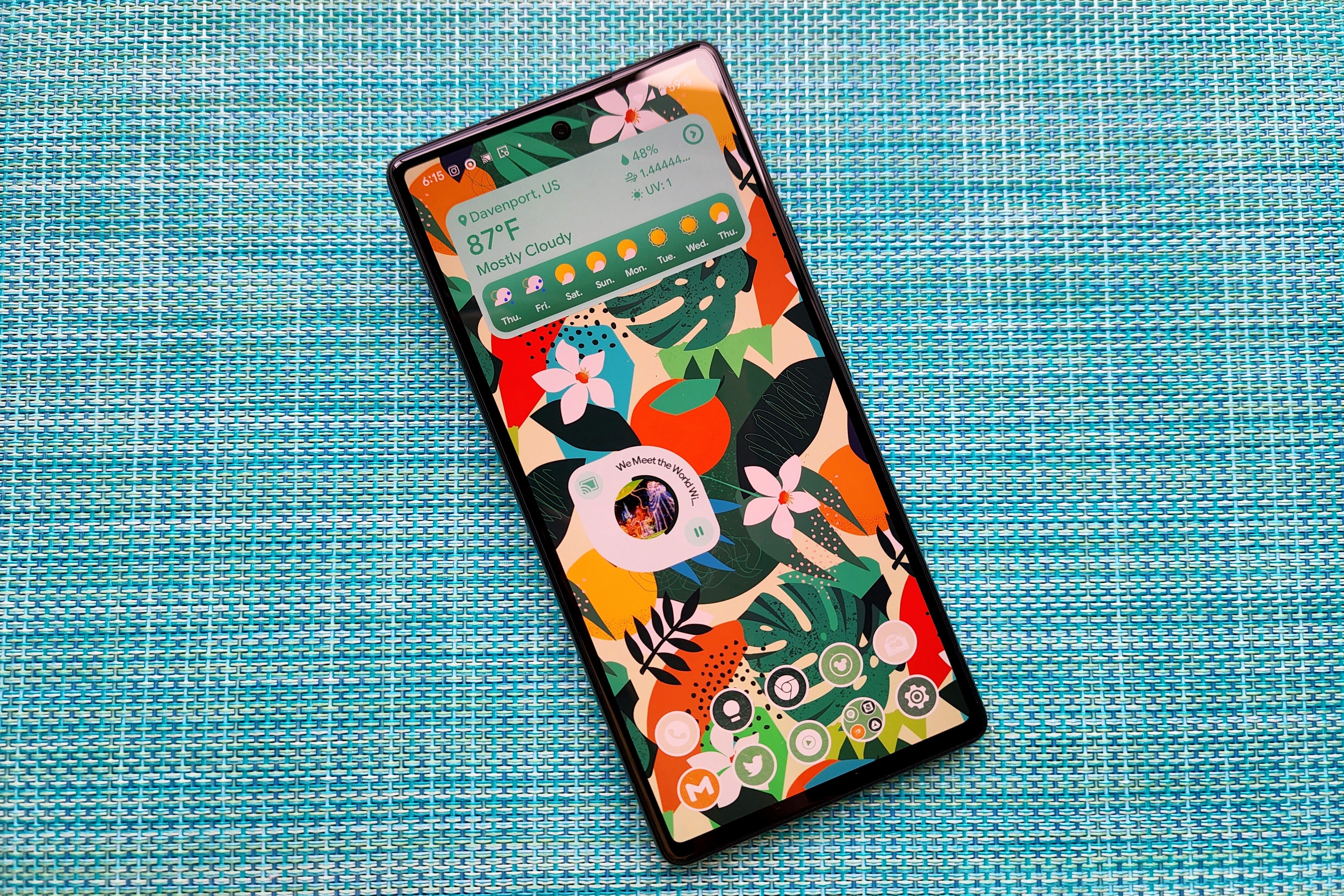
Material You’s monet color palette picker would only give you four color options to go with your wallpaper, and if those missed, you only had four standard color options to fall back on. With Android 13 Beta 1, you’ll now get up to 16 theme color options based on your wallpaper and up to 16 standard colors (11 solids and 5 dual tones). If you’re using a mostly black or mostly white wallpaper, you might only get eight palette options, as there are fewer colors for the picker to work with.
I wish you could set a persistent system style between one of the new theme style types; instead, you're given options generated from all six styles being presented almost randomly in the color picker. I might still end up going back to kdrag0n’s Repainter for bolder, brighter hues, but for the average user, these sweet 16 should prove more than enough to find one that puts the “you” in Material You.
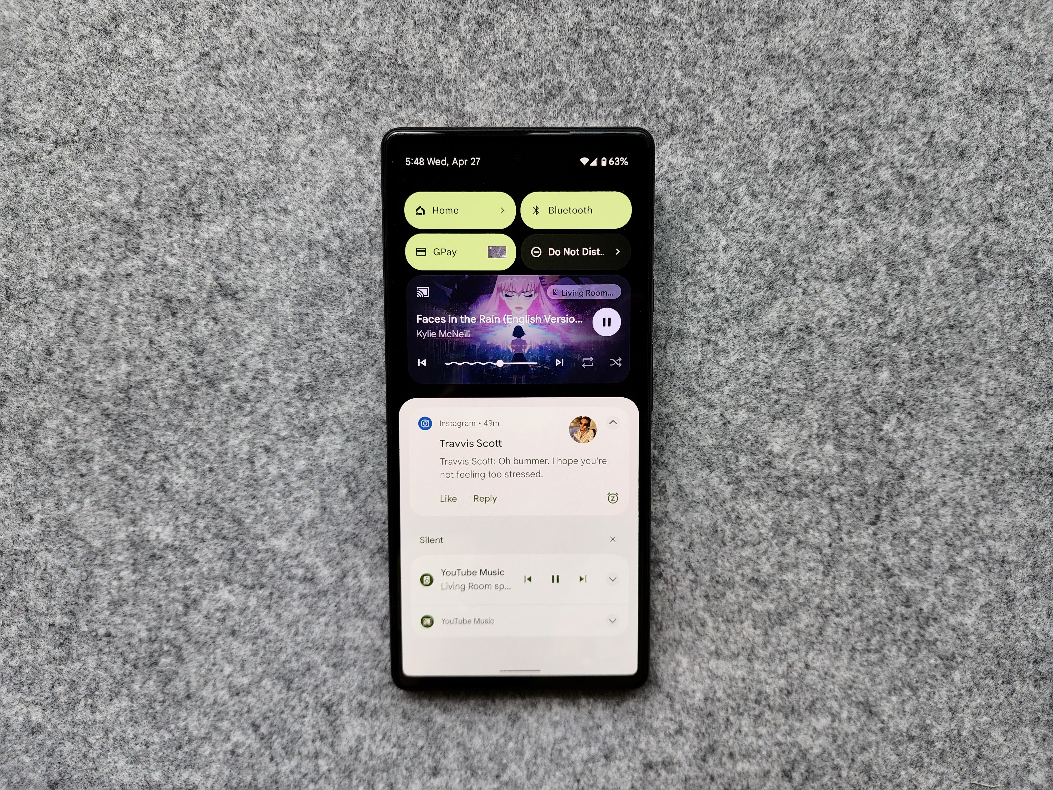
The most visually appealing change in Android 13 Beta 1 doesn’t touch your monet styles, though: Now Playing. The persistent media player that sits atop the Notification shade and beneath Quick Settings has grown in size, style, and functionality. Just being able to see and seek along the progress bar in Android 12 felt like a major improvement, but Android 13 not only doubles the playback controls you can access, its progress bar dances.
The bendy, squiggly progress bar grooves while you’re playing music, then snaps back to a boring flat line when you pause, as if it’s hiding from a passing supervisor before resuming the mid-afternoon dance break. Next/Previous track controls still sit to the sides of the progress bar, but a second set of controls sit in the bottom right corner. These controls vary by app and use the icon styling from the app itself; for YouTube Music, Shuffle/Repeat take that second set instead of Like/Dislike and I could cry with happiness. Spotify’s controls vary whether you’re on Free or Premium, and even podcast apps like Pocket Casts can get in on the fun with the ability to change playback speed from Now Playing.
Combine this with full-width album art backgrounds and controls tinted to match said artwork and Now Play has never looked better on Android. The only “downside” is that this player starts full-sized and stays full size, so it’ll be taking up a not-insignificant amount of space on smaller phones like the Pixel 4a.
Privacy, productivity, and (admittedly few) problems
When you finish the Android 13 Beta 1 update and swipe up to your Quick Settings for the first time, it’ll animate going to the last page and adding a Privacy and Security button…that doesn’t work. And then it vanishes the next time you go to Quick Settings, so don’t be alarmed; you’re not crazy. It’s just a working animation for a non-working feature.
Overall performance of Android 13 Beta 1 on the Pixel 6 series and Pixel 5 series is remarkably smooth. I spent hours trying to find what was broken — it’s a beta, something is always broken — but the only thing I could personally find on my Pixel was some control wonk in Now Playing. My coworkers have also found a few small bugs surrounding animations and Google listed a random reboot issue when the phone goes to sleep with a USB-C headset plugged in, but otherwise, most of the glitches so far are minor.
While a few users have reported carrier service issues after upgrading or long-pressing Bluetooth causing the Android UI to crash, most other “known issues” that arose in the 24 hours since Beta 1’s launch are minor, temporary, and not system critical (outside the rare few with SIM/service issues). Granted, Google tends to hold back the big beta changes until Beta 2 or 3 post-Google I/O, but sailing this smooth is almost creepy, and I’m still waiting for a shoe to drop somewhere.
The new, more granular permissions around media access are, like themed app icons, available but need to be implemented by app developers. Same goes for the ability to control your smart home while your phone is locked, a feature most of us at Android Police are quite excited for.
One of the few functional productivity upgrades right now is the new Clipboard overlay. Ever needed to copy a tracking number out of a text, only for Google Messages to copy the whole thing? This new overlay lets you trim it down to just what you need without having to use a note app. You can fully edit the text to add or remove what you want, in case you need to correct a spelling or remove some colorful language.
There were a few Developer Preview changes that actually got reversed in Beta 1: “Priority mode” has been changed back to its good and proper Do Not Disturb name, and per-app language settings that were working in DP2 are now broken, as is on-device search in the Pixel Launcher app drawer. That particular breakdown seems to hint at larger changes coming in later betas, such as bringing universal search to both the home screen and the app drawer. There are also additions to the taskbar search on large-screen devices in Beta 1 that could spell fun things, but we’ll have to wait until someone gets Beta 1 onto a truly large-screen device. (No offense, Pixel 6 Pro.)
Actually, we might not have to wait months and months until other manufacturers open up their Android 13 betas, as Google posted Generic System Images for Beta 1. This means any Treble-compatible device could theoretically flash Android 13 and play with it, but you still need an unlocked bootloader and the willingness to deal with some major stability issues, so maybe hold off unless you have a spare device you do not mind bricking or regularly factory resetting.
The smoothest beta yet is just getting started
Smooth and uneventful as Beta 1 has been, it’s still early days and Android 13 has more in store. We’ve seen hints of Spatial Audio on the way, and some buried code seems to hint at dockable Nest tablets, not that we’d see any of those until October. With Google I/O two weeks away, we won’t have long to see what other craziness Google has in store for the next version of Android.
If you own a Pixel 4 or up and want to install Android 13 Beta 1, this year might be the year to give it a try. As always, you should have a backup phone you could rely upon should Beta 1 or a later version cause critical issues that might take your phone out of commission until you can flash it back to a fresh Android 13 install — or back to Android 12. You should also be backing up your phone regularly because you never know when a bad update could happen or someone might break your phone in half in a blind rage. (What? Life happens.)
One note I will make is that Android 13 Beta 1 users should probably stick to wireless headphones for now. Google states that “In some cases, suspending the device while a USB-C headset is plugged in causes the device to crash and restart” and random reboots are never good. And honestly, in 2022, isn’t it time you switched to some sweet wireless earbuds? Wired headphones just increase the likelihood of you snagging or yanking the cord wrong and damaging your USB-C port.
"Android" - Google News
April 28, 2022 at 08:43PM
https://ift.tt/6OTst4o
Android 13 Beta 1 hands-on: A smooth, squiggly, and subtle upgrade - Android Police
"Android" - Google News
https://ift.tt/KndYgiz
https://ift.tt/y7SrjUk
Bagikan Berita Ini


0 Response to "Android 13 Beta 1 hands-on: A smooth, squiggly, and subtle upgrade - Android Police"
Post a Comment