Android has never been top dog when it comes to tablets—not that competing with the iPad is an easy job, but Android has always notably lacked the comprehensive functionality and app support of Apple’s flagship tablet. While Android 12L isn’t going to be an iPad killer any time soon, the new operating system is finally starting to address problems that have existed for the last decade.
Android 12L impressed right out of the gate. The streamlined multitasking features, added app support, and a raft of small but noticeable improvements to basic functionality all make a good case for Android’s future on the large screen. Google has released 12L on its Pixel phones, but the tablet version is only available as a beta on the Lenovo Tab P12 Pro, so glitches and missing features are to be expected, but overall, Android 12L is exciting. If you’ve been itching for a tablet experience to match your Android smartphone, this could finally be it.
Multitasking made easy
This is arguably the biggest draw of Android 12L, and that seems to be the intention. Tablets are increasingly expected to fulfill professional needs rather than purely as entertainment, and Android has not been up to the task. This update aims to change that by implementing a handy tool: the taskbar.
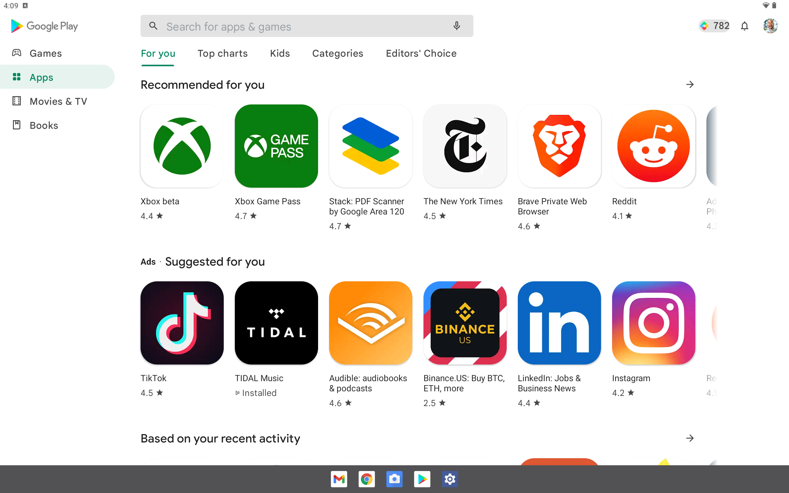
Positioned at the bottom of the screen, the compact black bar houses up to six apps, allowing you to seamlessly switch between up to two of them on a single screen. The simple drag-and-drop system feels intuitive, and on a big enough screen, the multi-window UI shows ample information. It’s a revelation compared to older versions of stock Android on tablets, which make it so awkward to get into split-screen mode that it’s almost not worth doing.
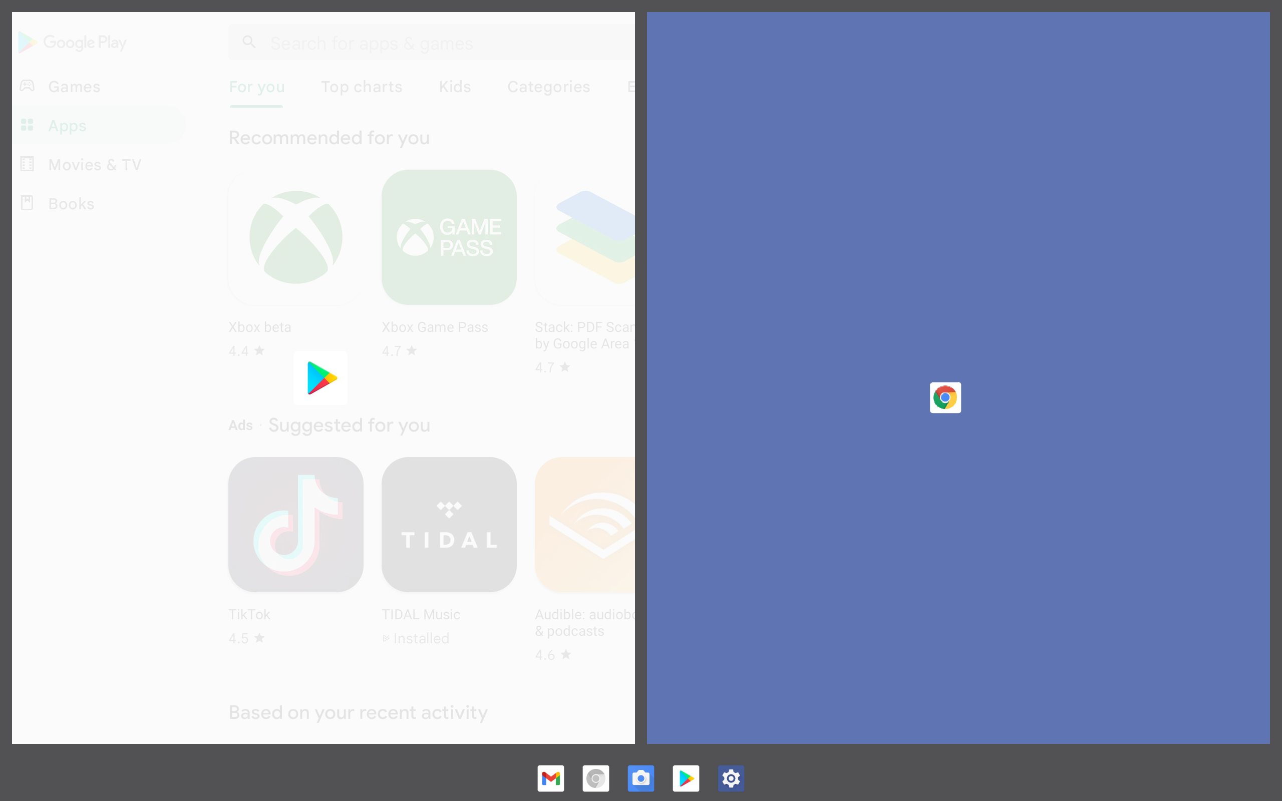
If the taskbar is in the way or ruining your experience, you can simply press and hold to hide it. If you decide you want it back, you just have to press and hold the gesture handle at the bottom of the screen. Even better, if you don’t want to use the taskbar at all, you can still take advantage of the multitasking mode by using gesture control to access the all-apps view of all your apps. Once you’ve got that up, just click on the “Split” button to input a second, open app on your display. It’s uncomplicated and a pleasant departure from convoluted multi-window modes found on older versions of Android.
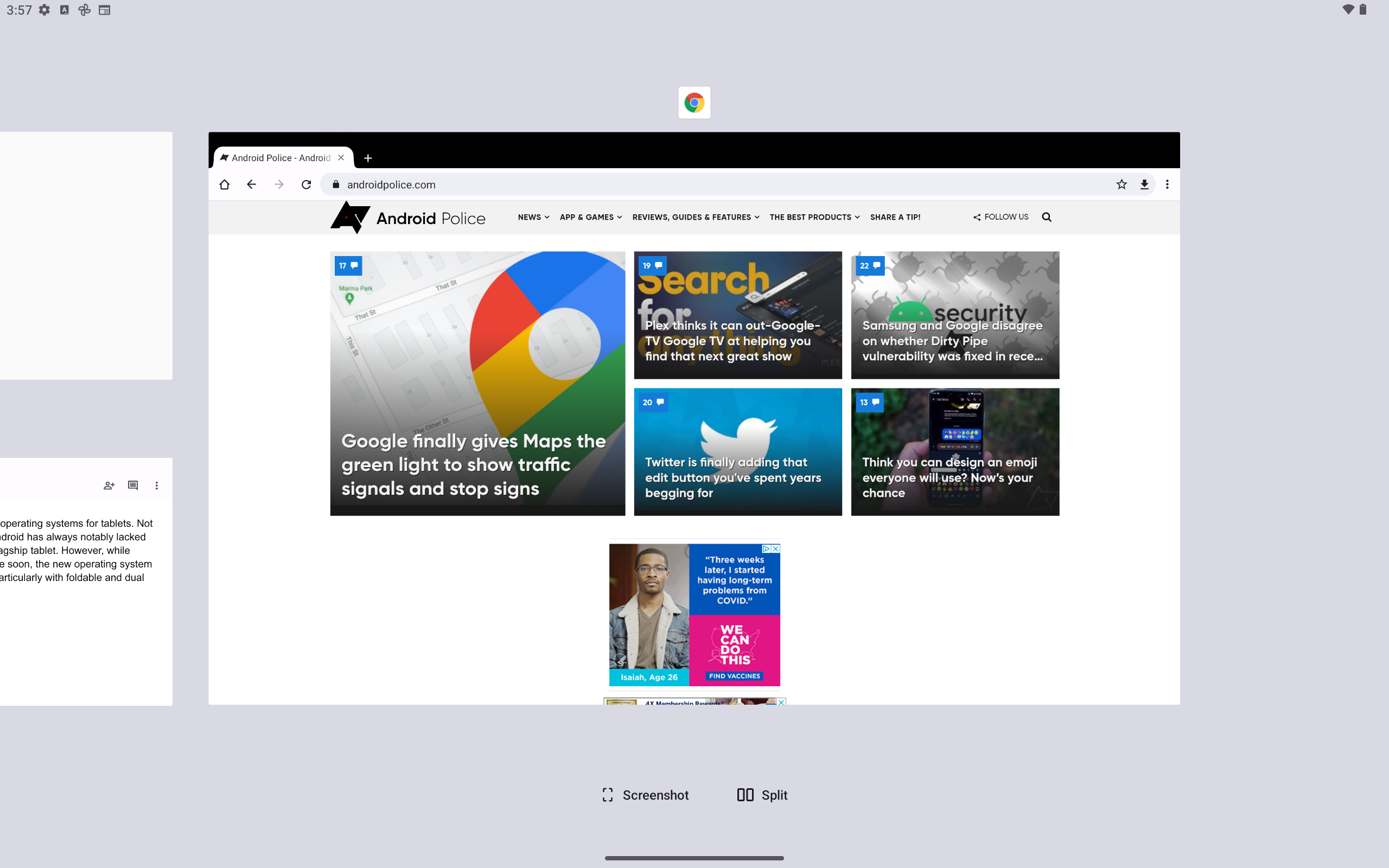
One drawback of the multitasking functionality is that it isn’t entirely obvious how to “unsplit” two pages from each other. As far as I can tell, the only way to do so is to drag the dividing bracket all the way to the edge of the screen, which is fun and well-animated, but not the most streamlined way to get back to your full-screen experience. You are also limited to a 50-50 split in the current beta build—no resizing apps to take up more or less space. By comparison, Samsung’s customized multi-window system gives each app a control bar, from which you can close, move, or resize them. You can also save groups of apps for quick multi-window access, which is not an option in the stock 12L software.
A better experience for tablets and dual screens
As noted in the developers docs, Android 12L is not only aimed at larger screen tablets. The new operating system update is also designed to make use on foldable and dual-screen devices more intuitive, and this should become quite obvious as soon as you launch Android 12L. It makes much better use of available space across the OS.
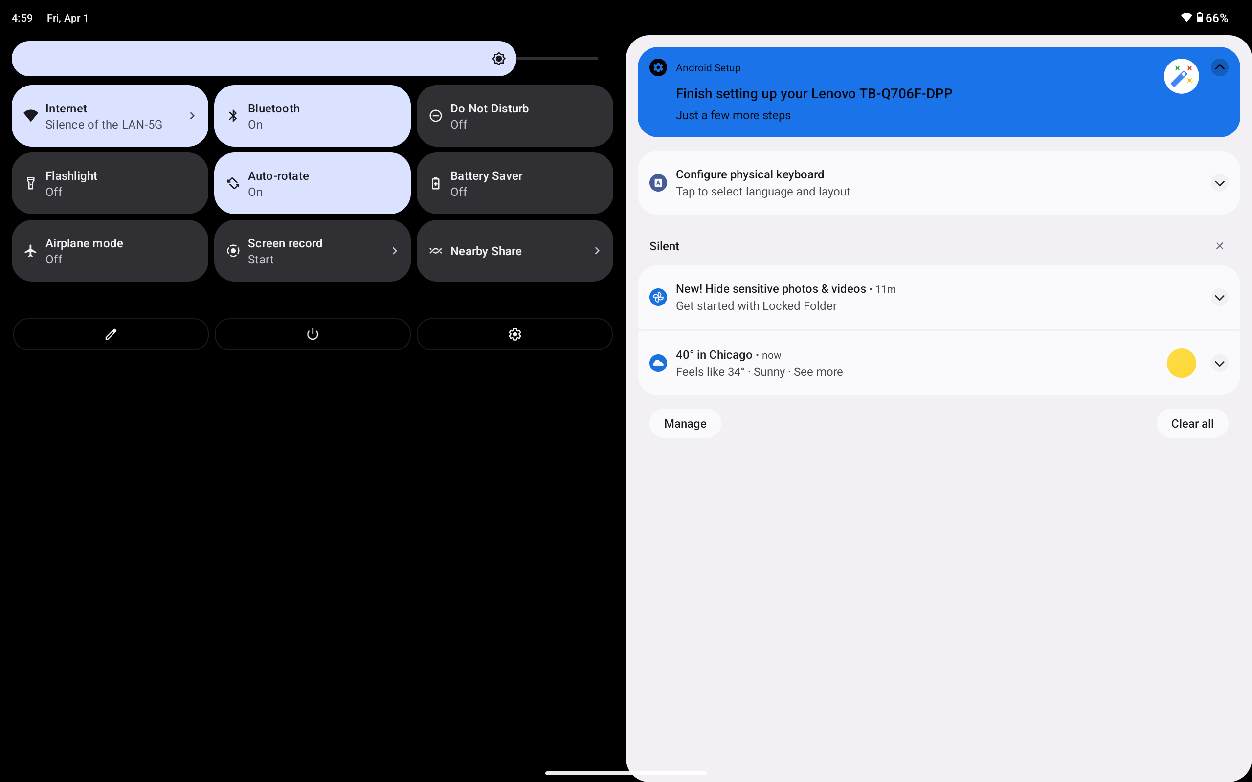
Everything from the setup process to the notifications shade is split in two, right down the middle. It saves you from unnecessary scrolling and saves you from reaching all over the screen, which is more annoying with a large device like a tablet than it is with a phone. Even the login screen features a pattern unlock in the bottom left or right corner, rather than in the center, for the sake of ease of use, and you can just click the side of the screen you’d like it to appear on.
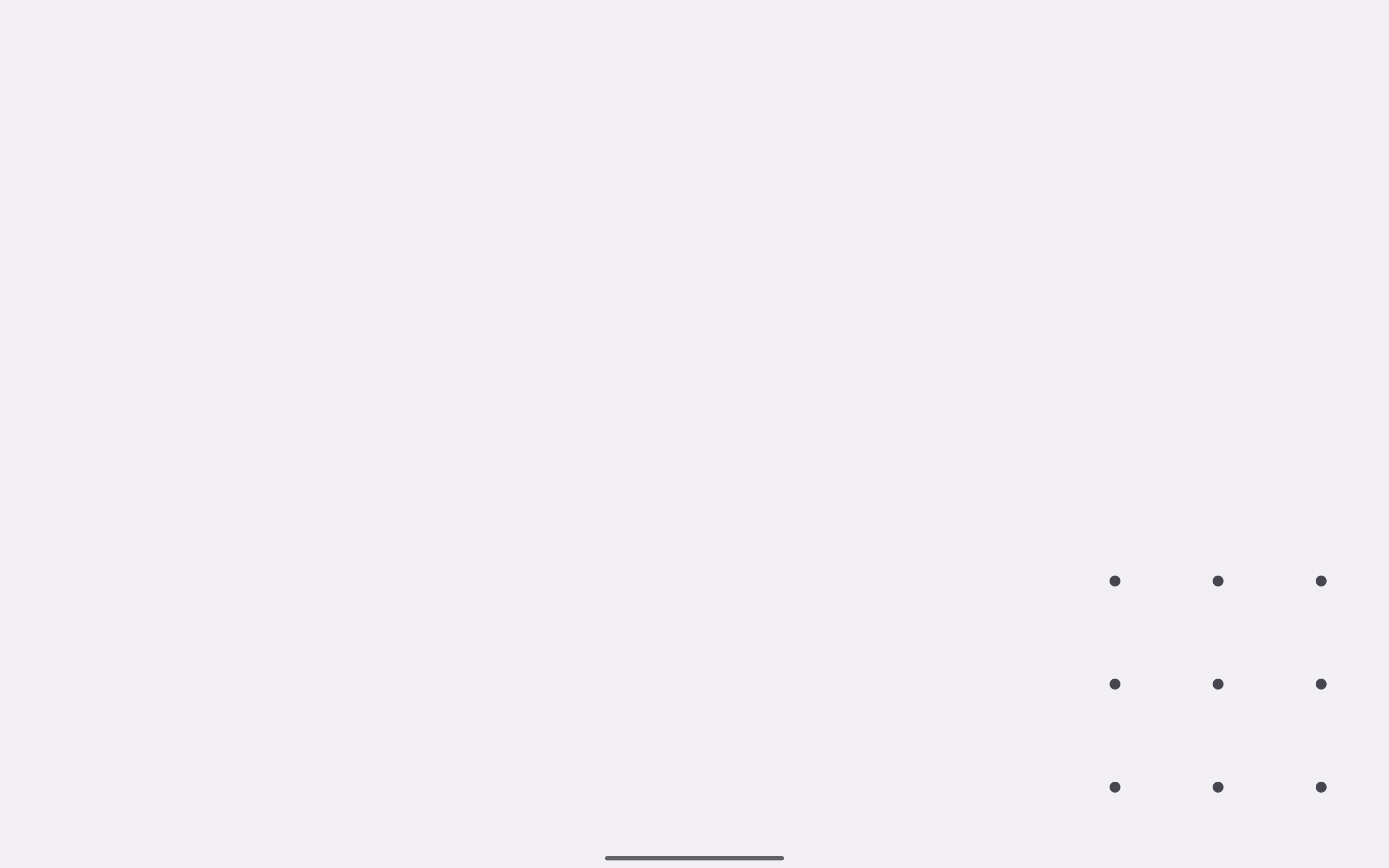
This approach is infinitely more intuitive, allowing for easy clicking without having to take your hand off the device. Plus, it seriously cuts back on the unsightly empty spaces that have become so common on tablet interfaces.
Addressing the app problem
We’ve all been there, opening an app on a tablet, only to be confronted by a clunky mobile app stretched out onto a larger screen. It’s ugly, outdated, and downright unreasonable at this point in technological history. Android 12L begins to right this terrible wrong with app support, making all apps supported in split-screen mode. Naturally, there are new tools and features for developers to ensure their apps work as intended on tablets, but I didn’t encounter any show-stopping issues with my usual selection of apps.
Yes, most popular apps already have some kind of tablet support to make the experience a bit more comprehensive. However, there are plenty of unoptimized apps out there that could throw a wrench in the works, and Android 12L is designed to fix that with an improved compatibility mode that can more effectively take advantage of all the space provided by larger screens.
This is where the dual-screen functionality really comes in handy, too. If an unoptimized app is used in split-screen mode, it will look infinitely better than the previously stretched-out version that users can’t stand. And even if it isn’t perfect, it’s a welcome improvement from older iterations of the interface. If you want to learn more about the technical details, our friends at Esper have an incredibly detailed deep-dive on 12L.
One small update for Android, one giant leap for the tablet experience
This is the first time in ten years that it really feels like Google cares about tablets, not since before the launch of Android Jelly Bean when Google reduced tablets to little more than blown-up phones. The interface in Android 12L is still recognizable as Android, but it morphs to make better use of the screen real estate on a tablet, and the revamped multitasking features massively boosted my productivity.
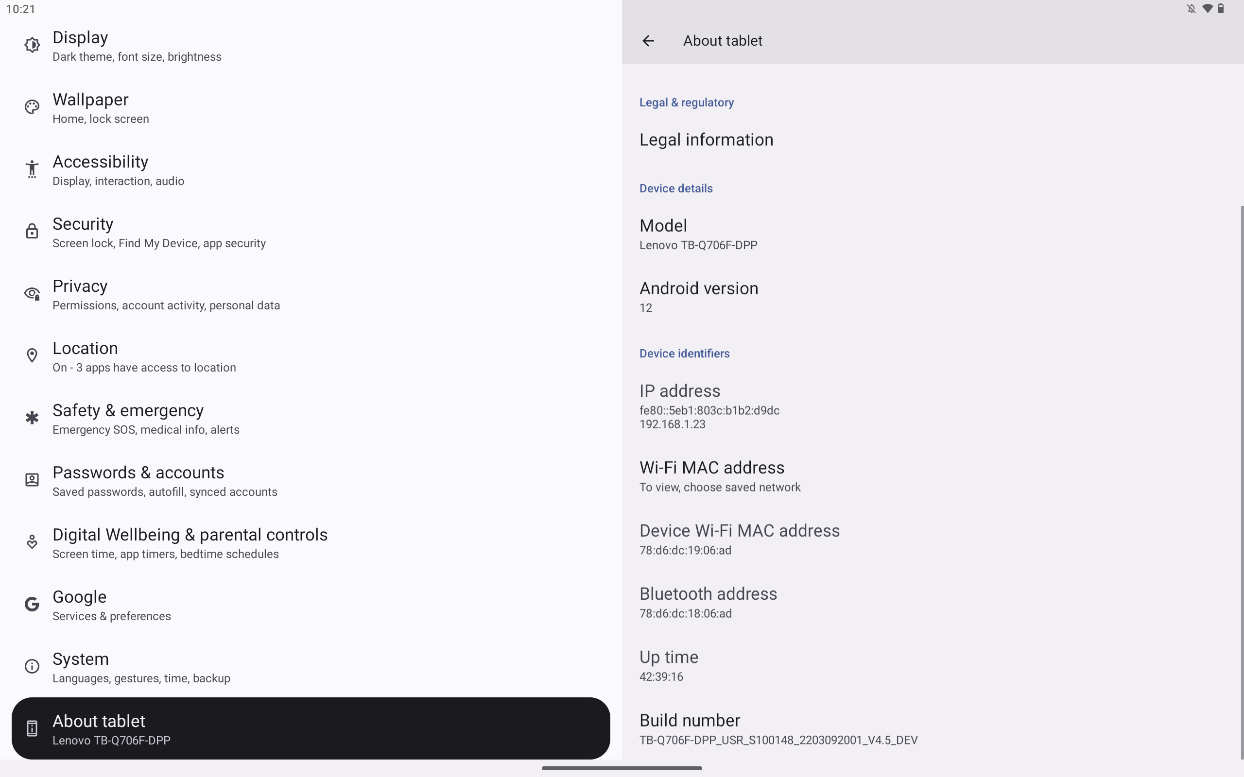
Overall, Android 12L is a definite win for Android users who have been waiting for a tablet experience that is actually tolerable. You get to enjoy the same apps and features, while utilizing the full potential of a large (or dual) screen device. Simply put, it looks like Android is finally going to finally get in the fight for tablet supremacy. I can’t wait to see where we go from here.
"Android" - Google News
April 09, 2022 at 08:00PM
https://ift.tt/WM0I8gU
Hands-On: Android 12L is a big step in the right direction for tablets - Android Police
"Android" - Google News
https://ift.tt/TAiUnDs
https://ift.tt/misZurH
Bagikan Berita Ini


0 Response to "Hands-On: Android 12L is a big step in the right direction for tablets - Android Police"
Post a Comment