Android tablets are always playing catch up to the iPad, which consistently outperforms on everything from productivity to entertainment. From Google scrapping the Pixel Slate, to Samsung’s various attempts at swaying us with amazing OLEDs, there simply hasn’t been a really solid tablet for those who want to dive a bit deeper into the Android experience.
Lenovo is trying its best to provide just that with the Tab P12 Pro. While the P12 has some notable downfalls – like the messy productivity mode – this device represents a good enough attempt at an Android tablet that isn’t a chore to use (high praise, I know). The screen is nice, Lenovo worked to make the interface moderately functional, and the thin body makes it far less cumbersome than you'd expect, even when donning the optional keyboard case. Still, it’s hard to get behind an outright recommendation, as the P12 is quite expensive at $700, particularly with the case. It simply doesn’t deliver on the premium promises made by its price tag.
The Lenovo Tab P12 Pro is a solid tablet, but doesn't match its premium price tag. However, the looming Android 12L update could change that.
- Brand: Lenovo
- Storage: 128, 256 GB
- CPU: Qualcomm Snapdragon 870
- Memory: 6, 8 GB
- Operating System: Android 11
- Battery: 10200mAh
- Ports: USB-C
- Display (Size, Resolution): 12.6" 2K (2560 x 1600) OLED
- Price: $699
- Measurements: 285.6 x 184.5 x 5.6 mm
- Very thin but solid design
- Comprehensive entertainment interface
- Accompanying case is truly great
- Includes Lenovo Precision Pen 3
- Upcoming Android 12L update with beta support
- Productivity functionality is a mess
- Pen feels cheap
- Quite expensive
- Currently running Android 11
Design, hardware, what's in the box
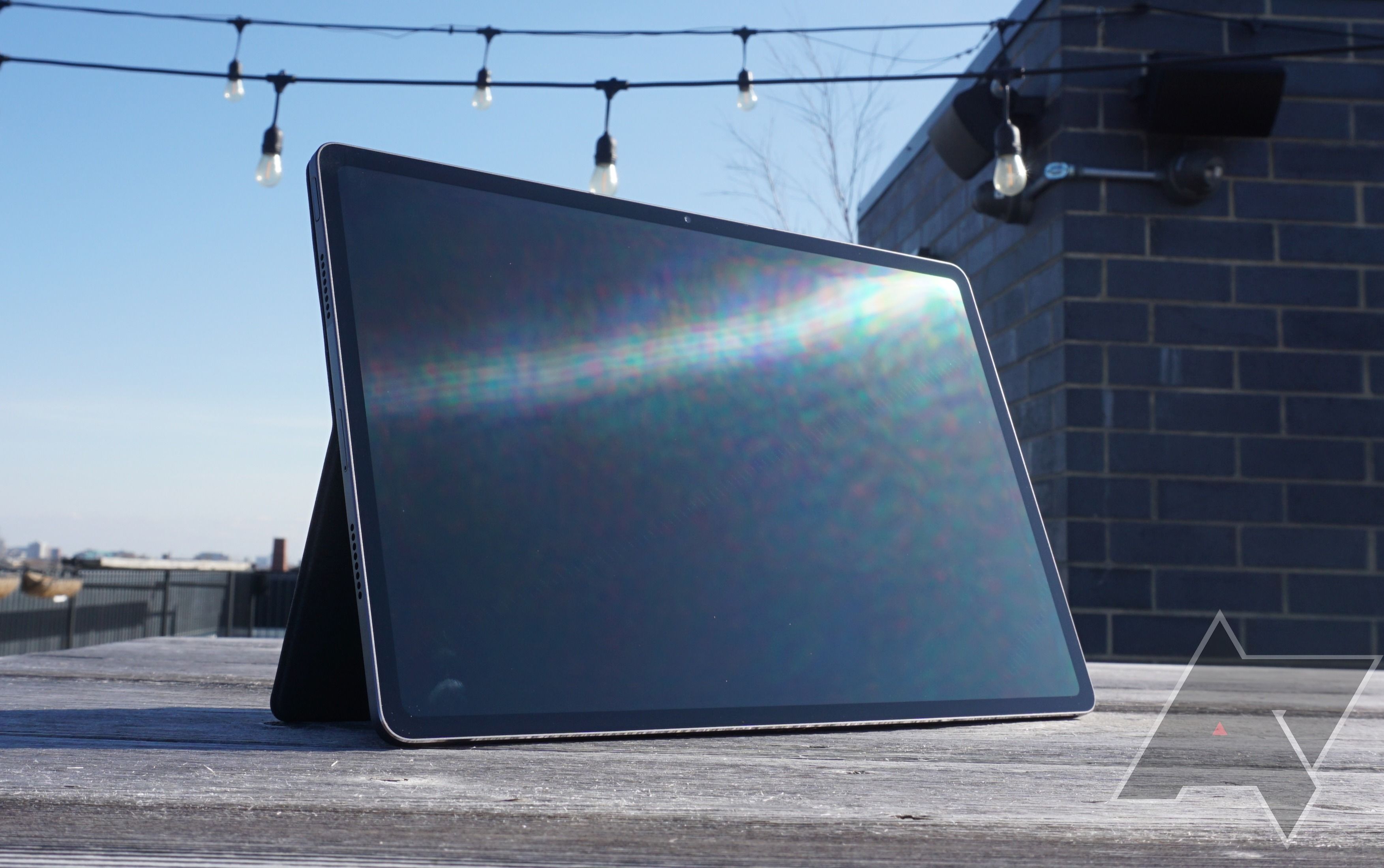
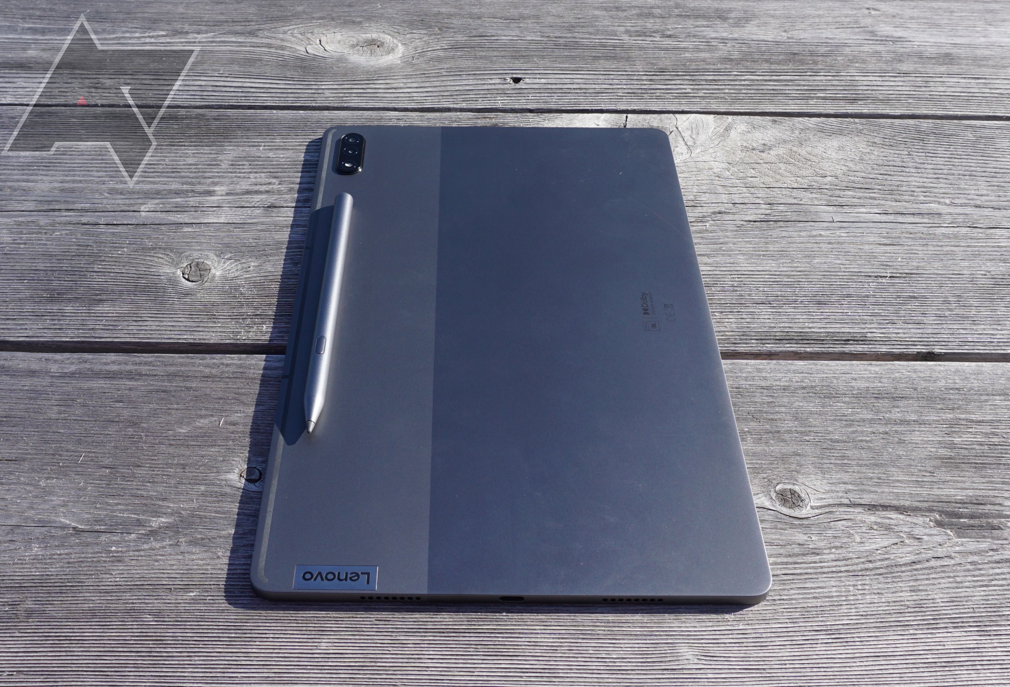
The first thing you'll notice about the design of the Lenovo P12 Pro is that, for a powerful tablet, it’s quite thin. In fact, at only 5.6 mm, it’s one of the thinnest tablets you can buy right now, and it feels like it. Plus, at only 1.24 pounds, the device isn’t too heavy either, which is ideal for portability. Surprisingly though, the thin body doesn’t sacrifice a sturdy feel, as I'm confident it would take quite a bit of effort to, say, snap it in half. The build is solid enough for a moderate drop on a carpeted floor, but we wouldn’t recommend testing it on anything firmer than that because of the huge OLED screen.
To the uninitiated, the display probably looks quite impressive–and it is in some ways. The 12.6" 2K AMOLED screen and the 120 Hz display refresh rate combine for a sharp, smooth visual experience, particularly when it comes to scrolling through streaming services like Netflix or Hulu. However, when you consider the premium status of the P12 – especially the price tag – the display doesn’t match up to competitors like Samsung or Apple. As has become common for non-Apple tablets today, the display is widescreen, which makes sense as this the P12 Pro is great for entertainment purposes, but it's awkward to hold in portrait orientation. The thin bezels leave plenty of room for the display, offering an 89% screen-to-body ratio.
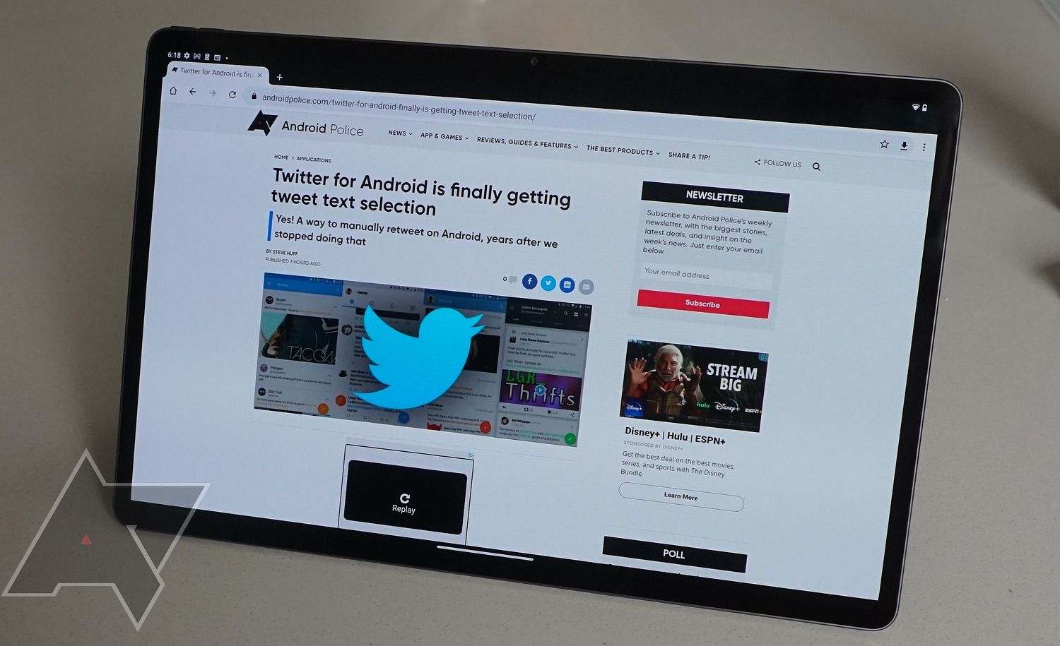
Additionally, the brightness comes in at 600 nits, which is pretty high. However, for late night meetings or midnight show binges, the brightness doesn't scale low enough–it feels like you’ve got a ring light pointed at your face. If you’re going to be using this device before bed, we’d recommend investing in some kind of shade, because it feels like staring into the sun in dark rooms.
For biometrics, the Lenovo P12 Pro has an inconspicuous fingerprint reader on the left side (landscape) of the device, which also acts as the power/standby button. Because the device is so thin, the fingerprint reader is far from perfect, as it still takes a few tries to access the device with my fingerprint. You can, of course, opt for a pin or swipe to unlock the tablet, but hey, where’s the fun in that?
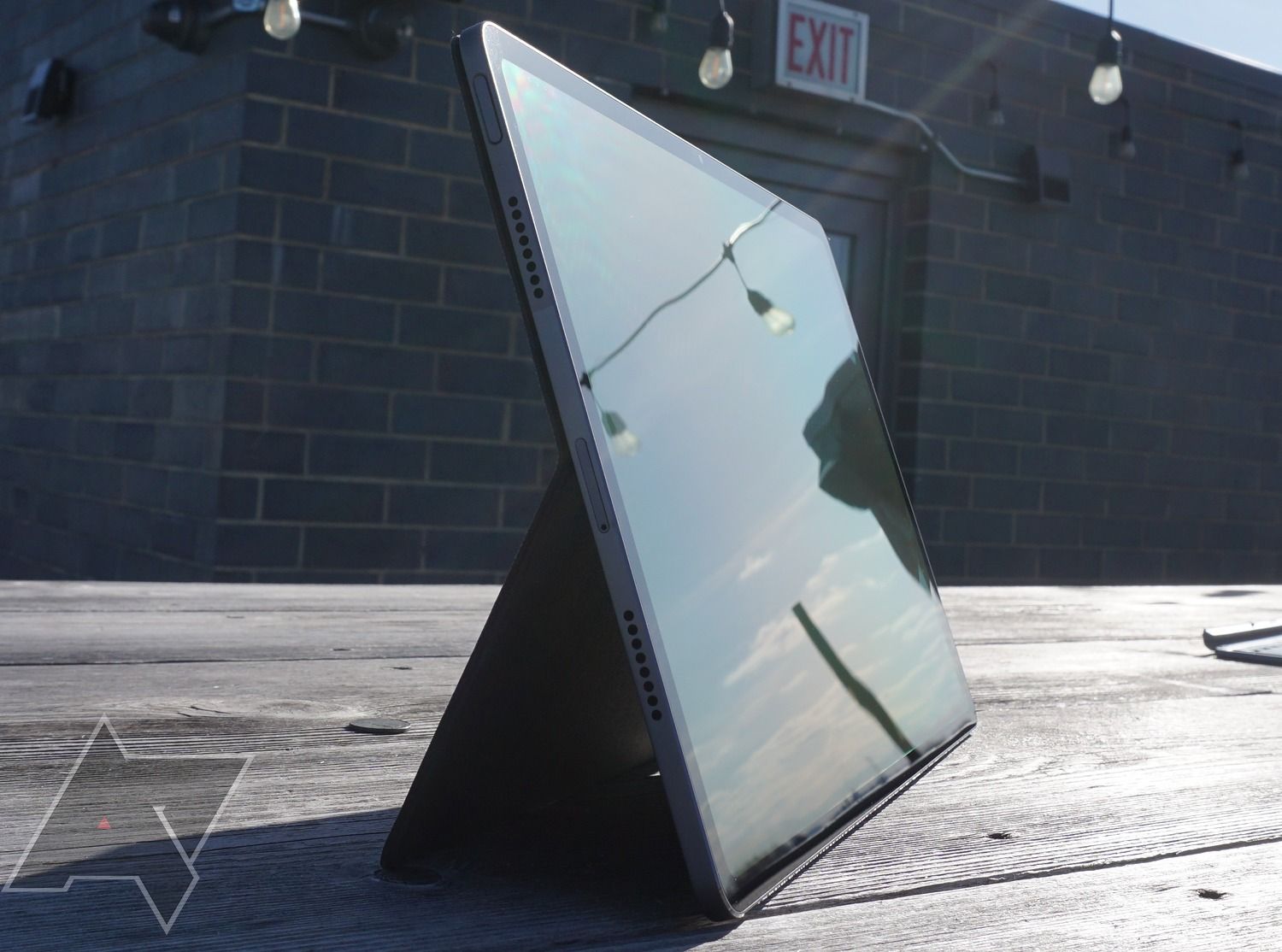
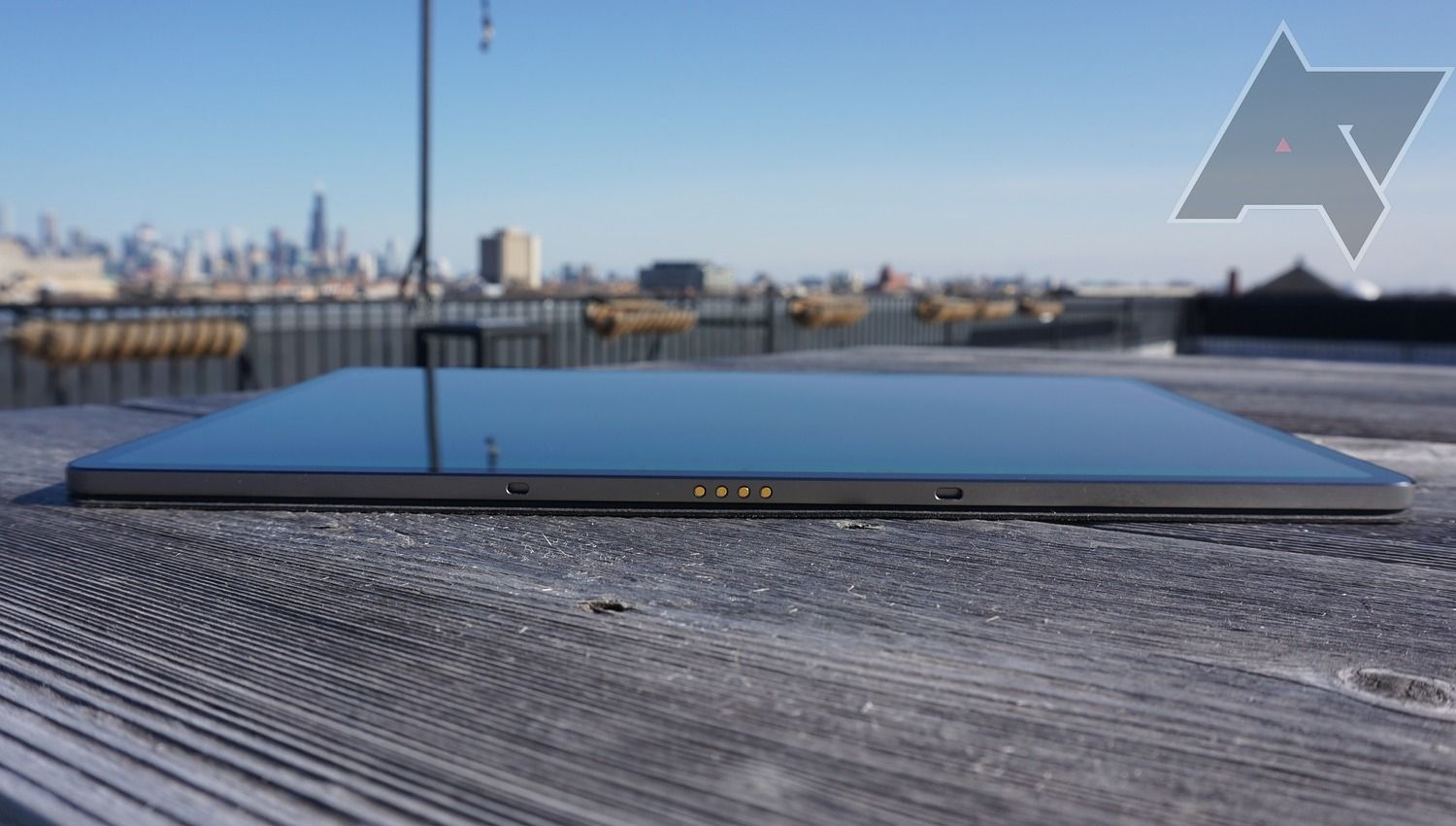
The Lenovo P12 Pro charges via the USB-C port on the right side (landscape) of the device, which should delight Android users who don’t feel like using another plug. You’ll also find small volume buttons on the top left of the device, as well as a microSD card slot underneath the fingerprint reader.
The Lenovo Precision Pen 3 is included, which is far from a given for tablets, and a 2-in-1 keyboard case is available for purchase for $130, which is at least somewhat competitively priced in the market. The pen feels a bit cheap compared to Samsung’s S Pen, for example, but it does magnetically attach to the back of the device, and fits comfortably in the small pocket on the keyboard case with no need to charge.
The cameras on the device aren’t too shabby either. The front-facing camera comes with 8MP fixed focus and TOF Sensor, while the two rear-facing cameras offer a 13MP autofocus + 5MP wide-angle. For a tablet, they are surprisingly clear, providing smartphone quality images, and the portrait mode isn’t too messy around the edges, thanks to the Google software. Even with the slim bezels, the front-facing camera is completely hidden, so you’ll find no notch on this device, thank goodness.
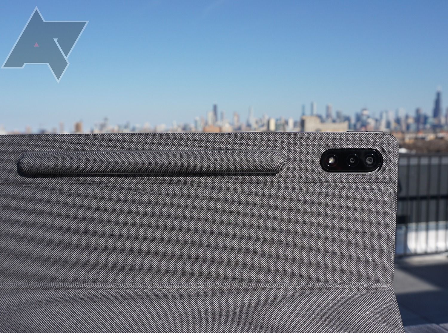
As you can imagine, you’ll find the Lenovo P12 Pro in the box, along with the Precision Pen 3, the USB-C charging cable, and an accompanying charging brick, which is always nice to see. You’ll also get the user’s manual and the tiny tools needed to swap out the microSD card slot. In the box for the 2-in-1 case, you’ll find two parts – the keyboard case and the back case – both of which attach magnetically. It is worth noting that the case was one of the nicest aspects of the package here, providing a high-quality, sturdy feel that keeps the tablet's thin body. It's not included, though.
Software, performance, and battery
As is the case with the majority of Android tablets, the Lenovo P12 Pro just doesn’t cut it when it comes to the software. Whatever the secret sauce is that makes iPads easy to use and Surface tablets great for work is simply not there for this device, and here’s why.
To start, if you’re looking for a laptop replacement, the productivity mode is hard to get on board with. The mode is supposed to replicate the laptop experience, providing a taskbar at the bottom with open apps and draggable windows for multitasking. And at first, you might not notice the minor inconveniences laden throughout the device, but you certainly will with enough use, because they are there.
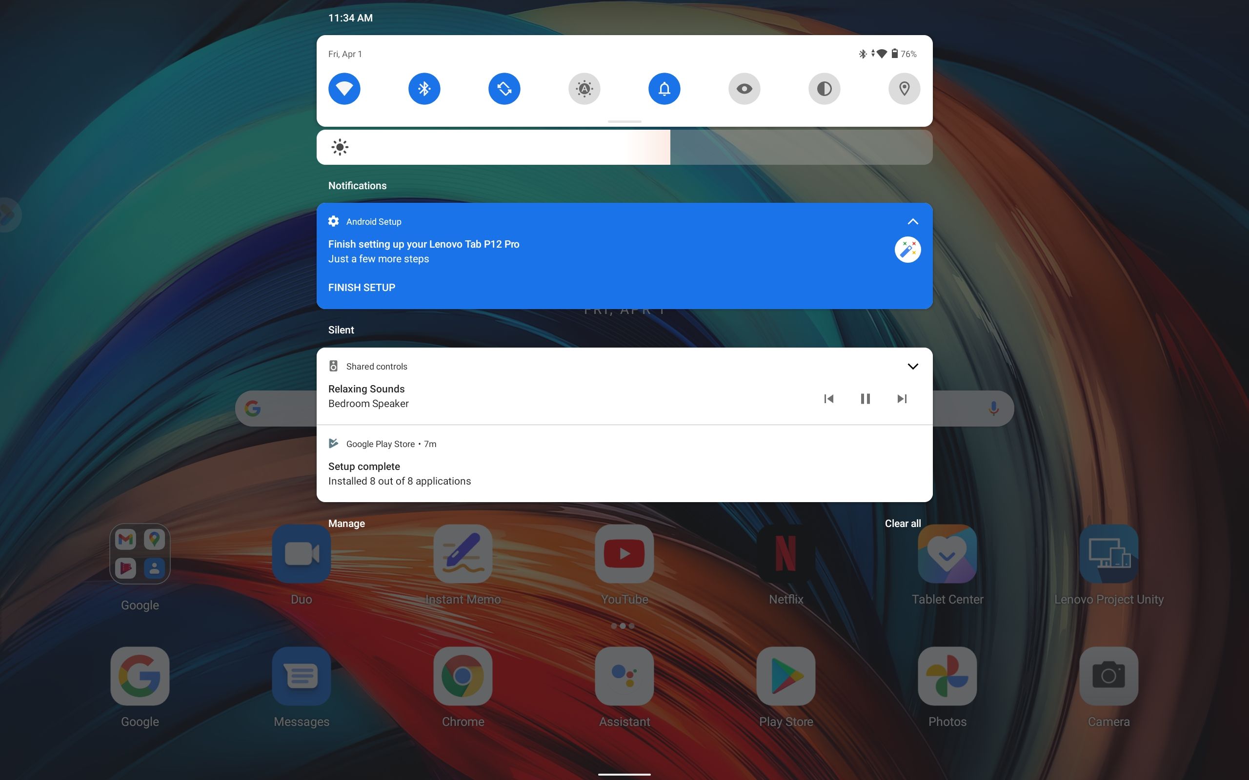
The multi-window functionality included in Android is clunky on its best day and consistently lags when trying to perform simple functions like dragging or minimizing a window. Even simply switching between basic tasks, like using the keyboard and typing, requires multiple clicks, slowing down any momentum you might have during the work day. That, combined with minor problems – like the top banner bar maddeningly infringing on the top section of any web page – make getting work done decidedly more difficult.
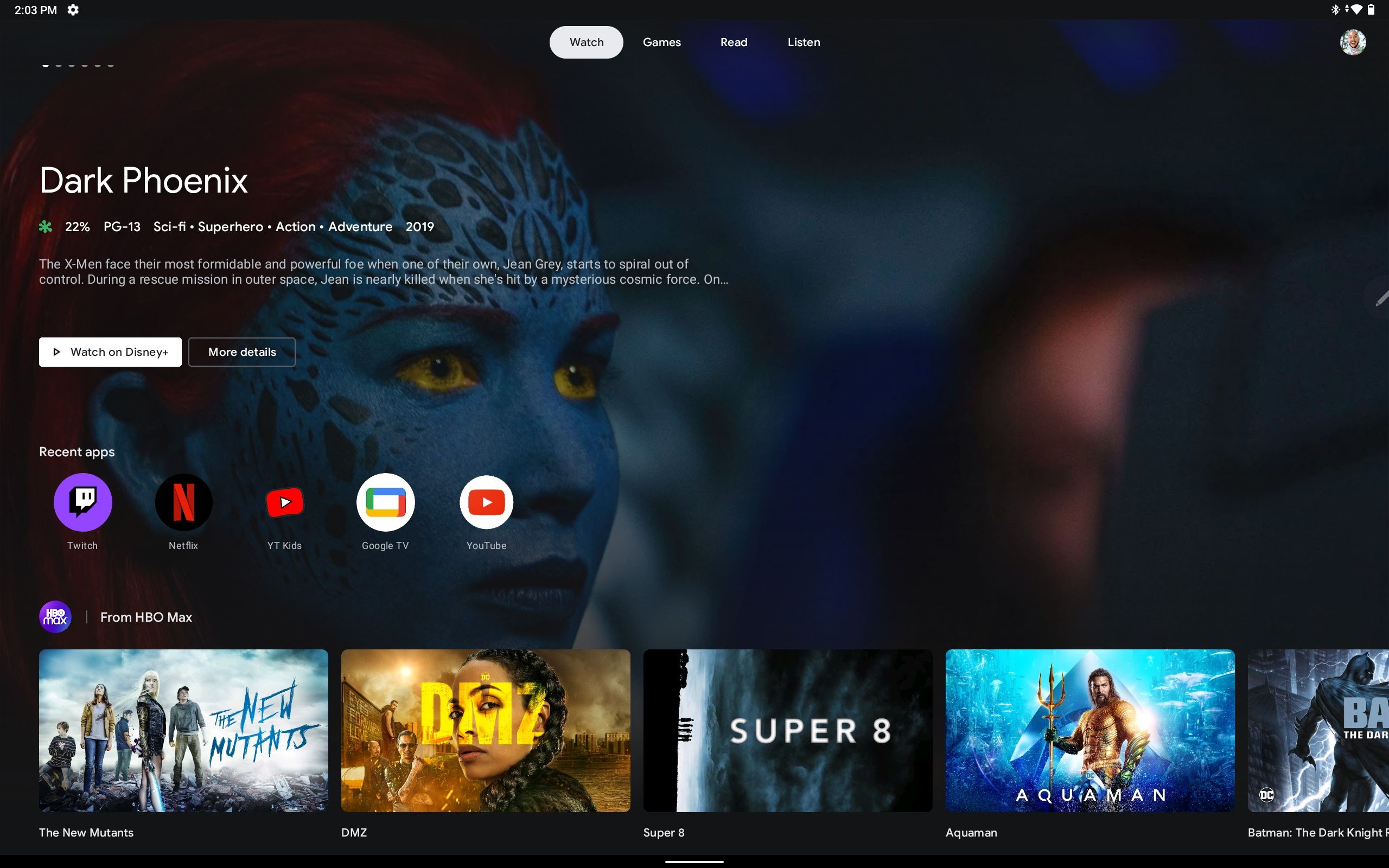
Where the Lenovo P12 Pro shines, though, is entertainment. With Google’s Entertainment Space built directly into the interface, you can easily switch between work mode and play mode in a single swipe – although you do unfortunately lose the Discover page found on many Android devices. If you haven’t checked it out before, the media platform allows you to add your services to the list, aggregating all of them into a single user experience to peruse more effectively. It’s not perfect, as it’s noticeably missing a Continue Watching section, which would admittedly be hard to manage, but for browsing, it’s one of the most seamless and comprehensive experiences you can have on a tablet.
The battery is also an impressive aspect of the Lenovo P12 Pro. The company claims the device offers nearly 15 hours of video playback and more than 10 hours of web browsing, and I actually found that to be a bit of an understatement. With casual use, the tablet didn’t need to be recharged for three days, which is the kind of premium performance you love to see from a device that costs this much.
Another benefit of the P12 Pro is that it allows you access to a beta version of Android 12L (see below for screens), Google’s new large-screen-optimized operating system for tablets. I must admit this improves the experience more than I expected, giving the P12 Pro much better multitasking functionality (still not as good as Samsung's though). Android 12L fully embraces the foldable/dual screen functionality of the future with its split-screen default for notifications, setup, and even login.
The best part of Android 12L is undeniably the taskbar, which sits at the bottom of the screen. You can get rid of it when you use apps, though, with a simple long click. The taskbar allows you to multitask significantly easier than on Android 11, making other apps just than a drag and drop away. Sure, it's not as refined as Samsung's multitasking, but it at least gives the P12 Pro a more manageable productivity experience.
Should you buy it?
Honestly, probably not, particularly if you need it for work. The messy productivity mode makes it very hard to recommend the P12 Pro to anyone looking for a portable work option. There are enough small interface problems to amount to a true productivity stopper—Samsung's still very frustrating DeX mode is worlds better. That, combined with the far from easy to use multi-window feature makes getting work done notably harder than your average big phone.
Android 12L is nothing to scoff at, though, and it could be enough to sway you in favor of this device. Getting a head start on this large-screen update on a device whose hardware is pretty impressive could make the high price tag worth it. This is only the beta release, and there are some bugs that will hinder the experience. Still, the looming 12L update is a net gain for the Lenovo P12 Pro.
Outside that, the price is the primary aspect preventing a full on recommendation. Yes, the screen is pretty high quality, the entertainment interface is fairly comprehensive, and the thin design can be seriously attractive, but the $700 price tag (not including the $130 keyboard case) is just too high for a tablet that can't compete with Samsung's latest. There are better alternatives no matter what you need.
Buy it if…
- You need a tablet for entertainment
- You love a thin tablet
- You want to get an early look at 12L
Don’t buy it if…
- You need a tablet for work
- You’re trying to save money
We hope you like the items we recommend and discuss! AndroidPolice has affiliate and sponsored partnerships, so we receive a share of the revenue from some of your purchases. This won’t affect the price you pay and helps us offer the best product recommendations.
"Android" - Google News
April 03, 2022 at 09:00PM
https://ift.tt/KgexEsT
Lenovo Tab P12 Pro review: A window into the future of Android tablets - Android Police
"Android" - Google News
https://ift.tt/8SAO7MP
https://ift.tt/yD4EG7S
Bagikan Berita Ini


0 Response to "Lenovo Tab P12 Pro review: A window into the future of Android tablets - Android Police"
Post a Comment